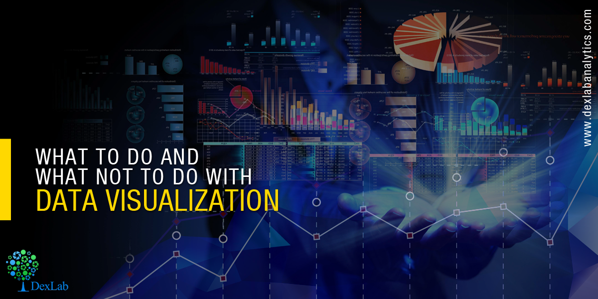
Data Visualization can be your bow and arrow provided you know the exact way to use it.
In modern day scenario, data visualization has become the crux of efforts – raw data in various forms and statistics tends to be incredibly powerful, but only if you decide to work with them as a whole. After all, it’s not just the numbers but the story behind those numerical figures that reveals something. So, you require data visualization to brush up these notions and turn them into something more compelling to target audience. Data Visualization makes your messages more attractive, lively and enhances the impact, along with keeping your audience hooked.
What Not To Do With Data Visualization
To start with, it’s important to make you aware that data visualization is a tool – and there are numerous ways in which you can misuse this tool or simply employ it in a wrong way that will take you further and further away.
Unfortunately, the biggest mistake that we often make in terms of data visualization is creating cumbersome content. You have to keep in mind, the reason data visualization is becoming so popular is that it transforms dry data into a form that is far more fresh, interesting and of course engaging with the users.
Forgetting content like infographics should be simple can take away all those hard work and ruin your presentation in a jiffy. What’s more, there is a reason why the most popular infographics doesn’t consist countless pages of statistics and pictures – they need to be a lot more focused and to the point in order to support a much larger idea.
Having said that, make your visual content short and crisp, without bogging it down with information gridlock. Advice – Stay away from making a boring infographic.
Understanding Credit Risk Management With Modelling and Validation- @Dexlabanalytics.
Engage Audience with Superior Visual Content
The visual content you are going to make should support a bigger narrative or a convincing idea. Infographic representations are the most powerful weapon – not only they are fast to engage users, but are also great to make your point loud and clear. If there’s a specific story you are willing to tell, then you have to resort to effective data visualization tools, not because you think they can be good, but because they are really good.
Don’t rack your brains out – you could definitely write a 1000 word blog post, but just think for once, instead of wasting your time in forming insights to jot down a full blog, you could use infographic visual content to present the very same idea but in a more simplistic way that could eventually garner more attention.
Maps in Tableau: Key to Answer Data Questions- @Dexlabanalytics.
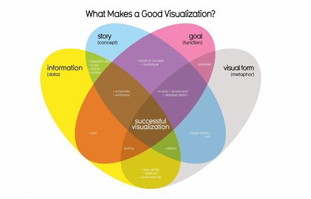
Data Visualization: Come Craft Something Powerful
For modern day marketing, there is no silver bullet – only a set of robust tools to ace up your goals.
Get to the base of data visualization and understand why is it so compelling as a tool and give some time to learn about its strengths and weaknesses, and by doing all this, you will be in a position to apply it properly.
However, just keep in mind, data visualization is not something that is designed to replace the ongoing marketing campaigns. So keep your eyes open and be sure, the rest will simply fall in place.
To feed yourself more data visualization knowledge, reach us at DexLab Analytics. It is one of the best Tableau training institutes in Delhi to help you become Tableau-savvy!
Interested in a career in Data Analyst?
To learn more about Data Analyst with Advanced excel course – Enrol Now.
To learn more about Data Analyst with R Course – Enrol Now.
To learn more about Big Data Course – Enrol Now.To learn more about Machine Learning Using Python and Spark – Enrol Now.
To learn more about Data Analyst with SAS Course – Enrol Now.
To learn more about Data Analyst with Apache Spark Course – Enrol Now.
To learn more about Data Analyst with Market Risk Analytics and Modelling Course – Enrol Now.