
This is the 4th part of the series on visualization using Python programming language, where we will continue our discussion on the Seaborn library. Now that you have become familiar with the basics of the Seaborn library, you will be learning specific skills such as learning to create a box plot using Seaborn. So, let’s begin.
Seaborn library offers a list of pre-defined methods to create semi-flexible plots in Python and one of them is. boxplot() method. But what is a box plot?
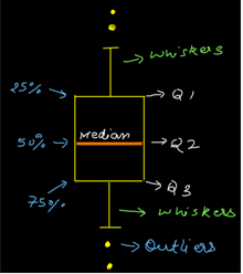
Answer:- A box plot often known as box and whisker plot is a graph created to visualize the distribution of numerical data and skewness through displaying the data quartiles (or percentiles) and median.
Creating a box plot
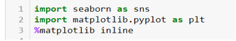
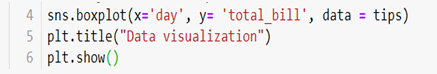
Let’s begin by importing the Seaborn and Matplotlib library.
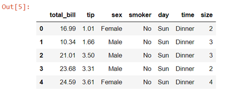
We will again be using the tips dataset which is a pre-defined dataset in Seaborn
![]()
Data description:- This is a dataset of a restaurant which keeps a record of the amount of bill paid by a customer, tip amount over the total bill paid, gender of the customer, whether he or she was a smoker or not, the day on which they ate at the restaurant, what was the time when they ate at the restaurant and the size of the table they booked.
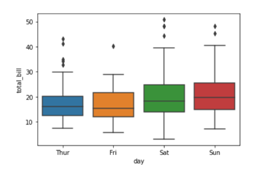
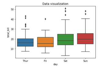
To create a box plot we will be using .boxplot() method.
![]()
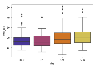
On the x axis we have day column having categorical data type and on the y axis we have total_bill column having numerical data type. Thus for each day with the help of a box plot we will be able to visualize how the total_bill changes around its median value.
To add title to the graph we can use. title() method from the Matplotlib library
To add color to your graph you can use palette argument
![]()
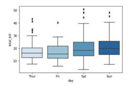
We are adding a list of palette colors in this blog down below:-
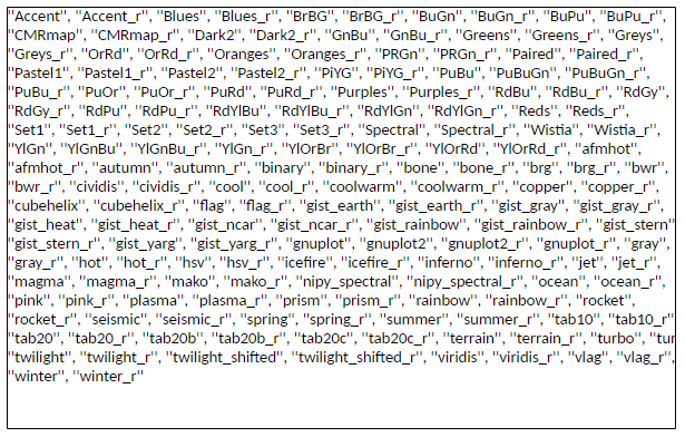
You can replace the color mentioned in the above code to see which color variations you would prefer in your graph. For example
![]()
Here we are using color palette ‘CMRmap’ to change my graph color from different shades of blues to a completely different color range i.e. from blues to orange, violet, pale yellow etc.
This tutorial hopefully, has clarified the concept and you can now create boxplots with Seaborn. Since this is a series you need to keep track of all the parts to be a visualization expert as we take you through the process step by step. Follow the Dexlab Analytics blog to access more informative posts on different topics including python for data analysis.
Go through the video tutorial attached below to get more in-depth knowledge.
.
Python, Python certification, python certification course, Python courses, python data science course, Python for data analysis, Python Training Institute