tableau training institutes in delhi Archives - Page 3 of 5 - DexLab Analytics | Big Data Hadoop SAS R Analytics Predictive Modeling & Excel VBA

DIY Website Analytics Dashboards for Marketers at TC 17 – A Quick Overview [Video]

Are you bushed of creating reports in Excel? Do you feel annoyed every time you extract data from multiple platforms to develop website traffic reports?

 
DIY-Website-Analytics-Dashboards -for-Marketers-at-TC 17– A-Quick-Overview
 

Here we have some good news for y’all!


Two of Tableau’s own marketers have invented a next-level website analytics dashboard loaded with custom traffic metrics to turn reporting as easy as cake, and they are going to showcase it at TC17 in their breakout session Disparate measures: Tableau marketing’s DIY ethos and custom reporting.

Continue reading “DIY Website Analytics Dashboards for Marketers at TC 17 – A Quick Overview [Video]”

Master These Piping Hot Data Analytics Techniques and Stay Ahead of the Curve [Video]

Big Data, Business Intelligence, Data Science – the digital revolution is here, and it’s evolving steadfastly.

 
Master These Piping Hot Data Analytics Techniques and Stay Ahead of the Curve [Video]
 

Soon, data analytics is becoming the life-source of IT. The range of technologies is varied, and the way data is expanding, we are fast moving towards a juncture where analysis of vast volumes of data will be done in a jiffy.

Continue reading “Master These Piping Hot Data Analytics Techniques and Stay Ahead of the Curve [Video]”

5 Sure-fire Ways to Develop a Powerful Customized Web Analytics Dashboard in Tableau [VIDEO]

Let’s kickstart creating a custom web analytics dashboard!

 
5 Sure-fire Ways to Develop a Powerful Customized Web Analytics Dashboard in Tableau [VIDEO]
 

This blogpost consists of all the resources you will need to build your own web analytics dashboard – some of the resources we have used ourselves and some we have culled down from the web.

Continue reading “5 Sure-fire Ways to Develop a Powerful Customized Web Analytics Dashboard in Tableau [VIDEO]”

Here’s How to Make Data More Actionable for Better Decision-making

Every customer demand needs to be fulfilled, and CEO’s expect marketing analysts to deliver them. Being a key marketing initiative, optimizing every customer experience is a significant deal to seal for marketers all around the globe.


Here’s How to Make Data More Actionable for Better Decision-making


Data, of course, plays a crucial role in marketing endeavors – but only the data that is interpretable makes sense, rendering other data useless. To turn data into actionable, organizations need to understand the accuracy of data and in the process should be successful in turning insights into action.

Continue reading “Here’s How to Make Data More Actionable for Better Decision-making”

5 Quick-Fire Tips and Tricks from Dashboard Specialists

No two dashboards are similar. They cater to different audiences, serves distinct purposes, and address individual problems as unique as you.


5 Quick-Fire Tips and Tricks from Dashboard Specialists


In this blog post, we will talk about the 5 best practices to apply right now to create attractive dashboards, and engage users effectively.

Continue reading “5 Quick-Fire Tips and Tricks from Dashboard Specialists”

Text Adventure – Using Control Flow In Python

Python wascreated by Guido van Rossum and first released in 1991.Python, as a programming platform, has gained a huge popularity within a short span of time because of its flexibility and the user-friendly interface. The software can be deployed easily for developing statistical models and machine learning algorithms

 
Text Adventure- Using Control Flow In Python
 

In fact, due to the advent of AI and ML, Python has a language has had a certain kind of rebirth as far as industrial use is concerned. Today, however, the focus is going to be on a particular section of the language, namely the control flow to create a basic system in Python.

Continue reading “Text Adventure – Using Control Flow In Python”

What to Do and What Not to Do With Data Visualization

What to Do and What Not to Do With Data Visualization

Data Visualization can be your bow and arrow provided you know the exact way to use it.

In modern day scenario, data visualization has become the crux of efforts – raw data in various forms and statistics tends to be incredibly powerful, but only if you decide to work with them as a whole. After all, it’s not just the numbers but the story behind those numerical figures that reveals something. So, you require data visualization to brush up these notions and turn them into something more compelling to target audience. Data Visualization makes your messages more attractive, lively and enhances the impact, along with keeping your audience hooked.

Continue reading “What to Do and What Not to Do With Data Visualization”

Wanna Talk to a Database? Tableau Acquires ClearGraph

Wanna-Talk-to-a-Database
 

For 14 years, Tableau has solely focused on helping people understand their data better. To take this mission a notch higher, this August, Tableau announced they have acquired ClearGraph, a robust Palo Alto startup that facilitates smart data discovery and data analysis through Natural Language Processing (NLP). They have decided to work with ClearGraph team to incorporate its cutting edge technology into their own products to make data interaction easier via natural language, query technology. Continue reading “Wanna Talk to a Database? Tableau Acquires ClearGraph”

Maps in Tableau: Key to Answer Data Questions

Maps in Tableau: Key to Answer Data Questions

For creating brilliant data visualization, first you need to know which visual chart type would be ideal for the data story you want to tell. In this post, we will explore maps in Tableau, when and where they seem to be appropriate for particular data visualization, and how to make them more productive. If you want to use a map, make sure you know the reason why.

Maps help you attain, authenticate, or communicate spatial patterns with data. With these maps, you should start your presentation with a spatial question. This spatial question ensures that your map will perfectly find you an answer in the best way possible.


For example, answer this question using a data map:

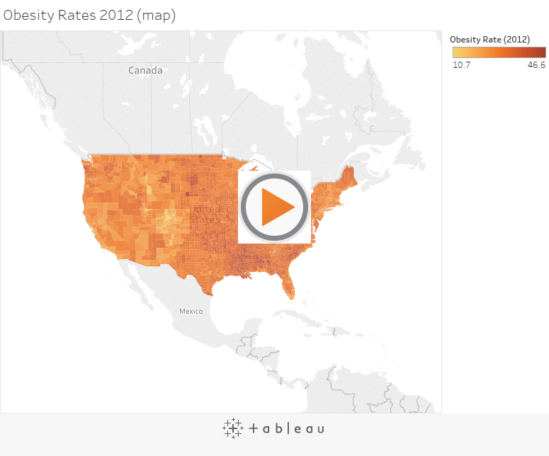
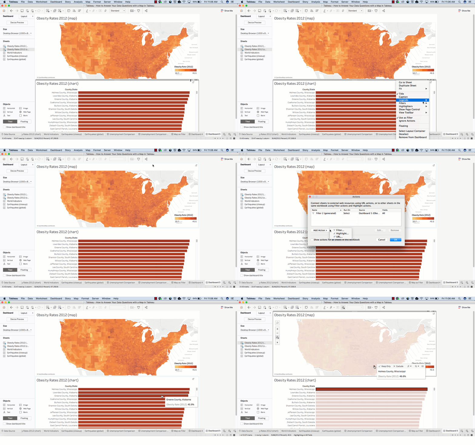
Which country in the US suffers from the highest obesity rate?
1_rss

How much time did it take to answer that question? Did you quickly find the actual location without fuddling too much over the darker-colored country? I guess not. However, this map might not be the best path to answer this spatial question.

Now, let’s use the bar chart below to answer the same question.


It is easier to discover the answer here.

By combining the map and bar chart together, the answer to your spatial question can easily be derived.
 

Basically, maps are great for answering these two types of spatial questions:

  • What is the value for a specific location or mark on the map?
  • How do patterns compare between locations, regions, or attributes?


Go through the following tips to answer these questions better.

How to determine the value for a specific location or a mark on map?

Tooltips are the perfect way to move your mouse over a mark and observe a list of all the underlying dimensions and measures present.

You can easily edit a tooltip to include both dynamic and static text.

For example, identify which of these tooltips reveals a story about earthquakes in Japan.

screen_shot_2017-06-16_at_7.47.20_am

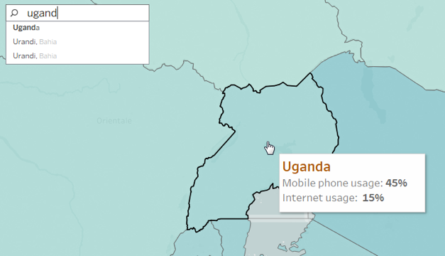
Also, the Tooltip improves speed-to-insight because the viewers of the map can easily find individual locations they want to find.

For example, find out the internet usage percentage in Uganda.
uganda

How do patterns compare between regions, locations or attributes?

To give answer to this question with a map, you must allow a direct comparison to be established between the data, symbols and even colors.

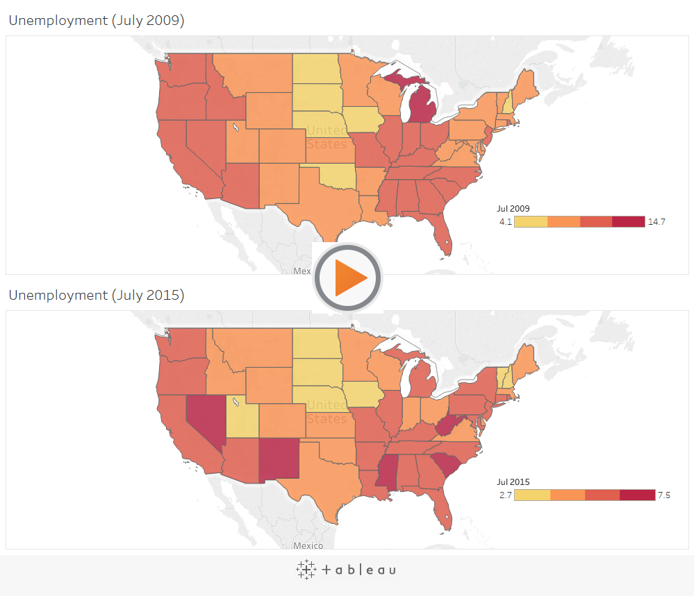
For example, while establishing a comparison between these two sets of unemployment data, the default color encoding doesn’t add any value for making direct comparisons. The reason being: the dark red doesn’t stand for the same value in both maps.

In turn, this situation can be very confusing for users who have no idea about the details of the data.
1_rss

The best way to deal with the problem is by getting an assurance that the color ramps in both maps use the same range.

Also, you can make your date easier for comparison by adjusting the color scheme, so that different color groups exude similar semantic meaning. Semantically-resonant colors help in processing information faster.

screen_shot_2017-06-16_at_7.52.23_am

In case, you want to learn more about Tableau, check out our blogs published on DexLab Analytics. We offer state-of-the-art Tableau training courses in Delhi, for any assistance reach out to us.


Interested in a career in Data Analyst?

To learn more about Data Analyst with Advanced excel course – Enrol Now.
To learn more about Data Analyst with R Course – Enrol Now.
To learn more about Big Data Course – Enrol Now.

To learn more about Machine Learning Using Python and Spark – Enrol Now.
To learn more about Data Analyst with SAS Course – Enrol Now.
To learn more about Data Analyst with Apache Spark Course – Enrol Now.
To learn more about Data Analyst with Market Risk Analytics and Modelling Course – Enrol Now.

Call us to know more