tableau course details Archives - Page 2 of 4 - DexLab Analytics | Big Data Hadoop SAS R Analytics Predictive Modeling & Excel VBA

Comprehensive Tableau Reference Guide: Calculated Fields-Logical Functions

Comprehensive Tableau Reference Guide: Calculated Fields-Logical Functions
Comprehensive Tableau Reference Guide is a blog series for explaining the basics of Tableau Software. So, if you are a newbie planning to get started with Tableau or if you simply want to explore the popular features in Tableau, then these step-by-step guides are perfect for you. In this blog, we will discuss about Logical Functions in Tableau.

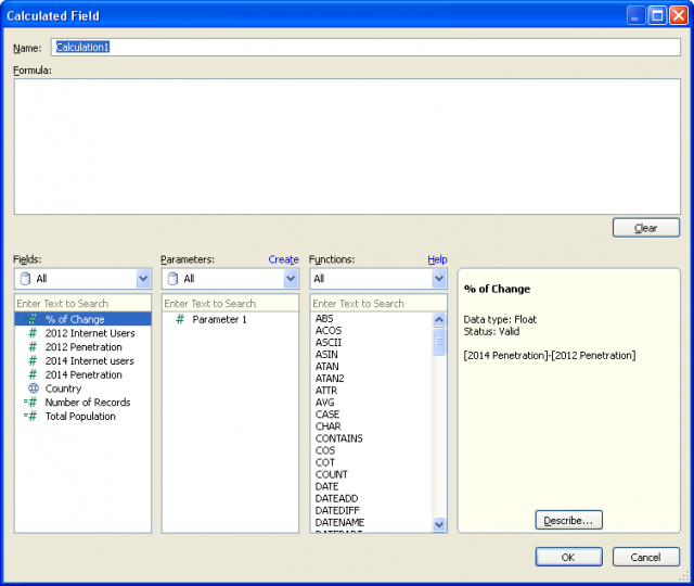
  • Go to the Calculated Field window:

1

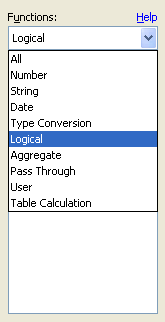
  • Go to Functions table. From the drop-down menu, select the option ‘’Logical’’:

2

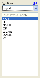
  • This selection filters the list of functions to display a listing of only logical functions, which consists of seven different functions:

3

We will explain these functions one by one.

  • CASE Function:

CASE expression WHEN value1 THEN return1 WHEN value2 THEN return2… ELSE default return END

The CASE function is applied when we need to perform a logical test. This function returns values based on the result of the logical test. A CASE function can also be written as an IF function. Generally, CASE function statements are simpler and shorter.

Example of a formula using CASE function:

004

Going through the country field, when the function comes across the value ‘’United States’’, it uses ‘’USA’’. On the other hand, when it comes across “United Kingdom’’, the function uses ‘’UK”. For all other values in the country field, ‘’World’’ is used.

  • IF Function:

IF test THEN value END/IF test THEN value ELSE else END

A logical test can be created using the IF function. The function works like this- IF the test is true THEN carry out the given condition. The test portion of the function must be Boolean. This can be achieved either by selecting a Boolean field from data source or by constructing the expression using operators and logical comparisons (AND, OR, NOT).

Example:

Logical205

IF test1 THEN value1 ELSEIF test2 THEN value2 ELSE else END

This statement is used when the functionality of IF function needs to be expanded. Additional IF-THEN statements can be incorporated through ELSEIF. Here’s an example to rewrite the CASE formula above with IF-THEN-ELSEIF statement:

Logical3-03

The result is the same as before.

  • IFNULL Function:

IFNULL(expression1, expression2)

The IFNULL function is used to perform a true/false test and check if the value in the tested field is NULL or not. If the value isn’t null then the first value of the function is used, and if the value is null then the second one is used.

Logical4_05

If Total Population of a country has no value, then it will be reset as zero and the null shall be eliminated from the newly created field.

  • IIF Function:

IIF(test, then, else, [unknown])

IIF function is very much alike the IF function described above, just a shorthand version for the IF-THEN-ELSE statement. The final argument of IIF function can define a value in case the test produces an unknown result. Like the IF function, the test must be Boolean, either by data type or the result of the test must give a Boolean value.

Here’s an example:

Logical5-06

If the % of change field is lower than 5% then the value Poor will be returned, or else the value Good will be returned.

  • ISDATE Function:

ISDATE(string)

The ISDATE function is used to determine if a string argument can be converted to a valid date (TRUE) or not (FALSE).

Example:

Logical6_1

This formula is supported by Tableau since the field used is a string data type, however each result will be FALSE. This function comes handy in case dates are formatted in a manner that is unrecognizable by a user, like ISO 8601.

Example:

Logical7_2

The above value stands for September 1, 2014 and is obviously a valid date.

  • ISNULL Function:

ISNULL(expression)

This is a simple function that checks if an expression is null (TRUE) or not (FALSE).

Example:

Logical8-03

The Filter card enables users to filter null values from their visualization.

  • ZN Function:

Statement: ZN(expression)

The ZN function is a variant of the ISNULL and IFNULL functions. It tests whether a function is null or not. In case the function is null, it returns a zero value.

Example:

Logical9_04

It is natural to feel overwhelmed when you see a list of logical functions for the first time. Since we have discussed each one of them, hopefully these functions will come handy in your visualization and data leveraging pursuits.

To learn more about Tableau functions, follow Dexlab Analytics– it is one of the best Tableau training institutes in Delhi. Do take a look at their Tableau BI training courses.


This article has been sourced from:  https://interworks.com/blog/ccapitula/2015/04/01/tableau-essentials-calculated-fields-logical-functions


Interested in a career in Data Analyst?

To learn more about Machine Learning Using Python and Spark – click here.

To learn more about Data Analyst with Advanced excel course – click here.
To learn more about Data Analyst with SAS Course – click here.
To learn more about Data Analyst with R Course – click here.
To learn more about Big Data Course – click here.
Top 3 Tableau Apps to Make the Most Out of Business Intelligence Software

Top 3 Tableau Apps to Make the Most Out of Business Intelligence Software

Dashboard visualization is big data’s next in-trend topic. Well-presented information boosts our processing capabilities. Programs like Tableau aim to do exactly that. Tableau uses state-of – art and highly functional graphics to transform big data into something pleasant to look at. More importantly, it has the profound ability to source data from cloud as well as hard drive units of various shapes and sizes, while simultaneously cross-paneling the information into meaningful graphs, charts and tables. This in turn have a remarkable impact on the overall speed to market time through the conversion of input information into interactive, actionable choices. As a result it speeds up the process of realizing the business decisions.

Today, there exists an intense competition between enterprise editions of Tableau. Many of these upon realizing the market value of the incredible visuals which are unique to Tableau have chosen build on it. This has been achieved through the addition of some useful functions and features. Following are the top 3 apps among these enterprise editions of Tableau.

  1. Alteryx

Alteryx fuels Tableau visualizations with an advanced level of data blending, transposing and analysis. As a result it is more efficient in presenting the data. It makes use of automated progresses thereby reducing the need to perform manual actions. Alteryx has been impressive in its exploration of spatial, predictive and statistical analysis, ease of transposability using drag/drop facility, and also because coding is not a requirement. It is capable of handling big data or cloud data in sequence with local or hard drive data. Collaborative information becomes scalable and more manageable.

  1. BI Connector

BI Connector is a self-serving data performer which seamlessly bridges the functions of Tableau and OBIEE without demanding the knowledge of an IT expert. Strong security protocol from OBIEE is utilized to safeguard data while it’s being exported, such as publishing worksheets with the drag/drop facility. The dashboard interface makes collaborating data more flexible. Also, the fluidity of its navigation is user-friendly and practical. Services on a server and desktop are equally powerful.

  1. Dataiku

Dataiku boosts the ability of its users to ‘think’ data. Its performance and credibility are honed through additional visual interfaces. In particular, Dataiku DSS lays emphasis on a capability pertaining to trending and predictive data. The users can even chose to share out code snippets or create their own model. This program exclusively caters to big data infrastructures. Dataiku permits users to quickly comprehend complex feature interactions and analyze coefficients. The best part about all these processes is their navigation which uses a rather visually-pleasing interface.

Hence Tableau enables users to interrelate with data and then proceed with its visualization which includes the creation of interactive and sharable dashboards. It enables the world’s largest organizations unleash the power of their most valuable asset- data. To know more about Data Visualization take a look at the Tableau BI Certification course conducted by DexLab Analytics-a premier institute offering professional courses on data science.

References:

https://www.biconnector.com/blog/3-apps-to-get-the-most-out-of-tableau/

http://www.dashboardinsight.com/articles/digital-dashboards/fundamentals/what-is-a-dashboard.aspx


Interested in a career in Data Analyst?

To learn more about Machine Learning Using Python and Spark – click here.

To learn more about Data Analyst with Advanced excel course – click here.
To learn more about Data Analyst with SAS Course – click here.
To learn more about Data Analyst with R Course – click here.
To learn more about Big Data Course – click here.
It’s Time to Upgrade Tableau with Hyper

On 10th January, 2018 Tableau 10.5 was launched!

 
It’s Time to Upgrade Tableau with Hyper
 

Once you upgrade yourself to Tableau’s latest version, you will automatically get access to Hyper, Tableau’s new, licensed data engine technology. Hyper harbors the cutting edge technology to deliver up to 3x enhanced extract creation speed and up to 5x improved query performance.

Continue reading “It’s Time to Upgrade Tableau with Hyper”

Here’s the Most Creative Ways to Embed Google Trends Data in Tableau Dashboard

Tableau and Google Trends? Wow, what a smashing combination to tick all the right boxes!!

Here’s the Most Creative Ways to Embed Google Trends Data in Tableau Dashboard

Also, you would be more than happy to know how some sections in your data have gotten along in search over time as compared to the others. Undeniably.

Continue reading “Here’s the Most Creative Ways to Embed Google Trends Data in Tableau Dashboard”

Top 4 Tableau Things That Changed the Way I Visualize Data

Top 4 Tableau Things That Changed the Way I Visualize Data

I love Tableau. I found it to be amazing and the best way to visualize data and develop fabulous reports and analysis. 4 years and still counting, I have come across various advanced features and concepts regarding Tableau, which actually enhanced the way I see Tableau as a fantastic tool for data representation. If I could go back in time and preach 4 Tableau concepts, this is what I would have liked to cover:

The fight between Green & Blue

Tableau differentiates. The differentiation is subject to the types of fields used in a view. Green data fields are continuous, while the blue ones are separate. The green ones give out gradient colors, axes and range filters, whereas the blues result in headers, multi-select filters and categorical colors.

Data Science Machine Learning Certification

The Importance of INDEX function (and its close associates)

Though I have scavenged through every available functions of Tableau in order to become a Tableau maestro in my early days, I knew I hadn’t made proper use of the functions INDEX, FIRST and LAST, until now. The main purpose of INDEX is to create a rank, irrespective of any order in which your items need to be displayed on the screen or by any other measure. It is thoroughly flexible and gives you enough room to sort, screen and put up your data in ways not possible otherwise.

While you drag and drop, Tableau writes a query language

Tableau is an intelligent visualization tool. It incorporates all kinds of latest, breakthrough technologies that assists in creating complicated visuals out of languorous data sets with just a simple drag and drop interface. However, on closer look, you will find that Tableau makes use of the data using a form of SQL and then gives shape to your data on screen with an ‘interpreter’.

Just incorporate a measure on label, a dimension on rows and write a query on the line of

SELECT Region, Sum(Sales) FROM Orders GROUP BY Region

You can also put another dimension straight on the filter shelf and it will come with a WHERE clause. After some classification, you get an ORDER BY.

Order of operations

Tableau always performs in an orderly manner – things are done here in a certain manner, and this order eventually helps you in creating a perfect view that will fetch you the desired results. Whether you add fields to your view or filter shelf or do custom calculations, all the items are calculated simultaneously.


Things are treated in the following order:

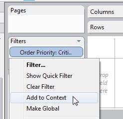
Context filters will generate a temp table in the source
Top N and/or conditional filters make a part of the SELECT command in the query
Standard filters are used as a WHERE clause
Aggregations are ciphered
Table calculations are implemented
Table layout and axes are etched
Anything on the Pages shelf is held accountable
Marks are then sketched

eca1faa965cdeeaff14af77b9f1e4635---years-i-wish

So, this is it! I figured out these functions, which helped me to derive the best out of Tableau. If you too had a Eureka moment, then feel free to let us know.

Of course, you might not be familiar with databases and SQL yet you can still become a Tableau expert without nailing the basics, but if you possess a bit of data analysis knowledge then our Tableau training courses Gurgaon can help accelerate your knowledge further. For more, check Tableau BI training courses by DexLab Analytics Delhi.


This article was sourced from – www.theinformationlab.co.uk/2013/01/28/5-things-i-wish-i-knew-about-tableau-when-i-started


Interested in a career in Data Analyst?

To learn more about Data Analyst with Advanced excel course – Enrol Now.
To learn more about Data Analyst with R Course – Enrol Now.
To learn more about Big Data Course – Enrol Now.

To learn more about Machine Learning Using Python and Spark – Enrol Now.
To learn more about Data Analyst with SAS Course – Enrol Now.
To learn more about Data Analyst with Apache Spark Course – Enrol Now.
To learn more about Data Analyst with Market Risk Analytics and Modelling Course – Enrol Now.

DIY Website Analytics Dashboards for Marketers at TC 17 – A Quick Overview [Video]

Are you bushed of creating reports in Excel? Do you feel annoyed every time you extract data from multiple platforms to develop website traffic reports?

 
DIY-Website-Analytics-Dashboards -for-Marketers-at-TC 17– A-Quick-Overview
 

Here we have some good news for y’all!


Two of Tableau’s own marketers have invented a next-level website analytics dashboard loaded with custom traffic metrics to turn reporting as easy as cake, and they are going to showcase it at TC17 in their breakout session Disparate measures: Tableau marketing’s DIY ethos and custom reporting.

Continue reading “DIY Website Analytics Dashboards for Marketers at TC 17 – A Quick Overview [Video]”

5 Sure-fire Ways to Develop a Powerful Customized Web Analytics Dashboard in Tableau [VIDEO]

Let’s kickstart creating a custom web analytics dashboard!

 
5 Sure-fire Ways to Develop a Powerful Customized Web Analytics Dashboard in Tableau [VIDEO]
 

This blogpost consists of all the resources you will need to build your own web analytics dashboard – some of the resources we have used ourselves and some we have culled down from the web.

Continue reading “5 Sure-fire Ways to Develop a Powerful Customized Web Analytics Dashboard in Tableau [VIDEO]”

Here’s How to Make Data More Actionable for Better Decision-making

Every customer demand needs to be fulfilled, and CEO’s expect marketing analysts to deliver them. Being a key marketing initiative, optimizing every customer experience is a significant deal to seal for marketers all around the globe.


Here’s How to Make Data More Actionable for Better Decision-making


Data, of course, plays a crucial role in marketing endeavors – but only the data that is interpretable makes sense, rendering other data useless. To turn data into actionable, organizations need to understand the accuracy of data and in the process should be successful in turning insights into action.

Continue reading “Here’s How to Make Data More Actionable for Better Decision-making”

5 Quick-Fire Tips and Tricks from Dashboard Specialists

No two dashboards are similar. They cater to different audiences, serves distinct purposes, and address individual problems as unique as you.


5 Quick-Fire Tips and Tricks from Dashboard Specialists


In this blog post, we will talk about the 5 best practices to apply right now to create attractive dashboards, and engage users effectively.

Continue reading “5 Quick-Fire Tips and Tricks from Dashboard Specialists”

Call us to know more