tableau bi training courses Archives - Page 4 of 4 - DexLab Analytics | Big Data Hadoop SAS R Analytics Predictive Modeling & Excel VBA

Battle the Blank Tableau Canvas Blues with These Nifty Tips

Battle the Blank Tableau Canvas Blues with These Nifty Tips

Do you experience vizzer’s block? Do you feel paralyzed by choices? Do you stare at the blank Tableau canvas, wondering from where to start your viz?

1

Though brimming with stories to tell, you are stuck at the get-go. Fortunately, here are a few tricks to help you get over the blank-canvas woes and get yourself rolling.
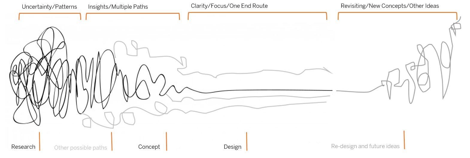
Draw your mind out

Doodling does help! Draw, doodle or sketch, just kick-start your cognitive thinking abilities. The scribbles don’t need to be pretty or legible, but they have to spur the creative process. So, grab a paper and pen, and start brainstorming.

2

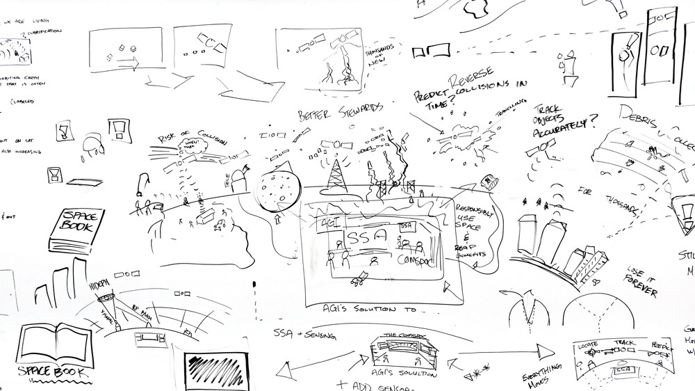
And, you don’t have to go it alone. From academic researchers and lifestyle bloggers to professional visual consultants, the entire world is drawing.

Get inspired by ace visualizers

People inspire you, or they drain you – pick them wisely. Keep the right people by your side, they will lift you up and get the better out of you. Be in association with hotshot vizzes, follow maven data journalists and data vizzers, jot down notes and read data-viz pdfs.

ALWAYS, keep your eyes open to stumble across fetching viz, whose idea might work out well for you!

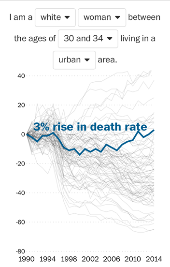
For example, this visualization by Washington Post tells a gripping food-survey story.

3

Develop a formidable structure to understand the data better

Frazzled about starting your viz? If affirmative, then this checklist can save your day. It is segregated into two parts – data preparation and data exploration.

Taking the first one first, i.e. Data Preparation:

As boring as it sounds, physical inspection of your data sometimes helps you comprehend the data set’s possibilities and challenges. To draw a clearer picture, here are few things to look into a data set:


  • The kind of data in each field
  • The pattern of data structure and format
  • Fields covered and not covered by the data set
  • Highest and lowest values in each field
  • Are there fields that contain null values


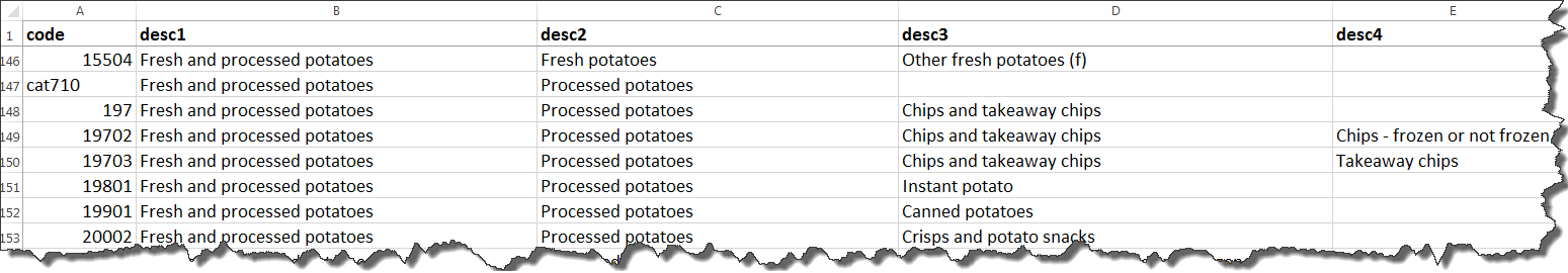
If you follow the above example, you will find there are multiple levels of data infused in the food-survey data set – where some food items boasts of four sub-categories, while others has only two. Situations like this make it hard to establish a comparison between two food items unless you know that they are at their minimum sub-category.

4

Coming to the second one, Data Analysis:

Analyse a data set just like interviewing it. Whenever you feel like going blank by staring at a Tableau canvas, start grilling yourself about data. Do it in a traditional interview way and you are sorted.
 

  • What, how, who, why, when, and where – Evaluate each field and ponder how to apply these questions on each field.
  • Let your inner child smile, while you ask “Why? Why? Why?” to your data.


To pop colours on your blank-canvas, interviewing is indispensable.

Remember: Every end is a new beginning

What if my final viz fails to shed light upon the deepest cognizance? Or, how will I feel if my viz cannot do justice to my story. Don’t worry, pondering is common. Get up and hit the road. There are countless number of ways to address a viz and remember that once you finish a viz, it doesn’t mean an end. Remaking and telling stories in newer and innovative ways are something you can always look up to anytime.

5

Turn the volume up and focus

Crank up the music, boost productivity and tune out distractions! Music helps in focusing on work, by diminishing outside noise (phone buzzing, colleagues chatting, TV blasting). Irrespective of the kind of tunes you like, plug in your headphones and say goodbye to the world!

original

Recently, tableau bi training courses are gaining a lot of attention. If you are seeking comprehensive tableau certification delhi, scroll through DexLab Analytics.


Interested in a career in Data Analyst?

To learn more about Data Analyst with Advanced excel course – Enrol Now.
To learn more about Data Analyst with R Course – Enrol Now.
To learn more about Big Data Course – Enrol Now.

To learn more about Machine Learning Using Python and Spark – Enrol Now.
To learn more about Data Analyst with SAS Course – Enrol Now.
To learn more about Data Analyst with Apache Spark Course – Enrol Now.
To learn more about Data Analyst with Market Risk Analytics and Modelling Course – Enrol Now.

Big Data in Every Day Living

Big Data in Every Day Living


Business Intelligence combined with Big Data analytics is stimulating the progress of Enterprises across the globe, along with pulling whooping amount of investment within the Big Data community. The infographic given below on big data in shaping everyday lives elucidates people about how Big Data is making our lives better.

Continue reading “Big Data in Every Day Living”

5 Tips for Creating Different Map Styles in Tableau

5 Tips for Creating Different Map Styles in Tableau

Let us not waste any time on reading long-worded introductions, and get right down to our 5 top tips for creating different map styles in Tableau.

You will be able to find out about these tips and a lot more on Tableau with our Tableau training courses.

  1. Removing map layer:

A simple way to create a clean map for best visualization is by removing the map layers. In order to do this, all you need to do is Select Map on the toolbar menu and “map layer”. Then simply click on the uncheck box and everything in the map layer window, this will leave behind only the outline of the map data.

Removing map layer:

Image Source: dataplusscience.com


Tableau course details has all these steps and much more to learn about the software, you can know the details by visiting our Tableau training institute website.

  1. Changing the map border colours:

When you use map, you can change the border colours of the map under the option ‘Color’. Simply select the colour and choose the border colour that you desire.

Changing the map border colours:

Image Source: dataplusscience.com


  1. Making the USA map outline:

Combining the above mentioned step 1 and 2 and by clicking to remove the fill colour, we can create an outline of a map. To do so, first remove the map layer shown in step 1 and then set the map fill colour to match with the background colour. And voila! After selecting the desirable colour for the borders (as shown in step 2) we now have created just a simple outline of the map of USA!

Making the USA map outline:

Image Source: dataplusscience.com


  1. Making a minimalistic map:

To do this in Tableau, you must remove the base layer which is similar as shown in the first step, we can then alter the Pane colour to change the colour of the water on the map to any colour we want. Once we get the base layer to be unchecked, all we have to do is simply right-click on the map and select ‘Format’ then select “Shading” and then alter the “Pane” colour to any shade of our choice.

  1. Creating the countries of the world:

Just like the previously discussed step (step 3) we can start by making the borders of the countries. In this case we have also combined the step 4 where the pane colour has been changed to match. This has given rise to a red coloured outline of the countries of the world on a pitch-black background.

Creating the countries of the world:

Image Source: dataplusscience.com


For more details on Tableau Certification Training in Gurgaon and which are the prominent Tableau training institutes in Delhi follow our regular uploads on this site.


Interested in a career in Data Analyst?

To learn more about Data Analyst with Advanced excel course – Enrol Now.
To learn more about Data Analyst with R Course – Enrol Now.
To learn more about Big Data Course – Enrol Now.

To learn more about Machine Learning Using Python and Spark – Enrol Now.
To learn more about Data Analyst with SAS Course – Enrol Now.
To learn more about Data Analyst with Apache Spark Course – Enrol Now.
To learn more about Data Analyst with Market Risk Analytics and Modelling Course – Enrol Now.

Are You Trying to Ace Your Tableau Interview?

Are You Trying to Ace Your Tableau Interview?

If you are looking to be hired as Tableau expert then you must be acquainted with these common interview questions and answers. These questions have been collected by the experts at DexLab Analytics who offer Tableau BI Certification training at the institute. These questions are to give you an idea of the types of questions you may be asked at an interview. Happy job hunting!

What do you understand by Data Visualization?

Data visualization is a much advanced, precise and ordered way of viewing large volumes of data. It is the way one visually represents data into graphs, charts and other illustrative aids, especially when you cannot define them textually. Through the various software applications like Tableau one can show various trends, patterns, correlations etc.

What are the main differences between a Tableau desktop and a Tableau server?

In Tableau desktop one can create workbooks for data visualizations but Tableau Servers are used to distribute the interactive workbooks or/and reports to the target audience. Users of Tableau servers can also edit and update workbooks and dashboards online on the Server but they cannot create new workbooks.

But there are limited options for editing in server as compared to desktop.

2

Differentiate between filters and parameters in Tableau.

The differences in these two features actually lie in their applications. With parameters one can allow users to insert their values, which can be integers, dates, floats, string these can be used for calculation purposes. But in filters one can only receive values which the user chooses to ‘filter by’ in the list, this cannot be used to perform calculations.

In them users can change the measures and dimensions in case of parameters but for filters this feature is not approved.

Are you interested in a Tableau training course we can help you get a head start in this much coveted career. Simply view our course details at Dexlab Analytics.

Why should you choose to learn Tableau? This infograph may help you decide better:

Are You Trying to Ace Your Tableau Interview? from Infographics


Interested in a career in Data Analyst?

To learn more about Data Analyst with Advanced excel course – Enrol Now.
To learn more about Data Analyst with R Course – Enrol Now.
To learn more about Big Data Course – Enrol Now.

To learn more about Machine Learning Using Python and Spark – Enrol Now.
To learn more about Data Analyst with SAS Course – Enrol Now.
To learn more about Data Analyst with Apache Spark Course – Enrol Now.
To learn more about Data Analyst with Market Risk Analytics and Modelling Course – Enrol Now.

Most Commonly Asked Tableau Interview Questions

Most Commonly Asked Tableau Interview Questions

In the near future, the world’s data generation will nearly double in amount than what it is now. According to a survey conducted by the IDC (International Data Corporation) by 2020 we will generate 50 times more data than in 2011. Now that such a gargantuan amount of data will be generated which will come with real-world business implications, thus, businesses around the world will require tools which should be capable to analyze this data and gather actionable insights from them. Tableau is a tool that helps organizations do exactly that, i.e. data mining and visualizing business opportunities to take requisite actions for amplifying revenue generation. So, it is understandable that the demand for personnel proficient in Tableau is expected to rise by manifolds in the next few years.

So, we India’s leading Tableau training institute have compiled a list of the most commonly asked interview questions for a position of Tableau operator/executive in this post. If you have more such questions that you have recently come across in an interview and would like to know the answer feel free to drop them in the comments below and our data science training faculty will get to them ASAP. And if you would like to take up a Tableau Certification course or take up an online Tableau training check out our curriculum on Tableau BI Certification.

2

Common interview questions on Tableau:

  • Do you know the difference between Live Data and Extract Data in Tableau?

The best answer to this question: An ‘extract’ connection is a connection with a static database, which is refreshed every day/hour/period. In this case all data are copied from the data source to the Tableau Server. Refreshing the data source will not give you the latest data – you have to refresh the extract to get them.

A live connection will query the underlying data in the data source/database – refreshing the visualization will give you the latest results. In this case no data is copied to Tableau Server for pre-processing.

• Name a few of the different types of filters used in tableau.

The best answer to this question:

The 3 types of Filters in Tableau are:
1) Quick Filter
2) Data Source Filter
3) Context Filter

  • Can you tell me the difference between parameters and filters in Tableau?

The best answer to this question: The difference actually lies in the application. Parameters allow users to insert their values these can be float, integers, string, date that can be used in calculations. However, filters receive only values users choose to ‘filter by’ the list this cannot be used to perform calculations.

Users can dynamically change measures and dimensions in parameter but filters do not support of this feature.

  • How will you view underlying SQL Queries in Tableau?

The best answer to this question: Viewing underlying SQL Queries in Tableau can be done in two ways:

• Create a Performance Recording, to register performance information about the main events you interact with workbook. Users can view the performance metrics in a workbook created by Tableau.

Help> Settings and Performance> Start Performance Recording
Help> Setting and Performance > Stop Performance Recording

• Reviewing the Tableau Desktop Logs located at C:\Users\\My Documents\My Tableau Repository. For live connection to data source, you can check log.txt and tabprotosrv.txt files. For an extract, check tdeserver.txt file.

  • Do you know the difference between .(dot) twb and .(dot) twbx?

The best answer to this question: The .(dot) twb is the most common file extension used in Tableau, which presents an XML format file and comprises all the data present in each dashboard and sheet like what fields are used in the views, styles and formatting that are applied to a sheet and dashboard.

But this workbook does not contain any data. The Packaged Workbook merges the data in a Tableau workbook with the local data available (which is not on server). A. (dot) twbx serves as a zip file this includes custom images if any. Packaged Workbook allows users to share their workbook information with other Tableau Desktop users and let them open it in Tableau Reader.

  • How many maximum tables can you join in Tableau?

The best answer to this question: A maximum number of 32 tables can be joined in Tableau. A table size must also be limited to 255 columns (fields).

Here were the answers to the most commonly asked Tableau interview questions, for more such interesting data analytics news, job updates and discussions follow our daily uploads from DexLab Analytics. We have recently launched our new branch in Pune, so, now Maharashtrians can also get their data analytics certification from DexLab Analytics, we add values to dull data!

Best of luck for your Tableau interview!


Interested in a career in Data Analyst?

To learn more about Data Analyst with Advanced excel course – Enrol Now.
To learn more about Data Analyst with R Course – Enrol Now.
To learn more about Big Data Course – Enrol Now.

To learn more about Machine Learning Using Python and Spark – Enrol Now.
To learn more about Data Analyst with SAS Course – Enrol Now.
To learn more about Data Analyst with Apache Spark Course – Enrol Now.
To learn more about Data Analyst with Market Risk Analytics and Modelling Course – Enrol Now.

Difference between a Heat Map and a Tree Map

Difference between a Heat Map and a Tree Map

Are you planning to pursue a Tableau training course in Delhi? Then you must be well aware of this common confusion about the difference between these two widely used maps. There are two very useful charts which help in analyzing data, heat maps and tree maps. Heat maps and tree maps are highly insightful visualizations. However, many a times, there is a confusion between the two due to which analysts either use misuse it or totally avoid using it.

This article will help to draw a clear line between heat maps and tree maps, thus enabling analysts pursuing tableau certification, Gurgaon to create better visualizations.

We the faculty at Dexlab Analytics, the premiere Tableau Training Institute in Gurgaon aim to clarify this common doubt with this brief discussion on these two maps.

Data Science Machine Learning Certification

What are heat maps?

Heat map is a type of visualization tool that is very apt to compare different categories. It helps to visualize measures against dimensions with the help of colors and size to compare one or more dimensions & up to two measures. The layout is similar to a text table with variations in values encoded as colors. In heat map, you can quickly see a wide array of information.

In a heat map, one measure can be assigned to the color and another measure can be assigned to the size.

 Quick Hands-On: Shows the sales and profit in all regions for different products category and sub-Category.

Analysis of visualization: The profit is represented by the color and ranges from red for loss to green for profit. The total sales are represented by the size.

Analysis of visualization

Hence, it is very easy to understand the performance of different products in different regions, at one glance, just by looking at the heat map.

What are tree maps?

Tree maps are a relatively new feature in Tableau, first appearing in version 8.0. The ‘tree map’ is a chart type that displays hierarchical or part-to-whole relationships via rectangles. In case of hierarchical (tree-structured) data these rectangles are nested. The space in the view is divided into rectangles that are sized and ordered by a measure. Nested rectangles mean that hierarchy levels in the data are expressed by larger rectangles (above in the hierarchy) containing smaller ones (below in the hierarchy). The rectangles in the tree map range in size from the top left corner of the chart to the bottom right corner, with the largest rectangle positioned in the top left corner and the smallest rectangle in the bottom right corner.

In a tree map 1 or more dimensions & up to 2 measures are used to create such a map.

Quick Hands- On: Show the sales and profit in all regions for different products category and Sub-Category.

Analysis of the visualization: The profit (color) and sales (size) of products are given at a Category and Sub- Category level. Bigger the size of the node, greater is the sales in that state. Similarly, the greener the node, more is the profit in that state.

Dexlab-2nd-images

Summary: A slight disadvantage of using tree maps in Tableau is that, as the number of items increase, the amount of space allocated for each item decreases. Hence, the area available to print the labels, become small.  As a result, usually, in a tree map almost all the squares or nodes will appear blank. This defect can be overcome by providing appropriate tooltips for each node. Like in heat maps, measures can be assigned to give different   colors and sizes to the nodes in the tree map.

To learn the right use of these two maps in Tableau we recommend seeking a corporate Tableau Training in Delhi NCR for better understanding of this complex statistical application.


Interested in a career in Data Analyst?

To learn more about Data Analyst with Advanced excel course – Enrol Now.
To learn more about Data Analyst with R Course – Enrol Now.
To learn more about Big Data Course – Enrol Now.

To learn more about Machine Learning Using Python and Spark – Enrol Now.
To learn more about Data Analyst with SAS Course – Enrol Now.
To learn more about Data Analyst with Apache Spark Course – Enrol Now.
To learn more about Data Analyst with Market Risk Analytics and Modelling Course – Enrol Now.

Call us to know more