We have discussed several times the efficiency of various techniques for selecting a simple random sample from an expansive dataset. With PROC SURVEYSELECT will do the job easily…
However, let us assume that our data includes a STATE variable, and one would want to guarantee that a random sample includes the precise proportion of observations from each of the states of America.
The PUT statement in SAS for programmers who have completed a SAS certification in the DATA step and the %PUT macro statements are highly useful statements, which will help to enable you to display the values of variables and macro variables, respectively.
And almost by default the output will appear in the SAS logs. In this article we will share a few tips which will allow you to make use of these statements more efficiently.
To those of you unaware of the developments in the SAS world, JSON is the new XML and the number of users who need to access JSON has really grown in the recent times. This is mainly due to proliferation of REST-based APIs and other web services. A good reason for JSON being so popular is the fact that it is structured data in the format of text. We have been capable of offering simple parsing techniques, which make use of data step and most recently PROC DS2. Now with the SAS 9.4 and Maintenance 4 we now have a built-in libname engine for the JSON XML.
Christmas is just at the end of this week, so we at team DexLab decided to help our dear readers who love some data-wizardry, with some SAS magic! You can choose to flaunt your extra SAS knowledge to your peer groups with the below described SAS program.
Celebrate Christmas in Data Analyst Style With SAS!
We are taking things a tad backwards by trying to, almost idiosyncratically complicate things that are otherwise simple. After all some say, a job of a data analyst is to do so! However, be it stupid or unnecessary this is definitely by far the coolest way to wish Merry Christmas, in data-analyst style.
Would you like to create customized SAS graphs with the use of PROC SGPLOT and other ODS graphic procedures? Then an essential skill that you must learn is to know how to join, merge, concentrate and append SAS data sets, which arise from a variety of sources. The SG procedures, which stand for SAS statistical graphic procedures, enable users to overlay different kinds of customized curves, bars and markers. But the SG procedures do expect all the data for a graph to be in one single set of data. Thus, it often becomes necessary to append two or more sets of data before one can create a complex graph.
In this blog post, we will discuss two ways in which we can combine data sets in order to create ODS graphics. An alternative option is to use the SG annotation facility, which will add extra curves and markers to the graph. We mostly recommend the use of the techniques that are given in this article for simple features and reserve annotations when adding highly complex yet non-standard features.
Using overlay curves:
Here is a brief idea on how to structure a SAS data set, so that one can overlay curves on a scatter plot.
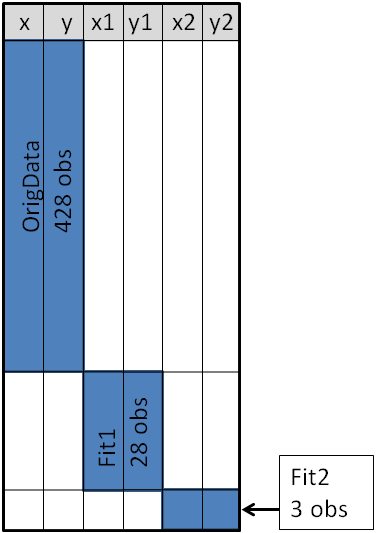
The original data is contained in the X and Y variables, as can be seen from the picture below. These will be the coordinates for the scatter plot. The secondary information will be appended at the end of the data. The variables X1 and Y1 contain the coordinates of a custom scatter plot smoother. The X2 and Y2 variables contain the coordinates of another scatter plot smoother.
Source: blogs.sas.com
This structure will enable you to use the SGPLOT procedure for overlaying, two curves on the scatter plot. One may make use of a SCATTER statement along with two SERIES statements to build the graphs.
Sometimes in addition to the overlaying curves, we like to add special markers to the scatter plot. In this blog we plan to show people how to add a marker that shows the location of the sample mean. It will discuss how to use PROC MEANS to build an output data set, which contains the coordinates of the sample mean, then we will append the data set to the original data.
With the below mentioned statements we can use PROC MEANS for computing the sample mean of the four variables in the data set of SasHelp.Iris. This data contains the measurements for 150 iris flowers. To further emphasize on the general syntax of this computation, we will make use of macro variables but note that it is not necessary:
With the AUTONAME option on the output statement, we can tell PROC MEANS to append the name of the statistics to names of the variables. As a result, the output datasets will contain the variables, with names like PetalLength_Mean or SepalWidth_Mean.
As depicted in the previous picture, this will enable you to append the new data into the end of the old data in the “wide form”, as shown here:
data Wide;
set &DSName Means; /* add four new variables; pad with missing values */run;
ods graphics / attrpriority=color subpixel;
proc sgplotdata=Wide;
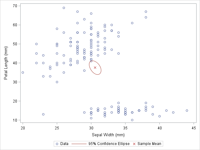
scatter x=SepalWidth y=PetalLength / legendlabel="Data";
ellipse x=SepalWidth y=PetalLength / type=mean;
scatter x=SepalWidth_Mean y=PetalLength_Mean /
legendlabel="Sample Mean" markerattrs=(symbol=X color=firebrick);
run;
And as here:
Source: blogs.sas.com
The original data is used in the first SCATTER statement and the ELLIPSE statement. You must remember that the ELLIPSE statement draws an approximate confidence ellipse for the population mean. The second SCATTER statement also makes use of sample means, which must be appended to the end of the original data. The second SCATTER statement will draw a red marker at the location of the sample mean.
This method can be used to plot other sample statistics (like the median) or to highlight special values such as the origin of a coordinate system.
Using overlay markers: of the long form
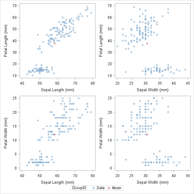
In certain circumstances, it is better to append the secondary data in the “long form”. In the long form the secondary data sets contains variables similar to the names in the original data set. One can choose to use the SAS data step to build a variable that will pinpoint the original and supplementary observations. With this technique it will be useful when people would want to show multiple markers (like, sample, mean, median, mode etc.) by making use of the GROUP = option on one of the SCATTER statement.
The following call to the PROC MEANS does not make use of an AUTONAME option. That is why the output data sets contain variables which have the same name as the input data. One can make use of the IN= data set option, for creating the ID variables that identifies with the data from the computed statistics:
/* Long form. New data has same name but different group ID */proc meansdata=&DSName noprint;
var&VarNames;
output out=Means(drop=_TYPE_ _FREQ_)mean=;
run;
data Long;
set &DSName Means(in=newdata);
if newdata then
GroupID = "Mean";
else GroupID = "Data";
run;
The DATA step is used to create the GroupID variable, which has several values “Data” for the original observations and the value “Mean” for the appended observations. This data structure will be useful for calling the PROC SGSCATTER and this will support the GROUP = option, however it does not support multiple PLOT statements as the following:
In closing thoughts, this blog is to demonstrate some useful techniques, to add markers to a graph. The technique requires people to use concatenate the original data with supplementary data. Often for creating ODS statistical graphics it is better to use appending and merging data technique in SAS. This is a great technique to include in your programming capabilities.
SAS courses in Noidacan give you further details on some more techniques that are worth adding to your analytics toolbox!
To learn more about Data Analyst with Advanced excel course – Enrol Now. To learn more about Data Analyst with R Course – Enrol Now. To learn more about Big Data Course – Enrol Now.
To learn more about Machine Learning Using Python and Spark – Enrol Now. To learn more about Data Analyst with SAS Course – Enrol Now. To learn more about Data Analyst with Apache Spark Course – Enrol Now. To learn more about Data Analyst with Market Risk Analytics and Modelling Course – Enrol Now.
Are you a non-data person? Do you think numbers are unnecessarily complex and are better to stay away from? When asked to calculations do you feel a little of sleepiness setting in? Then this would come as a surprise to you that our brains originally think in numbers. To be more precise, our brains actually think in the Logarithm Scale instead of thinking in the additive scale. To put it simply our brains understand better in terms of proportions than in differences.
So, how would our brains approach differences in numbers? We think almost automatically that the difference between 1 and 2 is greater than the difference between 3 and 2 and so forth.
Predictive modeling figures at the top of the list of new techniques put in to use by researchers in order to make out key archeological sites. The methodology used is not that complex. It makes predictions on the location of archeological sites having for its basis the qualities that are common to the sites already known. And the best news is that it works like a charm. A group of archeologists working in the company Logan Simpson which operates out of Utah discovered no less than 19 individual archeological sites containing many biface blades as well as stone points in addition to other artifacts that belong to the Paleoarchaic Period which ranges from 7,000 to 12,000 years ago.
The location of the site is about 160 km or 100 miles from Las Vegas, Nevada. The group of researchers also came across lakes and streams that disappeared long before. According to archeologists the sites were perhaps put into used by a number of groups of gatherers and hunters in the ancient times. The sites are scattered widely and also are scarce and could herald an understanding of the human activity that took place throughout the length and breadth of the Great Basin as a warmer climate prevailed after the end of the Ice Age. Their remoteness ensured that they remain unfound when traditional methods are employed.
In Nevada’s Dry Lake Valley, Delamar Valley and Kane Springs archeologists have discovered sites like Clovis, Lake Mojave and also Silver Lake that contains some stone tools constructed according to styles prevalent as far as 12,000 years back.The project was funded by the Lincoln County Archeological Initiative from the Bureau of Land Management. It made use of GIS or geographic information system technology in order to make predictions about activity belonging to the Pleistocene-Holocene period.
The predictive modeling put into use took in to account the fact that the Great Basin was way more wet and cool at the end period of the Pleistocene than the climate prevalent today and in all probability had attracted the attention of gatherers and hunters for several centuries. The process of mapping with GIS and aerial pictures amongst others was followed by pinpointing and ranking the various locations that hold the most promise.
Apart from the Paleoarchaic era, artifacts belonging to relatively more recent periods in History were also found which bear out that the sites at the lakeside had been used over the course of several millennia.
But the most important discovery was the proof that that Predictive Modeling on the basis of GIS works well and should be included in the arsenal of tools of archeologists trying to discover prehistoric sites .
To learn more about Data Analyst with Advanced excel course – Enrol Now. To learn more about Data Analyst with R Course – Enrol Now. To learn more about Big Data Course – Enrol Now.
To learn more about Machine Learning Using Python and Spark – Enrol Now. To learn more about Data Analyst with SAS Course – Enrol Now. To learn more about Data Analyst with Apache Spark Course – Enrol Now. To learn more about Data Analyst with Market Risk Analytics and Modelling Course – Enrol Now.