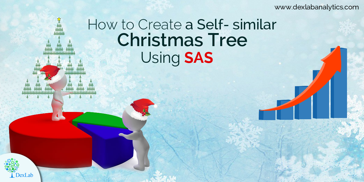
The season of celebration is here! Christmas is just around the corner. And here is a beautiful self-similar Christmas tree that was created using SAS with the help of two fascinating features – matrix computations and ODS statistical graphics.
Experiencing self-similarity in Kronecker products
You might have come across blogposts highlighting how repeated Kronecker product of a binary matrix ushers us into self-similar structures. But this time, we are taking special care in introducing self-similarity in Kronecker products – like, if M is a binary matrix then Kronecker product happens to be M@M, which is a block matrix in which each 1 inside the original matrix is replaced by a copy of M, and each O is replaced with a zero block. In this blog, @ stands for the Kronecker product (or direct product) operator implemented in IML/SAS software).Continue reading “How to Create a Self-similar Christmas Tree Using SAS”
Of late, in spite of trending insurgence of cutting edge technology tools, SAS remains one of the most popular, in-demand programming languages for advanced analytics. It’s been more than two decades, yet it didn’t lose its importance in ruling the data science market. This shows how flexible this pioneering analytics tool is, and how adaptable it is in its functionality that it stood strong through the test of time and development.
Possess the Right SAS Skills, Be In Demand
Organizations are utilizing the perks of advanced analytics inside out. They are realizing that not only big data analytics has secured a niche area of concentration for itself, but it has strived to be an indispensable part of any organization that is on its walk to success.
Impressive predictive analytics coupled with interactive data discovery technology enable rational SAS analysts to distinguish pertinent trends and interactions in datasets, and pan out questions from all dimensions. This smashing concoction of technologies also allows business users to exchange ideas with pundits, to create, modify and pick the best predictive models, constructively.
A comprehensive SAS solution might be the key to empower users in taking better business decisions, without wasting much time. This kind of interactive solution must involve ceaseless communication, giving enough room to even non-technical users to explore data visually, develop analytic models, and share fruitful results.
Without the great Analytical surge, everything was looking fit and fine. The economy was performing well. The IT industry was looking stable. The tech honchos were playing fine. And then IT happened! Data Analytics snatched the dazzling limelight all to itself.
It’s true once in a while, our market needs a good shaking, or else things tend to get sluggish and slow. Over time, the industries start decreasing in efficiency and business houses crumples. Therefore, the change induced by Big Data Analytics is one for good: it started pulling back the market to its former position. From medical science to military to security, the reach of Big Data Analytics can be witnessed everywhere.
The evolution of analytics is largely consistent and covers a wide span of industries. It’s not like it suddenly came into a lot of focus, its advancement was slow and steady. Now, it has strived to become extremely important to store, interpret, analyze and develop crucial insights – social media is deriving maximum benefits out of analytics, while customizing their products to make more money from advertisements. On the other hand, the service-oriented companies love to manipulate data that is generated through myriad social channels to trigger customer base.
Today, SAS certifications are extremely rewarding and scores high for both employee and employer. Analytics is a big word, encompassing a whole array of job roles, such as Forecaster, Market Researcher, Data Miner, Operations Researcher and Statistical Analyst – so when are you choosing this career gateway for a better future! DexLab Analytics is here with its state-of-the-art SAS training courses, help yourself.
3 key benefits of becoming SAS analytics professional:
Increase marketability and reach
SAS Analytics professionals possess higher marketability skills and enjoy a certain edge over competitors. Their job is to deliver nothing but the best, and they are very focused in doing that, leaving no scope for complaints.
Expand credibility for being the right technical professionals
As the SAS certified professionals have a thorough know-how about using SAS Software the employers stay relaxed and trusts their predicaments, hence, enhancing their credibility quotient.
Enhance skill and expertise in SAS area of specialization
No doubt, SAS Analytics professionals are extremely good in their field of work. Owing to their professional nature they tend to attract more lucrative job opportunities.
Apart from SAS, R programming is rapidly gaining popularity. Small and large companies have realized the growing the importance of these two tools. SAS combined with R language training in Delhi opens a whole gamut of striking opportunities. Having said that, companies that have stayed traditional, through its very core, have now embraced SAS and R skills, and for the right reasons.
At DexLab Analytics, we increasingly focus on making students totally data-ready. Opt for R programming certification, and give new data-hungry souls the drive to enter the world of analytics. After all, to excel in the analytics career and sail high you need to be well-equipped with SAS and R – they are the tools of combat for the future IT domain.!
Interested in a career in Data Analyst?
To learn more about Data Analyst with Advanced excel course – Enrol Now. To learn more about Data Analyst with R Course – Enrol Now. To learn more about Big Data Course – Enrol Now.
To learn more about Machine Learning Using Python and Spark – Enrol Now. To learn more about Data Analyst with SAS Course – Enrol Now. To learn more about Data Analyst with Apache Spark Course – Enrol Now. To learn more about Data Analyst with Market Risk Analytics and Modelling Course – Enrol Now.
When program codes, applications and SAS data sets are developed, enough attention is often not given to EFFECIENCY, especially during the initial phases of development. Since, data size and system conduct can influence a program or an application’s functioning, SAS users need to access information about a data set’s size and content. To ascertain how much disk space a data set is using, users can easily do a few calculations to learn to access metadata content and attain the important information. Determine, estimate and understand information with this following tip, which helps improve SAS performance and fine-tuning of techniques.
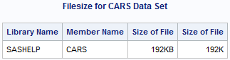
The SAS system accumulates valuable information (also known as metadata) about all-familiar SAS libraries, indexes, data sets (tables), system options, views, catalogs, macros and an assemblage of other “read-only” tables called Dictionary tables and SASHELP views. TABLES, a particular Dictionary table and its SASHELP view equivalent, VTABLE, consists details about a SAS session’s data set. Check the following PROC SQL code as its specification will help us get access to the contents of four columns observed in the TABLES Dictionary table, namely BNAME, MEMNAME, MEMTYPE and FILESIZE to exhibit the size of the CARS data set.
PROC SQL ;
TITLE ‘Filesize for CARS DataSet’ ;
SELECTLIBNAME,
MEMNAME,
FILESIZE FORMAT=SIZEKMG.,
FILESIZE FORMAT=SIZEK.
FROM DICTIONARY.TABLES
WHERELIBNAME = ‘SASHELP’
AND MEMNAME = ‘CARS’
AND MEMTYPE = ‘DATA’ ;
QUIT ;
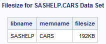
Results
Analysis
The above results show that the CARS data set filesize is 192KB.
Nota bene: If the SIZEKMG.format is mentioned in a format=option, SAS ascertains whether it should apply KB for kilobytes, MB for megabytes or GB for gigabytes, and divide the filesize value with the help of one of the following values:
KB 1024
MB 1048576
GB 1073741824
Using PROC PRINT and SASHELP.VTABLE
In the following example, the provisions of a PROC PRINT are explained to access the constituents of three columns found in the VTABLE SASHELP view, particularly LIBNAME, MEMNAME and FILESIZE to exhibit the size of the CARS data set.
PROC PRINTDATA=SASHELP.VTABLE NOOBS ;
VARLIBNAME MEMNAME FILESIZE ;
WHERELIBNAME = ‘SASHELP’
AND MEMNAME = ‘CARS’ ;
FORMAT FILESIZE SIZEKMG. ;
TITLE ‘Filesize for SASHELP.CARS DataSet’ ;
RUN ;
Results
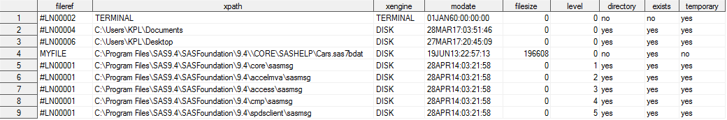
Using DATA _NULL_, SASHELP.VEXTFL and CALL SYMPUTX
Lastly, a DATA_NULL_ is depicted to approach the contents of the VEXTFL SASHELP view with a FILENAME statement. An assignment statement is specified to determine the FILESIZE value for the size of the CARS data set. The CALL SYMPUTX left supports and chops off the trailing blanks from the digital FILSESIZE value of 196608.
To learn more about Machine Learning Using Python and Spark – click here. To learn more about Data Analyst with Advanced excel course – click here. To learn more about Data Analyst with SAS Course – click here. To learn more about Data Analyst with R Course – click here. To learn more about Big Data Course – click here.
In this blog post, we will learn how to simulate multiple samples efficiently. In order to keep the discussion, easy we have simulated a single sample with ‘n’ number of observations, and ‘p’ amount of variables. But in order to use the Monte Carlo method to approximate the distribution sampling of statistics, one needs to simulate many specimens with the same regression model.
How to Simulate Multiple Samples From a Linear Regression Model
The data steps in SAS in most blogs have 4 steps mentioned for so. However, to simulate multiple samples, put DO loop around these steps that will generate, the error term and the response variable for very observation made in the model.
Would you like to create customized SAS graphs with the use of PROC SGPLOT and other ODS graphic procedures? Then an essential skill that you must learn is to know how to join, merge, concentrate and append SAS data sets, which arise from a variety of sources. The SG procedures, which stand for SAS statistical graphic procedures, enable users to overlay different kinds of customized curves, bars and markers. But the SG procedures do expect all the data for a graph to be in one single set of data. Thus, it often becomes necessary to append two or more sets of data before one can create a complex graph.
In this blog post, we will discuss two ways in which we can combine data sets in order to create ODS graphics. An alternative option is to use the SG annotation facility, which will add extra curves and markers to the graph. We mostly recommend the use of the techniques that are given in this article for simple features and reserve annotations when adding highly complex yet non-standard features.
Using overlay curves:
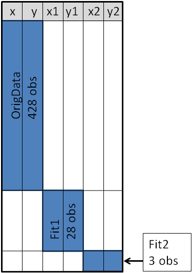
Here is a brief idea on how to structure a SAS data set, so that one can overlay curves on a scatter plot.
The original data is contained in the X and Y variables, as can be seen from the picture below. These will be the coordinates for the scatter plot. The secondary information will be appended at the end of the data. The variables X1 and Y1 contain the coordinates of a custom scatter plot smoother. The X2 and Y2 variables contain the coordinates of another scatter plot smoother.
Source: blogs.sas.com
This structure will enable you to use the SGPLOT procedure for overlaying, two curves on the scatter plot. One may make use of a SCATTER statement along with two SERIES statements to build the graphs.
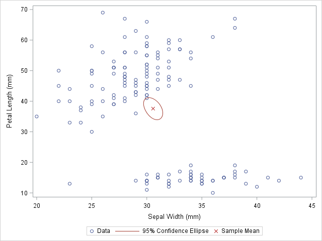
Sometimes in addition to the overlaying curves, we like to add special markers to the scatter plot. In this blog we plan to show people how to add a marker that shows the location of the sample mean. It will discuss how to use PROC MEANS to build an output data set, which contains the coordinates of the sample mean, then we will append the data set to the original data.
With the below mentioned statements we can use PROC MEANS for computing the sample mean of the four variables in the data set of SasHelp.Iris. This data contains the measurements for 150 iris flowers. To further emphasize on the general syntax of this computation, we will make use of macro variables but note that it is not necessary:
With the AUTONAME option on the output statement, we can tell PROC MEANS to append the name of the statistics to names of the variables. As a result, the output datasets will contain the variables, with names like PetalLength_Mean or SepalWidth_Mean.
As depicted in the previous picture, this will enable you to append the new data into the end of the old data in the “wide form”, as shown here:
data Wide;
set &DSName Means; /* add four new variables; pad with missing values */run;
ods graphics / attrpriority=color subpixel;
proc sgplotdata=Wide;
scatter x=SepalWidth y=PetalLength / legendlabel="Data";
ellipse x=SepalWidth y=PetalLength / type=mean;
scatter x=SepalWidth_Mean y=PetalLength_Mean /
legendlabel="Sample Mean" markerattrs=(symbol=X color=firebrick);
run;
And as here:
Source: blogs.sas.com
The original data is used in the first SCATTER statement and the ELLIPSE statement. You must remember that the ELLIPSE statement draws an approximate confidence ellipse for the population mean. The second SCATTER statement also makes use of sample means, which must be appended to the end of the original data. The second SCATTER statement will draw a red marker at the location of the sample mean.
This method can be used to plot other sample statistics (like the median) or to highlight special values such as the origin of a coordinate system.
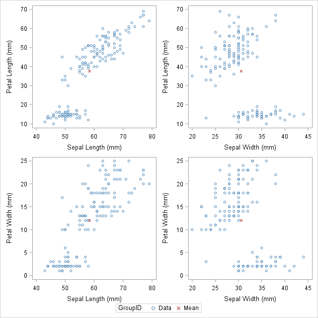
Using overlay markers: of the long form
In certain circumstances, it is better to append the secondary data in the “long form”. In the long form the secondary data sets contains variables similar to the names in the original data set. One can choose to use the SAS data step to build a variable that will pinpoint the original and supplementary observations. With this technique it will be useful when people would want to show multiple markers (like, sample, mean, median, mode etc.) by making use of the GROUP = option on one of the SCATTER statement.
The following call to the PROC MEANS does not make use of an AUTONAME option. That is why the output data sets contain variables which have the same name as the input data. One can make use of the IN= data set option, for creating the ID variables that identifies with the data from the computed statistics:
/* Long form. New data has same name but different group ID */proc meansdata=&DSName noprint;
var&VarNames;
output out=Means(drop=_TYPE_ _FREQ_)mean=;
run;
data Long;
set &DSName Means(in=newdata);
if newdata then
GroupID = "Mean";
else GroupID = "Data";
run;
The DATA step is used to create the GroupID variable, which has several values “Data” for the original observations and the value “Mean” for the appended observations. This data structure will be useful for calling the PROC SGSCATTER and this will support the GROUP = option, however it does not support multiple PLOT statements as the following:
In closing thoughts, this blog is to demonstrate some useful techniques, to add markers to a graph. The technique requires people to use concatenate the original data with supplementary data. Often for creating ODS statistical graphics it is better to use appending and merging data technique in SAS. This is a great technique to include in your programming capabilities.
SAS courses in Noidacan give you further details on some more techniques that are worth adding to your analytics toolbox!
To learn more about Data Analyst with Advanced excel course – Enrol Now. To learn more about Data Analyst with R Course – Enrol Now. To learn more about Big Data Course – Enrol Now.
To learn more about Machine Learning Using Python and Spark – Enrol Now. To learn more about Data Analyst with SAS Course – Enrol Now. To learn more about Data Analyst with Apache Spark Course – Enrol Now. To learn more about Data Analyst with Market Risk Analytics and Modelling Course – Enrol Now.
Predictive modeling figures at the top of the list of new techniques put in to use by researchers in order to make out key archeological sites. The methodology used is not that complex. It makes predictions on the location of archeological sites having for its basis the qualities that are common to the sites already known. And the best news is that it works like a charm. A group of archeologists working in the company Logan Simpson which operates out of Utah discovered no less than 19 individual archeological sites containing many biface blades as well as stone points in addition to other artifacts that belong to the Paleoarchaic Period which ranges from 7,000 to 12,000 years ago.
The location of the site is about 160 km or 100 miles from Las Vegas, Nevada. The group of researchers also came across lakes and streams that disappeared long before. According to archeologists the sites were perhaps put into used by a number of groups of gatherers and hunters in the ancient times. The sites are scattered widely and also are scarce and could herald an understanding of the human activity that took place throughout the length and breadth of the Great Basin as a warmer climate prevailed after the end of the Ice Age. Their remoteness ensured that they remain unfound when traditional methods are employed.
In Nevada’s Dry Lake Valley, Delamar Valley and Kane Springs archeologists have discovered sites like Clovis, Lake Mojave and also Silver Lake that contains some stone tools constructed according to styles prevalent as far as 12,000 years back.The project was funded by the Lincoln County Archeological Initiative from the Bureau of Land Management. It made use of GIS or geographic information system technology in order to make predictions about activity belonging to the Pleistocene-Holocene period.
The predictive modeling put into use took in to account the fact that the Great Basin was way more wet and cool at the end period of the Pleistocene than the climate prevalent today and in all probability had attracted the attention of gatherers and hunters for several centuries. The process of mapping with GIS and aerial pictures amongst others was followed by pinpointing and ranking the various locations that hold the most promise.
Apart from the Paleoarchaic era, artifacts belonging to relatively more recent periods in History were also found which bear out that the sites at the lakeside had been used over the course of several millennia.
But the most important discovery was the proof that that Predictive Modeling on the basis of GIS works well and should be included in the arsenal of tools of archeologists trying to discover prehistoric sites .
To learn more about Data Analyst with Advanced excel course – Enrol Now. To learn more about Data Analyst with R Course – Enrol Now. To learn more about Big Data Course – Enrol Now.
To learn more about Machine Learning Using Python and Spark – Enrol Now. To learn more about Data Analyst with SAS Course – Enrol Now. To learn more about Data Analyst with Apache Spark Course – Enrol Now. To learn more about Data Analyst with Market Risk Analytics and Modelling Course – Enrol Now.