sas certification delhi Archives - DexLab Analytics | Big Data Hadoop SAS R Analytics Predictive Modeling & Excel VBA

The Soaring Importance of SAS in Creating jobs Across Various Industry Domains

In a survey held in 2016, 54 million employees across 350 industries picked out SAS as the most valuable skill to possess. SAS skills still top the list. With predictive analytics gaining speed and accuracy in the world, one just cannot ignore SAS – the oldest and brightest data analytics tool. Though SAS-dominating days are gone, as R and Python has come up ruling the world , 41% of talented data science professionals still prefer SAS as compared to any other languages. The data science market is conquered by R and Python to a great extent, yet you will find a substantial number of clients still putting their bet on SAS predictive modeling.

SAS-Certification-India

To test how SAS certification is taking the job world by storm, open your web-browser and type ‘SAS jobs’ in the search panel – the following results in front of your eyes will give you all your answers. In fact, you’ll be more than surprised to see how many jobs springs up that calls for SAS expertise. A lot of clients and data houses seek SAS certified professionals to take care of the data-induced challenges and the numbers are quite overwhelming!


In total, SAS has around 85000 clients across the globe – owing to which, the demand for SAS should come as no surprise to you.

Benefits of SAS:

  • High Salary
  • Increasing Global Demand
  • Marketability
  • Role-focused
  • Validation of Skills


Besides the benefits enumerated above, SAS certification sizzles with myriad other perks related to data and analytics, and is regarded to be extremely useful in bagging entry-level jobs in data science and analytics. A diligent SAS expert explores the broadening field of SAS ANALYTICS, while streamlining his individual skill and expertise to add credibility to his job profile.


Want to get an instant pay hike? SAS skills may come to your rescue. Once you hone your SAS analytics skill, you can start expecting 6% to 10% pay hike, which further expands, if you add data mining and data modeling skills to in your resume, likewise.


Financial analytics and SAS

To improve the performance of business and act upon the loopholes present in an organization, financial analysts backed by advanced SAS analytics skills pore over a vast amount of company’s financial data. They help you answer all the business related questions and predict the future of your organization.

Healthcare and SAS

As healthcare pushes boundaries to ace the digital transition, Statistical Analysis Systems (SAS) is bringing all kinds of latest technical updates and modifications across a wide spectrum of care, right from the way healthcare providers perform tests to measuring patient safety and health outcomes. It is playing a pivotal role in tapping a lot of disease states and assessing ways to commercialize treatments.


2

Who specializes in SAS and why?

SAS skill is for experienced professionals. Old timers are its biggest fan, especially those who have more than 15 years of job experience. For them, nothing suits better than this miracle tool for data analysis.

However, the tides of time is changing, the current pool of students is somewhat showing keen interest in this field of study for quite some time now. But it takes a real effort of time and practice both to excel in this highly advanced software.


Drop by DexLab Analytics to avail SAS online training. The course here is designed and delivered by industry experts with crisp content and student-friendly learning techniques. Visit their website today!


Interested in a career in Data Analyst?

To learn more about Machine Learning Using Python and Spark – click here.

To learn more about Data Analyst with Advanced excel course – click here.
To learn more about Data Analyst with SAS Course – click here.
To learn more about Data Analyst with R Course – click here.
To learn more about Big Data Course – click here.
Digital Transformation: Data Scientists Are a Must Now for Enterprises

Data explosion, sprawling around Facebook and Internet of Things need to be nipped now to make sense what’s in there. Data is filled with promises, it offers new significant insights culled from the patterns in the data to just not report what happened but predict future scenarios.

Digital Transformation: Data Scientists Are a Must Now for Enterprises

This has led organizations to hire data scientists who are adept with the expertise and experience to shed some light on the mysteries of NoSQL data lakes and data bases, in which data is hoarded. For best SAS analytics training in Gurgaon, look up to DexLab Analytics – their SAS certification in Delhi is nifty and student-friendly.

Continue reading “Digital Transformation: Data Scientists Are a Must Now for Enterprises”

Researchers Peer into the Hood of Computational Linguistics

Researchers Peer into the Hood of Computational Linguistics


To start, give a look at these two sentences:

“This house is in a detestable location.”

“This detestable house is in this location.”


Well, these two sentences have virtually similar words, but owing to their structure, they exude entirely two different meanings. Understanding the true meaning of the sentences just by having a look at the words was something only reserved for the human intelligence, until now. Breakthroughs in Natural Language Processing (NLP), also known as computational linguistics have blazed a trail in this domain, which was once dominated by humans.

Continue reading “Researchers Peer into the Hood of Computational Linguistics”

How Many Category 5 Hurricanes Have We Had in the Atlantic?

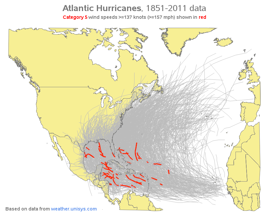
With Hurricane Irma battering the pretty state of Florida while ripping through the Caribbean like a mammoth buzzsaw blade, we start wondering how often such rare Category 5 hurricanes occur. We know hurricanes of such magnitude are rare, but how much rare?

According to Wikipedia page information, hurricanes having wind speed greater than or equal to 157 mph are termed as category 5 hurricanes, enough to wreak havoc around. Using SAS Analytics, let’s start digging some data to unravel how many hurricanes of such great magnitude have hit the Atlantic coastal towns and cities with such dangerous wind speeds..

After indulging in a bit of research work, we came across weather.unisys.com website that contains exhaustive data about all the past hurricanes formed out of Atlantic. It turned out to be a good repository of data – we jotted down a bit of code and parsed the data into SAS data set. Next, we marked all the Atlantic hurricane paths on a map, and highlighted the line segments in bright red, where the wind speed fell under the Category 5 tab. So, come know how often they have taken place, along with their accurate position.

sas certification

Hit the above image to view the full-size interactive version of the map with HTML mouse-over text displaying the hurricane names in red for category 5 descriptions.

Take a look at the technical details of the code we used to draw the map:

  1. The map is created using SAS/Graph Proc GMap.
  2. We projected the map with the help of Proc GProject. Followed to that, we saved the projection parameters using the brand new Parmout=option. It was only then that we can project the hurricane paths individually, using GProject’s parmin=option. (Before the innovation of parmout/parmin parameters, we used to combine the map and hurricane paths, compile and project them together, and then divide the results into two separate datasets – of course the new functionality eases the things out).
  3. The paths of hurricane were plotted using regular ‘move’ and ‘draw’ Annotate functions.
  4. We first plotted the land areas (choropleth map), then covered (annotated) the hurricane tracks (while doing so, make sure the red lines lie on top for better visibility), and finally overlaid the country border contours on top again so as to make them prominent.
  5. As lines are incompatible with mouse-over text, we annotated circles using mouse-over text along the red hurricane paths. We outlined these circles at the very beginning (using when=’b’), hence they would become invisible later.

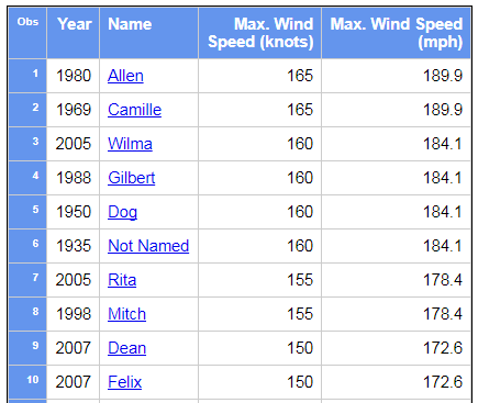
Have a look at the table we presented below. The table comprises of 34 Category 5 Atlantic hurricanes, derived from 150 years of data. You can also run your eyes through a snapshot image – click on the image to see the entire interactive table. And if you are interested in knowing more, hit each hurricane name and ask Google to give you information.

sas training institute

Nota Bene: There might be some hurricanes under Category 5 domain we missed out. Kindly excuse us there, but we think we have nicely hit our main point of discussion. If you have anything to say us, scroll down and comment!

DexLab Analytics is reckoned to be the best SAS analytics training in Pune. The courses are a collaboration of intensive subject matter research and industry experts’ relentless dedication towards their students. For state-of-the-art SAS training courses in Pune, drop by DexLab Analytics.

Interested in a career in Data Analyst?

To learn more about Machine Learning Using Python and Spark – click here.
To learn more about Data Analyst with Advanced excel course – click here.
To learn more about Data Analyst with SAS Course – click here.
To learn more about Data Analyst with R Course – click here.
To learn more about Big Data Course – click here.

How Data Preparation Changed Post Predictive Analytics Model Implementation

Data scientists assembling predictive models and formulating machine learning algorithms need to spare more time on data preparation work upfront than is required in traditional analytics applications.

How Data Preparation Changed Post Predictive Analytics Model Implementation

In today’s business sphere, the drive to structure big data architectures that would stand on predictive analytics models, data mining and machine learning applications is fast modifying the pattern of the data pipeline, along with the data preparation steps necessary to fuel it.

Continue reading “How Data Preparation Changed Post Predictive Analytics Model Implementation”

INTCK and INTNX: All about SAS Dates and Computing Intervals between Dates

INTCK-and-INTNX

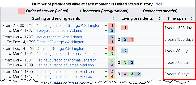
The INTCK and INTNX functions in SAS helps you compute the time between events. This technical blog is based on the timeline of living US presidents, sourced from a Wikipedia table. The table data shows the number of years and days between events.

So, let’s start.

LivingPresidents2

Gaps between dates

To calculate the interval between two dates, you can use these two SAS functions:

The INTCK function returns the number of time units between dates. The time unit can be selected in years, months, weeks, days, or whatever you feel like.

The INTNX function helps you compute the date that is 308 days away in the future from a specific date. This was just an example to help you understand what it means. The INTNX function returns a SAS date that is particular number of time units away from a particular date.

These two functions share a complimentary bond: where one calculates the difference between two dates, the other entitles you to add time units to a specified date value. Also, the INT part in both the functions denotes INTervals, and the terms INTCK and INTNX means Interval Check and Interval Next, respectively.

DexLab Analytics offers intensive SAS certification courses for candidates..

How to calculate anniversary dates

These two prime functions tend to be useful in counting the number of anniversaries between two dates along with calculating a future anniversary date. Use the ‘CONTINUOUS’ option for the INTCK function and the ‘SAME’ option for the INTNX function in the following manner:

The ‘CONTINUOUS’ option in the INTCK function helps you count the number of anniversaries of one date that occur before a second date. For example, the statement

Years = intck('year', '30APR1789'd, '04MAR1797'd, 'continuous');

returns the value 7 because there are 7 full years (anniversaries of 30APR) between those two dates. Without the ‘CONTINUOUS’ option, the function returns 8 as 01JAN occurs 8 times between those dates.

The statement

Anniv = intnx('year', '30APR1789'd, 7, 'same');

returns the 7th anniversary of the date 30APR1789. In some ways, it returns the date value for 30APR1796.

The most exciting part about these two functions is that they automatically handle leap years! Yes, you read that right. If you ask for the number of days within two dates, the INTCK function will show leap days in the result. If an event takes place on a leap day, and you ask the INTNX function to reveal the anniversary date, it will report 28FEB of the next year to the next anniversary date.

An algorithm calculating years and days between events

Go through the following algorithm to calculate the number of years and days between dates in SAS:

  • Use the INTCK function with the ‘CONTINUOUS’ option to calculate the number of completed years between two dates
  • Use the INTNX function to discover a third date, i.e. anniversary date, which is the same month and day like the start date, but takes place less than a year before the end date.
  • Use the INTCK function to ascertain the number of days occurring between the anniversary date and the end date.

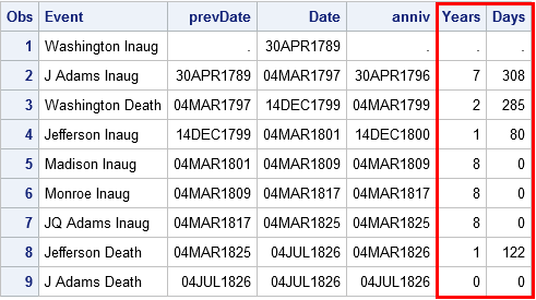
Here are the data steps that enable you to compute the time interval in years and days between the first few US presidential inaugurations and deaths.

data YearDays;
format Date prevDate anniv Date9.;
input @1  Date anydtdte12.
      @13 Event $26.;
prevDate = lag(Date);
if _N_=1 then do;                               /* when _N_=1, lag(Date)=. */
   Years=.; Days=.; return;            /* set years & days, go to next obs */
end;
Years = intck('year', prevDate, Date, 'continuous'); /* num complete years */
Anniv = intnx('year', prevDate, Years, 'same');      /* most recent anniv  */
Days = intck('day', anniv, Date);                    /* days since anniv   */
datalines;
Apr 30, 1789 Washington Inaug
Mar 4, 1797  J Adams Inaug
Dec 14, 1799 Washington Death
Mar 4, 1801  Jefferson Inaug
Mar 4, 1809  Madison Inaug
Mar 4, 1817  Monroe Inaug
Mar 4, 1825  JQ Adams Inaug
Jul 4, 1826  Jefferson Death
Jul 4, 1826  J Adams Death
run;
 
proc print data=YearDays;
var Event prevDate Date Anniv Years Days;
run;


LivingPresidents3


In a nutshell, the INTCK and INTNX functions are consequential for calculating intervals between dates. In this blog, I discussed about two-less-popular options inn SAS, for more such SAS training related blogs, follow us at DexLab Analytics.

Data Science Machine Learning Certification

This post originally appeared onblogs.sas.com/content/iml/2017/05/15/intck-intnx-intervals-sas.html
 

Interested in a career in Data Analyst?

To learn more about Machine Learning Using Python and Spark – click here.
To learn more about Data Analyst with Advanced excel course – click here.
To learn more about Data Analyst with SAS Course – click here.
To learn more about Data Analyst with R Course – click here.
To learn more about Big Data Course – click here.

The ABC of Summary Statistics and T Tests in SAS

The ABC of Summary Statistics and T Tests in SAS

Getting introduced to statistics for SAS training? Then, you must know how to create summary statistics (such as sample size, mean, and standard deviation) to test hypotheses and to figure confidence intervals. In this blog, we will show you how to furnish summary statistics (instead of raw data) to PROC TTEST in SAS, how to develop a data set that includes summary statistics and how to run PROC TTEST to calculate a two-sample or one-sample t test for the mean.

So, let’s start!

2

Running a two-sample t test for difference of means from summarized statistics

Instead of going the clichéd way, we will start with establishing a comparison between the mean heights of 19 students, based on gender – the data is held in the Sashelp class data set.

Observe the below SAS statements that sorts the data by the grouping variable, calling PROC MEANS and printing a subset of the statistics:

proc sort data=sashelp.class out=class; 
   by sex;                                /* sort by group variable */
run;
proc means data=class noprint;           /* compute summary statistics by group */
   by sex;                               /* group variable */
   var height;                           /* analysis variable */
   output out=SummaryStats;              /* write statistics to data set */
run;
proc print data=SummaryStats label noobs; 
   where _STAT_ in ("N", "MEAN", "STD");
   var Sex _STAT_ Height;
run;

summarystats1

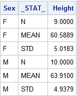
The table reflects the structure of the Summary Stats set for two sample tests. The two samples used here are differentiated on the levels of the Sex Variable (‘F’ for females and ‘M’ for males). The _STAT_ column shows the name of the statistic implemented here. The Height column depicts the value of the statistics for individual group.

Get SAS certification Delhi from DexLab Analytics today!

The problem: The heights of sixth-grade students are normally distributed. Random samples of n1=9 females and n2=10 males are selected. The mean height of the female sample is m1=60.5889 with a standard deviation of s1=5.0183. The mean height of the male sample is m2=63.9100 with a standard deviation of s2=4.9379. Is there evidence that the mean height of sixth-grade students depends on gender?

Here, you have to do nothing special to get the PROC TTEST – whenever the procedure gets the sight of the respective variable _STAT_ and any unique values, the procedure understands that the data set comprises summarized statistics. The following representation compares the mean heights of males and females:

proc ttest data=SummaryStats order=data
           alpha=0.05 test=diff sides=2; /* two-sided test of diff between group means */
   class sex;
   var height;
run;

summarystats1

Check the confidence intervals for the standard deviations and also that the output includes 95% confidence intervals for group means.

In the second table, the ‘Pooled’ row radiates out the impression that both the variances of two groups are more or less equal, which is somewhat true even. The value of the t statistic is t = -1.45 with a two-sided p-value of 0.1645.

The syntax for the PROC TTEST statement allows you to change the type of hypothesis test and the significance level. To support this, you can now run a one-sided test for the alternative hypothesis μ1 < μ2 at the 0.10 significance level just by using:

proc ttest ... alpha=0.10 test=diff sides=L;  /* Left-tailed test */

Running a one-sample t test of the mean from summarized statistics

In the above section, you have learnt to create the summary statistics from PROC MEANS. Nevertheless, you can also generate the summary statistic manually, if you lack original data.

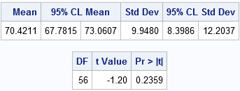
The problem: A research study measured the pulse rates of 57 college men and found a mean pulse rate of 70.4211 beats per minute with a standard deviation of 9.9480 beats per minute. Researchers want to know if the mean pulse rate for all college men is different from the current standard of 72 beats per minute.

The following statements jots down the summary statistics for a data set, asks PROC TTEST to perform a one-sample test of the null hypothesis μ = 72 against a two-sided alternative hypothesis:

data SummaryStats;
  infile datalines dsd truncover;
  input _STAT_:$8. X;
datalines;
N, 57
MEAN, 70.4211
STD, 9.9480
;
 
proc ttest data=SummaryStats alpha=0.05 H0=72 sides=2; /* H0: mu=72 vs two-sided alternative */
   var X;
run;

summarystats3 (2)

The outcome is a 95% confidence interval for the mean containing a value 72. The value of the t statistic is t = -1.20, which corresponds to a p-value of 0.2359. Therefore, the data fails in rejecting the null hypothesis at the 0.05 significance level.

For more informative blogs and news about SAS course, drop by our prime SAS predictive modeling training institute DexLab Analytics.

 
This post originally appeared onblogs.sas.com/content/iml/2017/07/03/summary-statistics-t-tests-sas.html
 

Interested in a career in Data Analyst?

To learn more about Data Analyst with Advanced excel course – Enrol Now.
To learn more about Data Analyst with R Course – Enrol Now.
To learn more about Big Data Course – Enrol Now.

To learn more about Machine Learning Using Python and Spark – Enrol Now.
To learn more about Data Analyst with SAS Course – Enrol Now.
To learn more about Data Analyst with Apache Spark Course – Enrol Now.
To learn more about Data Analyst with Market Risk Analytics and Modelling Course – Enrol Now.

Trends to Watch Out – Global Self-service Business Intelligence (BI) Market 2017

Gartner says – By 2020, the global BI and Analytics market is expected to flourish to USD 22.8 billion.


Trends to Watch Out - Global Self-service Business Intelligence (BI) Market 2017


The Global Self-Service Business Intelligence (BI) Market Research Report 2017 provides a comprehensive, detailed analysis of Self-Service BI industry, including the present Self-Service BI market trends and norms. It mainly focuses on the market of big continents, like North America, Europe and Asia, coupled with countries like Germany, US, China and Japan.

Continue reading “Trends to Watch Out – Global Self-service Business Intelligence (BI) Market 2017”

What is Truly Efficient? Understanding Stratified Random Sample

What is Truly Efficient?  Understanding Stratified Random Sample:

We have discussed several times the efficiency of various techniques for selecting a simple random sample from an expansive dataset. With PROC SURVEYSELECT will do the job easily…


proc surveyselect data=large out=sample
	 method=srs   /* simple random sample */
	 rate=.01;   /* 1% sample rate       */
run;


However, let us assume that our data includes a STATE variable, and one would want to guarantee that a random sample includes the precise proportion of observations from each of the states of America.

Continue reading “What is Truly Efficient? Understanding Stratified Random Sample”

Call us to know more