Brainchild of Ross Ihaka and Robert Gentleman, R programming language was first developed in 1993 with an exclusive and extensive catalog of statistical and graphical techniques and processes, including machine learning, time series, linear regression, statistical inference and lot more.
In the following section, we’re about to talk about top interview questions on R programming –perfect for both freshers and experienced consultants, this interesting interview guide covers almost all the major concepts of R and its applications.
Dive Down!
What is R programming?
R programming is an ideal language used for data analysis, and to build incredible statistical software. It’s widely used for a wide range of machine learning applications.
How to write syntax for R commands?
When you start writing commands in R, start using # in the beginning of the line, so that the commands are written as #division.
How to project data analysis outcome through R language?
The best way to convey the results would be by combining the results of data, code and analysis on a document and present the data for further reproducible research. It would help the user recheck the result and take part in the following discussions. The reproducible research aids in performing experiments easily and solving crucial problems.
What are the data structures found in R programming?
Homogenous and Heterogeneous are two data structures found in R programming. For same kinds of objects, we suggest using homogenous data structures as for Array, Vectors and Matrix. And for different types of objects, it’s better to stick to heterogeneous data structures.
How should you import data in R language?
Importing of data in R is done with the help of R commander GUI – it’s used to type commands and is also known as Rcmdr.
Here are 3 ways to import data into R:
As soon as you select data set from the dialog box, enter the date set name as asked.
R command can also be used to enter data – Data-> New Data Set (It’s only applicable for small data sets).
The user can also import data directly from URL, through simple ASCII file, statistical package or from clipboards.
Highlight the advantages of R programming language.
The user doesn’t get entangled in license restrictions and norms for using R programming.
It’s an open source software and completely free of cost.
It has several graphical capabilities.
It is easily run on a majority of hardware and OS (including 32 and 64-bit processors).
Mention the limit for memory in R.
For a 32-bit system, the memory of R is limited to 3GB. And for a 64-bit system, the limit is extended to 8TB.
With this, hope you are ready to crack a tough job interview on R programming – however, for those, who want to dig deeper into the intricacies of this fascinating programming language, we have fabulous R programming courses in Gurgaon. With them discover the path towards a dream career!
To learn more about Data Analyst with Advanced excel course – Enrol Now. To learn more about Data Analyst with R Course – Enrol Now. To learn more about Big Data Course – Enrol Now.
To learn more about Machine Learning Using Python and Spark – Enrol Now. To learn more about Data Analyst with SAS Course – Enrol Now. To learn more about Data Analyst with Apache Spark Course – Enrol Now. To learn more about Data Analyst with Market Risk Analytics and Modelling Course – Enrol Now.
Today, every business is putting efforts to understand their customers and themselves, better. But, how? What methods are they applying? Do mere Excel pivot tables help analyze vast pool of data? The answer to the latter question is in the negative – Excel pivot tables are not that great at analyzing data – so a wide number of companies look forward to SAS and R Programming to cull Business Intelligence.
Besides SAS, R-Programming is another open-source language that is used by most of the budding data scientists in the world of analytics. The R Programming language is more oriented towards the correct implication of data science, while ensuring business the cutting edge data analysis tools.Continue reading “How R Programming is Transforming Business for Good”
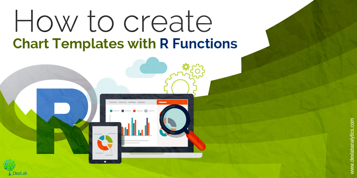
R functions are used to produce chart templates to keep the look and feel of the reports intact.
In this post you will come across how to create chart templates with R functions – all the R users should be accustomed to the calling functions so as to perform calculations and outline plots accurately. Remember what colors and fonts to use each time: R functions are used as a short-cut for producing customary-looking charts.
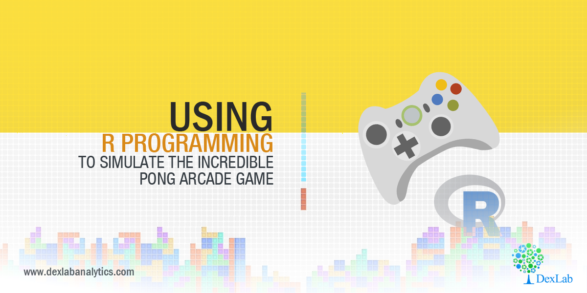
Unleashed in the market in 1972, Pong is one of the first computer games ever developed. Loosely inspired by tennis, Pong captured the worldwide gaming market soon after its launch. Instantaneously, it became a trending fad. Gaming enthusiasts became intrigued, they desired to delve deeper into the computer coding and system mechanisms mostly to understand the essence of arcade game development.
Today, R-Programming is extensively used to develop numerous board games. But the question to ponder on is – can we create traditional arcade games with R programming?
Let’s acknowledge, we are living in a digital world. Whether you attend a business dinner, work in the oil fields or inspect warehouse records, the claws of digital technology grips you daily. Today’s digital world revolves around communications, and Avaya is a pioneer in delivering brilliant communications experiences.
The expert consultants at DexLab Analytics – a top-notch big data training institute in India is conducting a three-month long training program for selected officials of Avaya at the company’s Pune branch. The consummate team of Business Intelligence, Data Warehousing and Analytics representatives from Avaya will stay in Pune, till the session is completed.
Headquartered in Delhi, DexLab Analytics feels extremely honoured in heading such an inspiring event with an acute vision of imparting knowledge and skills to individuals. The diligent team of consultants is going to share deeper insights on subjects, like R Programming, Data Science using R, Statistical Modeling using R, Advance Microsoft Excel – VBA, Macros, Dashboards and Tableau BI & Visualization. The sole purpose of this training is to equip the team of Avaya with modern state-of-the-art data technology so as to give them a certain edge over their rival tailing companies.
In this age of digitisation, and when Modijee is in his endeavour to make India Digital India, how can we ignore the reverberating importance of analytical skills! One of the prime advantages of great analytical skills is that you can take crucial decisions to fulfil your organization’s aims and objectives. The vast amount of real time data is at your disposal, and with them, you can easily achieve success and growth in the future. Therefore, it is evident that the need for analytical skills is going to swell in the coming years, and DexLab Analytics is a reputable business-analytics training institute, which strongly believes in the growing significance of digitisation using data science and analytics.
In the context of the above discussion, the spokesperson from DexLab Analytics has this to say –
“DexLab Analytics with its team of seasoned corporate trainers offering valuable insights about the high-in-demand skills, like Big Data Hadoop, Business Analytics, R Programming, Machine Learning, SAS Programming, Data Science, Visualization using Tableau and Excel are seeking ways to fabricate a path towards corporate training excellence in the wide-encompassing field of Big Data and Data Analytics. Our intensive training module will help officials confer an exhaustive analysis of a newer domain of data science, which will make them more data-efficient and data-friendly.”
Recently, the expertise in big data has been recognised as a major component for achieving success in the advanced digital world and the concerned representatives are acknowledging this impressive view. So, let’s hope this take on data analytics motivates more people, paving new roads for data-centric ideas and modules in the near future.
To learn more about Machine Learning Using Python and Spark – click here. To learn more about Data Analyst with Advanced excel course – click here. To learn more about Data Analyst with SAS Course – click here. To learn more about Data Analyst with R Course – click here. To learn more about Big Data Course – click here.
We are back again with some exciting news for you! We, a team of consultants of DexLab Analytics are sponsoring Atharva – the Ultimate CMO Challenge 2017, which is to be held at the Delhi School of Economics, today.
The first round was held on 13th February, 2017, where an Initial Case Study was needed to be submitted online and a brief for solutions, in the form of 3-4 slides or 2-3 pages write-up was to be submitted by 19th February, 2017. The candidates who got selected were declared as shortlisted by 21st February, 2017. And within 27th February 2017, final solutions in the form of PPT (with maximum 15 slides) were submitted.
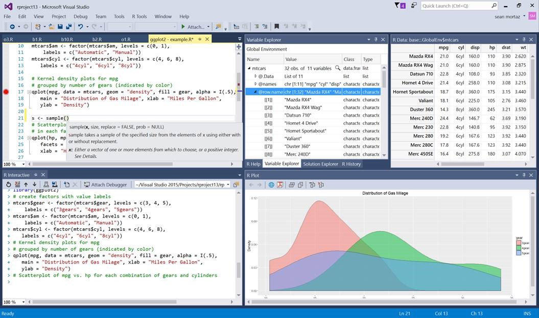
It is a great new development that the new Visual Studio now speaks the R Language!
Here is how:
Decidedly now R is the most popular statistical data analysis language which is in use these days. The R tools for Visual Studio brings together the power of R and Visual Studio in the same pod, for a convenient, and easy to use plug-in that is not only free and open source, but is very user friendly. When it is combined with the powers of Visual Studio Community Edition, then you will receive a multilingual IDE, which is perpetually free for all small teams.
In order to showcase and inspire testing and evaluation from the developer community, the R tools package for Visual Studios has been launched as a public preview version.
Here are the new exciting features being introduced in this preview release version:
Editor – this is a complete package for fine editing experience finished with R scripts and functions, which also include detachable/ tabbed windows, syntax highlighting and a lot more.
IntelliSense – this is also known as auto-completion and is available in both the editor as well as the Interactive R window
R Interactive Window – with this you can work directly with R console from within the Visual Studio
History window – one can search, view, and select previous commands and then send it to the Interactive Window.
A variable explorer – now get the advantage to drill deep into your R data structures and examine their values
Plotting – now check all your R plots within a Visual Studio tool window
Debugging – stepping, breakpoints, watch windows, call stacks and much more
R markdown – get to use R Markdown/knitr support with export to Word and HTML
Git – get control over source code through Git and GitHub
Extensions – more than 6000 extensions covering a wide spectrum from Data to Productivity to Language
Help – view R documentation with the use of ? and ?? in Visual Studio itself
A polyglot IDE– VS supports, R, Python, C and C++, C#, Node.js, SQL, etc projects can be managed simultaneously.
Some other features that were requested by the R developer community are the Package Manager GUI, Visual Studio Code (cross-plat), and more, which will be a part of one of our future updates.
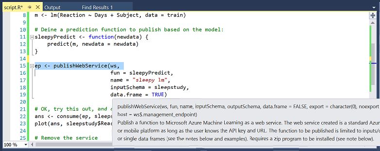
Now use Azure ML SDK:
Now you can use the R SDK with the RTVS to access all your datasets and also workspaces on the Azure ML. You can use the environment to build and test the models locally and easily operationalize them at scale on Azure.
This SDK is not tied to RTVS, but it can be used from any environment to publish models to Azure ML.
Conclusion:
This new element to the analytics offerings viz. a powerful R authoring environment post their previous announcements of Microsoft R Open and Microsoft R server announcements that took place last year is an exciting development.
For more exciting news on RTVS stay tuned to our regular blogs, because the time has never been better to be a data analyst.
To learn more about Machine Learning Using Python and Spark – click here. To learn more about Data Analyst with Advanced excel course – click here. To learn more about Data Analyst with SAS Course – click here. To learn more about Data Analyst with R Course – click here. To learn more about Big Data Course – click here.
Recently, a discussion was held, which invited data scientists and analysts all over the world, to take part in the Science of Super Bowl discussion panel, this discussion was held by Newswise.
We found one notable discussion topic, which answered three very important questions related to data science that the sports industry could use:
DexLab Analytics over the course of next few weeks will cover the basics of various data analysis techniques like creating your own histogram in R programming. We will explore three options for this: R commands, ggplot2 and ggvis. These posts are for users of R programming who are in the beginner or intermediate level and who require accessible and easy to understand resources.
A histogram is a category of visual representation of a dataset distribution. As such the shape of a histogram is its most common feature for identification. With a histogram one will be able to see which factor has the relatively higher amount of data and which factors or segments have the least.
Or put in simpler terms, one can see where the middle or median is in a data distribution, and how close or farther away the data would lie around the middle and where would the possible outliers be found. And precisely because of all this histograms will be the best way to understand your data.
But what can a specific shape of a histogram tell us? In short a typical histogram consists of an x-axis and a y-axis and a few bars of varying heights. The y-axis will exhibit how frequently the values on the x-axis are occurring in the data. The y-axis showcases the frequency of the values on the x-axis where the data occurs, the bar group ranges of either values or continuous categories on the x-axis. And the latter explains why the histograms do not have any gaps between the bars.
How can one make a histogram with basic R?
Step 1: Get your eyes on the data:
As histograms require some amount of data to be plotted initially, you can carry that out by importing a dataset or simply using one which is built into the system of R. In this tutorial we will make use of 2 datasets the built-in R dataset AirPassengers and another dataset called as chol, which is stored into a .txt file and is available for download.
Step 2: Acquaint yourself with The Hist () function:
One can make a histogram in R by opting the easy way where they use The Hist () function, which automatically computes a histogram of the given data values. One would put the name of their dataset in between parentheses to use this function.
Here is how to use the function:
hist(AirPassengers)
But if in case, you want to select a certain column of a data frame like for instance in chol, for making a histogram. The hist function should be used with the dataset name in combination with a $ symbol, which should be followed by the column name:
Here is a specimen showing the same:
hist(chol$AGE) #computes a histogram of the data values in the column AGE of the dataframe named “chol”
Step 3: Up the level of the hist () function:
You may find that the histograms created with the previous features seem a little dull. That is because the default visualizations do not contribute much to the understanding of the histograms. One may need to take one more step to reach a better and easier understanding of their histograms. Fortunately, this is not too difficult to accomplish, R has several allowances for easy and fast ways to optimize the visualizations of the diagrams while still making use of the hist () function.
To adapt your histogram you will only need to add more arguments to the hist () function, in this way:
hist(AirPassengers,
     main="Histogram for Air Passengers",
     xlab="Passengers",
     border="blue",
     col="green",
     xlim=c(100,700),
     las=1,
     breaks=5)
This code will help to compute a histogram of data values from the dataset AirPassengers, with the name “Histogram for Air Passengers” as the title. The x-axis would be labelled as ‘Passengers’ and will have a blue border with a green colour to the bins, while limiting the x-axis with a range of 100 to 700 and rotating the printed values on the y-axis by 1 while changing the bin width by 5.
We know what you are thinking – this is a humungous string of code. But do not worry, let us break it down into smaller pieces to see what each component holds.
Name/colours:
You can alter the title of the histogram by adding main as an argument to the hist () function.
This is how:
hist(AirPassengers, main=”Histogram for Air Passengers”) #Histogram of the AirPassengers dataset with title “Histogram for Air Passengers”
For adjusting the label of the x-axis you can add xlab as the feature. Similarly one can also use ylab to label the y-axis.
This code would work:
hist(AirPassengers, xlab=”Passengers”, ylab=”Frequency of Passengers”) #Histogram of the AirPassengers dataset with changed labels on the x-and y-axes hist(AirPassengers, xlab=”Passengers”, ylab=”Frequency of Passengers”) #Histogram of the AirPassengers dataset with changed labels on the x-and y-axes
If in case you would want to change the colours of the default histogram you can simply choose to add the arguments border or col. Adjusting would be easy, as the name itself kind of gives away the borders and the colours of the histogram.
hist(AirPassengers, border=”blue”, col=”green”) #Histogram of the AirPassengers dataset with blue-border bins with green filling
Note: you must not forget to put the names and the colours within “ ”.
For x and y axes:
To change the range of the x and y axes one can use the xlim and the ylim as arguments to the hist function ():
The code to be used is:
hist(AirPassengers, xlim=c(100,700), ylim=c(0,30)) #Histogram of the AirPassengers dataset with the x-axis limited to values 100 to 700 and the y-axis limited to values 0 to 30
Point to be noted in this case, is the c() function is used for delimiting the values on the axes when one is suing the xlim and ylim functions. It takes 2 values the first being the begin value and the second being the end value.
Make sure to rotate the labels on the y-axis by adding 1as=1 as the argument, the argument 1as can be 0, 1, 2 or 3.
The code to be used:
hist(AirPassengers, las=1) #Histogram of the AirPassengers dataset with the y-values projected horizontally
Depending on the option one chooses the placement of the label will vary: like for instance, if you choose 0 the label will always be parallel to the axis (the one that is the default). And if one chooses 1, The label will be horizontally put. If you want the label to be perpendicular to the axis then pick 2 and for placing it vertically select 3.
For bins:
One can alter the bin width by including breaks as an argument, in combination with the number of breakpoints which one wants to have.
This is the code to be used:
hist(AirPassengers, breaks=5) #Histogram of the AirPassengers dataset with 5 breakpoints
If one wants to have increased control over the breakpoints in between the bins, then they can enrich the breaks arguments by adding in it vector of breakpoints, one can also do this by making use of the c() function.
hist(AirPassengers, breaks=c(100, 300, 500, 700)) #Compute a histogram for the data values in AirPassengers, and set the bins such that they run from 100 to 300, 300 to 500 and 500 to 700.
But the c () function can help to make your code very messy at times, which is why we recommend using add = seq(x,y,z) instead. The values of x, y and z are determined by the user and represented in a specific order of appearance, the starting number of x-axis and the last number of the same as well as the intervals in which these numbers are to appear.
A noteworthy point to be mentioned here is that one can combine both the functions:
hist(AirPassengers, breaks=c(100, seq(200,700, 150))) #Make a histogram for the AirPassengers dataset, start at 100 on the x-axis, and from values 200 to 700, make the bins 150 wide
Here is the histogram of AirPassengers:
How to Make a Histogram with Basic R – (Image Courtesy r-bloggers)
Please note that this is the first blog tranche in a list of 3 posts on creating histograms using R programming.
For more information regarding R language training and other interesting news and articles follow our regular uploads at all our channels.
To learn more about Machine Learning Using Python and Spark – click here.
To learn more about Data Analyst with Advanced excel course – click here. To learn more about Data Analyst with SAS Course – click here. To learn more about Data Analyst with R Course – click here. To learn more about Big Data Course – click here.