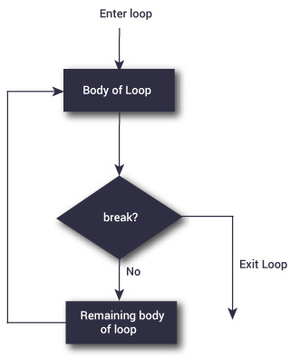
In this tutorial, we will learn to make a repeat loop with the use of R programming.
A repeat loop is used to iterate over a block of code over several number of times.
In case of a repeat loop, there is no condition to check in for exiting repeat loop.
Hence, we must ourselves put a condition explicitly within a repeat loop body and make use of the break statement to exit the loop. Failing to do so will result into an infinite loop.
Syntax of repeat loop
repeat {
   statement
}
When in the statement block, we must use the statement ‘break’ to exit the loop.
Example: repeat loop
x <-1
repeat {print(x)
x = x+1if(x ==6){break}}
Output
[1] 1
[1] 2
[1] 3
[1] 4
[1] 5
Note that in the example above, we have only made use of a condition to check and exit the loop when x equals the value of 6.
That is why we see in our output that only values from 1 to 5 get printed.
To learn more about Machine Learning Using Python and Spark – click here. To learn more about Data Analyst with Advanced excel course – click here. To learn more about Data Analyst with SAS Course – click here. To learn more about Data Analyst with R Course – click here. To learn more about Big Data Course – click here.
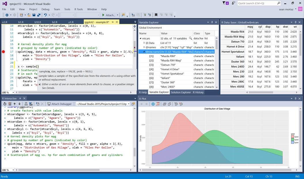
It is a great new development that the new Visual Studio now speaks the R Language!
Here is how:
Decidedly now R is the most popular statistical data analysis language which is in use these days. The R tools for Visual Studio brings together the power of R and Visual Studio in the same pod, for a convenient, and easy to use plug-in that is not only free and open source, but is very user friendly. When it is combined with the powers of Visual Studio Community Edition, then you will receive a multilingual IDE, which is perpetually free for all small teams.
In order to showcase and inspire testing and evaluation from the developer community, the R tools package for Visual Studios has been launched as a public preview version.
Here are the new exciting features being introduced in this preview release version:
Editor – this is a complete package for fine editing experience finished with R scripts and functions, which also include detachable/ tabbed windows, syntax highlighting and a lot more.
IntelliSense – this is also known as auto-completion and is available in both the editor as well as the Interactive R window
R Interactive Window – with this you can work directly with R console from within the Visual Studio
History window – one can search, view, and select previous commands and then send it to the Interactive Window.
A variable explorer – now get the advantage to drill deep into your R data structures and examine their values
Plotting – now check all your R plots within a Visual Studio tool window
Debugging – stepping, breakpoints, watch windows, call stacks and much more
R markdown – get to use R Markdown/knitr support with export to Word and HTML
Git – get control over source code through Git and GitHub
Extensions – more than 6000 extensions covering a wide spectrum from Data to Productivity to Language
Help – view R documentation with the use of ? and ?? in Visual Studio itself
A polyglot IDE– VS supports, R, Python, C and C++, C#, Node.js, SQL, etc projects can be managed simultaneously.
Some other features that were requested by the R developer community are the Package Manager GUI, Visual Studio Code (cross-plat), and more, which will be a part of one of our future updates.
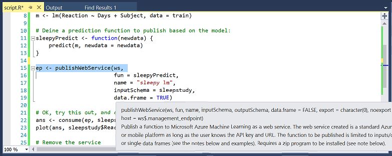
Now use Azure ML SDK:
Now you can use the R SDK with the RTVS to access all your datasets and also workspaces on the Azure ML. You can use the environment to build and test the models locally and easily operationalize them at scale on Azure.
This SDK is not tied to RTVS, but it can be used from any environment to publish models to Azure ML.
Conclusion:
This new element to the analytics offerings viz. a powerful R authoring environment post their previous announcements of Microsoft R Open and Microsoft R server announcements that took place last year is an exciting development.
For more exciting news on RTVS stay tuned to our regular blogs, because the time has never been better to be a data analyst.
To learn more about Machine Learning Using Python and Spark – click here. To learn more about Data Analyst with Advanced excel course – click here. To learn more about Data Analyst with SAS Course – click here. To learn more about Data Analyst with R Course – click here. To learn more about Big Data Course – click here.
Recently, a discussion was held, which invited data scientists and analysts all over the world, to take part in the Science of Super Bowl discussion panel, this discussion was held by Newswise.
We found one notable discussion topic, which answered three very important questions related to data science that the sports industry could use:
It is a well-known fact that Python, R and SAS are the most important three languages to be learnt for data analysis.
If you are a fresh blood in the data science community and are not experienced in any of the above-mentioned languages, then it makes a lot of sense to be acquainted with R, SAS or Python.
DexLab Analytics over the course of next few weeks will cover the basics of various data analysis techniques like creating your own histogram in R programming. We will explore three options for this: R commands, ggplot2 and ggvis. These posts are for users of R programming who are in the beginner or intermediate level and who require accessible and easy to understand resources.
A histogram is a category of visual representation of a dataset distribution. As such the shape of a histogram is its most common feature for identification. With a histogram one will be able to see which factor has the relatively higher amount of data and which factors or segments have the least.
Or put in simpler terms, one can see where the middle or median is in a data distribution, and how close or farther away the data would lie around the middle and where would the possible outliers be found. And precisely because of all this histograms will be the best way to understand your data.
But what can a specific shape of a histogram tell us? In short a typical histogram consists of an x-axis and a y-axis and a few bars of varying heights. The y-axis will exhibit how frequently the values on the x-axis are occurring in the data. The y-axis showcases the frequency of the values on the x-axis where the data occurs, the bar group ranges of either values or continuous categories on the x-axis. And the latter explains why the histograms do not have any gaps between the bars.
How can one make a histogram with basic R?
Step 1: Get your eyes on the data:
As histograms require some amount of data to be plotted initially, you can carry that out by importing a dataset or simply using one which is built into the system of R. In this tutorial we will make use of 2 datasets the built-in R dataset AirPassengers and another dataset called as chol, which is stored into a .txt file and is available for download.
Step 2: Acquaint yourself with The Hist () function:
One can make a histogram in R by opting the easy way where they use The Hist () function, which automatically computes a histogram of the given data values. One would put the name of their dataset in between parentheses to use this function.
Here is how to use the function:
hist(AirPassengers)
But if in case, you want to select a certain column of a data frame like for instance in chol, for making a histogram. The hist function should be used with the dataset name in combination with a $ symbol, which should be followed by the column name:
Here is a specimen showing the same:
hist(chol$AGE) #computes a histogram of the data values in the column AGE of the dataframe named “chol”
Step 3: Up the level of the hist () function:
You may find that the histograms created with the previous features seem a little dull. That is because the default visualizations do not contribute much to the understanding of the histograms. One may need to take one more step to reach a better and easier understanding of their histograms. Fortunately, this is not too difficult to accomplish, R has several allowances for easy and fast ways to optimize the visualizations of the diagrams while still making use of the hist () function.
To adapt your histogram you will only need to add more arguments to the hist () function, in this way:
hist(AirPassengers,
     main="Histogram for Air Passengers",
     xlab="Passengers",
     border="blue",
     col="green",
     xlim=c(100,700),
     las=1,
     breaks=5)
This code will help to compute a histogram of data values from the dataset AirPassengers, with the name “Histogram for Air Passengers” as the title. The x-axis would be labelled as ‘Passengers’ and will have a blue border with a green colour to the bins, while limiting the x-axis with a range of 100 to 700 and rotating the printed values on the y-axis by 1 while changing the bin width by 5.
We know what you are thinking – this is a humungous string of code. But do not worry, let us break it down into smaller pieces to see what each component holds.
Name/colours:
You can alter the title of the histogram by adding main as an argument to the hist () function.
This is how:
hist(AirPassengers, main=”Histogram for Air Passengers”) #Histogram of the AirPassengers dataset with title “Histogram for Air Passengers”
For adjusting the label of the x-axis you can add xlab as the feature. Similarly one can also use ylab to label the y-axis.
This code would work:
hist(AirPassengers, xlab=”Passengers”, ylab=”Frequency of Passengers”) #Histogram of the AirPassengers dataset with changed labels on the x-and y-axes hist(AirPassengers, xlab=”Passengers”, ylab=”Frequency of Passengers”) #Histogram of the AirPassengers dataset with changed labels on the x-and y-axes
If in case you would want to change the colours of the default histogram you can simply choose to add the arguments border or col. Adjusting would be easy, as the name itself kind of gives away the borders and the colours of the histogram.
hist(AirPassengers, border=”blue”, col=”green”) #Histogram of the AirPassengers dataset with blue-border bins with green filling
Note: you must not forget to put the names and the colours within “ ”.
For x and y axes:
To change the range of the x and y axes one can use the xlim and the ylim as arguments to the hist function ():
The code to be used is:
hist(AirPassengers, xlim=c(100,700), ylim=c(0,30)) #Histogram of the AirPassengers dataset with the x-axis limited to values 100 to 700 and the y-axis limited to values 0 to 30
Point to be noted in this case, is the c() function is used for delimiting the values on the axes when one is suing the xlim and ylim functions. It takes 2 values the first being the begin value and the second being the end value.
Make sure to rotate the labels on the y-axis by adding 1as=1 as the argument, the argument 1as can be 0, 1, 2 or 3.
The code to be used:
hist(AirPassengers, las=1) #Histogram of the AirPassengers dataset with the y-values projected horizontally
Depending on the option one chooses the placement of the label will vary: like for instance, if you choose 0 the label will always be parallel to the axis (the one that is the default). And if one chooses 1, The label will be horizontally put. If you want the label to be perpendicular to the axis then pick 2 and for placing it vertically select 3.
For bins:
One can alter the bin width by including breaks as an argument, in combination with the number of breakpoints which one wants to have.
This is the code to be used:
hist(AirPassengers, breaks=5) #Histogram of the AirPassengers dataset with 5 breakpoints
If one wants to have increased control over the breakpoints in between the bins, then they can enrich the breaks arguments by adding in it vector of breakpoints, one can also do this by making use of the c() function.
hist(AirPassengers, breaks=c(100, 300, 500, 700)) #Compute a histogram for the data values in AirPassengers, and set the bins such that they run from 100 to 300, 300 to 500 and 500 to 700.
But the c () function can help to make your code very messy at times, which is why we recommend using add = seq(x,y,z) instead. The values of x, y and z are determined by the user and represented in a specific order of appearance, the starting number of x-axis and the last number of the same as well as the intervals in which these numbers are to appear.
A noteworthy point to be mentioned here is that one can combine both the functions:
hist(AirPassengers, breaks=c(100, seq(200,700, 150))) #Make a histogram for the AirPassengers dataset, start at 100 on the x-axis, and from values 200 to 700, make the bins 150 wide
Here is the histogram of AirPassengers:
How to Make a Histogram with Basic R – (Image Courtesy r-bloggers)
Please note that this is the first blog tranche in a list of 3 posts on creating histograms using R programming.
For more information regarding R language training and other interesting news and articles follow our regular uploads at all our channels.
To learn more about Machine Learning Using Python and Spark – click here.
To learn more about Data Analyst with Advanced excel course – click here. To learn more about Data Analyst with SAS Course – click here. To learn more about Data Analyst with R Course – click here. To learn more about Big Data Course – click here.
Medical predictive analysis is slowly being recognized as a system that if utilized well can completely change the very face of medicine and healthcare practices.
We have all been a patient at least once in our lives and there is a high likely that we will be so again. While some of us may require medical attention more frequently than others and some do not, but we have all been to the clinic at some point and we all desire the best of medical care. We believe that the doctors and technicians there are equipped to provide us with that and that there has been good research and understanding behind all their medical decisions. But that is often not the case.Continue reading “How Predictive Analysis Can Be Used In Healthcare For The Better”
While many firms are stating that they leverage their data to gain valuable insights and translate them into profit. But the basic question remains whether data is an asset or a liability. This is the mind-numbing question that haunts all IT managers and must be given ample concentration on what is collected in terms of data and how can it be managed efficiently.
There can be two approaches to answer this question, the first being that data could be an asset if used ethically and correctly. But when no actionable insight can be gathered from data, it is a liability in the same lines as an old non-performing loan. Optimum use of data is elemental to the operations of any data driven initiative. The main reason behind this data-drive remains to be to obtain faster and better decision making abilities with more accuracy. Nowadays organizations across the board leverage their data to achieve their goals. Currently sales organizations are the frontrunners who mine their data to get the best results and maximize their revenue from already customers. Also crediting companies use their data to evaluate the risks associated with different individual debtors and then act accordingly when setting rates and fees for their loans that seem to be fair based on this information. In these scenarios the companies use real information to make decisions.
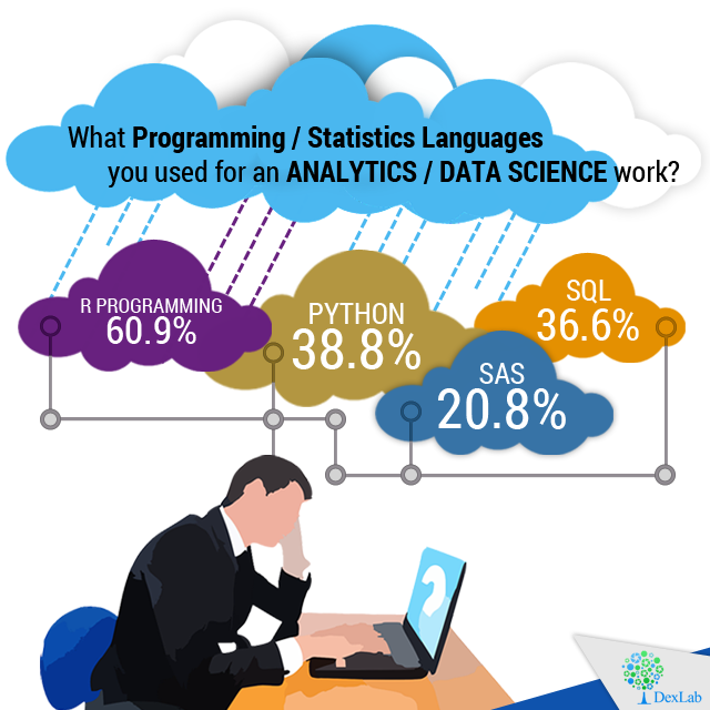
If Big Data interests you as a career choice and you are pretty much aware of the skills you need in order to be proficient in this field, in all likelihood you must be aware that R and Python are two leading languages used for analyzing data. And in case you are not really sure as to learn which of the mentioned articles first, this post will help you in making that decision.
In the field of analysis of data, R and Python both are free solutions that are easy to install and get started with. And it is normal for the layman to wonder which to learn first. But you may thank the heavens as both are excellent choices.
A recent poll on the most widely used programming languages for analytics and data science reveal the following:
Reasons to Choose R
R has an illustrious history that stretches for a considerable period of time. In addition you receive support from an active, dedicated and thriving community. That translates to the fact that you are more likely to be helped in case you are in need of some assistance or have any queries to resolve. In addition another factor that works in the favor of R is the abundance of packages that contribute greatly to increasing its functionality and make it more accessible which put R as one of the front runners to being the data science tool of choice. R works well with computer languages like Java, C and C++.
In situations that call for heavy tasks in statistical analysis as well as creating graphics R programming is the tool that you want to turn to. In R, you are able to perform convoluted mathematical operations with surprising ease like matrix multiplication. And the array-centered syntax of the language make the process of translating the math into lines of code far easier which especially true of persons with little or no coding knowledge and experience.
Reasons to Opt for Python
In contrast to the specialized nature of R, Python is a programming language that serves general purposes and is able to perform a variety of tasks like munging data, engineering and wrangling data, building web applications and scraping websites amongst others. It is also the easier one to master among the two especially if you have learned an OOP or object-oriented programming language previously. In addition the Code written in Python is scalable and may be maintained with more robust code than it is possible in case of R.
Though the data packages available are not as large and comprehensive as R, Python when used in conjunction with tools like Numpy, Pandas, Scikit etc it comes pretty close to the comprehensive functionality of R. Python is also being adopted for tasks like statistical work of intermediate and basic complexity as well as machine learning.
Interested in a career in Data Analyst?
To learn more about Data Analyst with Advanced excel course – Enrol Now. To learn more about Data Analyst with R Course – Enrol Now. To learn more about Big Data Course – Enrol Now.
To learn more about Machine Learning Using Python and Spark – Enrol Now. To learn more about Data Analyst with SAS Course – Enrol Now. To learn more about Data Analyst with Apache Spark Course – Enrol Now. To learn more about Data Analyst with Market Risk Analytics and Modelling Course – Enrol Now.
One of the fundamental advantages of the ecosystem related to R and the primary reason that lie behind the phenomenal growth of R is the practice and facility to contribute new packages to R. When this is added to the highly stable CRAN which happens to be the primary repository of packages of R,gives it a great advantage. The effectiveness of CRAN is further enhanced by the ability of people with sufficient technical expertise and to contribute packages through a proper system of submission.
It is only with sufficient effort and time that one realizes the system of packages submitted through proper procedures can yield integrated software of high quality.Even those who are relatively new to R Programming the process of discovering the packages that serves as the bedrock of R language growth. Such packages add value to the language in a reliable way.
The following 5 new packages listed in the paragraphs that follow may trigger the curiosity of data scientists.
AzureML V0.1.1
Cloud computing is and will continue to be of great interest to all data scientists. The AzureML provides Python and R Programmers a rich environment for machine learning. If you are yet to be initiated to Azure as a user this package will go long ways in helping you get started. It provides functions that let you push R code from your local system to the Azure cloud in addition to publishing models and functions as web services.
Distcomp V0.25.1
Using distributed computing when dealing with large sets of data is invariable an irksome problem. This is truer in cases where sharing data amongst collaborators is difficult or simply not possible. The distcomp package implements a crafty partial likelihood algorithm which lets users build statistical models of complexity and sophistication on data sets that are not aggregated.
RotationForest V0.1
If there is any primary ensemble method that performs well on diverse sets of data on a constant basis is the forests algorithm. This particular variety performs principal analysis of components on subsets taken at random in the feature space and holds great promise.
Rpca V0.2.3
In case there is a matrix that forms a superposition of a component that is lowly ranked along with a sparse component, rcpa calls in a robust PCA method that recovers all of these components. The algorithm was publicized by the data scientists at Netflix.
SwarmSVM V0.1
One of the primary machine learning algorithm happens to be the support vector machine. SwarmSVM has for its basis an approach that may be said to be as a clustering approach and makes provisions for 3 different ensemble methods that train support vector machines. A practical introduction to this particular method is also attached with the vignette that comes with the package.
To learn more about Data Analyst with Advanced excel course – Enrol Now. To learn more about Data Analyst with R Course – Enrol Now. To learn more about Big Data Course – Enrol Now.
To learn more about Machine Learning Using Python and Spark – Enrol Now. To learn more about Data Analyst with SAS Course – Enrol Now. To learn more about Data Analyst with Apache Spark Course – Enrol Now. To learn more about Data Analyst with Market Risk Analytics and Modelling Course – Enrol Now.