The wave of digital transformation is ravaging all industry verticals. Big Data coupled with AI and ML is driving the force, with data being at the bull’s eye.
But, what if we say most of the data in the world is hardly used? What if it becomes a hefty liability? Yes, data can become a liability if we fail to understand it properly. For that, we’ve data visualization – it’s the best way to present your data to the world in order to gain meaningful insights.
Fortunately, data visualization is evolving rapidly. Charts, graphs, infographics, videos and AR/VR presentations have taken the channels of communication to an entirely different level. In this blog, we’ve compiled tip 3 most popular and effective data visualization tools – they are easy to use, do their job well and highly compatible with major software and programming languages. However, they are all paid, although they offer free-trials.
Tableau
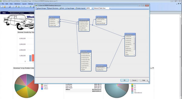
With a huge customer base of 57000+accounts spread across diverse industry verticals, Tableau is the father of data visualization software and for the right reasons! Along with having the ability to generate interactive visualizations, Tableau is relatively easy to use and offers more than generic BI solutions.
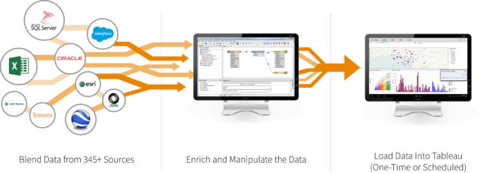
Tableau is ideal for handling vast and fast-changing datasets that are used mainly for Big Data operations, such as ML applications and AI implementations. Developers and data scientists look up to Tableau as it integrates seamlessly with high-end database solutions, including My SQL, Hadoop, SAP, Amazon AWS and Teradata. Also, a wide number of third-party resources online are on offer plus a powerful community to aid and assist new users about how to integrate the tool seamlessly with their projects.
Interested in arming yourself with the skills of Tableau? Worry not; DexLab Analytics is a top-notch Tableau training institute in the heart of Delhi excelling in many other in-demand skill training courses.
Plotly
For highly advanced and complex data visualizations, Plotly is the key. All thanks to how well it homogenizes with cutting-edge programming languages, such as Matlab, Python and R! All of them being extremely analytics oriented.
Developed above the open source d3.js visualization libraries for JavaScript, this high-valued commercial package is extremely user-friendly, along with providing inbuilt support for APIs, like Salesforce.

QlikView
Touted as the biggest rival of Tableau, QlikView boasts of 40000 clients’ accounts across 100 countries. It is one of the most terrific players in the space of data visualization, and why not?! The customers who have used it have lauded QlikView because of its customized setup and versatile range of functionalities. However, this could also mean it takes some time to be familiar with entirely and then only it can be leveraged to its full potential.
Along with providing superior data viz capabilities, the tool excels in some of the best BI and analytics reporting capabilities. It’s simple, effective and non-clumsy user interface scores extra brownie points. Interestingly, customers use it in collaboration with its sister package, QlikSense – it manages data discovery and exploration to derive maximum benefits.
For more information on Tableau BI training courses, drop by DexLab Analytics! They are experts in everything DATA!
The blog has been sourced from:
.