data analytics certification courses Archives - Page 3 of 4 - DexLab Analytics | Big Data Hadoop SAS R Analytics Predictive Modeling & Excel VBA

Master These Piping Hot Data Analytics Techniques and Stay Ahead of the Curve [Video]

Big Data, Business Intelligence, Data Science – the digital revolution is here, and it’s evolving steadfastly.

 
Master These Piping Hot Data Analytics Techniques and Stay Ahead of the Curve [Video]
 

Soon, data analytics is becoming the life-source of IT. The range of technologies is varied, and the way data is expanding, we are fast moving towards a juncture where analysis of vast volumes of data will be done in a jiffy.

Continue reading “Master These Piping Hot Data Analytics Techniques and Stay Ahead of the Curve [Video]”

Here’s How to Make Data More Actionable for Better Decision-making

Every customer demand needs to be fulfilled, and CEO’s expect marketing analysts to deliver them. Being a key marketing initiative, optimizing every customer experience is a significant deal to seal for marketers all around the globe.


Here’s How to Make Data More Actionable for Better Decision-making


Data, of course, plays a crucial role in marketing endeavors – but only the data that is interpretable makes sense, rendering other data useless. To turn data into actionable, organizations need to understand the accuracy of data and in the process should be successful in turning insights into action.

Continue reading “Here’s How to Make Data More Actionable for Better Decision-making”

5 Quick-Fire Tips and Tricks from Dashboard Specialists

No two dashboards are similar. They cater to different audiences, serves distinct purposes, and address individual problems as unique as you.


5 Quick-Fire Tips and Tricks from Dashboard Specialists


In this blog post, we will talk about the 5 best practices to apply right now to create attractive dashboards, and engage users effectively.

Continue reading “5 Quick-Fire Tips and Tricks from Dashboard Specialists”

Write ETL Jobs to Offload the Data Warehouse Using Apache Spark

Write ETL Jobs to Offload the Data Warehouse Using Apache Spark

The surge of Big Data is everywhere. The evolving trends in BI have taken the world in its stride and a lot of organizations are now taking the initiative of exploring how all this fits in.

Leverage data ecosystem to its full potential and invest in the right technology pieces – it’s important to think ahead so as to reap maximum benefits in IT in the long-run.

“By 2020, information will be used to reinvent, digitalize or eliminate 80% of business processes and products from a decade earlier.” – Gartner’s prediction put it so right!

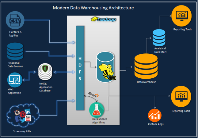
The following architecture diagram entails a conceptual design – it helps you leverage the computing power of Hadoop ecosystem from your conventional BI/ Data warehousing handles coupled with real time analytics and data science (data warehouses are now called data lakes).

moderndwarchitecture

In this post, we will discuss how to write ETL jobs to offload data warehouse using PySpark API from the genre of Apache Spark. Spark with its lightning-fast speed in data processing complements Hadoop.

Now, as we are focusing on ETL job in this blog, let’s introduce you to a parent and a sub-dimension (type 2) table from MySQL database, which we will merge now to impose them on a single dimension table in Hive with progressive partitions.

Stay away from snow-flaking, while constructing a warehouse on hive. It will reduce useless joins as each join task generates a map task.

Just to raise your level of curiosity, the output on Spark deployment alone in this example job is 1M+rows/min.

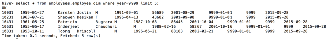
The Employee table (300,024 rows) and a Salaries table (2,844,047 rows) are two sources – here employee’s salary records are kept in a type 2 fashion on ‘from_date’ and ‘to_date’ columns. The main target table is a functional Hive table with partitions, developed on year (‘to_date’) from Salaries table and Load date as current date. Constructing the table with such potent partition entails better organization of data and improves the queries from current employees, provided the to_date’ column has end date as ‘9999-01-01’ for all current records.

The rationale is simple: Join the two tables and add load_date and year columns, followed by potent partition insert into a hive table.

Check out how the DAG will look:

screen-shot-2015-09-28-at-1-44-32-pm

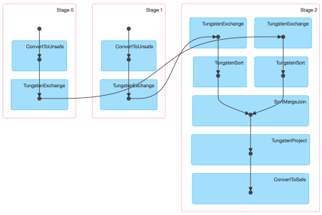
Next to version 1.4 Spark UI conjures up the physical execution of a job as Direct Acyclic Graph (the diagram above), similar to an ETL workflow. So, for this blog, we have constructed Spark 1.5 with Hive and Hadoop 2.6.0

Go through this code to complete your job easily: it is easily explained as well as we have provided the runtime parameters within the job, preferably they are parameterized.

Code: MySQL to Hive ETL Job

__author__ = 'udaysharma'
# File Name: mysql_to_hive_etl.py
from pyspark import SparkContext, SparkConf
from pyspark.sql import SQLContext, HiveContext
from pyspark.sql import functions as sqlfunc

# Define database connection parameters
MYSQL_DRIVER_PATH = "/usr/local/spark/python/lib/mysql-connector-java-5.1.36-bin.jar"
MYSQL_USERNAME = '<USER_NAME >'
MYSQL_PASSWORD = '********'
MYSQL_CONNECTION_URL = "jdbc:mysql://localhost:3306/employees?user=" + MYSQL_USERNAME+"&password="+MYSQL_PASSWORD 

# Define Spark configuration
conf = SparkConf()
conf.setMaster("spark://Box.local:7077")
conf.setAppName("MySQL_import")
conf.set("spark.executor.memory", "1g")

# Initialize a SparkContext and SQLContext
sc = SparkContext(conf=conf)
sql_ctx = SQLContext(sc)

# Initialize hive context
hive_ctx = HiveContext(sc)

# Source 1 Type: MYSQL
# Schema Name  : EMPLOYEE
# Table Name   : EMPLOYEES
# + --------------------------------------- +
# | COLUMN NAME| DATA TYPE    | CONSTRAINTS |
# + --------------------------------------- +
# | EMP_NO     | INT          | PRIMARY KEY |
# | BIRTH_DATE | DATE         |             |
# | FIRST_NAME | VARCHAR(14)  |             |
# | LAST_NAME  | VARCHAR(16)  |             |
# | GENDER     | ENUM('M'/'F')|             |
# | HIRE_DATE  | DATE         |             |
# + --------------------------------------- +
df_employees = sql_ctx.load(
    source="jdbc",
    path=MYSQL_DRIVER_PATH,
    driver='com.mysql.jdbc.Driver',
    url=MYSQL_CONNECTION_URL,
    dbtable="employees")

# Source 2 Type : MYSQL
# Schema Name   : EMPLOYEE
# Table Name    : SALARIES
# + -------------------------------- +
# | COLUMN NAME | TYPE | CONSTRAINTS |
# + -------------------------------- +
# | EMP_NO      | INT  | PRIMARY KEY |
# | SALARY      | INT  |             |
# | FROM_DATE   | DATE | PRIMARY KEY |
# | TO_DATE     | DATE |             |
# + -------------------------------- +
df_salaries = sql_ctx.load(
    source="jdbc",
    path=MYSQL_DRIVER_PATH,
    driver='com.mysql.jdbc.Driver',
    url=MYSQL_CONNECTION_URL,
    dbtable="salaries")

# Perform INNER JOIN on  the two data frames on EMP_NO column
# As of Spark 1.4 you don't have to worry about duplicate column on join result
df_emp_sal_join = df_employees.join(df_salaries, "emp_no").select("emp_no", "birth_date", "first_name",
                                                             "last_name", "gender", "hire_date",
                                                             "salary", "from_date", "to_date")

# Adding a column 'year' to the data frame for partitioning the hive table
df_add_year = df_emp_sal_join.withColumn('year', F.year(df_emp_sal_join.to_date))

# Adding a load date column to the data frame
df_final = df_add_year.withColumn('Load_date', F.current_date())

df_final.repartition(10)

# Registering data frame as a temp table for SparkSQL
hive_ctx.registerDataFrameAsTable(df_final, "EMP_TEMP")

# Target Type: APACHE HIVE
# Database   : EMPLOYEES
# Table Name : EMPLOYEE_DIM
# + ------------------------------- +
# | COlUMN NAME| TYPE   | PARTITION |
# + ------------------------------- +
# | EMP_NO     | INT    |           |
# | BIRTH_DATE | DATE   |           |
# | FIRST_NAME | STRING |           |
# | LAST_NAME  | STRING |           |
# | GENDER     | STRING |           |
# | HIRE_DATE  | DATE   |           |
# | SALARY     | INT    |           |
# | FROM_DATE  | DATE   |           |
# | TO_DATE    | DATE   |           |
# | YEAR       | INT    | PRIMARY   |
# | LOAD_DATE  | DATE   | SUB       |
# + ------------------------------- +
# Storage Format: ORC


# Inserting data into the Target table
hive_ctx.sql("INSERT OVERWRITE TABLE EMPLOYEES.EMPLOYEE_DIM PARTITION (year, Load_date) \
            SELECT EMP_NO, BIRTH_DATE, FIRST_NAME, LAST_NAME, GENDER, HIRE_DATE, \
            SALARY, FROM_DATE, TO_DATE, year, Load_date FROM EMP_TEMP")

As we have the necessary configuration mentioned in our code, we will simply call to run this job

spark-submit mysql_to_hive_etl.py

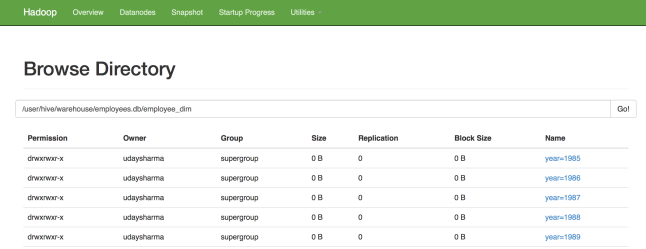
As soon as the job is run, our targeted table will consist 2844047 rows just as expected and this is how the partitions will appear:

screen-shot-2015-09-29-at-12-42-37-am

2

3

screen-shot-2015-09-29-at-12-46-55-am

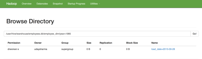
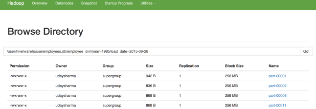
The best part is that – the entire process gets over within 2-3 mins..

For more such interesting blogs and updates, follow us at DexLab Analytics. We are a premium Big Data Hadoop institute in Gurgaon catering to the needs of aspiring candidates. Opt for our comprehensive Hadoop certification in Delhi and crack such codes in a jiffy!


Interested in a career in Data Analyst?

To learn more about Data Analyst with Advanced excel course – Enrol Now.
To learn more about Data Analyst with R Course – Enrol Now.
To learn more about Big Data Course – Enrol Now.

To learn more about Machine Learning Using Python and Spark – Enrol Now.
To learn more about Data Analyst with SAS Course – Enrol Now.
To learn more about Data Analyst with Apache Spark Course – Enrol Now.
To learn more about Data Analyst with Market Risk Analytics and Modelling Course – Enrol Now.

5 Ways to Enhance Value of Your Dashboards Using Maps

Today, an effective dashboard is mostly insight-driven. And since a good lot of analysis projects stand upon spatial data, playing with maps is an indispensable skill you need to have in your visualization toolbox.  

 
5 Ways to Enhance Value of Your Dashboards Using Maps
 

Here, we will like to share a few handy tips to improve the analytic and aesthetic value of maps in your dashboard:

Continue reading “5 Ways to Enhance Value of Your Dashboards Using Maps”

Wanna Talk to a Database? Tableau Acquires ClearGraph

Wanna-Talk-to-a-Database
 

For 14 years, Tableau has solely focused on helping people understand their data better. To take this mission a notch higher, this August, Tableau announced they have acquired ClearGraph, a robust Palo Alto startup that facilitates smart data discovery and data analysis through Natural Language Processing (NLP). They have decided to work with ClearGraph team to incorporate its cutting edge technology into their own products to make data interaction easier via natural language, query technology. Continue reading “Wanna Talk to a Database? Tableau Acquires ClearGraph”

The Alliance between MongoDB and Tableau Makes Visual Analysis Easier

The Alliance between MongoDB and Tableau Makes Visual Analysis Easier
 

After a volley of speculations, in 2015 the BIG revelation was made – MongoDB, the database for mammoth ideas has partnered with Tableau, the master in visual analytics to make visual analysis of rich JSON-like data structures easier directly in MongoDB. This is a fascinating telltale about a leader in modern databases for robust application development teaming with a leader in rapid-fire visual analytics to serve users’ better.


Recently, the two global tech players are again in the news – Tableau certified MongoDB’s connector for BI as a “named” connector, which means users for the first time can visually analyze rich JSON-like data structures incorporated with modern applications directly in MongoDB Enterprise Advanced. “Data is a modern software team’s greatest asset, so it needs to be easy for them to both store and visualize it in performant, flexible and scalable ways,” said Eliot Horowitz, CTO, MongoDB. He further added, “With Tableau’s certification of the MongoDB Connector for BI, executives, business analysts and data scientists can benefit from both the engineering and operational advantages of MongoDB, and the insights that Tableau’s powerful and intuitive BI platform make possible.”

Continue reading “The Alliance between MongoDB and Tableau Makes Visual Analysis Easier”

Data Says This Game of Throne Character Carries the Maximum Weight

HBO’s fiery fantasy saga Game of Thrones Season 7 premiered last Sunday – by now the ardent stalwarts of this epic series have figured out the characters that matter the most. Just recently, a reputable data analytics firm Looker revealed some interesting facts, based on the data accumulated. So, want to know who secured the topmost rank?

 
Data Says This Game of Throne Character Carries the Maximum Weight
 

Head out for a Data analyst certification in Delhi. Dexlab Analytics is here.

Continue reading “Data Says This Game of Throne Character Carries the Maximum Weight”

Making Data Visualizations Smarter, Tableau Explains How

Making Data Visualizations Smarter, Tableau explains How

Appalling, bewildering and utterly nonsensical – data at times can look incomprehensible, especially in its raw forms. This accelerated the foundation of the data visualization company and our very own ‘business dashboard’ tool. Generally found locked within the so-called BI sphere, we can now consider these top notch graphical tools as a powerful medium of assimilating, categorizing, analyzing and then presenting data in a highly interactive and interesting form, using images and charts.

2

What images are used in a BI dashboard?

Typically, we would found scatter plots, bubble charts, heat maps, pie charts, geographical maps and of course standard tables strewn across a BI dashboard– in short, it is a real smorgasbord of visualization tools.

But a question that clogs our minds is – why do we have to use these tools? What purpose they serve? The most prominent underlying reason typically revolves around the fact that we rely more on the computing power to sail through the numbers and then feature those numbers or ‘trends’ that the human mind would have taken ages to comprehend.

From our standpoint, we humans are more comfortable with pictures than tables or numbers. Spotting a trend through visual representation makes things easier and faster as compared to their traditional counterparts.

Infusing some more intelligence

Tableau Software, a Data Visualization specialist is in its endeavour to add intelligence in its existing format by injecting new brain power in the Tableau 10.3 product release. 

Expect the following updates:

  1. Automated table and join recommendations, powered by machine learning algorithms
  2. Data driven alerts for proactive monitoring of key metrics
  3. Six new data sources are added for rapid-fire analysis

To make things easier, Tableau excels to help create data dashboard table construction USING machine learning tools – and, trust me it would be quite important as all the machine logs comes mostly from the Internet of Things (IoT).

The mechanism behind data alerts

Powered by latest data-driven alerts, users can now receive instant notifications just the moment their data crosses a pre-determined threshold, ensuring they never miss out the changes occurring within the organisation.

Francois Ajenstat, chief product officer at Tableau stated, “Tableau 10.3 makes it easy for teams to access data, wherever it resides. In all, customers can now connect to more than 75 data sources via 66 connectors, without any programming. That includes a new PDF connector, which allows people to directly import PDF tables into Tableau with just one click. With an Adobe estimated 2.5 trillion PDFs worldwide, this unlocks a new realm of data that can be leveraged for rich analysis.”

New improved Tableau is now equipped with new connectors to data sources, like ServiceNow, MongoDB, Amazon Athena, Dropbox and Microsoft OneDrive.

Is data visualization really a cure-all?

If you ask me, I would say NO, not necessarily. Just by adopting data visualization and BI tools, such as Penataho, SAP, Microsoft, TIBCO and others, it doesn’t mean everything will be good to go. Keep in mind, though the algorithms are gaining momentum and becoming super powerful, we humans are still better in identifying the nuances, quirks, outliers and absolutely unique one-offs.

As parting thoughts, Tableau is marvellous, but don’t forget your fundamental commands in mathematics, learnt at school. They’ll help you, for sure! Till then, wish you luck!

1648519ca6ff87be75a3618dce6b4497d

For Tableau training courses, rest your trust on DexLab Analytics. We are a reputable Tableau Training Institute, headquartered in Gurgaon, with a branch in Delhi.


Interested in a career in Data Analyst?

To learn more about Data Analyst with Advanced excel course – Enrol Now.
To learn more about Data Analyst with R Course – Enrol Now.
To learn more about Big Data Course – Enrol Now.

To learn more about Machine Learning Using Python and Spark – Enrol Now.
To learn more about Data Analyst with SAS Course – Enrol Now.
To learn more about Data Analyst with Apache Spark Course – Enrol Now.
To learn more about Data Analyst with Market Risk Analytics and Modelling Course – Enrol Now.

Call us to know more