COVID-19 pandemic Archives - DexLab Analytics | Big Data Hadoop SAS R Analytics Predictive Modeling & Excel VBA

A Deep Dive Into The US Healthcare System in New York

A Deep Dive Into The US Healthcare System in New York

Unlike India’s healthcare system wherein both public and private entities deliver healthcare facilities to citizens, in the US, the healthcare sector is completely privatised.

The aim of this notebook is to study some of the numerical data we have for the US and especially data for New York. Most of us know about New York’s situation that is one of the worst in the world.

Therefore, analysing data may clarify a few things. We will be using three sets of data – urgent care facilities, US county healthcare rankings 2020 and Covid sources for counties.

For the data and codesheet click below.


Now pick key column names for your study with ‘.keys’ as the function name. We are interested in a few variables from health rankings so we take only the ones we think will be useful in a new data frame.

We will study each data set one by one so that we can get an understanding of the data before combining them. For this we call the plotly library that has very interactive graphs. We use the choropleth to generate a heat map over the country in question.

Fig. 1.

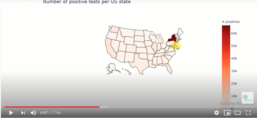
It is clear form the heat map that New York has a very high incidence of infections vis a vis other states. We then begin working with data on the number of ICU beds in each state. Since each state will have different populations, we cannot compare the absolute number of ICU beds. We need the ratio of ICU beds per a given number of inhabitants.

Fig. 2.

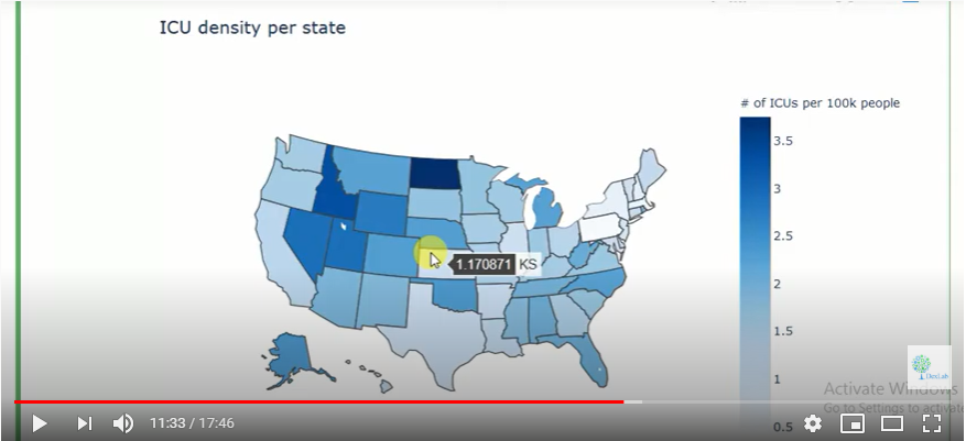
The generated heat map (Fig. 2.) shows the ICU density per state in the US. For more on this do watch the complete video tutorial attached herewith.

This tutorial was brought to you by DexLab Analytics. DexLab Analytics is a premiere data analyst training institute in Gurgaon.


.

The Impact of latitude on The Spread of COVID-19 (Part-I)

The Impact of latitude on The Spread of COVID-19 (Part-I)

The COVID-19 pandemic has hit us hard as a people and forced us to bow down to the vagaries of nature. As of April 29, 2020, the number of persons infected stands at 31,39,523 while the number of persons dead stands at 2,18,024 globally.

This essay is on the phenomenon of detecting geographical variations in the mortality rate of the COVID-19 epidemic. This essay explores a specific range of latitudes along which a rapid spread of the infection has been detected with the help of data sets on Kaggle. The findings are Dexlab Analytics’ own. Dexlab Analytics is a premiere institute that trains professionals in python for data analysis.

For the code sheet and data used in this study, click below.


The instructor has imported all Python libraries and the visualisation of data hosted on Kaggle has been done through a heat map. The data is listed on the basis of country codes and their latitudes and there is a separate data set based on the figures from the USA alone.

Fig. 1.

The instructor has compared data from amongst the countries in one scenario and among states in the USA in another scenario. Data has been prepared and structured under these two heads.

Fig. 2.

The instructor has prepared the data according to the mortality rate of each country and it is updated to the very day of working on the data, i.e. the latest updated figures are presented in the study. When the instructor runs the program, a heat map is produced.

For more on this, do go through the half-an-hour long program video attached herewith. The rest of the essay will be featured in subsequent parts of this series of articles.


.

Call us to know more