The first case of the 2019-2020 Coronavirus pandemic in India was reported on January 30, 2020, originating in China. Experts suggest the number of infections could be much higher as India’s testing rates are among the lowest in the world. The infection rate of COVID-19 in India is 1.7, significantly lower than in the worst affected countries.
The World Health Organisation chief executive director of health emergencies program Michael Ryan said that India has “tremendous capacity” to deal with the coronavirus outbreak, and as the second most populous country, will have enormous impact on the world’s ability to deal with it.
DexLab Analytics, in the first part of this blog series, studied the statewise breakup of COVID-19 cases in India through a Jupyter Notebook. Libraries were called, maps were drawnand data was taken from Kaggle.
The data and code sheet can be found below.
In this part of the blog series we will study how states are performing with regard to laboratories and testing. First we make three data sets – that of confirmed cases, recovered cases and cases of deaths.
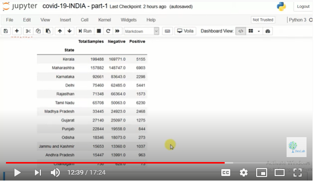
We first plot this data on a graph and study it carefully. Then we make a pivot table and study the data. We then also study which state is performing how many tests on people. Kerala is found to have done the maximum number of tests (Fig.1.).
Fig. 1.
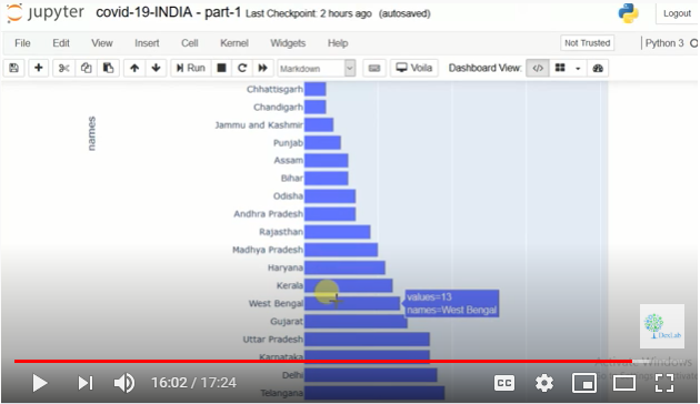
The purpose of this video is to teach you how to use visual graphs in Python. Now we aim to find why testing is underdone in states. Is there a possibility of a lesser number of labs in the first place? We get a graph (Fig. 2.) that shows us how many labs each state has for testing COVID-19 samples.
The first case of the 2019-2020 Coronavirus pandemic in India was reported on January 30, 2020, originating in China. Experts suggest the number of infections could be much higher as India’s testing rates are among the lowest in the world. The infection rate of COVID-19 in India is 1.7, significantly lower than in the worst affected countries.
The World Health Organisation chief executive director of health emergencies program Michael Ryan said that India has “tremendous capacity” to deal with the coronavirus outbreak, and as the second most populous country, will have enormous impact on the world’s ability to deal with it.
Other commentators worried about the economic devastation caused by the lockdown that has huge effects on informal workers, micro and small enterprises and farmers and self employed people who are left without a livelihood in the absence of transportation and access to markets.
The lockdown was justified by the government and other agencies for being pre-emptive to prevent India from entering a higher stage which could make handling very difficult and cause even more losses thereafter. According to a study by Shiv Nadar University, India could have witnesses a surge of 31,000 cases between March 24 and April 14 without lockdown.
So we call a Jupyter Notebook in Python to study India’s COVID-19 story.
The data and code sheet used in this study can be found below.
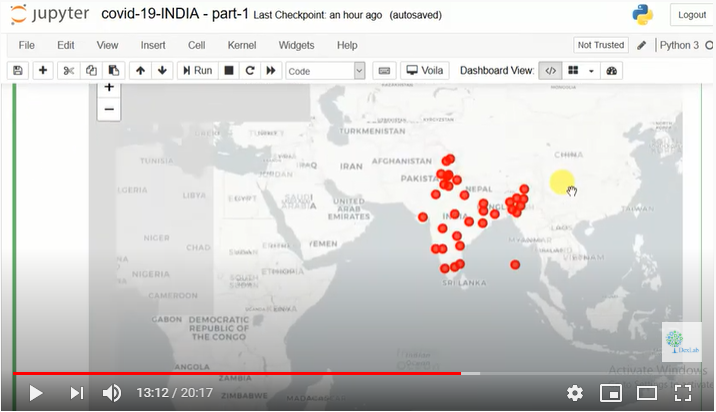
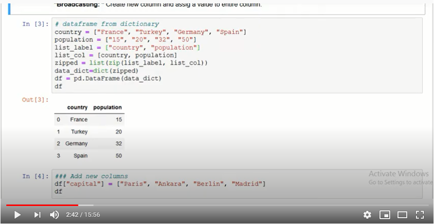
We will first import all libraries like pandas and numpy. All the data has been taken from kaggle. We then take the data and work a dataframe on it. And then we generate an India map to study the spread of SARS-CoV-2.
Unlike India’s healthcare system wherein both public and private entities deliver healthcare facilities to citizens, in the US, the healthcare sector is completely privatised.
The aim of this notebook is to study some of the numerical data we have for the US and especially data for New York. Most of us know about New York’s situation that is one of the worst in the world.
Therefore, analysing data may clarify a few things. We will be using three sets of data – urgent care facilities, US county healthcare rankings 2020 and Covid sources for counties.
For the data and codesheet click below.
Now pick key column names for your study with ‘.keys’ as the function name. We are interested in a few variables from health rankings so we take only the ones we think will be useful in a new data frame.
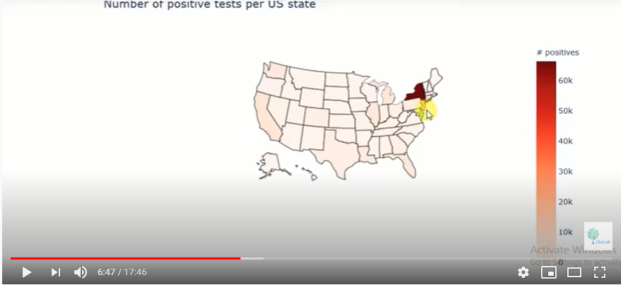
We will study each data set one by one so that we can get an understanding of the data before combining them. For this we call the plotly library that has very interactive graphs. We use the choropleth to generate a heat map over the country in question.
Fig. 1.
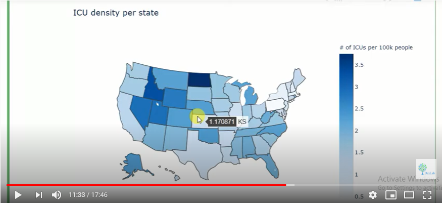
It is clear form the heat map that New York has a very high incidence of infections vis a vis other states. We then begin working with data on the number of ICU beds in each state. Since each state will have different populations, we cannot compare the absolute number of ICU beds. We need the ratio of ICU beds per a given number of inhabitants.
Fig. 2.
The generated heat map (Fig. 2.) shows the ICU density per state in the US. For more on this do watch the complete video tutorial attached herewith.
This video tutorial is on exploratory data analysis. The data is on COVID-19 cases and it has been taken from Kaggle. This tutorial is based on simple visualization of COVID-19 cases.
For code sheet and data click below.
Firstly, we must call whatever libraries we need in Python. Then we must import the data we will be working on onto our platform.
Now, we must explore PANDAS. For this it is important to know that there are three types of data structures – Series, Data Frame and Panel Data. In our tutorial we will be using data frames.
Fig. 1.
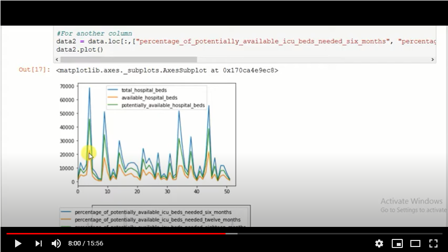
Now we will plot the data we have onto a graph. When we run the program, we get a graph that shows total hospital beds, potentially available hospital beds and available hospital beds.
Fig. 2.
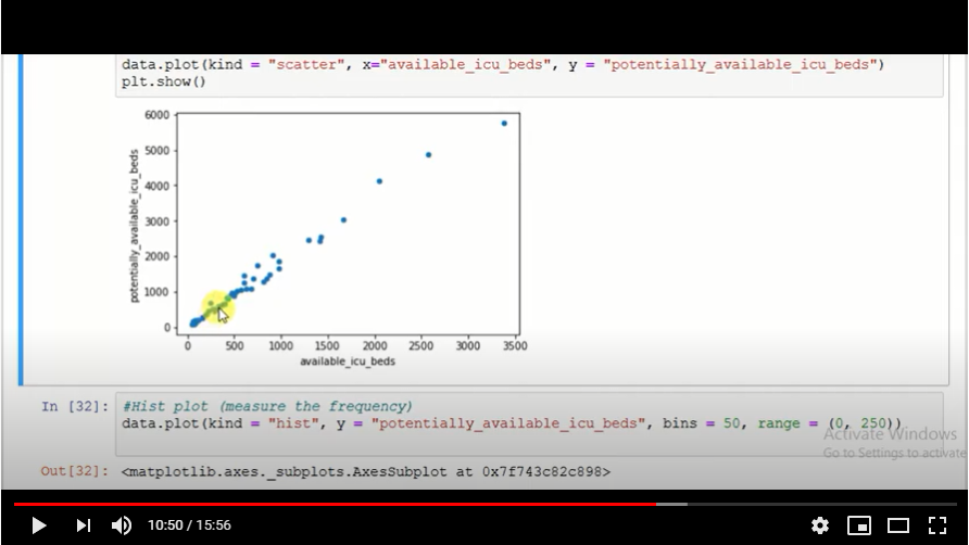
While visualizing data we must remember to keep the data as simple as possible and not make it complex. If there are too many data columns the interpretation will be a very complex one, something we do not want.
Fig. 3.
A scatter plot (Fig. 3.) is also generated to show the reading of the data available. We study the behaviour of the data on the plot.
The COVID-19 pandemic has hit us hard as a people and forced us to bow down to the vagaries of nature. As of April 29, 2020, the number of persons infected stands at 31,39,523 while the number of persons dead stands at 2,18,024 globally.
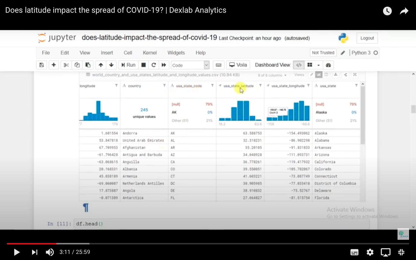
This essay is on the phenomenon of detecting geographical variations in the mortality rate of the COVID-19 epidemic. This essay explores a specific range of latitudes along which a rapid spread of the infection has been detected with the help of data sets on Kaggle. The findings are Dexlab Analytics’ own. Dexlab Analytics is a premiere institute that trains professionals in python for data analysis.
For the code sheet and data used in this study, click below.
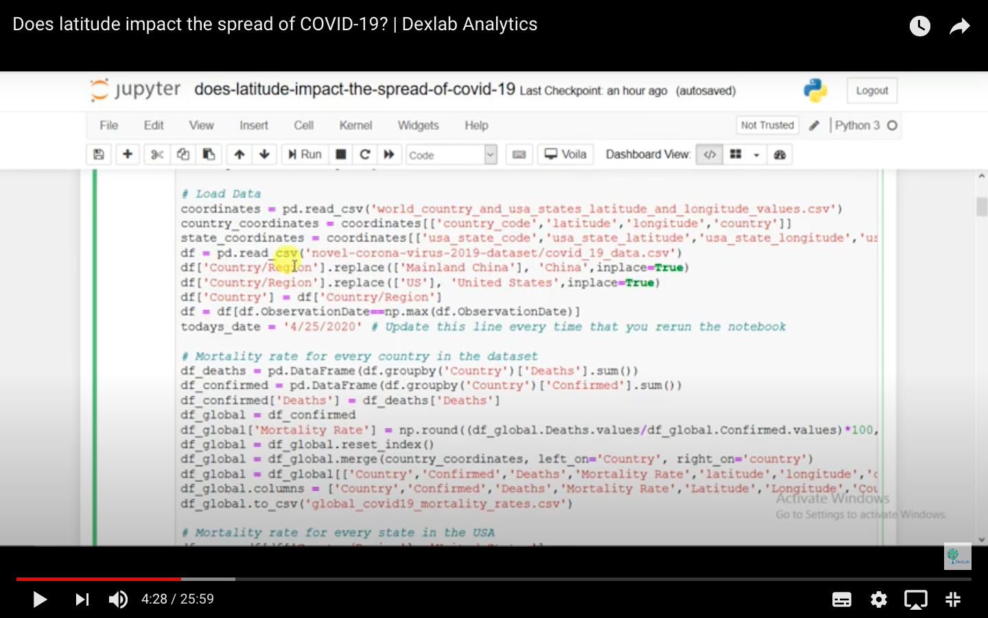
The instructor has imported all Python libraries and the visualisation of data hosted on Kaggle has been done through a heat map. The data is listed on the basis of country codes and their latitudes and there is a separate data set based on the figures from the USA alone.
Fig. 1.
The instructor has compared data from amongst the countries in one scenario and among states in the USA in another scenario. Data has been prepared and structured under these two heads.
Fig. 2.
The instructor has prepared the data according to the mortality rate of each country and it is updated to the very day of working on the data, i.e. the latest updated figures are presented in the study. When the instructor runs the program, a heat map is produced.
For more on this, do go through the half-an-hour long program video attached herewith. The rest of the essay will be featured in subsequent parts of this series of articles.
In the midst of a crisis as big as COVID-19 which has as per the current update taken more than 80,000 lives around the world and caused nations to go under a lockdown, machine learning and artificial intelligence has played a vital role in detecting COVID-19 positive cases and helping fast track the tests and analysis of drugs that can be a solution to the problem.
Countries around the world are building algorithms to better understand the molecular structure of the diseaseso that the so-called protein around the SARS-CoV-2, the virus that causes COVID-19, can be blocked.
Use of AI and machine learning around the world
The legendary story of a Canada-based AI named Bluedot is not something one can forget. Buledot is a low cost AI based tool that predicted the outbreak of the disease in December 2019 and also predicted the top 20 destinations where passengers from Wuhan, the origin of pandemic, would arrive.
Deargen a South-Korean company built an AI tool named MT-DTI to test and analyze the molecular bond of the SARS-CoV-2 protein and recommend medication on the basis of the same. Even though their recommendations are yet to be reviewed and tested properly, their find might prove to be a super solution to reduce the number of death counts and covid positive cases.
Insilico Medicine, a Hong-Kong based company instead of building a platform to recommend the currently available medication to break the protein of covid-19 virus and stop it from replicating, built an AI based tool to formulate and test the potency of new and chemically advanced medication to break the chain.
Benevolent AI, a British startup based on its machine learning tool discovered six important covid-19 virus fighting compounds that can prove to be helpful in curing and limiting the spread of the disease. Out of the six compounds discovered, ‘baricitinib’, a compound used to cure rheumatoid arthritis according to the sources, proves to be the safest compound that can be tested on the covid positive volunteers.
Use of AI and machine learning in India
The spread of the covid-19 pandemic in India began by the end of January 2020 and till date more than 5000 cases have been reported. The Government of India declared a lockdown by mid-March 2020 and in the middle of all this when misinformation and rumors were rising day by day, to tackle the problem the Government of India launched its covid-19 tracking app called Aarogya Setuthat means ‘a bridge of health’.
This AI-based app uses bluetooth and the mobile location of the user and informs them if there is any person covid positive within 6 feet of their location or not. The app checks the user’s data in their own database and in case the data matches a corona positive patient then it only notifies their presence keeping their identity anonymous.
India has also launched a whatsapp chatbot and any one using the whatsapp platform can access the chatbot by simply typing “MyGov Corona Helpdesk” and get the relevant and authentic information relating to the symptoms and how they can get help from direct sources.
Apart from the above initiatives to tackle the pandemic, medical practitioners, data analysts and data scientists from around the world are trying to find ways and means and analyzing the database to capture the trends and are working day and night to find best possible cure to fight the disease.