Advanced excel vba institute in gurgaon Archives - Page 2 of 2 - DexLab Analytics | Big Data Hadoop SAS R Analytics Predictive Modeling & Excel VBA

10 Amazing Excel Templates to Help Maintain an Organized Budget

10 Amazing Excel Templates to Help Maintain an Organized Budget

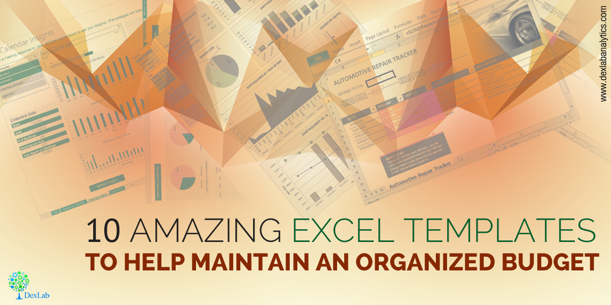
Managing a proper budget is an essential task. Professionals working in enterprises are somehow involved in performing this task to some degree. Fortunately, a handful number of budgeting Excel templates is available online – check out some of our favorites:

Back to the basics, budget is something more than an educative, future projection of what should happen to a company’s financial position over a specific course of time, based on the latest trends, current data and previous history. The accuracy of the entire forecast depends on the quality of financial data accumulated during the budget period – it is here that a robust set of data collection tools saves the day.

Here’s a roundup of some of the most useful and easy-to-use budget-related MS Excel templates – most of them are available and are for free. Let’s check them out:

Microsoft Office Templates

When it comes to software, Microsoft remains unbeatable. It offers few applaud-worthy customizable office templates that help you become more productive in implementing programs, perform tasks and track financial budgets. Some of them are below:

Business Expense Report

Business travel expense report is one of the most popular budget reporting activities. For reimbursement of travel expenses, the employee needs to present detailed accounts of expenditures. The Excel template in here is easy to fill up, less time-consuming and removes the frustration caused due to tracking expenses in a business trip.
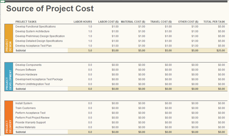
Project Budget

Project Budget template helps you evaluate your project’s design, development and delivery costs so as to monitor actual expenses that occur thereafter.


bfreeexcelbudget

Profit and Loss Statement

An all-inclusive profit and loss statement is fundamental for any enterprise. Whether it’s on a departmental level or encompassing an entire organization, determining profit and loss in the financial statement is important to put into focus the problematic areas of your business. The Excel template helps in calculating both the actual and budget revenues and expenses over a pre-determined period of time.

Balance Sheet

Balance Sheet is an effective financial budgetary document that enlists all the assets and liabilities, while evaluating their budgetary values, depreciation rates and amortization records, and the job gets easier when it’s done on an Excel template.

Activity-based Cost Tracker

The activity-based cost tracker template provides you a visual representation of standard, administrative, direct and indirect costs in relation to production. It also helps in monitoring the cost of each unit, while helping you manipulate your budget plan, if other factors, including costs fluctuate.

Small Business Cash Flow Projection

Managing cash flow is more significant than determining profit and loss and balance sheet and by properly using the Excel template small businesses will do well for themselves anytime.
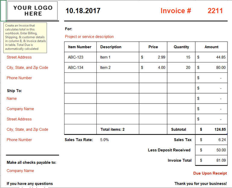
Simple Invoice

In the business circle, an Excel template on invoice gains a lot of accolades. This kind of Excel template automatically calculates the totals and subtotals so that the businesses don’t have to lose any of its valuable time.

cfreeexcelbudget

Beyond the jurisdiction of Microsoft, here are few other budget-related Excel templates:

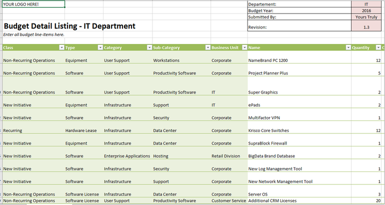
Year-round IT Budget Template

From the curators of Tech Pro Research team, this cutting edge Excel template helps you track all your spending, administer unplanned expenditure, classify expenses, and highlight key data, like cost of hiring new recruits, contract end dates and recurring payments.


afreeexcelbudget

Systems Downtime Expense Calculator

Taking care of an enterprise network is the most demanding job role for any IT administrator. Nothing in this wide world will be more traumatic than network downtime. Hence, this Excel template assist you place a dollar amount on your network downtime.

Computer Hardware Depreciation Calculator

This Excel worksheet helps you determine depreciation for your equipment – finding the rate of depreciation is not a piece of cake – there are many methods of deprecation to take into account.

Do you want to know more about how to use MS Excel for better budgeting for your business? Advanced Excel course by DexLab Analytics would be perfect for you. Excel certification in Delhi helps you grow in your career, so enroll today!


Interested in a career in Data Analyst?

To learn more about Data Analyst with Advanced excel course – Enrol Now.
To learn more about Data Analyst with R Course – Enrol Now.
To learn more about Big Data Course – Enrol Now.

To learn more about Machine Learning Using Python and Spark – Enrol Now.
To learn more about Data Analyst with SAS Course – Enrol Now.
To learn more about Data Analyst with Apache Spark Course – Enrol Now.
To learn more about Data Analyst with Market Risk Analytics and Modelling Course – Enrol Now.

Analyze Data Using These Easy but Effective MS Excel Tricks

Analyze-Data-Using-These-Easy-but-Effective-MS-Excel-Tricks


Everyone adores MS Excel. The powerful Excel software not only excels in doing basic computations but is also used for various formidable purposes, like financial modeling and business strategies. For novices, employing the skills of MS Excel can open new vistas in the world of data analytics. It is even being said – prior to R or Python, better grab the knowledge about Excel. Excel, with its wide array of functions, visualizations and skills empowers the users to quickly generate insights about data from the data, which would take a great toll otherwise.

Top 5 commonly used functions are highlighted below:

  1. Vlookup(): It works great in search of a value in a table and returns the corresponding value. For better understanding, take a look at the Policy Table.

For mapping the city name from the customer tables, based on a regular “customer id”, use function vlookup()

Vlookup_11-850x263

Syntax: =VLOOKUP(Key to lookup, Source_table, column of source table, are you ok with relative match?)


For this problem, we can type formula in cell “F4” as =VLOOKUP(B4, $H$4:$L$15, 5, 0) and this will return the city name for all the Customer id 1 and after that, copy this formula for all Customer ids.

Tip: Do not forget to lock the range of the second table using “$” sign – a common error when copying this formula down. This is known as relative referencing.

  1. CONCATINATE() – When it comes to combine text from two or more cells into a single cell, use CONCATINATE().

Check out the following table:

Concatenate1Here, we want to create a URL structured on input of host name and request path.

Use formula =concatenate(B3,C3) to solve the issue, and copy it.

Tip: Try to use “&” symbol, as it is shorter than typing a full “concatenate” formula, and does the exactly same thing. The formula can be written as “= B3&C3”.

  1. LEN() – It indicates the length of a cell, consisting the number of characters, including special characters and spaces.


Syntax: =Len(Text)


Example: =Len(B3) = 23


  1. TRIM() – This is a very useful function to wipe off text that has leading and trailing white space. When you get a large chunk of data from any database, the text found is usually padded with blanks. To deal with such problems, use this handy function.


Syntax: =Trim(Text)


  1. If() – It allows you to use conditional formulas to calculate when a certain thing holds true and when not. Move your eyes below on the below table to mark each sales as High and Low.Conditional

Undoubtedly MS Excel is one of the most robust programs ever created, and it still remains to be the golden standard for all business outcomes worldwide. Irrespective of whether you are a fresh blood or a veteran user, there is always some scope to learn new things in Excel, which makes it an all-time-favorite software program.  


To follow such interesting blogs on Excel, SAS, Big Data and other branches of Big Data, reach us at DexLab Analytics. We are the prime advanced Excel institute in Gurgaon and expect nothing but the best from us!

 
This post originally appeared onwww.analyticsvidhya.com/blog/2015/11/excel-tips-tricks-data-analysis
 

Interested in a career in Data Analyst?

To learn more about Data Analyst with Advanced excel course – Enrol Now.
To learn more about Data Analyst with R Course – Enrol Now.
To learn more about Big Data Course – Enrol Now.

To learn more about Machine Learning Using Python and Spark – Enrol Now.
To learn more about Data Analyst with SAS Course – Enrol Now.
To learn more about Data Analyst with Apache Spark Course – Enrol Now.
To learn more about Data Analyst with Market Risk Analytics and Modelling Course – Enrol Now.

Tutorial for creating a Speedometer dial in MS Excel

 Tutorial for creating a Speedometer dial in MS Excel

Here in this video tutorial we have discussed in detailed steps, how to create a Speedometer chart in MS Excel. A Speedometer chart is often called as a gauge chart and combines two different type of charts, a pie chart and a doughnut chart.

The Speedometer dial is made with the help of using a Doughnut chart and needle is actually a combination of two types of charts, another doughnut chart and a pie chart.

A speedometer chart or a gauge chart can be created in other data visualization software as well, like for instance in Tableau and is usually easier to create due to availability of better controls and features.  It is due to the simplistic nature of these charts which is well adjusted to context of data and is a great use of space in a spreadsheet that charts like these are popular with non-data executives. Usually such non-data personnel do not want to dig deep into the contextual details like an analyst which is why these charts are great for using in a presentation where diverse departmental executives will be participating.

Gauge charts pack in a lot of horsepower and form a sort of ubiquitous symbol when it comes to understanding business metrics from an analytical point of view. So, learn to create these charts with our simple tutorial and for more such interesting lessons on data analysis software, join us every day as we share technical posts based on data on a regular basis.


Interested in a career in Data Analyst?

To learn more about Data Analyst with Advanced excel course – Enrol Now.
To learn more about Data Analyst with R Course – Enrol Now.
To learn more about Big Data Course – Enrol Now.

To learn more about Machine Learning Using Python and Spark – Enrol Now.
To learn more about Data Analyst with SAS Course – Enrol Now.
To learn more about Data Analyst with Apache Spark Course – Enrol Now.
To learn more about Data Analyst with Market Risk Analytics and Modelling Course – Enrol Now.

Let us Revise Regression Analysis

Let us revise regression analysis

By now every business owner and manager is aware of the latest megatrend related to data analysis and knows that they should make data-driven decisions only at work. Gut feeling and winging it are now practices outdates as they have proved time and again that they fail. But the problem still remains in the know-how of parsing through all the layers of data streaming into your systems. Do you have the requisite know how?

Luckily for you, you may not be the one to crunch all the numbers (phew!). You pay other robotic data analytics personnel to do that for you. But you must correctly understand the analysis report that is handed over to you for interpretation after your colleagues are done with all the heavy lifting. A common practice is the realm of data analysis is regression analysis. Continue reading “Let us Revise Regression Analysis”

Gain Expertise in MS Excel with DexLab Analytics

Gain-Expertise-in-MS-Excel-with-DexLab-Analytics

MS Excel needs no introduction as spreadsheet program. As part of the MS Office suite it has been a regular software skill expected from employees across the globe regardless their roles or levels. But the utility of MS Excel in the world of Big Data is not so widely acknowledged due to the lack of awareness. But that does not rob it of any of its sting as a Big Data tool to advanced Excel users.

So if you are keen to know more about the emerging technology that elite techies cannot stop raving about, a solid grounding in MS Excel will serve you well. Accordingly DexLab Analytics has scheduled a symposium on the topic of Designing MS Excel Dashboards as an introduction to the Big Data capabilities of Big Data to aspiring data analystand data scientists. The symposium is going to be MS Excel Experts who also instruct students of DexLab Analytics most of whom have been advanced users of MS Excel for more than a decade.

How to Create a Macro With MS Excel – @Dexlabanalytics.

The main speaker of the symposium is an industry expert who is currently attached with a leading Multi-National Company for over 5 years. He will bring with himself invaluable information regarding the latest developments in data science. We will cover the following topics in the meet scheduled to be held on the 26th of January:

  •  MS Excel functions overview like V Look Up, Match, H Look Up, Address, Match, Countlfs, Indirect, Sumlfs amongst many others.
  •  Introducing the world of recording macros and building VBA.
  • Introducing Advanced Excel with abilities in Dynamic Referencing and pivot.
  • Hot to make use of Excel and VBA in order to generate KPI dashboards.

The interactive session with industry professionals with many years of experience and help you acquire invaluable exposure to the basics of MS Excel so that you get a foretaste of what lies in store for you in this new and exciting world called Big Data.

Note: It is assumed that the participants of this event have a basic understanding of the rudiments of statistics.

Looking for an Advanced excel training in Gurgaon? Drop by DexLab Analytics – their Excel dashboards training is unparalleled!


Interested in a career in Data Analyst?

To learn more about Data Analyst with Advanced excel course – Enrol Now.
To learn more about Data Analyst with R Course – Enrol Now.
To learn more about Big Data Course – Enrol Now.

To learn more about Machine Learning Using Python and Spark – Enrol Now.
To learn more about Data Analyst with SAS Course – Enrol Now.
To learn more about Data Analyst with Apache Spark Course – Enrol Now.
To learn more about Data Analyst with Market Risk Analytics and Modelling Course – Enrol Now.

Ms Excel VBA May Be Used To Predict Sales

banner 11

MS Excel VBA has uses in various facets of day to day activities of businesses. But it is a little known factthat this tool may also be used to carry out advanced functions like predicting future sales. This blogpost will try to represent in as an illustrative way as possible how it manages to do the same with thelimitations imposed by the format of this text based post.Suppose we have sales data of two sets for 24 periods within the time range of January 2013 to the December of 2014.

What we are trying to do is to utilize the function LINEST in order to predict sales for the year 2015 by making use of method of least squares as well as regression analysis. The elementary knowledge of this function suggests that it is worth sharing. In the lines that follow we will try to examine the rudiments of this function and the formula that we will put into use in the calculations we make.

The use of the LINEST function lies in regression analysis in order to make calculations about a line that uses the least squares method and return a straight line that is best fitted to the data that you input and outputs an array that serves as a description of the particular line.


The equation that represents the line is: y = mx + b


Here m stands for the slope, x represents the period of time dealt with the data and b is the y intercept.It is to be noted that there is necessity of having a column that indicates the period number of the existing as well as future sales. It should also be noted that while you use the LINEST function so that you may calculate the values of the Y- Intercept along with that of the slope those cells need to reside side by side.

So, what one has to do is to highlight the two cells that you want to use in order to make calculations of the Y-Intercept and the Slope before typing in the LINEST function. In such cases all that is needed is to include the “y”s that are already known. It is up to you whether you want to provide other arguments as they are optional. Then all you need to do is press Ctrl+Shift+Enter and you get the Y-Intercept and the Slope.

The magic that takes place in the background is basically this, by making use of the Slope and the Y-Intercept Excel does its crystal ball gazing and takes the last sales data of the precious 24 months and creates a straight-line that forecasts the trend that is likely to persist in the coming 12 months.

2

What Excel actually does is that it takes the actual values and manipulates them slightly to that is able to come up with a straight-line that serves as the trend line that extends out to the periods of forecast and thus the actual values and the values of the forecast have trends that are similar.This is the basics of crystal ball gazing through the use of MS Excel.


Want to shine bright in MS Excel? Visit DexLab Analytics – their Advanced Excel course is truly remarkable. Enrol for Advanced Excel training today.


Interested in a career in Data Analyst?

To learn more about Machine Learning Using Python and Spark – click here.
To learn more about Data Analyst with Advanced excel course – click here.
To learn more about Data Analyst with SAS Course – click here.
To learn more about Data Analyst with R Course – click here.
To learn more about Big Data Course – click here.

Call us to know more