Advanced excel course in gurgaon Archives - DexLab Analytics | Big Data Hadoop SAS R Analytics Predictive Modeling & Excel VBA

G-Suite and Office 365: A Comparison of Spreadsheets for Your Business Needs

G-Suite and Office 365: A Comparison of Spreadsheets for Your Business Needs

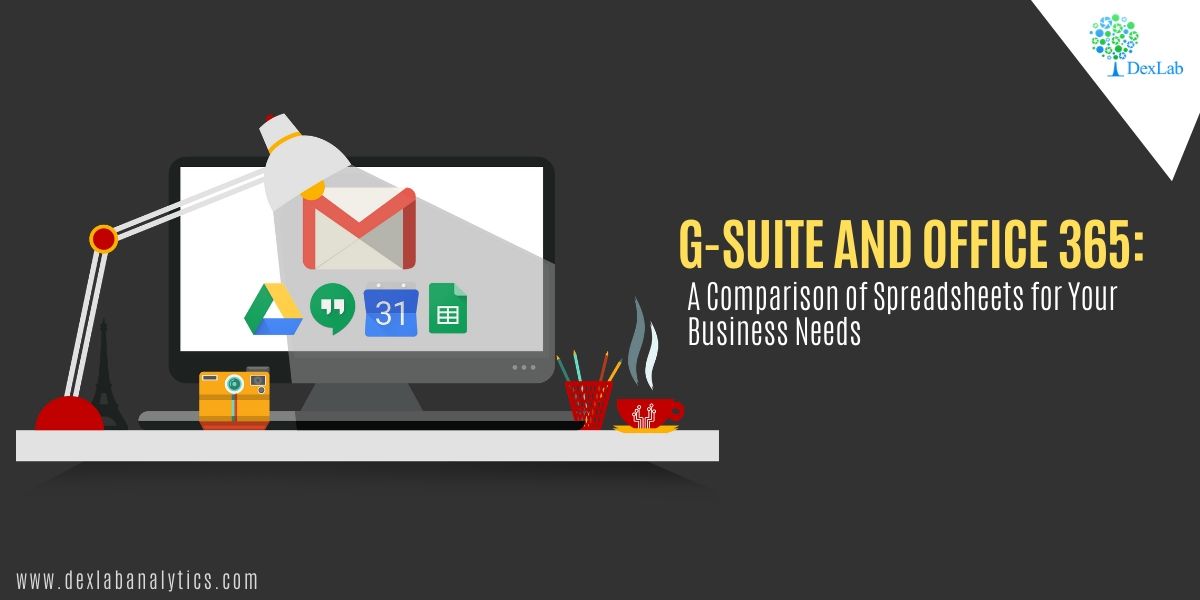
When Google introduced its G-Suite in 2006, Microsoft Office was a world leader with virtually no competition. Over time, however, Google Suite (initially known as Google Docs and Spreadsheets) has managed to draw a loyal user base despite its subscription fee. Faced with this new challenge, Microsoft went ahead and introduced in the market what it calls Office 365, a subscription based version of its Office, which is regularly updated with new features.

Common features

G-Suite and Office 365 have many features and aspects in common. For instance, both work offline and both offer apps for the Android and iOS versions. The suites offer the same core and basic utilities. They have word processing, spreadsheet, presentation, email, calendar, contacts, video conferencing, and programs like messaging, note-taking software among others. The two suites also have cloud storage though these are different from each other by virtue of the tools used to manage them.

When thinking about which suite to use for your business needs, compare the prices of the two. But before that, it is important that you know that you can use several online apps from the two suites – like Google Docs, Sheets and Slides as well as Microsoft Word Online, Excel Online and Powerpoint Online. In India, Microsoft is still a little more popular and it is not surprising that institutes aiming at excellence in computing like DexLab Analytics prefer to have a separate course on excel certification in gurgaon.

Cost and Word Processors

The G-Suite comes in three ranges – Basic, Business and Enterprise with the prices starting from $6 to $25 per month. Office 365 is a little expensive, its cost ranging from $5 to $35 per month. When it comes to their word processing software, Google Docs is better for collaboration while Word has numerous editing features and templates to offer.

Spreadsheets and Presentations

When it comes to Google Sheets against Microsoft Excel, again, collaboration becomes the bellwether. If users are prone to working on spreadsheets by themselves without collaborating with others, then Microsoft Excel is the application for you. But if you are going to collaborate with fellow workers, then Google Sheets is the option for you. Similarly, collaboration is easier on Google Sheets than it is on Powerpoint but for every other reason, be they charts or slide layouts, Powerpoint is the winner.

Email

If you prefer simplicity over clutter, then Gmail is your go-to mail service. Gmail has succeeded in cutting the clutter and offers this really fast and streamlined mail service. However, Microsoft Outlook is also trying to be as straightforward as possible. It can be anything, composing a mail to managing it and responding to it, Gmail has a system which is intuitive and understands user response. When it comes to the Microsoft Outlook, power features like the Focused Inbox are a great draw. Focused Inbox helps prioritize important mails and enables you to read them and respond to them first.

Data Science Machine Learning Certification

And, “because the contacts and calendar functions are part of Outlook itself, they’re well integrated with email. Gmail relies on the separate Google Contacts and Calendar apps, which can be a bit more cumbersome to navigate”, says a handy report on the comparison of the two suites.


Interested in a career in Data Analyst?

To learn more about Data Analyst with Advanced excel course – Enrol Now.
To learn more about Data Analyst with R Course – Enrol Now.
To learn more about Big Data Course – Enrol Now.

To learn more about Machine Learning Using Python and Spark – Enrol Now.
To learn more about Data Analyst with SAS Course – Enrol Now.
To learn more about Data Analyst with Apache Spark Course – Enrol Now.
To learn more about Data Analyst with Market Risk Analytics and Modelling Course – Enrol Now.

Ms Excel is All-Powerful: Some Tasks You Never Know You Could Do With Excel!

Ms Excel is All-Powerful: Some Tasks You Never Know You Could Do With Excel!

Data is everywhere and evident. With the multiplication of data and the increasing need to preserve it, we must always organise data. A properly organised data not only makes it easier to analyse data in the future, but it also makes everything clear and presentable. 

Though we had some initial difficulties of maintaining data right at the beginning, MS Excel has surely been making our tasks easier ever since it was discovered. Therefore, it is not a shock that Microsoft Excel is one of the most demanding skills in the present age we are living. However, you should always choose the Advanced excel institute in Gurgaon, if you are interested in learning MS Excel in a top-notch environment, from the experts. 

Microsoft Excel and its Advantages

Microsoft Excel has come a long way from helping us in the basic tasks of keeping things comprehensible and organised. Many of our daily chores of simple arithmetic calculations, interactive representation of data in the form of tables, charts and statistical representation of data via bar graphs, line graphs and pie charts are easier than ever with MS Excel. Besides, with the progressive age, it is remarkable how Excel is keeping up with the dizzying pace and the rising demands of the technological advancements we are experiencing a day in and day out.

Business Intelligence and location intelligence are the new trends of the hour and you can count on MS Excel to help you out with them as well. If you find us asking for too much here, then check some compelling tasks which you can perform via MS Excel.

Data Science Machine Learning Certification

You can Wield the Spreadsheet as a Map

Did you know that you can gain a deep insight into the location just through your spreadsheets? Well, perhaps you can! 

Though your spreadsheet appears to be all tables, they can eventually fetch you important information on the location. Moreover, you can also look at MS Excel as a spatial dataset bringing you spatial relationships, which is similar to a GML or an Esri Shapefile. Besides, with the introduction of innovative FME technology, you can:

  1. Convert the existing coordinates into geometrical representations of latitudes and longitudes.
  2. Geocode the available addresses on your spreadsheet to spatialize them automatically. ArcGIS Online and Google are some of the popular options òf geocoding services that you can avail.
  3. Associate your spreadsheet to an existing geometry stored somewhere else. 

Merge all into One with Ms Excel

You might gather data in a wide range of available formats but you need not be confused with MS Excel. Whether your data is in complex spreadsheets, represented by GIS and CAD drawings or etched in the form of orthophotos, you can import them all and most importantly, merge them with your current MS Excel worksheet. Moreover, FME also enables you to integrate your spreadsheet with data in variegated formats. Therefore, you just need to build a workflow initially and you can import a convincing amount of data and merge them just as you want to.

To Sum Up!

Apart from these, you can also load all your data; manage and analyse data effectively and generate lengthy reports and summaries without any hassles. Therefore, it is important to grasp all the latest skills of MS Excel to be updated with the age. Here’s where Dexlab Analytics stands by you as a compelling companion with Advanced Excel course in Gurgaon

Automation is seeping into every other discipline and the same goes for Excel as well. So, if you are interested to explore the world of automation in relation to MS Excel, then check out the upcoming workshop scheduled by Dexlab on 28th and 29th of December, 2019, promising you intensive training on Automation in Ms Excel.

If you also want to be a part of this all-inclusive training, then


This blog is sourced from www.safe.com/blog/2015/03/5-automated-excel-tasks


Interested in a career in Data Analyst?

To learn more about Data Analyst with Advanced excel course – Enrol Now.
To learn more about Data Analyst with R Course – Enrol Now.
To learn more about Big Data Course – Enrol Now.

To learn more about Machine Learning Using Python and Spark – Enrol Now.
To learn more about Data Analyst with SAS Course – Enrol Now.
To learn more about Data Analyst with Apache Spark Course – Enrol Now.
To learn more about Data Analyst with Market Risk Analytics and Modelling Course – Enrol Now.

Most Popular MS Excel Shortcuts That Would Save Time, Money and Effort

Most Popular MS Excel Shortcuts That Would Save Time, Money and Effort

Marketers look up to MS Excel every day. The reason can be anything – from creating charts to data analysis to structure a report for the upcoming presentation.

But, of course, working on Excel can be too time-consuming. Don’t you think it would be great if you could labor less formatting and entering gibberish formulas in the desktop or laptop?! Wouldn’t it be helpful if there were some keyboard shortcuts that could make the task easier and faster?!

Woah! Glad you did ask!

Fortunately, we’ve shortlisted a list of most common and widely used keyboard shortcuts for Microsoft Excel. No wonder, you can do all the navigation manually, but these hacks will save a lot of time as well effort, leaving you to focus only on the important stuffs.


To view our whole compilation of MS Excel shortcuts, click here


Or, another more profound way to fill in excellent MS Excel skills and expertise is through an advanced Excel course in Gurgaon. Encompassing courses like this helps students arm up with advanced skills and take the world in their stride. So, when are you enrolling?

Till then, pore over the list below. These simple yet effective shortcuts does help chop off time, enhance productivity and maneuver swiftly through workbooks, rows, sheets and columns:

Shortcuts play a significant role in every marketer’s or analyst’s life. Since its launch in 1985, MS Excel shortcuts have been helping users across the globe – they help analyze data quickly and efficiently. Undoubtedly, Excel spreadsheet is one of the top notch computer applications that helps store, manage and analyze data in tabular form for easy evaluation and scrutiny.

To know more about Excel that too in depth, look for an advanced excel VBA institute in Gurgaon. DexLab Analytics can come to your rescue. In the heart of India, specifically in the capital city, Delhi, DexLab Analytics with a core team of industry professionals offers state of the art data analytics training. The institute excels in numerous in-demand skill training, including training on Big Data Hadoop, PySpark, Python, R Programming, Business Analytics, Business Intelligence, SQL, VBA Macros, Ms Dashboards, Data Science, Machine Learning, Deep Learning, Data Visualization using Tableau and Excel. Drop by the site for more details.


The blog has been sourced from ― blog.hubspot.com/marketing/excel-shortcuts


Interested in a career in Data Analyst?

To learn more about Data Analyst with Advanced excel course – Enrol Now.
To learn more about Data Analyst with R Course – Enrol Now.
To learn more about Big Data Course – Enrol Now.

To learn more about Machine Learning Using Python and Spark – Enrol Now.
To learn more about Data Analyst with SAS Course – Enrol Now.
To learn more about Data Analyst with Apache Spark Course – Enrol Now.
To learn more about Data Analyst with Market Risk Analytics and Modelling Course – Enrol Now.

Ace an Interview: Top 4 MS Excel FAQs You Need To Know RN

Ace an Interview: Top 4 MS Excel FAQs You Need To Know RN

For more than three decades, MS Excel has been wooing us all. Thanks to its incredible features that help users analyze data, easily and quickly!

Spreadsheets are popular, more than ever before. Companies prefer conducting Excel interviews – it ensures job applicants are qualified and well-versed in using Excel – before job confirmations.

Now, without further ado, we’ll provide you the 4 most common Excel interview questions that recruiters ask for sure. Pore over them – a little bit of advance preparation doesn’t hurt, does it?! It’s better to be confident on interview day than being completely vague about the questions shot at you!

2

What are important data formats found in Excel, and how are they used?

Some of the most popular data formats in Excel are given below:

  • Numbers – They are one of the most widely seen data types in Excel. They are mostly formatted with a customized number of decimal places, and can be seen with or without commas separating thousands of digits.
  • Dates – They are displaced in Excel in numerous ways, including the most conventional US style MM/DD/YYYY format. Technically, they are stored as numbers and can be manipulated through a bunch of date-based functions.
  • Strings – Text is mainly stored in Excel in the form of strings. It’s format which includes standard characters, like numbers, letters and punctuation.

DexLab Analytics offer excel certification in Gurgaon – check out the course itinerary now!

Define a function in Excel.

Functions come secondary when you are a regular Excel user. For so many times, you have used SUM, VLOOKUP and AVERAGE that you mostly have even forgotten using a function while creating spreadsheets.

Now, a function is like a slew of components – which when mixed in the right way turns out something effective and more useful. The name of the function defines the purpose of the function, like what it does – for example, a SUM or an AVERAGE.

The arguments of the function refer to the components that go into it. And the output of the function is whatever useful comes out the other side.

Highlight the order of operations while evaluating formulas in Excel.

For this, we’ve the acronym PEMDAS – it’s widely taught in mathematics classes around the world, and that’s what Excel follows. The full form of PEMDAS is:

  • Parentheses
  • Exponents
  • Multiplication
  • Division
  • Addition
  • Subtraction

What distinguishes absolute cell references from relative cell references? And when should you use each of them?

Cell reference is touted as one of the most remarkable features of MS Excel. It lets users include values of external cells in formulas dynamically, instead of working on values manually. Talking of the differences, relative cell references change dynamically while they are copied and pasted in a sheet, whereas, absolute cell references remain fixed when they are copied and pasted to other places in a sheet. The latter can be used on anywhere, on columns, rows or both at the same time. It’s mostly denoted with the $ sign.

Hope these questionnaire set help you prepare for the upcoming MS Excel interview – for more intensive knowledge and Excel expertise, take up our Advanced Excel Course in Noida. Seasoned industry specialists, encompassing course curriculum and convenient prices are the USP of our training. For more information, drop by our homepage.


The blog has been sourced from www.deskbright.com/excel/excel-interview-questions


Interested in a career in Data Analyst?

To learn more about Data Analyst with Advanced excel course – Enrol Now.
To learn more about Data Analyst with R Course – Enrol Now.
To learn more about Big Data Course – Enrol Now.

To learn more about Machine Learning Using Python and Spark – Enrol Now.
To learn more about Data Analyst with SAS Course – Enrol Now.
To learn more about Data Analyst with Apache Spark Course – Enrol Now.
To learn more about Data Analyst with Market Risk Analytics and Modelling Course – Enrol Now.

DexLab Analytics’ AUGUST OFFER: Everything You Need to Know Of

DexLab Analytics’ AUGUST OFFER: Everything You Need to Know Of

We are happy to announce that we’re rolling some good news your way – DexLab Analytics is all set to launch exhaustive modules in Deep Learning with AI starting with Artificial Neural Networks using Python, MS Excel, Dashboards, VBA Macros, Tableau BI, Visualization and Python Spark for Big Data from September 1, 2018. The course modules are on in-demand skills and they are taking the world quite by a storm.

DexLab Analytics’ AUGUST OFFER

Big data, data science and artificial intelligence are buzz words these days. More and more people are coming forward and showing keen interest on these nuanced notions that solves real-world problems. This is why we didn’t want to fall behind. We understand the importance of data in this digitized world, and accordingly have chalked out our intensive industry-ready courses.

Deep Learning and AI starting with Artificial Neural Networks using Python course module is a 30-hour long training program that gives exposure to MLP, CNN, RNN, LSTM, Theano, TensorFlow and Keras. It includes more than 8 projects out of which a couple of focuses on development of models in to Image and Text recognition. MS Excel, Dashboards and VBA Macros certification is curated by the expert consultants after combining industry expertise with academician’s knowledge. The course duration is in total of 24 hours and is conducted by seasoned professionals with more than 8 years of industry experience specific to this budding field of science.

DexLab Analytics’ August Offer is On Machine Learning & AI

DexLab Analytics’ August Offer is On Machine Learning & AI

Next, we have30-hour hands-on classroom training on Tableau BI & Visualization certification, which teaches young minds how graphical representation of data unlocks company future trends and take quicker decisions. Tableau is one of the fastest evolving BI and data visualization tool. With that in mind, we offer a learning path to all you students by framing a structured approach coupled with easy learning methodology and course curriculum.  

DexLab Analytics Offers MS Excel, Dashboards and VBA Macros Certification!

DexLab Analytics Offers MS Excel, Dashboards and VBA Macros Certification!

Lastly, our Big Data with PySpark certification is another gem in the learner’s cap: the Spark Python API (PySpark) exposes users to the Spark Programming model with Python. Apache Spark is an open source and is touted as a significant big data framework for pivoting your tasks in a cluster. The main objective of this course is to teach budding programmers how to write python code using map-reduce programming model. The 40-hours hands-on classroom training will talk about Big Data, overview of Hadoop, Python, Apache Spark, Kafka, PySpark and Machine Learning.

Now, first 12 students who happen to register for each course on or before 30th August, 2018 will get alluring discount offer on the total course fee. Interesting, isn’t it? So, what are you waiting for? Go, grab all the details about AUGUST OFFER: to register, call us at +91 9315 725 902 / +91 124 450 2444 or hit the link below – www.dexlabanalytics.com/contact


Interested in a career in Data Analyst?

To learn more about Data Analyst with Advanced excel course – Enrol Now.
To learn more about Data Analyst with R Course – Enrol Now.
To learn more about Big Data Course – Enrol Now.

To learn more about Machine Learning Using Python and Spark – Enrol Now.
To learn more about Data Analyst with SAS Course – Enrol Now.
To learn more about Data Analyst with Apache Spark Course – Enrol Now.
To learn more about Data Analyst with Market Risk Analytics and Modelling Course – Enrol Now.

Master the Art and Science of MS Excel with These Cool Tips and Tricks

Spreadsheets are savior. In majority of industries, they have become a necessity. With ample filling rows and columns inundated with data points, Excel is the need of the hour. It is a top notch application for creating and managing spreadsheets.

Master the Art and Science of MS Excel with These Cool Tips and Tricks

But, remember the bigger the Excel gets, the uglier it starts to get, and that’s the time when you need to use a set of tricks and features to keep a tab on the data compilation. Here we’ve compiled a set of tips on Excel to help enhance your productivity.

Read on.

Select All

For selecting a specific grid of cell, no worries; simply click and drag. But what happens, when you want to select the entire lot? In cases like such, you can either use a keyboard shortcut Ctrl + “A” in Windows 10 and Command + “A” in MacOS or directly go up to the smaller cell in the upper-left corner and hit it.

Hiding or Unhiding Rows

Want to hide rows or columns of data? It mostly happens when you want to print copies of any event, where the audience needs to see only the important parts. Fortunately, it’s quite easy to hide rows and columns in Excel. Right click it, and Hide. That’s all.

Note: When you’re unhiding rows and columns, both, you have to unhide one axis at a time.


Drop Down List

Drop down menu is the best option when you want to restrict the stream of options a user puts into a cell. You can easily create one that provides users a comprehensive list of options to choose from. Just, choose a cell, go to the data tab and click on Validate.

Use of VLOOKUP

Want to retrieve information from a specified cell? For an instance, suppose you possess an inventory of a store, and want to check the price of any single item. You can use Excel’s VLOOKUP function. It lets you select a range of columns consisting relevant data, a particular column to pick out the output and a cell to deliver output at.

Shading Every Other Row

Spreadsheets can be really boring, and if you’ve got lots of data, the chances of reader’s eyes drifting here and there get high. Hence, adding a dash of color on the spreadsheet will try to fix the gaze of the viewers. So try shading rows of importance. It will make them more visible and prompt to the eyes.

To color the entire spreadsheet, select all. And if you want to color any particular area, apply effects only on that region.

Concatenate

If you want to reorganize data and integrate information from different cells all into a single field, use concatenate function.

Wrap Text

What happens when a lot of text gets accumulated in a single cell? Obviously, the text spills over into adjacent cells, which doesn’t look nice visually.

Luckily, it’s easy to wrap a text within a cell. Just select the cell with more text, right-click and select Format Cells.

Now, get ready to master Excel!

Let’s Take Your Data Dreams to the Next Level

DexLab Analytics is a top notch Excel institute in Delhi that caters to the needs of MS Excel aspirants. Their Advanced Excel course in Gurgaon is assembled by the experts and curated to perfection!

The blog has been sourced from – https://www.digitaltrends.com/computing/microsoft-excel-tips-and-tricks


Interested in a career in Data Analyst?

To learn more about Machine Learning Using Python and Spark – click here.

To learn more about Data Analyst with Advanced excel course – click here.
To learn more about Data Analyst with SAS Course – click here.
To learn more about Data Analyst with R Course – click here.
To learn more about Big Data Course – click here.

The Boons of Technology: How Excel Has Changed Workplace Dynamics

Microsoft Excel is a smorgasbord of information – it is a staple technology tool in any business environment. Whether you are crunching business data, organizing client sales inventory or planning an office event, Excel is arguably the most powerful tool entrenched across multiple business domains worldwide.

 
The Boons of Technology: How Excel Has Changed Workplace Dynamics
 

Aspiring professionals contemplating to make an entry into the workplace are required to excel on Excel tricks – Excel Dashboards Training Pune from DexLab Analytics is a promising gateway to your dreams!

Continue reading “The Boons of Technology: How Excel Has Changed Workplace Dynamics”

Analyze Data Using These Easy but Effective MS Excel Tricks

Analyze-Data-Using-These-Easy-but-Effective-MS-Excel-Tricks


Everyone adores MS Excel. The powerful Excel software not only excels in doing basic computations but is also used for various formidable purposes, like financial modeling and business strategies. For novices, employing the skills of MS Excel can open new vistas in the world of data analytics. It is even being said – prior to R or Python, better grab the knowledge about Excel. Excel, with its wide array of functions, visualizations and skills empowers the users to quickly generate insights about data from the data, which would take a great toll otherwise.

Top 5 commonly used functions are highlighted below:

  1. Vlookup(): It works great in search of a value in a table and returns the corresponding value. For better understanding, take a look at the Policy Table.

For mapping the city name from the customer tables, based on a regular “customer id”, use function vlookup()

Vlookup_11-850x263

Syntax: =VLOOKUP(Key to lookup, Source_table, column of source table, are you ok with relative match?)


For this problem, we can type formula in cell “F4” as =VLOOKUP(B4, $H$4:$L$15, 5, 0) and this will return the city name for all the Customer id 1 and after that, copy this formula for all Customer ids.

Tip: Do not forget to lock the range of the second table using “$” sign – a common error when copying this formula down. This is known as relative referencing.

  1. CONCATINATE() – When it comes to combine text from two or more cells into a single cell, use CONCATINATE().

Check out the following table:

Concatenate1Here, we want to create a URL structured on input of host name and request path.

Use formula =concatenate(B3,C3) to solve the issue, and copy it.

Tip: Try to use “&” symbol, as it is shorter than typing a full “concatenate” formula, and does the exactly same thing. The formula can be written as “= B3&C3”.

  1. LEN() – It indicates the length of a cell, consisting the number of characters, including special characters and spaces.


Syntax: =Len(Text)


Example: =Len(B3) = 23


  1. TRIM() – This is a very useful function to wipe off text that has leading and trailing white space. When you get a large chunk of data from any database, the text found is usually padded with blanks. To deal with such problems, use this handy function.


Syntax: =Trim(Text)


  1. If() – It allows you to use conditional formulas to calculate when a certain thing holds true and when not. Move your eyes below on the below table to mark each sales as High and Low.Conditional

Undoubtedly MS Excel is one of the most robust programs ever created, and it still remains to be the golden standard for all business outcomes worldwide. Irrespective of whether you are a fresh blood or a veteran user, there is always some scope to learn new things in Excel, which makes it an all-time-favorite software program.  


To follow such interesting blogs on Excel, SAS, Big Data and other branches of Big Data, reach us at DexLab Analytics. We are the prime advanced Excel institute in Gurgaon and expect nothing but the best from us!

 
This post originally appeared onwww.analyticsvidhya.com/blog/2015/11/excel-tips-tricks-data-analysis
 

Interested in a career in Data Analyst?

To learn more about Data Analyst with Advanced excel course – Enrol Now.
To learn more about Data Analyst with R Course – Enrol Now.
To learn more about Big Data Course – Enrol Now.

To learn more about Machine Learning Using Python and Spark – Enrol Now.
To learn more about Data Analyst with SAS Course – Enrol Now.
To learn more about Data Analyst with Apache Spark Course – Enrol Now.
To learn more about Data Analyst with Market Risk Analytics and Modelling Course – Enrol Now.

Tutorial for creating a Speedometer dial in MS Excel

 Tutorial for creating a Speedometer dial in MS Excel

Here in this video tutorial we have discussed in detailed steps, how to create a Speedometer chart in MS Excel. A Speedometer chart is often called as a gauge chart and combines two different type of charts, a pie chart and a doughnut chart.

The Speedometer dial is made with the help of using a Doughnut chart and needle is actually a combination of two types of charts, another doughnut chart and a pie chart.

A speedometer chart or a gauge chart can be created in other data visualization software as well, like for instance in Tableau and is usually easier to create due to availability of better controls and features.  It is due to the simplistic nature of these charts which is well adjusted to context of data and is a great use of space in a spreadsheet that charts like these are popular with non-data executives. Usually such non-data personnel do not want to dig deep into the contextual details like an analyst which is why these charts are great for using in a presentation where diverse departmental executives will be participating.

Gauge charts pack in a lot of horsepower and form a sort of ubiquitous symbol when it comes to understanding business metrics from an analytical point of view. So, learn to create these charts with our simple tutorial and for more such interesting lessons on data analysis software, join us every day as we share technical posts based on data on a regular basis.


Interested in a career in Data Analyst?

To learn more about Data Analyst with Advanced excel course – Enrol Now.
To learn more about Data Analyst with R Course – Enrol Now.
To learn more about Big Data Course – Enrol Now.

To learn more about Machine Learning Using Python and Spark – Enrol Now.
To learn more about Data Analyst with SAS Course – Enrol Now.
To learn more about Data Analyst with Apache Spark Course – Enrol Now.
To learn more about Data Analyst with Market Risk Analytics and Modelling Course – Enrol Now.

Call us to know more