Let us assume you have got sales data in your hands, wouldn’t it be absolutely grand to be able to recognize certain customer groups to be able to develop targeted marketing programs? It could also be that you are in healthcare and you’d love to identify patients who have had similar symptoms to determine the effectiveness of treatments.
With complex data these questions can be very difficult to answer, even when people have distinct and well-separated groups. Additionally, sometimes data is distributed in such a way that it contains no obvious gaps which can help us distinguish between groups with simple inspection.
But there is some good news for those who know Tableau, as Tableau 10 comes packed with features. The new clustering feature that comes with Tableau automatically groups together similar data points.
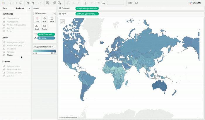
This clustering feature can be used in data visualization you like starting from text tables to scatter plots to even maps. If you want to use the clustering feature in your sheet, then all you need to do is simply drag Clustering from the Analytics pane into the view. In order to check how different inputs change the clustering results, you can test them out by dragging them in and out of the dialog to see the output in real time.
Another great feature of Tableau is that it also recommends the number of splits in data which acts very handy when one is exploring their data set to determine if there are groupings. One can also specify the number of clusters that they would like to get. For instance, if one is working on analyzing which combination of products one’s customers buy, in order to find out what kind of bundle offers makes the most business sense. People may also want to split their data into a number of bundles that one is considering. This approach in a way is similar to the concept of making bins in Tableau but it can cut across multiple fields with different bin sizes.
After you have identified your data clusters you can assign them with more intuitive names that are based on the summaries for each of the cluster. Clustering results can be used in all types of visualizations like dimensions. One can also choose to manually override cluster assignments if they have knowledge of external domain that they are seeking to incorporate into the results.
The tableau 10 version makes use of k-means clustering algorithm which is based on variance partitioning methods. This ensures consistency between runs. It also allows automatic processing steps to minimize data preparation which is often necessary for this kind of analysis.
Such features also include standardization of inputs which automatically scales the data along with multiple correspondence analyses. Thus, you can work with many different types of data with the least of preparations.
We at DexLab Analytics are thrilled to bring you to these new features and would love to spread analytics literacy amongst ambitious youth of the country. Join our Tableau certification courses and see endless possibilities unwind towards success.
Interested in a career in Data Analyst?
To learn more about Data Analyst with Advanced excel course – click here.
To learn more about Data Analyst with SAS Course – click here.
To learn more about Data Analyst with R Course – click here.
To learn more about Big Data Course – click here.
data visualization, Tableau BI Certification, tableau certification