tableau training institute Archives - DexLab Analytics | Big Data Hadoop SAS R Analytics Predictive Modeling & Excel VBA

Not to Miss: The Startup India tableau at Republic Day 2020 parade

Not to Miss: The Startup India tableau at Republic Day 2020 parade

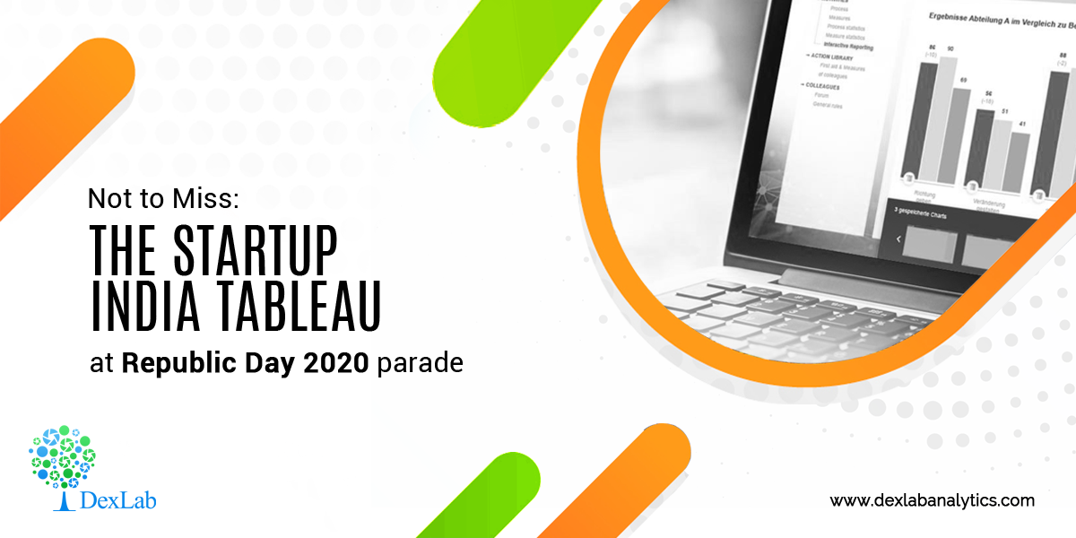
The commerce and industry ministry recently, in a written press briefing, said that it will showcase a tableau on Startup India, with an aim to promote innovation and entrepreneurship in the nation. The tableau will be displayed at the Republic Day Parade this year, in a first.

The name of the tableau is ‘Startups: Reach for the Sky’. It is themed on the stages of the life-cycle of a startup and the multifarious elements of support provided by the government, the ministry said in a press statement.

“The front of the tableau depicts a creative mind, full of ideas to solve real world problems. The Startup India Tree, in the middle will represent different kinds of support given,” a government official from the Department of Promotion of Industry & Internal Trade (DPIIT), said in the statement.

The staircase will stand for the various stages of growth – those are – coming up with a concept, creating a prototype, preparing a business plan, building a team, launching into markets and eventually scaling up, an Economic Times report said.

The wheel will denote sectors of economy where Indians have driven and given a fillip to economic growth and created employment opportunities on a big scale, the statement read. The wheel and the map of India together depict the width and the depth of the Startup India movement in the country.

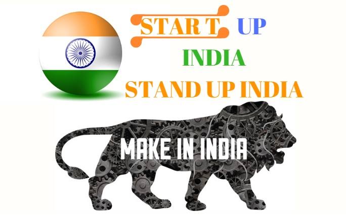
Startup India is a flagship initiative of the Narendra Modi government, conceived with the intention of building a strong environment to nurture innovation, drive sustainable economic growth and generate large scale employment opportunities and job openings.

“We have a million problems, but at the same time we have over a billion minds,” Prime Minister Narendra Modi had said about the flagship programme started in January, 2016. In October, 2019 Prime Minister Narendra Modi said that the Indian startup ecosystem will help India achieve the $5 trillion target for the economy set by the government.  

The objective is to inspire and motivate youth to follow their dreams to generate wealth and become job creators and not just job seekers. Under the Startup India Scheme, eligible companies can get recognised as startups by the ministry in order to access a host of tax benefits, easier compliance, IPR fast tracking and other incentives.

More than 26,000 startups from 551 districts of 28 States and 7 Union Territories have been recognized so far. “Working across IT, Industry 4.0, education, healthcare, agriculture, energy, finance, space, defence and all other sectors of economy, Indian startups have attracted substantial global investments and created more than 2,91,000 jobs,” it added.

Besides DPIIT, the Department of Financial Services, Department of Drinking Water and Sanitation, NDRF Ministry of Home Affairs, CPWD Ministry of Housing and Urban Affairs, and Ministry of Shipping will also participate in the Republic Day parade.


Interested in a career in Data Analyst?

To learn more about Data Analyst with Advanced excel course – Enrol Now.
To learn more about Data Analyst with R Course – Enrol Now.
To learn more about Big Data Course – Enrol Now.

To learn more about Machine Learning Using Python and Spark – Enrol Now.
To learn more about Data Analyst with SAS Course – Enrol Now.
To learn more about Data Analyst with Apache Spark Course – Enrol Now.
To learn more about Data Analyst with Market Risk Analytics and Modelling Course – Enrol Now.

Why Tableau Is the Best Data Visualization Tool for Industries Worldwide?

Why Tableau Is the Best Data Visualization Tool for Industries Worldwide?

There are several data visualization tools available in the market but Tableau is the most popular and effective. Most of the key players from the BI industry depend on this software for transforming raw data into an easy-to-understand format.

What Makes Tableau So Popular?

Tableau is frequently used as a tool that helps to analyze data quickly and creates visualizations for worksheets and dashboards. It lets users design dashboards that generate actionable insights and takes businesses to new heights. Below, we’ve rounded up top 4 reasons why businesses rely on Tableau:

Amazing Visualizations

Tableau allows you to work with more unordered data and develop stunning visualization: courtesy an array of in-built features. You can also achieve superb context, different ways of drilling meaningful data and understand data in minutes.

Data Science Machine Learning Certification

Detailed Insights

The best thing about this visualization tool is that it lets you analyze future data; you can do that while observing data from several angles and approaches. Plus, you can frame hypothetical queries and work on that data correspondingly – possible only because of the feature of adding elements for comparison and analysis and ‘what-if’ visualizations!

Simple Approach

Being user-friendly is one of the major strengths of Tableau. Thanks to this feature, users with no coding or technical knowledge can use Tableau easily. Since most of the features are in a drag-and-drop format, any newbie can work on Tableau without possessing a prior set of skills.

DexLab Analytics is one of the most popular Tableau training institutes in Delhi. Take a look at their offerings.

Works With Various Data Sources

This is what makes Tableau an absolute essential for business houses! In Tableau, data can be taken from anywhere irrespective of its sources. This feature makes it powerful as compared to other BI and Analytics tools. It lets you connect diverse data sources, cloud files, spreadsheet data, big data, data warehouses and various other types of data, including non-relational ones. The software can blend any kind of data to create amazing visualizations that are bound to garner admiration.

Are You Ready?

As of endnotes, a large number of Fortune Global 500 companies prefer Tableau over other data visualization tools. And why not! It is user-friendly and can solve complex business problems and prepare phenomenal visualizations within minutes.  

If you are interested in pursuing a business intelligence career, check out Tableau Certification Delhi. Such certification course will push your career to new heights. It will be a good start for your analytics career and you will get better opportunities to succeed.

Enroll now: <www.dexlabanalytics.com/courses/tableau-bi-visualization-certification>
 
The blog has been sourced from: www.knowledgehut.com/blog/business-intelligence-and-visualization/why-tableau-is-so-popular
 

Interested in a career in Data Analyst?

To learn more about Data Analyst with Advanced excel course – Enrol Now.
To learn more about Data Analyst with R Course – Enrol Now.
To learn more about Big Data Course – Enrol Now.

To learn more about Machine Learning Using Python and Spark – Enrol Now.
To learn more about Data Analyst with SAS Course – Enrol Now.
To learn more about Data Analyst with Apache Spark Course – Enrol Now.
To learn more about Data Analyst with Market Risk Analytics and Modelling Course – Enrol Now.

Know the Difference between Alteryx and Tableau

Know the Difference between Alteryx and Tableau

Alteryx and Tableau are two leading software products in the realm of data science with broad application. Both are pivotal in the analysis of data and obtaining important insights. But what is the specific role of each product in an enterprise? Are the products complementary or incompatible? Will using them jointly enhance performance? Read on to find out.

Function of Alteryx:

In general, data preparation takes up a major portion of an analyst’s time. Before the data can be analyzed, it needs to be prepped, which involves many humdrum tasks such as combining data sources together and changing the format of data. This process of readying the data in a format appropriate for analysis is called ETL, short for Extract, Transform and Load.

Alteryx is a top software product for simplifying the ETL process. It offers a large array of tools for handling data. From importing data from various sources to getting it ready for analysis work, Alteryx provides a tool for every task. After modifying the data, you can use Alteryx tools with advanced statistical capabilities to perform sophisticated analyses, like predictive analytics and time series forecasting.

For top rated Alteryx certification training in Delhi, get in touch with DexLab Analytics.

Function of Tableau:

Tableau is renowned as a useful data visualization tool, performing a distinct role in the world of data analytics.  Tableau helps transform data into charts and dashboards, revealing useful insights contained in the data. High-quality charts can be created with Tableau, which in turn leave an impactful impression on the audience.

Combination of the Two Tools:

Tableau and Alteryx complement each other really well. Alteryx comes in very handy in converting data into operable format, but it has limited capacity to display data before an audience. Tableau effectively fills this void. On the other hand, Tableau is unparalleled at data visualization, but is lacking in the field of data preparation, especially areas requiring advanced analytics. Hence, the combination of the two tools adds value to the overall task.

In a nutshell, Alteryx simplifies the tedious preparation process of data analysis and Tableau makes the explanatory part of analysis more enjoyable.

Who works with these products?

A good thing about Alteryx and Tableau is that they are user-friendly and hence, don’t demand advanced technical expertise. They contain easy-to-use drag and drop interfaces. So, data analysts with different levels of skill and experience are comfortable working with these tools.

However, these two software products are market leaders and that reflects in their cost. They are quite pricey and can be afforded only by companies greater than the average ones. It makes sense; because these companies generally work huge volumes of data and have the financial power to afford high-level analytics tools like these.

For companies with smaller budgets, Power BI can be an alternative to Tableau, but its functionality will not be at par with Tableau. In case of Alteryx, there isn’t a clear alternative. R and Python are typically used by businesses, but these are coding languages demanding high levels of skill.

2

Concluding Note:

Alteryx and Tableau are both leading products in the analytics industry, the former deals with data preparation whereas the latter deals with visualization. Together they boost up business operations. Affordability might be an issue for many organizations, but if you’re looking for the best products in the market, you cannot go wrong with Alteryx and Tableau.

Looking for ways to upskill and get a hefty pay hike in your analytics career? Check out the courses offered by DexLab Analytics. The faculty, comprising industry experts, provides professional certification courses in a number of key areas, like Tableau, credit risk modeling and more!

Reference: blog.kubicle.com/what-is-the-difference-between-alteryx-and-tableau


Interested in a career in Data Analyst?

To learn more about Data Analyst with Advanced excel course – Enrol Now.
To learn more about Data Analyst with R Course – Enrol Now.
To learn more about Big Data Course – Enrol Now.

To learn more about Machine Learning Using Python and Spark – Enrol Now.
To learn more about Data Analyst with SAS Course – Enrol Now.
To learn more about Data Analyst with Apache Spark Course – Enrol Now.
To learn more about Data Analyst with Market Risk Analytics and Modelling Course – Enrol Now.

Importance of MIS in Business

Importance of MIS in Business

Today’s corporate world is dynamic. Ever-evolving technologies and daily upgrades drive business organizations to fulfill goals and objectives. They also involve substantial risks and uncertainties. These challenges urge businesses to take crucial decisions that end up determining their future success. Since the primary objective of any organization is to improve their profit ratio and flourish in the long run.

This is why businesses can’t ignore the significance of MIS – Management Information System

Define MIS

MIS is a comprehensive set of processes that offers critical data and information to the management so as to enhance informed decision-making. It involves:

  • Gathering apt data from numerous reliable sources
  • Processing of those data to derive meaningful, relevant information
  • Furnishing this essential information to the respective department

What Makes MIS Reports so Important to Boost Business Decision-making?

MIS Reports are prepared after careful analysis of existing data and observing on-going trends prevalent in the industry. They play a key role in improving productivity, performance and profitability of any enterprise. No wonder, it’s extremely important for the administration to lay hands on reliable data in sync with the latest trends to make quick, informed decisions.

As a result, MIS Reporting System is regarded as the bedrock of company operations, and it aids the company to stand out against its tailing rivals.

2

Advantages of MIS

Efficient Data Management

MIS is widely favored for managing essential business data to aid in complex decision-making. The high on significance kind of information is stored in an efficient way and can be easily accessed by the administration anytime anywhere.

Trend Analysis

Management in any organization needs to prepare a presentation for strategic planning and tabulate future goals. In order to create such advanced strategies, they need to possess accurate reports clearing in accordance with prevailing market situations. MIS uses numerous mathematical tools that would analyze current market trends and precisely predict future trends based on such details.

MIS Sets Future Goals

Be it a finance firm, an MNC, a healthcare institute – setting up a goal matters a lot. It requires ample research and development. The information derived from MIS Reports is held veritable and is mostly used to determine company goal. Also, MIS requires current market trend analysis and future industry forecasts. Thus, it won’t be prudent enough to ignore MIS and reporting.

Improved Efficiency

The appropriate information collected by MIS helps in formulating improved goals and top notch strategies for the company. Also, the performance can be easily gauged with the help MIS Reports. Undeniably, MS plays a crucial role in enhancing the efficiency of the organization.

Compare and Contrast

MIS database is encompassing and can be accessed anytime. Management professionals can anytime go through the MIS reports and compare and contrast its present business performance with that of previous years’. Often this helps in measuring company’s growth prospects and if it’s on the right track towards success.

In a concluding note, we would recommend Best MIS Training in Gurgaon; DexLab Analytics is a sure bet when it comes to the best MIS training institute in Delhi. With skilled experts in the team, the institute is one stop shop for all things data analytics.

 
The blog has been sourced from  ― aristotleconsultancy.com/blog/mis-important-businesses
 

Interested in a career in Data Analyst?

To learn more about Data Analyst with Advanced excel course – Enrol Now.
To learn more about Data Analyst with R Course – Enrol Now.
To learn more about Big Data Course – Enrol Now.

To learn more about Machine Learning Using Python and Spark – Enrol Now.
To learn more about Data Analyst with SAS Course – Enrol Now.
To learn more about Data Analyst with Apache Spark Course – Enrol Now.
To learn more about Data Analyst with Market Risk Analytics and Modelling Course – Enrol Now.

Manage Information Systems: Its Challenges and Recommended Solutions

Manage Information Systems: Its Challenges and Recommended Solutions

The scope and capabilities of today’s CFO have extended well beyond the norms of conventional financial management more into strategic domains of business. The new improved job responsibilities make it important for CFOs to derive meaningful data that would sustain and cultivate strategic business initiatives.

However, the real challenge is to find the right data at the right time and in the right format. Traditional MIS systems that are used for expense and revenue reporting have always been laden with inconsistency, inaccuracy and unreserved intricacy.

The manner in which data is collected, kept, assembled and presented to CFOs is complex and unfit for decision-making. For CFOs and finance teams, data management is a very challenging job which takes a lot of time, effort and expertise. But, why?

Aggregate data is extracted from the conventional MIS system

If you look into any organization, product or department heads are allotted given budgets at the beginning of every month or quarter – and their monthly performance is ascertained against this budget. Canned reports issued by the finance departments are studied to gauge employee’s individual performance against budgets.

Based on the data report, corrective measures are taken, cost overruns are eliminated and budget efficiency is maximized. But, what if there exist deviations in data?

2

Aggregate data can never determine the cause of budget deviations

In the General Ledger report, you get to scour through aggregate data for spending vs. budget, but it doesn’t contain explicit transactional details that are required for investigating the root causes that trickles budget deviation or any unexpected increase in a specific expense bracket.

Different teams manage and store data in multiple systems

Transactional data found in the GL summary report is derived from numerous systems, such as Accounts Payable, HRM & Payroll and Inventory Management – each one of them is managed by distinct teams.

Sometimes, professionals not belonging from financial departments can be asked to extract meaningful insights from these data.

Obviously, all this makes the task more complex and challenging. No wonder, it takes a lot of time and effort to solve such intricate issues.

The Solutions

  • Replace the traditional GL system with the cutting edge ERP or a bunch of accounting software.
  • Adopt a self-service management system that might be heavy on cost but productive. It would give the CFOs the analytics they are looking for without disrupting their existing GL.

In this regard, Best MIS Training in Gurgaon offered by DexLab Analytics is the best bet. Our robust MIS system gives you gain access to the right data in a format you prefer.

Remember, if your enterprise is facing any of the above challenges, you should definitely look for a better MIS to tackle your business expenditure and make things right. We, being one of the best MIS training institutes in Gurgaon would love to help you out!


The blog has been sourced from  

www.happay.in/blog/3-challenges-of-legacy-mis-and-ways-to-overcome-them


Interested in a career in Data Analyst?

To learn more about Data Analyst with Advanced excel course – Enrol Now.
To learn more about Data Analyst with R Course – Enrol Now.
To learn more about Big Data Course – Enrol Now.

To learn more about Machine Learning Using Python and Spark – Enrol Now.
To learn more about Data Analyst with SAS Course – Enrol Now.
To learn more about Data Analyst with Apache Spark Course – Enrol Now.
To learn more about Data Analyst with Market Risk Analytics and Modelling Course – Enrol Now.

Top 3 Data Visualization Tools Trending Now

Top 3 Data Visualization Tools Trending Now

The wave of digital transformation is ravaging all industry verticals. Big Data coupled with AI and ML is driving the force, with data being at the bull’s eye.

But, what if we say most of the data in the world is hardly used? What if it becomes a hefty liability? Yes, data can become a liability if we fail to understand it properly. For that, we’ve data visualization – it’s the best way to present your data to the world in order to gain meaningful insights.

Fortunately, data visualization is evolving rapidly. Charts, graphs, infographics, videos and AR/VR presentations have taken the channels of communication to an entirely different level. In this blog, we’ve compiled tip 3 most popular and effective data visualization tools – they are easy to use, do their job well and highly compatible with major software and programming languages. However, they are all paid, although they offer free-trials.

Tableau

With a huge customer base of 57000+accounts spread across diverse industry verticals, Tableau is the father of data visualization software and for the right reasons! Along with having the ability to generate interactive visualizations, Tableau is relatively easy to use and offers more than generic BI solutions.

Tableau is ideal for handling vast and fast-changing datasets that are used mainly for Big Data operations, such as ML applications and AI implementations. Developers and data scientists look up to Tableau as it integrates seamlessly with high-end database solutions, including My SQL, Hadoop, SAP, Amazon AWS and Teradata. Also, a wide number of third-party resources online are on offer plus a powerful community to aid and assist new users about how to integrate the tool seamlessly with their projects.

Interested in arming yourself with the skills of Tableau? Worry not; DexLab Analytics is a top-notch Tableau training institute in the heart of Delhi excelling in many other in-demand skill training courses.

Plotly

For highly advanced and complex data visualizations, Plotly is the key. All thanks to how well it homogenizes with cutting-edge programming languages, such as Matlab, Python and R! All of them being extremely analytics oriented.

Developed above the open source d3.js visualization libraries for JavaScript, this high-valued commercial package is extremely user-friendly, along with providing inbuilt support for APIs, like Salesforce.

Data Science Machine Learning Certification

QlikView

Touted as the biggest rival of Tableau, QlikView boasts of 40000 clients’ accounts across 100 countries. It is one of the most terrific players in the space of data visualization, and why not?! The customers who have used it have lauded QlikView because of its customized setup and versatile range of functionalities. However, this could also mean it takes some time to be familiar with entirely and then only it can be leveraged to its full potential.

Along with providing superior data viz capabilities, the tool excels in some of the best BI and analytics reporting capabilities. It’s simple, effective and non-clumsy user interface scores extra brownie points. Interestingly, customers use it in collaboration with its sister package, QlikSense – it manages data discovery and exploration to derive maximum benefits.

For more information on Tableau BI training courses, drop by DexLab Analytics! They are experts in everything DATA!


The blog has been sourced from:

www.forbes.com/sites/bernardmarr/2017/07/20/the-7-best-data-visualization-tools-in-2017/#6fdf13cf6c30


.

Most Popular Tableau Interview Questions with Answers to Learn Right Now

Most Popular Tableau Interview Questions with Answers to Learn Right Now

Tableau is dominating the business intelligence industry. It’s a powerful and fastest growing data viz tool used to simplify complicated raw data. It helps break the data into easy-to comprehend formats.

In this blog, we’ve compiled down the most popular Tableau Interview questions with their answers. The sample questions are framed by seasoned experts, who have encompassing knowledge on the subject matter – they have taken needed care and effort to help you get the correct answers. This will help you on your endeavor of job hunting!

2

Mention top 5 main products offered by Tableau.

Tableau specializes in these 5 products – Tableau Server, Tableau Desktop, Tableau Reader, Tableau Online and Tableau Public.

Name the latest version of Tableau Desktop.

Tableau Desktop Version 10.5.

Explain data visualization, and the use of Tableau.

Data visualization is an umbrella term referring to a set of well-defined techniques used for data communication through proper presentation and graphics (such as bars, diagrams, lines or points).

Tableau helps analyze data in an on-premise database, a cloud application, a normal database, a data warehouse or an Excel file – create interesting representations of data and share with your colleagues, friends and clients. You can also use Tableau to include other data too, and help keep your data up-to-date regularly.

Define filters. How many types of filters exist in Tableau?

In Tableau, there are several ways to filter and restrict your data – the outcome may be oriented towards improving performance, helping viewer get the right information or for highlighting something critical.

Three types of filters are as follows:

  • Context Filter
  • Quick Filter
  • Datasource Filter

Do you know how to remove all options from a Tableau auto-filter?

  1. Right click filter
  2. Customize
  3. Uncheck show all option

Why Tableau Extract is better over live connection?

Tableau Extract is easy to use, anywhere, anytime. For this, you don’t need any connection and can construct your own visualizations without connecting yourself with any database.

How many tables can you join in Tableau at the most?

Up to 32 tables can be joined in Tableau, but not more than that.

Define dimensions and facts.

To put simply, dimensions denotes text columns, while facts refer to measures, meaning numerical values.

Examples of dimensions – product name, city

Examples of facts – profit or sales

Highlight the difference between heat map and tree map.

Well, a heat map is an ideal method for comparing groups using size and color. Here, you can easily compare two distinct measures. On the other hand, a tree map is one of the most robust visualization, especially for graphically representing hierarchical data. 

For more in-depth knowledge on Tableau and its related applications, we recommend good Tableau training institutes in Delhi. Tableau certification Delhi is gaining a lot of prominence amidst the data analytics circuit. Hope this helps build a fine career for you!


The blog has been sourced fromintellipaat.com/interview-question/tableau-interview-questions


Interested in a career in Data Analyst?

To learn more about Data Analyst with Advanced excel course – Enrol Now.
To learn more about Data Analyst with R Course – Enrol Now.
To learn more about Big Data Course – Enrol Now.

To learn more about Machine Learning Using Python and Spark – Enrol Now.
To learn more about Data Analyst with SAS Course – Enrol Now.
To learn more about Data Analyst with Apache Spark Course – Enrol Now.
To learn more about Data Analyst with Market Risk Analytics and Modelling Course – Enrol Now.

DexLab Analytics’ AUGUST OFFER: Everything You Need to Know Of

DexLab Analytics’ AUGUST OFFER: Everything You Need to Know Of

We are happy to announce that we’re rolling some good news your way – DexLab Analytics is all set to launch exhaustive modules in Deep Learning with AI starting with Artificial Neural Networks using Python, MS Excel, Dashboards, VBA Macros, Tableau BI, Visualization and Python Spark for Big Data from September 1, 2018. The course modules are on in-demand skills and they are taking the world quite by a storm.

DexLab Analytics’ AUGUST OFFER

Big data, data science and artificial intelligence are buzz words these days. More and more people are coming forward and showing keen interest on these nuanced notions that solves real-world problems. This is why we didn’t want to fall behind. We understand the importance of data in this digitized world, and accordingly have chalked out our intensive industry-ready courses.

Deep Learning and AI starting with Artificial Neural Networks using Python course module is a 30-hour long training program that gives exposure to MLP, CNN, RNN, LSTM, Theano, TensorFlow and Keras. It includes more than 8 projects out of which a couple of focuses on development of models in to Image and Text recognition. MS Excel, Dashboards and VBA Macros certification is curated by the expert consultants after combining industry expertise with academician’s knowledge. The course duration is in total of 24 hours and is conducted by seasoned professionals with more than 8 years of industry experience specific to this budding field of science.

DexLab Analytics’ August Offer is On Machine Learning & AI

DexLab Analytics’ August Offer is On Machine Learning & AI

Next, we have30-hour hands-on classroom training on Tableau BI & Visualization certification, which teaches young minds how graphical representation of data unlocks company future trends and take quicker decisions. Tableau is one of the fastest evolving BI and data visualization tool. With that in mind, we offer a learning path to all you students by framing a structured approach coupled with easy learning methodology and course curriculum.  

DexLab Analytics Offers MS Excel, Dashboards and VBA Macros Certification!

DexLab Analytics Offers MS Excel, Dashboards and VBA Macros Certification!

Lastly, our Big Data with PySpark certification is another gem in the learner’s cap: the Spark Python API (PySpark) exposes users to the Spark Programming model with Python. Apache Spark is an open source and is touted as a significant big data framework for pivoting your tasks in a cluster. The main objective of this course is to teach budding programmers how to write python code using map-reduce programming model. The 40-hours hands-on classroom training will talk about Big Data, overview of Hadoop, Python, Apache Spark, Kafka, PySpark and Machine Learning.

Now, first 12 students who happen to register for each course on or before 30th August, 2018 will get alluring discount offer on the total course fee. Interesting, isn’t it? So, what are you waiting for? Go, grab all the details about AUGUST OFFER: to register, call us at +91 9315 725 902 / +91 124 450 2444 or hit the link below – www.dexlabanalytics.com/contact


Interested in a career in Data Analyst?

To learn more about Data Analyst with Advanced excel course – Enrol Now.
To learn more about Data Analyst with R Course – Enrol Now.
To learn more about Big Data Course – Enrol Now.

To learn more about Machine Learning Using Python and Spark – Enrol Now.
To learn more about Data Analyst with SAS Course – Enrol Now.
To learn more about Data Analyst with Apache Spark Course – Enrol Now.
To learn more about Data Analyst with Market Risk Analytics and Modelling Course – Enrol Now.

Step-by-Step Guide on Calculated Fields-String Functions in Tableau

Step-by-Step Guide on Calculated Fields-String Functions in Tableau

This blog is an easy-to-read article on String Functions in Tableau’s Calculated Field. Previously, we have covered many other functions in Calculated Fields, like Logical Functions, Date Function and Aggregate Functions. These step-by-step articles are meant for beginners who wish to be well acquainted with functions in Tableau. In fact, these blogs are great for all Tableau enthusiasts who want to explore the numerous amazing features available in Tableau.

So, let’s begin exploring String Functions.

Firstly, get to the Calculated Field window following the steps explained in the previous blog posts. Next, select the option ‘’String’’ from the Functions drop-down menu to view all the string functions.

ASCII Function

ASCII(string)

This function is used to return the ASCII code for the first character in a string. Example:

CHAR Function

CHAR(integer)

This function works in the reverse of ASCII function. CHAR function is used to change an integer ASCII code to a character. Example:

CONTAINS Function

CONTAINS(string, substring)

The CONTAINS function gives back the value TRUE if a string contains a specific substring and FALSE if it doesn’t contain it. Example:

ENDSWITH Function

ENDSWITH(string, substring)

This works in a similar way to the function described above. The function is used to indicate if a string ends with a selected substring or not, returning either TRUE or FALSE. Example:

FIND Function

FIND(string, substring, [start])

The FIND function is used to get the starting position of a substring within a string. The first character of the string is position 1. In case the substring is not located, then it returns the value 0. Example:

If the start argument is defined, any instance of the substring appearing before the start shall be ignored. Here’s an example:

ISDATE Function

ISDATE(string)

This function performs a logical test and is also included in the set of logical functions and date functions. It is used to test a string and determine if it is a valid date or not. Example:

LEFT Function

LEFT(string, num_chars)

A number is specified and using that this function returns the characters in the string. Example:

Incase start_of_week is excluded then it is determined based on the data source.

LEN Function

LEN(string)

This is the length function that is used to return the number of characters in a given string field. Example:

LOWER Function

LOWER(string)

This function is used to convert each and every character in a given string into lower case letters. Example:

LTRIM Function

LTRIM(string)

This function is used to remove spaces at the beginning of a string. Example:

MAX Function

MAX(a, b)

The Max function is included in many categories of functions. When used as a string function, the MAX function gives back the value that is highest in the sort sequence, which is defined by the database for that field’s column. If the field is NULL, then the function returns the value NULL. Example:

MID Function

MID(string, start, [length])

The MID function is used for obtaining characters from the middle of a text string. The start argument states the beginning of the returned value and the length argument gives the number of characters that is to be returned. In case the length isn’t included, then all the characters from the start position is considered. The first character in a string position is 1. Example:

MIN Function

MIN(a, b)

Works similary as the MAX function; the MIN function returns the minimum between a and b. Both must be of identical data type. With strings, the MIN function returns the lower value as per the sort sequence defined in the database. In case either of the argument is null, the function returns the value NULL. Example:

REPLACE Function

REPLACE(string, substring, replacement)

This function finds the occurrence of substring in a string and replaces them with the replacement string. If the substring cannot be located in the string then there’s no replacement. Example:

RIGHT Function

RIGHT(string, num_chars)

This works in reverse of the LEFT function. It gives back the characters starting at the end of a given string. And the amount of characters is determined by the argument giving the number of characters. Example:

RTRIM Functon

RTRIM(string)

This is similar to the LTRIM function and removes trailing spaces at the end of a string. Example:

SPACE Function

SPACE(number)

The SPACE function returns a string of spaces and the number of spaces is mentioned in the number argument. Example:

STARTSWITH Function

STARTSWITH(string, substring)

This works in reverse of the ENDSWITH function and returns TRUE or FALSE depending on whether a string starts with the given substring or not. Example:

TRIM Function

TRIM(string)

The TRIM function removes any leading or trailing spaces in a particular string. Example:

UPPER Function

UPPER(string)

The last function in the list of string function- the UPPER function works in reverse of the LOWER function. It is used to convert all the characters in the string to uppercase characters. Example:

This brings us to an end of the String functions. If you want to learn about the other functions in calculated fields then you must follow DexLab Analytics and check back for our previous blog posts.

This is the concluding blog of the blog series on Tableau’s Calculated Field functions. If you want to learn more about Tableau’s fantastic features then enroll for Tableau BI training courses. We offer professional Tableau certification in Delhi.

 
This article has been sourced from:
https://www.interworks.com/blog/ccapitula/2015/04/22/tableau-essentials-calculated-fields-string-functions
 

Interested in a career in Data Analyst?

To learn more about Data Analyst with Advanced excel course – Enrol Now.
To learn more about Data Analyst with R Course – Enrol Now.
To learn more about Big Data Course – Enrol Now.

To learn more about Machine Learning Using Python and Spark – Enrol Now.
To learn more about Data Analyst with SAS Course – Enrol Now.
To learn more about Data Analyst with Apache Spark Course – Enrol Now.
To learn more about Data Analyst with Market Risk Analytics and Modelling Course – Enrol Now.

Call us to know more