Tableau Interview questions Archives - DexLab Analytics | Big Data Hadoop SAS R Analytics Predictive Modeling & Excel VBA

Most Popular Tableau Interview Questions with Answers to Learn Right Now

Most Popular Tableau Interview Questions with Answers to Learn Right Now

Tableau is dominating the business intelligence industry. It’s a powerful and fastest growing data viz tool used to simplify complicated raw data. It helps break the data into easy-to comprehend formats.

In this blog, we’ve compiled down the most popular Tableau Interview questions with their answers. The sample questions are framed by seasoned experts, who have encompassing knowledge on the subject matter – they have taken needed care and effort to help you get the correct answers. This will help you on your endeavor of job hunting!

2

Mention top 5 main products offered by Tableau.

Tableau specializes in these 5 products – Tableau Server, Tableau Desktop, Tableau Reader, Tableau Online and Tableau Public.

Name the latest version of Tableau Desktop.

Tableau Desktop Version 10.5.

Explain data visualization, and the use of Tableau.

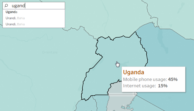
Data visualization is an umbrella term referring to a set of well-defined techniques used for data communication through proper presentation and graphics (such as bars, diagrams, lines or points).

Tableau helps analyze data in an on-premise database, a cloud application, a normal database, a data warehouse or an Excel file – create interesting representations of data and share with your colleagues, friends and clients. You can also use Tableau to include other data too, and help keep your data up-to-date regularly.

Define filters. How many types of filters exist in Tableau?

In Tableau, there are several ways to filter and restrict your data – the outcome may be oriented towards improving performance, helping viewer get the right information or for highlighting something critical.

Three types of filters are as follows:

  • Context Filter
  • Quick Filter
  • Datasource Filter

Do you know how to remove all options from a Tableau auto-filter?

  1. Right click filter
  2. Customize
  3. Uncheck show all option

Why Tableau Extract is better over live connection?

Tableau Extract is easy to use, anywhere, anytime. For this, you don’t need any connection and can construct your own visualizations without connecting yourself with any database.

How many tables can you join in Tableau at the most?

Up to 32 tables can be joined in Tableau, but not more than that.

Define dimensions and facts.

To put simply, dimensions denotes text columns, while facts refer to measures, meaning numerical values.

Examples of dimensions – product name, city

Examples of facts – profit or sales

Highlight the difference between heat map and tree map.

Well, a heat map is an ideal method for comparing groups using size and color. Here, you can easily compare two distinct measures. On the other hand, a tree map is one of the most robust visualization, especially for graphically representing hierarchical data. 

For more in-depth knowledge on Tableau and its related applications, we recommend good Tableau training institutes in Delhi. Tableau certification Delhi is gaining a lot of prominence amidst the data analytics circuit. Hope this helps build a fine career for you!


The blog has been sourced fromintellipaat.com/interview-question/tableau-interview-questions


Interested in a career in Data Analyst?

To learn more about Data Analyst with Advanced excel course – Enrol Now.
To learn more about Data Analyst with R Course – Enrol Now.
To learn more about Big Data Course – Enrol Now.

To learn more about Machine Learning Using Python and Spark – Enrol Now.
To learn more about Data Analyst with SAS Course – Enrol Now.
To learn more about Data Analyst with Apache Spark Course – Enrol Now.
To learn more about Data Analyst with Market Risk Analytics and Modelling Course – Enrol Now.

Maps in Tableau: Key to Answer Data Questions

Maps in Tableau: Key to Answer Data Questions

For creating brilliant data visualization, first you need to know which visual chart type would be ideal for the data story you want to tell. In this post, we will explore maps in Tableau, when and where they seem to be appropriate for particular data visualization, and how to make them more productive. If you want to use a map, make sure you know the reason why.

Maps help you attain, authenticate, or communicate spatial patterns with data. With these maps, you should start your presentation with a spatial question. This spatial question ensures that your map will perfectly find you an answer in the best way possible.


For example, answer this question using a data map:

Which country in the US suffers from the highest obesity rate?

1_rss

How much time did it take to answer that question? Did you quickly find the actual location without fuddling too much over the darker-colored country? I guess not. However, this map might not be the best path to answer this spatial question.

Now, let’s use the bar chart below to answer the same question.


It is easier to discover the answer here.

By combining the map and bar chart together, the answer to your spatial question can easily be derived.


Basically, maps are great for answering these two types of spatial questions:

  • What is the value for a specific location or mark on the map?
  • How do patterns compare between locations, regions, or attributes?


Go through the following tips to answer these questions better.

How to determine the value for a specific location or a mark on map?

Tooltips are the perfect way to move your mouse over a mark and observe a list of all the underlying dimensions and measures present.

You can easily edit a tooltip to include both dynamic and static text.

For example, identify which of these tooltips reveals a story about earthquakes in Japan.

screen_shot_2017-06-16_at_7.47.20_am

Also, the Tooltip improves speed-to-insight because the viewers of the map can easily find individual locations they want to find.

For example, find out the internet usage percentage in Uganda.

uganda

How do patterns compare between regions, locations or attributes?

To give answer to this question with a map, you must allow a direct comparison to be established between the data, symbols and even colors.

For example, while establishing a comparison between these two sets of unemployment data, the default color encoding doesn’t add any value for making direct comparisons. The reason being: the dark red doesn’t stand for the same value in both maps.

In turn, this situation can be very confusing for users who have no idea about the details of the data.

1_rss

The best way to deal with the problem is by getting an assurance that the color ramps in both maps use the same range.

Also, you can make your date easier for comparison by adjusting the color scheme, so that different color groups exude similar semantic meaning. Semantically-resonant colors help in processing information faster.

screen_shot_2017-06-16_at_7.52.23_am

In case, you want to learn more about Tableau, check out our blogs published on DexLab Analytics. We offer state-of-the-art Tableau training courses in Delhi, for any assistance reach out to us.


Interested in a career in Data Analyst?

To learn more about Data Analyst with Advanced excel course – Enrol Now.
To learn more about Data Analyst with R Course – Enrol Now.
To learn more about Big Data Course – Enrol Now.

To learn more about Machine Learning Using Python and Spark – Enrol Now.
To learn more about Data Analyst with SAS Course – Enrol Now.
To learn more about Data Analyst with Apache Spark Course – Enrol Now.
To learn more about Data Analyst with Market Risk Analytics and Modelling Course – Enrol Now.

Are You Trying to Ace Your Tableau Interview?

Are You Trying to Ace Your Tableau Interview?

If you are looking to be hired as Tableau expert then you must be acquainted with these common interview questions and answers. These questions have been collected by the experts at DexLab Analytics who offer Tableau BI Certification training at the institute. These questions are to give you an idea of the types of questions you may be asked at an interview. Happy job hunting!

What do you understand by Data Visualization?

Data visualization is a much advanced, precise and ordered way of viewing large volumes of data. It is the way one visually represents data into graphs, charts and other illustrative aids, especially when you cannot define them textually. Through the various software applications like Tableau one can show various trends, patterns, correlations etc.

What are the main differences between a Tableau desktop and a Tableau server?

In Tableau desktop one can create workbooks for data visualizations but Tableau Servers are used to distribute the interactive workbooks or/and reports to the target audience. Users of Tableau servers can also edit and update workbooks and dashboards online on the Server but they cannot create new workbooks.

But there are limited options for editing in server as compared to desktop.

2

Differentiate between filters and parameters in Tableau.

The differences in these two features actually lie in their applications. With parameters one can allow users to insert their values, which can be integers, dates, floats, string these can be used for calculation purposes. But in filters one can only receive values which the user chooses to ‘filter by’ in the list, this cannot be used to perform calculations.

In them users can change the measures and dimensions in case of parameters but for filters this feature is not approved.

Are you interested in a Tableau training course we can help you get a head start in this much coveted career. Simply view our course details at Dexlab Analytics.

Why should you choose to learn Tableau? This infograph may help you decide better:

Are You Trying to Ace Your Tableau Interview? from Infographics


Interested in a career in Data Analyst?

To learn more about Data Analyst with Advanced excel course – Enrol Now.
To learn more about Data Analyst with R Course – Enrol Now.
To learn more about Big Data Course – Enrol Now.

To learn more about Machine Learning Using Python and Spark – Enrol Now.
To learn more about Data Analyst with SAS Course – Enrol Now.
To learn more about Data Analyst with Apache Spark Course – Enrol Now.
To learn more about Data Analyst with Market Risk Analytics and Modelling Course – Enrol Now.

Call us to know more