tableau course details Archives - Page 3 of 4 - DexLab Analytics | Big Data Hadoop SAS R Analytics Predictive Modeling & Excel VBA

The Alliance between MongoDB and Tableau Makes Visual Analysis Easier

The Alliance between MongoDB and Tableau Makes Visual Analysis Easier
 

After a volley of speculations, in 2015 the BIG revelation was made – MongoDB, the database for mammoth ideas has partnered with Tableau, the master in visual analytics to make visual analysis of rich JSON-like data structures easier directly in MongoDB. This is a fascinating telltale about a leader in modern databases for robust application development teaming with a leader in rapid-fire visual analytics to serve users’ better.


Recently, the two global tech players are again in the news – Tableau certified MongoDB’s connector for BI as a “named” connector, which means users for the first time can visually analyze rich JSON-like data structures incorporated with modern applications directly in MongoDB Enterprise Advanced. “Data is a modern software team’s greatest asset, so it needs to be easy for them to both store and visualize it in performant, flexible and scalable ways,” said Eliot Horowitz, CTO, MongoDB. He further added, “With Tableau’s certification of the MongoDB Connector for BI, executives, business analysts and data scientists can benefit from both the engineering and operational advantages of MongoDB, and the insights that Tableau’s powerful and intuitive BI platform make possible.”

Continue reading “The Alliance between MongoDB and Tableau Makes Visual Analysis Easier”

Maps in Tableau: Key to Answer Data Questions

Maps in Tableau: Key to Answer Data Questions

For creating brilliant data visualization, first you need to know which visual chart type would be ideal for the data story you want to tell. In this post, we will explore maps in Tableau, when and where they seem to be appropriate for particular data visualization, and how to make them more productive. If you want to use a map, make sure you know the reason why.

Maps help you attain, authenticate, or communicate spatial patterns with data. With these maps, you should start your presentation with a spatial question. This spatial question ensures that your map will perfectly find you an answer in the best way possible.


For example, answer this question using a data map:

Which country in the US suffers from the highest obesity rate?

1_rss

How much time did it take to answer that question? Did you quickly find the actual location without fuddling too much over the darker-colored country? I guess not. However, this map might not be the best path to answer this spatial question.

Now, let’s use the bar chart below to answer the same question.


It is easier to discover the answer here.

By combining the map and bar chart together, the answer to your spatial question can easily be derived.


Basically, maps are great for answering these two types of spatial questions:

  • What is the value for a specific location or mark on the map?
  • How do patterns compare between locations, regions, or attributes?


Go through the following tips to answer these questions better.

How to determine the value for a specific location or a mark on map?

Tooltips are the perfect way to move your mouse over a mark and observe a list of all the underlying dimensions and measures present.

You can easily edit a tooltip to include both dynamic and static text.

For example, identify which of these tooltips reveals a story about earthquakes in Japan.

screen_shot_2017-06-16_at_7.47.20_am

Also, the Tooltip improves speed-to-insight because the viewers of the map can easily find individual locations they want to find.

For example, find out the internet usage percentage in Uganda.

uganda

How do patterns compare between regions, locations or attributes?

To give answer to this question with a map, you must allow a direct comparison to be established between the data, symbols and even colors.

For example, while establishing a comparison between these two sets of unemployment data, the default color encoding doesn’t add any value for making direct comparisons. The reason being: the dark red doesn’t stand for the same value in both maps.

In turn, this situation can be very confusing for users who have no idea about the details of the data.

1_rss

The best way to deal with the problem is by getting an assurance that the color ramps in both maps use the same range.

Also, you can make your date easier for comparison by adjusting the color scheme, so that different color groups exude similar semantic meaning. Semantically-resonant colors help in processing information faster.

screen_shot_2017-06-16_at_7.52.23_am

In case, you want to learn more about Tableau, check out our blogs published on DexLab Analytics. We offer state-of-the-art Tableau training courses in Delhi, for any assistance reach out to us.


Interested in a career in Data Analyst?

To learn more about Data Analyst with Advanced excel course – Enrol Now.
To learn more about Data Analyst with R Course – Enrol Now.
To learn more about Big Data Course – Enrol Now.

To learn more about Machine Learning Using Python and Spark – Enrol Now.
To learn more about Data Analyst with SAS Course – Enrol Now.
To learn more about Data Analyst with Apache Spark Course – Enrol Now.
To learn more about Data Analyst with Market Risk Analytics and Modelling Course – Enrol Now.

Making Data Visualizations Smarter, Tableau Explains How

Making Data Visualizations Smarter, Tableau explains How

Appalling, bewildering and utterly nonsensical – data at times can look incomprehensible, especially in its raw forms. This accelerated the foundation of the data visualization company and our very own ‘business dashboard’ tool. Generally found locked within the so-called BI sphere, we can now consider these top notch graphical tools as a powerful medium of assimilating, categorizing, analyzing and then presenting data in a highly interactive and interesting form, using images and charts.

2

What images are used in a BI dashboard?

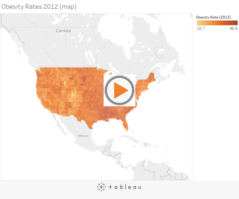
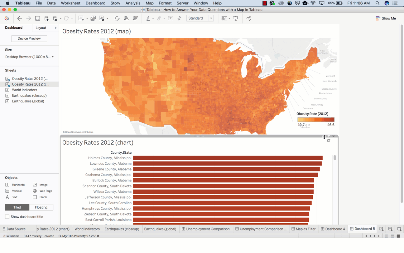
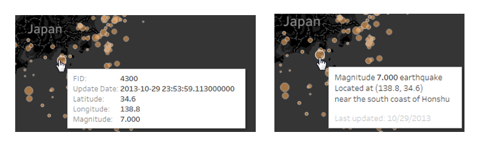
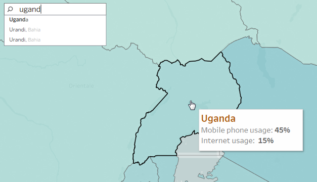
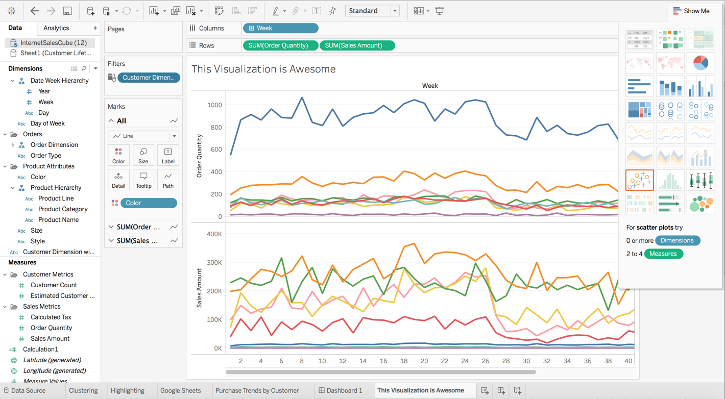
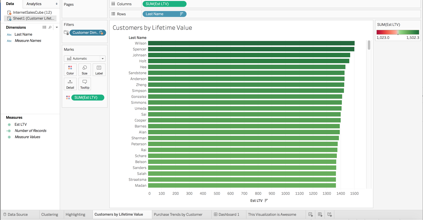
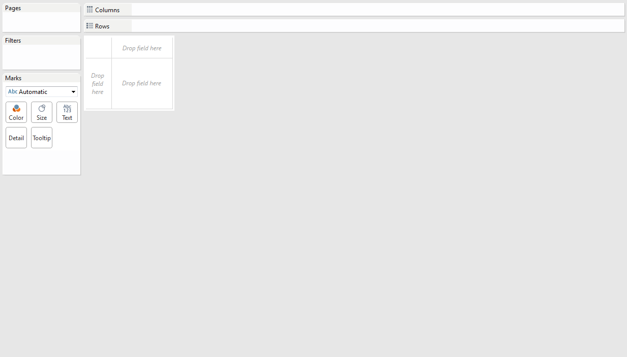
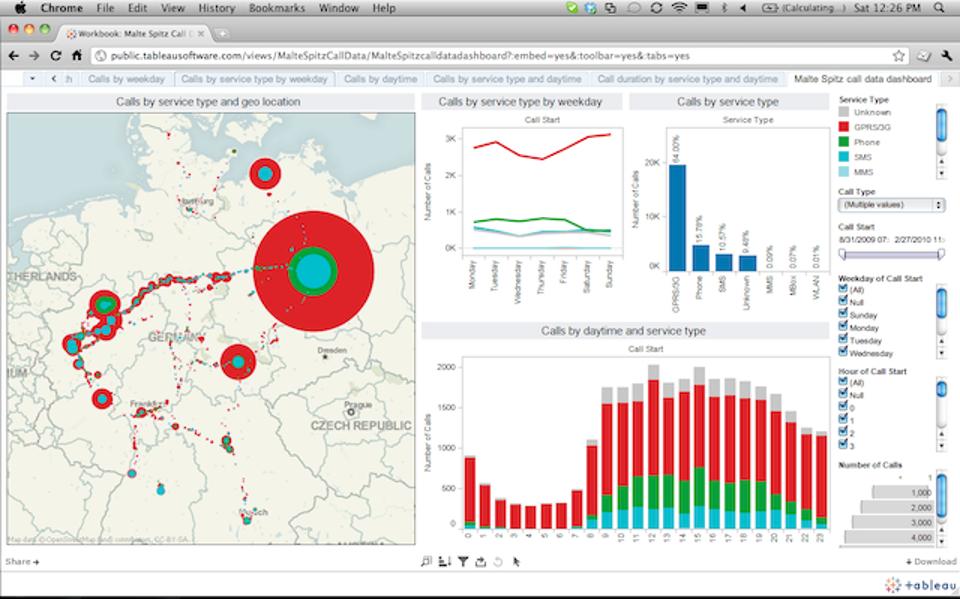
Typically, we would found scatter plots, bubble charts, heat maps, pie charts, geographical maps and of course standard tables strewn across a BI dashboard– in short, it is a real smorgasbord of visualization tools.

But a question that clogs our minds is – why do we have to use these tools? What purpose they serve? The most prominent underlying reason typically revolves around the fact that we rely more on the computing power to sail through the numbers and then feature those numbers or ‘trends’ that the human mind would have taken ages to comprehend.

From our standpoint, we humans are more comfortable with pictures than tables or numbers. Spotting a trend through visual representation makes things easier and faster as compared to their traditional counterparts.

Infusing some more intelligence

Tableau Software, a Data Visualization specialist is in its endeavour to add intelligence in its existing format by injecting new brain power in the Tableau 10.3 product release. 

Expect the following updates:

  1. Automated table and join recommendations, powered by machine learning algorithms
  2. Data driven alerts for proactive monitoring of key metrics
  3. Six new data sources are added for rapid-fire analysis

To make things easier, Tableau excels to help create data dashboard table construction USING machine learning tools – and, trust me it would be quite important as all the machine logs comes mostly from the Internet of Things (IoT).

The mechanism behind data alerts

Powered by latest data-driven alerts, users can now receive instant notifications just the moment their data crosses a pre-determined threshold, ensuring they never miss out the changes occurring within the organisation.

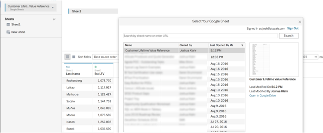
Francois Ajenstat, chief product officer at Tableau stated, “Tableau 10.3 makes it easy for teams to access data, wherever it resides. In all, customers can now connect to more than 75 data sources via 66 connectors, without any programming. That includes a new PDF connector, which allows people to directly import PDF tables into Tableau with just one click. With an Adobe estimated 2.5 trillion PDFs worldwide, this unlocks a new realm of data that can be leveraged for rich analysis.”

New improved Tableau is now equipped with new connectors to data sources, like ServiceNow, MongoDB, Amazon Athena, Dropbox and Microsoft OneDrive.

Is data visualization really a cure-all?

If you ask me, I would say NO, not necessarily. Just by adopting data visualization and BI tools, such as Penataho, SAP, Microsoft, TIBCO and others, it doesn’t mean everything will be good to go. Keep in mind, though the algorithms are gaining momentum and becoming super powerful, we humans are still better in identifying the nuances, quirks, outliers and absolutely unique one-offs.

As parting thoughts, Tableau is marvellous, but don’t forget your fundamental commands in mathematics, learnt at school. They’ll help you, for sure! Till then, wish you luck!

1648519ca6ff87be75a3618dce6b4497d

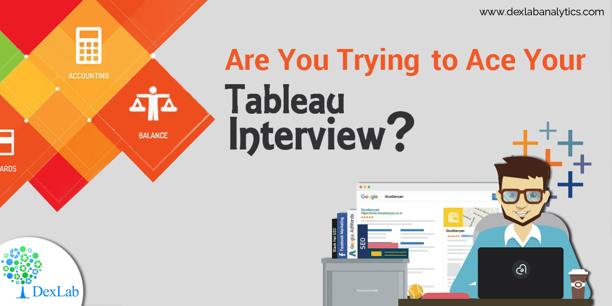
For Tableau training courses, rest your trust on DexLab Analytics. We are a reputable Tableau Training Institute, headquartered in Gurgaon, with a branch in Delhi.


Interested in a career in Data Analyst?

To learn more about Data Analyst with Advanced excel course – Enrol Now.
To learn more about Data Analyst with R Course – Enrol Now.
To learn more about Big Data Course – Enrol Now.

To learn more about Machine Learning Using Python and Spark – Enrol Now.
To learn more about Data Analyst with SAS Course – Enrol Now.
To learn more about Data Analyst with Apache Spark Course – Enrol Now.
To learn more about Data Analyst with Market Risk Analytics and Modelling Course – Enrol Now.

What Makes Tableau 10 So Desirable Among the IT Nerds

What Makes Tableau 10 So Desirable Among the IT Nerds

Your data just got better, say thanks to Tableau 10. The big data geeks have worked on both the beauty and brains of Tableau, to make the analyses easier, faster and exceptionally delightful. Tableau 10 features an exciting new look and feel, loaded with cute fonts and beautiful colours to make your viz sparkle.

We are thrilled. We have been waiting for days to gauge how some of the Tableau 10 new features will synchronise with our conventional business interface for Hadoop. We have culled out some of the best features of Tableau 10, which had made us zealous and left us buzzing. And here they are ..

An extremely visually appealing new interface

Connect the little dots to get a bigger picture. The new interface pays enough attention to minute details making the entire visualization environment pleasant and engaging.

For example: When you name a worksheet tab, the same name pops up as an inline title, blending seamlessly with the viz – now isn’t that great!

atscale1

Ten on ten to Tableau’s clustering feature

Owing to Tableau’s outstanding analytics capabilities, Tableau 10’s clustering feature is the next best thing. The feature focuses on the elements of a pool of data values and visually highlights an inconspicuous number of clusters, which is found in the data. This makes it easier for an analyst to run his eyes through the data sets they need to investigate.

Spotting the zip codes was never so easy before, come and take a look at the following video.

Tableau 10’s highlighting feature helps in finding a needle from the big data haystack

While developing interesting data visualizations, we often need to present the most comprehensive view of the data, so that the consumers get the right information they are looking for, without foraging here and there. With Tableau 10’s highlighting feature, this goal is easily achieved.

In the video shared below, we can see the weekly trend of sales and numbers of customer across the states included in the sales transaction data.

Multisource data integration and blending

By using Tableau 10, the users will be able to directly connect to data stored in Google Sheets.

Scroll down:

atscale2 (1)

Develop visual representation of the most-favoured customers, based on estimated lifetime value.

005

Once the new data source is created, you can now use the data-relationships feature to let Tableau know that the Last Name column from the Google Sheets data set is mapped to the Customer Dimension column from my AtScale big data virtual cube.

004

Soon after the above relation has been accomplished, a filter is initiated on my Purchase Trends by Ranked Customers dashboard. Watch the video, to get a clearer picture.

These are some of the slivers of what’s new in Tableau 10. Want even more? Join DexLab Analytics for intensive Tableau Certification Training. This premier data science training institute excels in data analytics certification courses. Get interesting data knowledge and Tableau insights from the veterans!


Sources: tableau.com
 

Interested in a career in Data Analyst?

To learn more about Data Analyst with Advanced excel course – Enrol Now.
To learn more about Data Analyst with R Course – Enrol Now.
To learn more about Big Data Course – Enrol Now.

To learn more about Machine Learning Using Python and Spark – Enrol Now.
To learn more about Data Analyst with SAS Course – Enrol Now.
To learn more about Data Analyst with Apache Spark Course – Enrol Now.
To learn more about Data Analyst with Market Risk Analytics and Modelling Course – Enrol Now.

Demystifying Tableau Jargons: Interact With Data like Never Before

Demystifying Tableau Jargons: Interact With Data like Never Before

Businesses are flourishing. Managerial data are in abundance. The need for efficient BI softwares is at the pinnacle. Structured BI softwares are nimble and up to the minute. Tableau is one such BI tool, which is not only simple and comprehensible, but also extremely purposeful, enough to fulfil high-end professional commitments. It works just the way you want it to, instruct it in a particular way and wait for the results, without compromising the security of various confidential data.</span

Here in this FAQ blog, we have pulled out some of the top of the line frequently asked queries, regarding Tableau and R Programming. Both are highly functional, user friendly and efficient. Scroll down to grasp the basics and decode the fundamentals of Tableau.

Also read: Most Commonly Asked Tableau Interview Questions

What is Tableau?

Tableau is one of the finest data visualization tools that empower the enterprises to represent the data in the most flawless and explicit manner. It has proved its worth by being at par with its dominant predecessors, who analysed data visually and ruled the market for long.

How Tableau is classified?

Tableau can be classified as follows:

  • Tableau Desktop
  • Tableau Server
  • Tableau Online

What makes Tableau so popular?

With superb visualizations at an affordable price, Tableau is unrivalled. It can easily connect to any database – you don’t have to plug-in and is equipped with a robust memory processing.

Also read: Power BI or Tableau? Which is Better and Why?

Can we use precompiled models, packages, etc. with Tableau and R?

The answer is YES. If you can do it with R, you can easily incorporate it with Tableau. It includes any parallel computing modules, packages, libraries and statistical packages. It also involves commercialized versions of R, including Revolution Analytics.

Also read: How to Connect Oracle BI Server with Tableau

While you integrate Tableau and R, what is the best measure to debug R scripts or discover errors?

This is a vital question. There are mainly two ways. The first way to do this is by using ‘write.csv’ command within the studied field that calls an R script. The second one considers the use of debug version of the unparalleled executable of Rserve (Rserve_d.exe), which is ideal to print out any code that R is performing, and will be called R scripts.

Also read: Are You Trying to Ace Your Tableau Interview?

Can R be used to reshape data?

Yes, R possesses the ability of reshaping data.

Can data be transferred from a relational database to R, using Tableau?

Well, yes. Tableau can transfer data from any given source and run R scripts on that particular data set, irrespective of data type – be it relational database, flat-file, cube or unstructured.

2

What is Tableau Reader?

Tableau Reader is an effective tool to open the .twbx(Tableau packaged Workbook) files. However, keep in mind, it can only open files and cannot develop new connections and workbooks.

What do you mean by Tableau Public?

Tableau Public is a fantastic tool for anyone who wants to share his interesting stories on the web with others. You will gain access to data, develop interactive data visualizations and publish them on your website for others to see. And all of this, without writing a single line of code.

As parting thoughts, if you want to make something promising out of your mundane organisational data or want to make your frantic schedule of data handling and management a bit easier and enjoyable, then surely Tableau certification Gurgaon will work wonders for you! Contact us at DexLab Analytics, the pioneering data science online learning institute. We will be happy to help you.


Interested in a career in Data Analyst?

To learn more about Machine Learning Using Python and Spark – click here.
To learn more about Data Analyst with Advanced excel course – click here.
To learn more about Data Analyst with SAS Course – click here.
To learn more about Data Analyst with R Course – click here.
To learn more about Big Data Course – click here.

Power BI or Tableau? Which is Better and Why?

Power-BI-or-Tableau--Which-is-Better--and-Why

In the present data frenzy setting, data visualization is the new Talk of the Town. Various companies are developing and launching their own data visualization tools in the market. For quite some time now, Tableau has been the pioneering data visualization platform and till date the best to consider. Tableau’s data visualization tool is unbeatable to any other emerging product in the digital community. 

Apparently, Tableau has a remarkable competitor, recently. It is the Power BI, a decisive and dynamic BI tool, brought into by Microsoft. It is catching the trend with Tableau fast and appears to be on its way to become the number one BI tool in the digital market.

tableau_dashboard

Talking about features, there is little room to establish a set of comparisons between Power BI and Tableau, as Power BI is better equipped with scintillating features. Putting it aside, Tableau comes with its own respective advantages, like high-end visualizations and superb scalability.

Is data visualization your business’ prime focus? If yes, Tableau will be the perfect solution for your venture. However, if you are on a look out for a platform, excelling on versatile analytic capabilities, including predictive modelling, optimizing and reporting, Power BI suite will be the real deal-breaker.  

In terms of tools and abilities, Power BI and Tableau boasts of two major differences:

Dummies guide to being a Data Architect / Administrator

Visualizations

Data visualization is crucial. Tableau strongly emphasizes on visuals, while Power BI mostly stresses on dynamic data manipulation features along with providing access to basic visualizations. Under Power BI, users select the visualization first and then drag the data into it. It is easy to upload data sets. On the other hand, Tableau offers sophisticated visualizations for larger data sets as compared to Power BI. Here, users can select the data and switch between visualizations on the go. Hoping between visualizations is easier in Tableau.


5

In-depth analysis

Analysis of data by each solution is distinctive in its own ways. Where Tableau lays stress on the front end, Power BI works more on the back-end depth. Better analyses of data is possible with Power BI than it was with Excel. The meat and potatoes of Power BI is to provide faster analyses of standard data sets. In case of Tableau, the features highlighted here ensure users ways to answer questions while they delve deeper into investigating data visualizations. The strategy displays basic trends as forecasts, implement ‘what if’ questions to calibrate data hypothetically and visualize ingredients of data dynamically for better comparison and contrast.

When it comes to investigating familiar sets of data and Excel is no more efficacious, Power BI is highly recommended. Contrarily, for interactive superior visualizations, Tableau remains unparalleled. However, it fails to casts its charm in manipulating data, where its tailing counterpart Power BI proves its superiority.

2016-09-23-1474621255-9641969-bibusinessintelligencets100646689primary.idge_

Drawing an inference – Tableau is my personal favourite and is still the most productive BI Tool available in the market. However, from a business perspective, Power BI is continuously on its endeavour to elevate its quality and is at present one of the most appealing products in the data viz world.  

For a bright career in data analytics, enrol for intensive tableau training courses. DexLab Analytics is a top-notch data science online learning platform. Run your eyes through their tableau BI training courses today.


Interested in a career in Data Analyst?

To learn more about Data Analyst with Advanced excel course – Enrol Now.
To learn more about Data Analyst with R Course – Enrol Now.
To learn more about Big Data Course – Enrol Now.

To learn more about Machine Learning Using Python and Spark – Enrol Now.
To learn more about Data Analyst with SAS Course – Enrol Now.
To learn more about Data Analyst with Apache Spark Course – Enrol Now.
To learn more about Data Analyst with Market Risk Analytics and Modelling Course – Enrol Now.

ETL and ETL Testing: The Concepts Explained

In this New Age, businesses pay maximum attention in collecting customer and transactional data. Businesses with draconian financial reporting and persistent audit requirements look up to ETL, as it offer an organized and integrated solution instead of relying on other apparent solutions like Hadoop.


ETL and ETL Testing: A Detailed Evaluation

 From Visually.

Continue reading “ETL and ETL Testing: The Concepts Explained”

Battle the Blank Tableau Canvas Blues with These Nifty Tips

Battle the Blank Tableau Canvas Blues with These Nifty Tips

Do you experience vizzer’s block? Do you feel paralyzed by choices? Do you stare at the blank Tableau canvas, wondering from where to start your viz?

1

Though brimming with stories to tell, you are stuck at the get-go. Fortunately, here are a few tricks to help you get over the blank-canvas woes and get yourself rolling.

Draw your mind out

Doodling does help! Draw, doodle or sketch, just kick-start your cognitive thinking abilities. The scribbles don’t need to be pretty or legible, but they have to spur the creative process. So, grab a paper and pen, and start brainstorming.

2

And, you don’t have to go it alone. From academic researchers and lifestyle bloggers to professional visual consultants, the entire world is drawing.

Get inspired by ace visualizers

People inspire you, or they drain you – pick them wisely. Keep the right people by your side, they will lift you up and get the better out of you. Be in association with hotshot vizzes, follow maven data journalists and data vizzers, jot down notes and read data-viz pdfs.

ALWAYS, keep your eyes open to stumble across fetching viz, whose idea might work out well for you!

For example, this visualization by Washington Post tells a gripping food-survey story.

3

Develop a formidable structure to understand the data better

Frazzled about starting your viz? If affirmative, then this checklist can save your day. It is segregated into two parts – data preparation and data exploration.

Taking the first one first, i.e. Data Preparation:

As boring as it sounds, physical inspection of your data sometimes helps you comprehend the data set’s possibilities and challenges. To draw a clearer picture, here are few things to look into a data set:


  • The kind of data in each field
  • The pattern of data structure and format
  • Fields covered and not covered by the data set
  • Highest and lowest values in each field
  • Are there fields that contain null values


If you follow the above example, you will find there are multiple levels of data infused in the food-survey data set – where some food items boasts of four sub-categories, while others has only two. Situations like this make it hard to establish a comparison between two food items unless you know that they are at their minimum sub-category.

4

Coming to the second one, Data Analysis:

Analyse a data set just like interviewing it. Whenever you feel like going blank by staring at a Tableau canvas, start grilling yourself about data. Do it in a traditional interview way and you are sorted.
 

  • What, how, who, why, when, and where – Evaluate each field and ponder how to apply these questions on each field.
  • Let your inner child smile, while you ask “Why? Why? Why?” to your data.


To pop colours on your blank-canvas, interviewing is indispensable.

Remember: Every end is a new beginning

What if my final viz fails to shed light upon the deepest cognizance? Or, how will I feel if my viz cannot do justice to my story. Don’t worry, pondering is common. Get up and hit the road. There are countless number of ways to address a viz and remember that once you finish a viz, it doesn’t mean an end. Remaking and telling stories in newer and innovative ways are something you can always look up to anytime.

5

Turn the volume up and focus

Crank up the music, boost productivity and tune out distractions! Music helps in focusing on work, by diminishing outside noise (phone buzzing, colleagues chatting, TV blasting). Irrespective of the kind of tunes you like, plug in your headphones and say goodbye to the world!

original

Recently, tableau bi training courses are gaining a lot of attention. If you are seeking comprehensive tableau certification delhi, scroll through DexLab Analytics.


Interested in a career in Data Analyst?

To learn more about Data Analyst with Advanced excel course – Enrol Now.
To learn more about Data Analyst with R Course – Enrol Now.
To learn more about Big Data Course – Enrol Now.

To learn more about Machine Learning Using Python and Spark – Enrol Now.
To learn more about Data Analyst with SAS Course – Enrol Now.
To learn more about Data Analyst with Apache Spark Course – Enrol Now.
To learn more about Data Analyst with Market Risk Analytics and Modelling Course – Enrol Now.

Are You Trying to Ace Your Tableau Interview?

Are You Trying to Ace Your Tableau Interview?

If you are looking to be hired as Tableau expert then you must be acquainted with these common interview questions and answers. These questions have been collected by the experts at DexLab Analytics who offer Tableau BI Certification training at the institute. These questions are to give you an idea of the types of questions you may be asked at an interview. Happy job hunting!

What do you understand by Data Visualization?

Data visualization is a much advanced, precise and ordered way of viewing large volumes of data. It is the way one visually represents data into graphs, charts and other illustrative aids, especially when you cannot define them textually. Through the various software applications like Tableau one can show various trends, patterns, correlations etc.

What are the main differences between a Tableau desktop and a Tableau server?

In Tableau desktop one can create workbooks for data visualizations but Tableau Servers are used to distribute the interactive workbooks or/and reports to the target audience. Users of Tableau servers can also edit and update workbooks and dashboards online on the Server but they cannot create new workbooks.

But there are limited options for editing in server as compared to desktop.

2

Differentiate between filters and parameters in Tableau.

The differences in these two features actually lie in their applications. With parameters one can allow users to insert their values, which can be integers, dates, floats, string these can be used for calculation purposes. But in filters one can only receive values which the user chooses to ‘filter by’ in the list, this cannot be used to perform calculations.

In them users can change the measures and dimensions in case of parameters but for filters this feature is not approved.

Are you interested in a Tableau training course we can help you get a head start in this much coveted career. Simply view our course details at Dexlab Analytics.

Why should you choose to learn Tableau? This infograph may help you decide better:

Are You Trying to Ace Your Tableau Interview? from Infographics


Interested in a career in Data Analyst?

To learn more about Data Analyst with Advanced excel course – Enrol Now.
To learn more about Data Analyst with R Course – Enrol Now.
To learn more about Big Data Course – Enrol Now.

To learn more about Machine Learning Using Python and Spark – Enrol Now.
To learn more about Data Analyst with SAS Course – Enrol Now.
To learn more about Data Analyst with Apache Spark Course – Enrol Now.
To learn more about Data Analyst with Market Risk Analytics and Modelling Course – Enrol Now.

Call us to know more