tableau certification Archives - Page 3 of 6 - DexLab Analytics | Big Data Hadoop SAS R Analytics Predictive Modeling & Excel VBA

Top 4 Tableau Things That Changed the Way I Visualize Data

Top 4 Tableau Things That Changed the Way I Visualize Data

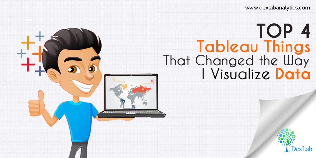
I love Tableau. I found it to be amazing and the best way to visualize data and develop fabulous reports and analysis. 4 years and still counting, I have come across various advanced features and concepts regarding Tableau, which actually enhanced the way I see Tableau as a fantastic tool for data representation. If I could go back in time and preach 4 Tableau concepts, this is what I would have liked to cover:

The fight between Green & Blue

Tableau differentiates. The differentiation is subject to the types of fields used in a view. Green data fields are continuous, while the blue ones are separate. The green ones give out gradient colors, axes and range filters, whereas the blues result in headers, multi-select filters and categorical colors.

Data Science Machine Learning Certification

The Importance of INDEX function (and its close associates)

Though I have scavenged through every available functions of Tableau in order to become a Tableau maestro in my early days, I knew I hadn’t made proper use of the functions INDEX, FIRST and LAST, until now. The main purpose of INDEX is to create a rank, irrespective of any order in which your items need to be displayed on the screen or by any other measure. It is thoroughly flexible and gives you enough room to sort, screen and put up your data in ways not possible otherwise.

While you drag and drop, Tableau writes a query language

Tableau is an intelligent visualization tool. It incorporates all kinds of latest, breakthrough technologies that assists in creating complicated visuals out of languorous data sets with just a simple drag and drop interface. However, on closer look, you will find that Tableau makes use of the data using a form of SQL and then gives shape to your data on screen with an ‘interpreter’.

Just incorporate a measure on label, a dimension on rows and write a query on the line of

SELECT Region, Sum(Sales) FROM Orders GROUP BY Region

You can also put another dimension straight on the filter shelf and it will come with a WHERE clause. After some classification, you get an ORDER BY.

Order of operations

Tableau always performs in an orderly manner – things are done here in a certain manner, and this order eventually helps you in creating a perfect view that will fetch you the desired results. Whether you add fields to your view or filter shelf or do custom calculations, all the items are calculated simultaneously.


Things are treated in the following order:

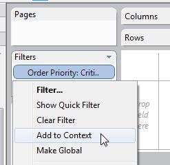
Context filters will generate a temp table in the source
Top N and/or conditional filters make a part of the SELECT command in the query
Standard filters are used as a WHERE clause
Aggregations are ciphered
Table calculations are implemented
Table layout and axes are etched
Anything on the Pages shelf is held accountable
Marks are then sketched

eca1faa965cdeeaff14af77b9f1e4635---years-i-wish

So, this is it! I figured out these functions, which helped me to derive the best out of Tableau. If you too had a Eureka moment, then feel free to let us know.

Of course, you might not be familiar with databases and SQL yet you can still become a Tableau expert without nailing the basics, but if you possess a bit of data analysis knowledge then our Tableau training courses Gurgaon can help accelerate your knowledge further. For more, check Tableau BI training courses by DexLab Analytics Delhi.


This article was sourced from – www.theinformationlab.co.uk/2013/01/28/5-things-i-wish-i-knew-about-tableau-when-i-started


Interested in a career in Data Analyst?

To learn more about Data Analyst with Advanced excel course – Enrol Now.
To learn more about Data Analyst with R Course – Enrol Now.
To learn more about Big Data Course – Enrol Now.

To learn more about Machine Learning Using Python and Spark – Enrol Now.
To learn more about Data Analyst with SAS Course – Enrol Now.
To learn more about Data Analyst with Apache Spark Course – Enrol Now.
To learn more about Data Analyst with Market Risk Analytics and Modelling Course – Enrol Now.

DIY Website Analytics Dashboards for Marketers at TC 17 – A Quick Overview [Video]

Are you bushed of creating reports in Excel? Do you feel annoyed every time you extract data from multiple platforms to develop website traffic reports?

 
DIY-Website-Analytics-Dashboards -for-Marketers-at-TC 17– A-Quick-Overview
 

Here we have some good news for y’all!


Two of Tableau’s own marketers have invented a next-level website analytics dashboard loaded with custom traffic metrics to turn reporting as easy as cake, and they are going to showcase it at TC17 in their breakout session Disparate measures: Tableau marketing’s DIY ethos and custom reporting.

Continue reading “DIY Website Analytics Dashboards for Marketers at TC 17 – A Quick Overview [Video]”

Master These Piping Hot Data Analytics Techniques and Stay Ahead of the Curve [Video]

Big Data, Business Intelligence, Data Science – the digital revolution is here, and it’s evolving steadfastly.

 
Master These Piping Hot Data Analytics Techniques and Stay Ahead of the Curve [Video]
 

Soon, data analytics is becoming the life-source of IT. The range of technologies is varied, and the way data is expanding, we are fast moving towards a juncture where analysis of vast volumes of data will be done in a jiffy.

Continue reading “Master These Piping Hot Data Analytics Techniques and Stay Ahead of the Curve [Video]”

5 Sure-fire Ways to Develop a Powerful Customized Web Analytics Dashboard in Tableau [VIDEO]

Let’s kickstart creating a custom web analytics dashboard!

 
5 Sure-fire Ways to Develop a Powerful Customized Web Analytics Dashboard in Tableau [VIDEO]
 

This blogpost consists of all the resources you will need to build your own web analytics dashboard – some of the resources we have used ourselves and some we have culled down from the web.

Continue reading “5 Sure-fire Ways to Develop a Powerful Customized Web Analytics Dashboard in Tableau [VIDEO]”

Here’s How to Make Data More Actionable for Better Decision-making

Every customer demand needs to be fulfilled, and CEO’s expect marketing analysts to deliver them. Being a key marketing initiative, optimizing every customer experience is a significant deal to seal for marketers all around the globe.


Here’s How to Make Data More Actionable for Better Decision-making


Data, of course, plays a crucial role in marketing endeavors – but only the data that is interpretable makes sense, rendering other data useless. To turn data into actionable, organizations need to understand the accuracy of data and in the process should be successful in turning insights into action.

Continue reading “Here’s How to Make Data More Actionable for Better Decision-making”

5 Quick-Fire Tips and Tricks from Dashboard Specialists

No two dashboards are similar. They cater to different audiences, serves distinct purposes, and address individual problems as unique as you.


5 Quick-Fire Tips and Tricks from Dashboard Specialists


In this blog post, we will talk about the 5 best practices to apply right now to create attractive dashboards, and engage users effectively.

Continue reading “5 Quick-Fire Tips and Tricks from Dashboard Specialists”

Text Adventure – Using Control Flow In Python

Python wascreated by Guido van Rossum and first released in 1991.Python, as a programming platform, has gained a huge popularity within a short span of time because of its flexibility and the user-friendly interface. The software can be deployed easily for developing statistical models and machine learning algorithms

 
Text Adventure- Using Control Flow In Python
 

In fact, due to the advent of AI and ML, Python has a language has had a certain kind of rebirth as far as industrial use is concerned. Today, however, the focus is going to be on a particular section of the language, namely the control flow to create a basic system in Python.

Continue reading “Text Adventure – Using Control Flow In Python”

Tableau: The intelligent tool of business

Tableau: The intelligent tool of business.
 

Tableau plays a very crucial role in data intelligence, data representations, data visualizations, and data modelling. The time has gone when folks used to draw graph, charts, on excel and variant types of resources or tool. Because provide us live data source accessibility with number of data sources like – spark, Google Products, Social network, programming language (R,Python,JAVA) whereas tableau uses VIZQL in background to speed up the performance. So now the time is to move towards Business Intelligence.As of now, you don’t need to worry about either data or data sources.

Continue reading “Tableau: The intelligent tool of business”

5 Ways to Enhance Value of Your Dashboards Using Maps

Today, an effective dashboard is mostly insight-driven. And since a good lot of analysis projects stand upon spatial data, playing with maps is an indispensable skill you need to have in your visualization toolbox.  

 
5 Ways to Enhance Value of Your Dashboards Using Maps
 

Here, we will like to share a few handy tips to improve the analytic and aesthetic value of maps in your dashboard:

Continue reading “5 Ways to Enhance Value of Your Dashboards Using Maps”

Call us to know more