tableau certification delhi Archives - Page 3 of 4 - DexLab Analytics | Big Data Hadoop SAS R Analytics Predictive Modeling & Excel VBA

It’s Time to Upgrade Tableau with Hyper

On 10th January, 2018 Tableau 10.5 was launched!

 
It’s Time to Upgrade Tableau with Hyper
 

Once you upgrade yourself to Tableau’s latest version, you will automatically get access to Hyper, Tableau’s new, licensed data engine technology. Hyper harbors the cutting edge technology to deliver up to 3x enhanced extract creation speed and up to 5x improved query performance.

Continue reading “It’s Time to Upgrade Tableau with Hyper”

Here’s the Most Creative Ways to Embed Google Trends Data in Tableau Dashboard

Tableau and Google Trends? Wow, what a smashing combination to tick all the right boxes!!

Here’s the Most Creative Ways to Embed Google Trends Data in Tableau Dashboard

Also, you would be more than happy to know how some sections in your data have gotten along in search over time as compared to the others. Undeniably.

Continue reading “Here’s the Most Creative Ways to Embed Google Trends Data in Tableau Dashboard”

Top 4 Tableau Things That Changed the Way I Visualize Data

Top 4 Tableau Things That Changed the Way I Visualize Data

I love Tableau. I found it to be amazing and the best way to visualize data and develop fabulous reports and analysis. 4 years and still counting, I have come across various advanced features and concepts regarding Tableau, which actually enhanced the way I see Tableau as a fantastic tool for data representation. If I could go back in time and preach 4 Tableau concepts, this is what I would have liked to cover:

The fight between Green & Blue

Tableau differentiates. The differentiation is subject to the types of fields used in a view. Green data fields are continuous, while the blue ones are separate. The green ones give out gradient colors, axes and range filters, whereas the blues result in headers, multi-select filters and categorical colors.

Data Science Machine Learning Certification

The Importance of INDEX function (and its close associates)

Though I have scavenged through every available functions of Tableau in order to become a Tableau maestro in my early days, I knew I hadn’t made proper use of the functions INDEX, FIRST and LAST, until now. The main purpose of INDEX is to create a rank, irrespective of any order in which your items need to be displayed on the screen or by any other measure. It is thoroughly flexible and gives you enough room to sort, screen and put up your data in ways not possible otherwise.

While you drag and drop, Tableau writes a query language

Tableau is an intelligent visualization tool. It incorporates all kinds of latest, breakthrough technologies that assists in creating complicated visuals out of languorous data sets with just a simple drag and drop interface. However, on closer look, you will find that Tableau makes use of the data using a form of SQL and then gives shape to your data on screen with an ‘interpreter’.

Just incorporate a measure on label, a dimension on rows and write a query on the line of

SELECT Region, Sum(Sales) FROM Orders GROUP BY Region

You can also put another dimension straight on the filter shelf and it will come with a WHERE clause. After some classification, you get an ORDER BY.

Order of operations

Tableau always performs in an orderly manner – things are done here in a certain manner, and this order eventually helps you in creating a perfect view that will fetch you the desired results. Whether you add fields to your view or filter shelf or do custom calculations, all the items are calculated simultaneously.


Things are treated in the following order:

Context filters will generate a temp table in the source
Top N and/or conditional filters make a part of the SELECT command in the query
Standard filters are used as a WHERE clause
Aggregations are ciphered
Table calculations are implemented
Table layout and axes are etched
Anything on the Pages shelf is held accountable
Marks are then sketched

eca1faa965cdeeaff14af77b9f1e4635---years-i-wish

So, this is it! I figured out these functions, which helped me to derive the best out of Tableau. If you too had a Eureka moment, then feel free to let us know.

Of course, you might not be familiar with databases and SQL yet you can still become a Tableau expert without nailing the basics, but if you possess a bit of data analysis knowledge then our Tableau training courses Gurgaon can help accelerate your knowledge further. For more, check Tableau BI training courses by DexLab Analytics Delhi.


This article was sourced from – www.theinformationlab.co.uk/2013/01/28/5-things-i-wish-i-knew-about-tableau-when-i-started


Interested in a career in Data Analyst?

To learn more about Data Analyst with Advanced excel course – Enrol Now.
To learn more about Data Analyst with R Course – Enrol Now.
To learn more about Big Data Course – Enrol Now.

To learn more about Machine Learning Using Python and Spark – Enrol Now.
To learn more about Data Analyst with SAS Course – Enrol Now.
To learn more about Data Analyst with Apache Spark Course – Enrol Now.
To learn more about Data Analyst with Market Risk Analytics and Modelling Course – Enrol Now.

DIY Website Analytics Dashboards for Marketers at TC 17 – A Quick Overview [Video]

Are you bushed of creating reports in Excel? Do you feel annoyed every time you extract data from multiple platforms to develop website traffic reports?

 
DIY-Website-Analytics-Dashboards -for-Marketers-at-TC 17– A-Quick-Overview
 

Here we have some good news for y’all!


Two of Tableau’s own marketers have invented a next-level website analytics dashboard loaded with custom traffic metrics to turn reporting as easy as cake, and they are going to showcase it at TC17 in their breakout session Disparate measures: Tableau marketing’s DIY ethos and custom reporting.

Continue reading “DIY Website Analytics Dashboards for Marketers at TC 17 – A Quick Overview [Video]”

Master These Piping Hot Data Analytics Techniques and Stay Ahead of the Curve [Video]

Big Data, Business Intelligence, Data Science – the digital revolution is here, and it’s evolving steadfastly.

 
Master These Piping Hot Data Analytics Techniques and Stay Ahead of the Curve [Video]
 

Soon, data analytics is becoming the life-source of IT. The range of technologies is varied, and the way data is expanding, we are fast moving towards a juncture where analysis of vast volumes of data will be done in a jiffy.

Continue reading “Master These Piping Hot Data Analytics Techniques and Stay Ahead of the Curve [Video]”

5 Sure-fire Ways to Develop a Powerful Customized Web Analytics Dashboard in Tableau [VIDEO]

Let’s kickstart creating a custom web analytics dashboard!

 
5 Sure-fire Ways to Develop a Powerful Customized Web Analytics Dashboard in Tableau [VIDEO]
 

This blogpost consists of all the resources you will need to build your own web analytics dashboard – some of the resources we have used ourselves and some we have culled down from the web.

Continue reading “5 Sure-fire Ways to Develop a Powerful Customized Web Analytics Dashboard in Tableau [VIDEO]”

Here’s How to Make Data More Actionable for Better Decision-making

Every customer demand needs to be fulfilled, and CEO’s expect marketing analysts to deliver them. Being a key marketing initiative, optimizing every customer experience is a significant deal to seal for marketers all around the globe.


Here’s How to Make Data More Actionable for Better Decision-making


Data, of course, plays a crucial role in marketing endeavors – but only the data that is interpretable makes sense, rendering other data useless. To turn data into actionable, organizations need to understand the accuracy of data and in the process should be successful in turning insights into action.

Continue reading “Here’s How to Make Data More Actionable for Better Decision-making”

Maps in Tableau: Key to Answer Data Questions

Maps in Tableau: Key to Answer Data Questions

For creating brilliant data visualization, first you need to know which visual chart type would be ideal for the data story you want to tell. In this post, we will explore maps in Tableau, when and where they seem to be appropriate for particular data visualization, and how to make them more productive. If you want to use a map, make sure you know the reason why.

Maps help you attain, authenticate, or communicate spatial patterns with data. With these maps, you should start your presentation with a spatial question. This spatial question ensures that your map will perfectly find you an answer in the best way possible.


For example, answer this question using a data map:

Which country in the US suffers from the highest obesity rate?

1_rss

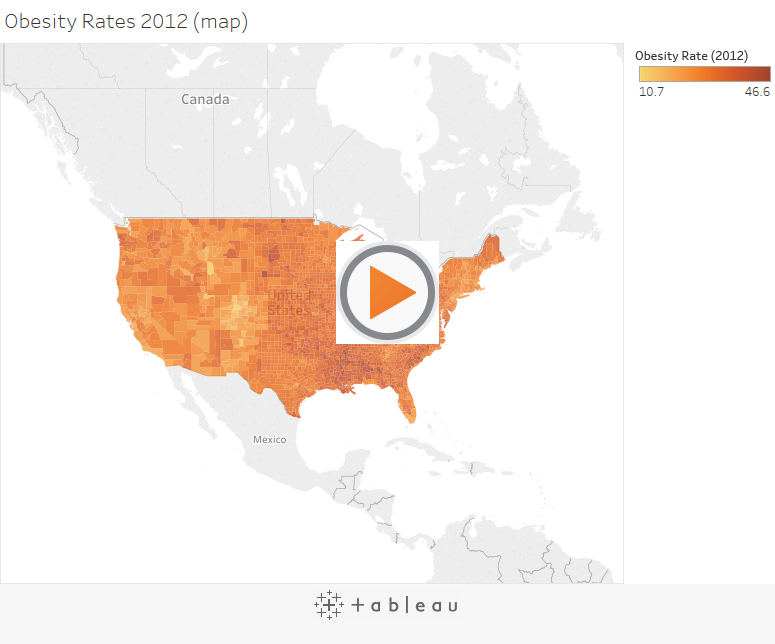
How much time did it take to answer that question? Did you quickly find the actual location without fuddling too much over the darker-colored country? I guess not. However, this map might not be the best path to answer this spatial question.

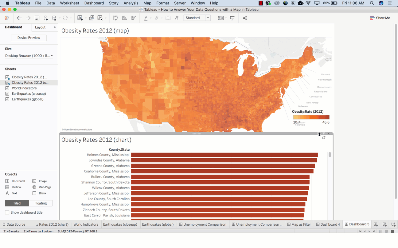
Now, let’s use the bar chart below to answer the same question.


It is easier to discover the answer here.

By combining the map and bar chart together, the answer to your spatial question can easily be derived.


Basically, maps are great for answering these two types of spatial questions:

  • What is the value for a specific location or mark on the map?
  • How do patterns compare between locations, regions, or attributes?


Go through the following tips to answer these questions better.

How to determine the value for a specific location or a mark on map?

Tooltips are the perfect way to move your mouse over a mark and observe a list of all the underlying dimensions and measures present.

You can easily edit a tooltip to include both dynamic and static text.

For example, identify which of these tooltips reveals a story about earthquakes in Japan.

screen_shot_2017-06-16_at_7.47.20_am

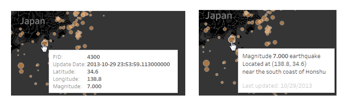
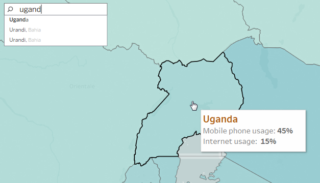
Also, the Tooltip improves speed-to-insight because the viewers of the map can easily find individual locations they want to find.

For example, find out the internet usage percentage in Uganda.

uganda

How do patterns compare between regions, locations or attributes?

To give answer to this question with a map, you must allow a direct comparison to be established between the data, symbols and even colors.

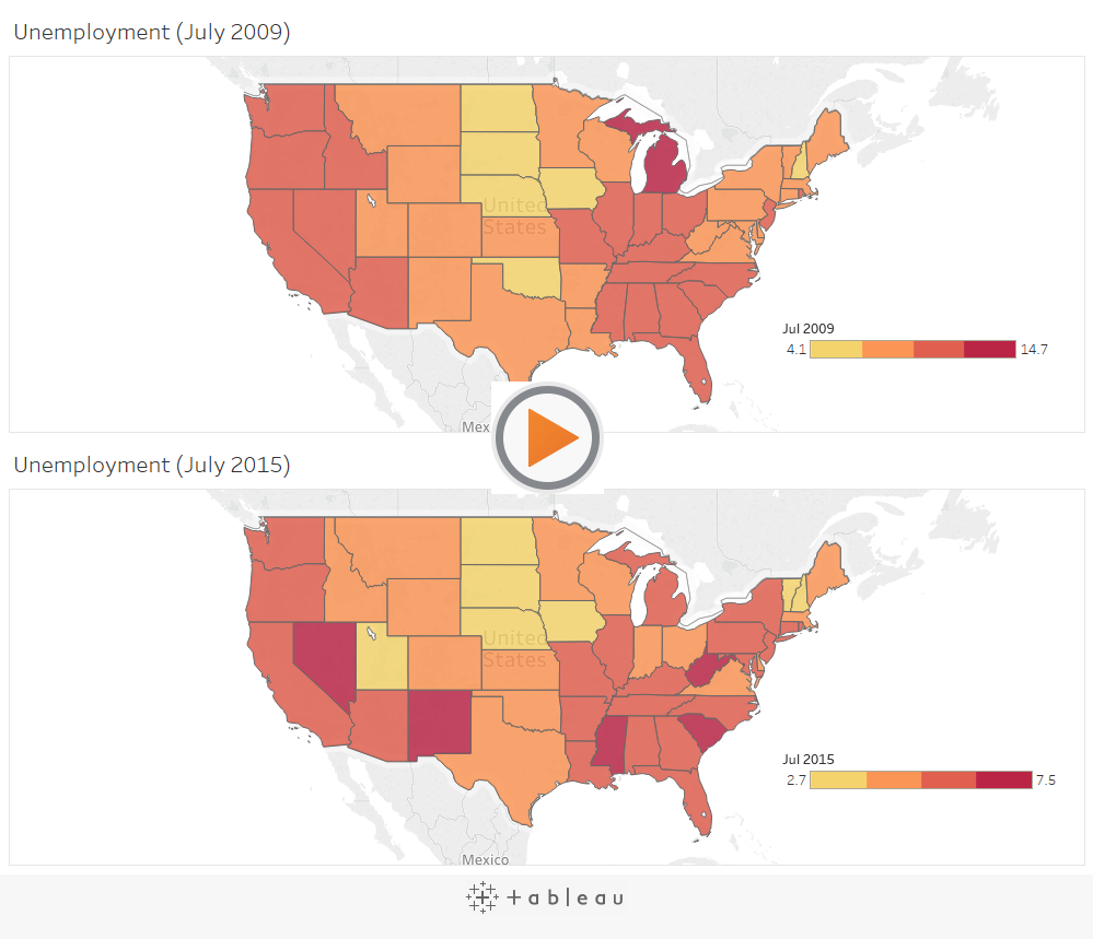
For example, while establishing a comparison between these two sets of unemployment data, the default color encoding doesn’t add any value for making direct comparisons. The reason being: the dark red doesn’t stand for the same value in both maps.

In turn, this situation can be very confusing for users who have no idea about the details of the data.

1_rss

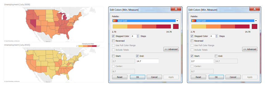
The best way to deal with the problem is by getting an assurance that the color ramps in both maps use the same range.

Also, you can make your date easier for comparison by adjusting the color scheme, so that different color groups exude similar semantic meaning. Semantically-resonant colors help in processing information faster.

screen_shot_2017-06-16_at_7.52.23_am

In case, you want to learn more about Tableau, check out our blogs published on DexLab Analytics. We offer state-of-the-art Tableau training courses in Delhi, for any assistance reach out to us.


Interested in a career in Data Analyst?

To learn more about Data Analyst with Advanced excel course – Enrol Now.
To learn more about Data Analyst with R Course – Enrol Now.
To learn more about Big Data Course – Enrol Now.

To learn more about Machine Learning Using Python and Spark – Enrol Now.
To learn more about Data Analyst with SAS Course – Enrol Now.
To learn more about Data Analyst with Apache Spark Course – Enrol Now.
To learn more about Data Analyst with Market Risk Analytics and Modelling Course – Enrol Now.

Demystifying Tableau Jargons: Interact With Data like Never Before

Demystifying Tableau Jargons: Interact With Data like Never Before

Businesses are flourishing. Managerial data are in abundance. The need for efficient BI softwares is at the pinnacle. Structured BI softwares are nimble and up to the minute. Tableau is one such BI tool, which is not only simple and comprehensible, but also extremely purposeful, enough to fulfil high-end professional commitments. It works just the way you want it to, instruct it in a particular way and wait for the results, without compromising the security of various confidential data.</span

Here in this FAQ blog, we have pulled out some of the top of the line frequently asked queries, regarding Tableau and R Programming. Both are highly functional, user friendly and efficient. Scroll down to grasp the basics and decode the fundamentals of Tableau.

Also read: Most Commonly Asked Tableau Interview Questions

What is Tableau?

Tableau is one of the finest data visualization tools that empower the enterprises to represent the data in the most flawless and explicit manner. It has proved its worth by being at par with its dominant predecessors, who analysed data visually and ruled the market for long.

How Tableau is classified?

Tableau can be classified as follows:

  • Tableau Desktop
  • Tableau Server
  • Tableau Online

What makes Tableau so popular?

With superb visualizations at an affordable price, Tableau is unrivalled. It can easily connect to any database – you don’t have to plug-in and is equipped with a robust memory processing.

Also read: Power BI or Tableau? Which is Better and Why?

Can we use precompiled models, packages, etc. with Tableau and R?

The answer is YES. If you can do it with R, you can easily incorporate it with Tableau. It includes any parallel computing modules, packages, libraries and statistical packages. It also involves commercialized versions of R, including Revolution Analytics.

Also read: How to Connect Oracle BI Server with Tableau

While you integrate Tableau and R, what is the best measure to debug R scripts or discover errors?

This is a vital question. There are mainly two ways. The first way to do this is by using ‘write.csv’ command within the studied field that calls an R script. The second one considers the use of debug version of the unparalleled executable of Rserve (Rserve_d.exe), which is ideal to print out any code that R is performing, and will be called R scripts.

Also read: Are You Trying to Ace Your Tableau Interview?

Can R be used to reshape data?

Yes, R possesses the ability of reshaping data.

Can data be transferred from a relational database to R, using Tableau?

Well, yes. Tableau can transfer data from any given source and run R scripts on that particular data set, irrespective of data type – be it relational database, flat-file, cube or unstructured.

2

What is Tableau Reader?

Tableau Reader is an effective tool to open the .twbx(Tableau packaged Workbook) files. However, keep in mind, it can only open files and cannot develop new connections and workbooks.

What do you mean by Tableau Public?

Tableau Public is a fantastic tool for anyone who wants to share his interesting stories on the web with others. You will gain access to data, develop interactive data visualizations and publish them on your website for others to see. And all of this, without writing a single line of code.

As parting thoughts, if you want to make something promising out of your mundane organisational data or want to make your frantic schedule of data handling and management a bit easier and enjoyable, then surely Tableau certification Gurgaon will work wonders for you! Contact us at DexLab Analytics, the pioneering data science online learning institute. We will be happy to help you.


Interested in a career in Data Analyst?

To learn more about Machine Learning Using Python and Spark – click here.
To learn more about Data Analyst with Advanced excel course – click here.
To learn more about Data Analyst with SAS Course – click here.
To learn more about Data Analyst with R Course – click here.
To learn more about Big Data Course – click here.

Call us to know more