Tableau Archives - DexLab Analytics | Big Data Hadoop SAS R Analytics Predictive Modeling & Excel VBA

Time Series Analysis Part I


A time series is a sequence of numerical data in which each item is associated with a particular instant in time. Many sets of data appear as time series: a monthly sequence of the quantity of goods shipped from a factory, a weekly series of the number of road accidents, daily rainfall amounts, hourly observations made on the yield of a chemical process, and so on. Examples of time series abound in such fields as economics, business, engineering, the natural sciences (especially geophysics and meteorology), and the social sciences.

  • Univariate time series analysis- When we have a single sequence of data observed over time then it is called univariate time series analysis.
  • Multivariate time series analysis – When we have several sets of data for the same sequence of time periods to observe then it is called multivariate time series analysis.

The data used in time series analysis is a random variable (Yt) where t is denoted as time and such a collection of random variables ordered in time is called random or stochastic process.

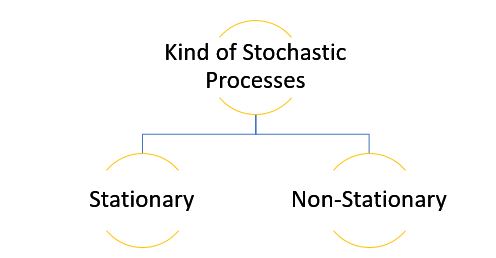
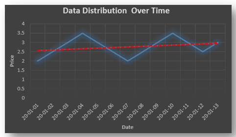
Stationary: A time series is said to be stationary when all the moments of its probability distribution i.e. mean, variance , covariance etc. are invariant over time. It becomes quite easy forecast data in this kind of situation as the hidden patterns are recognizable which make predictions easy.

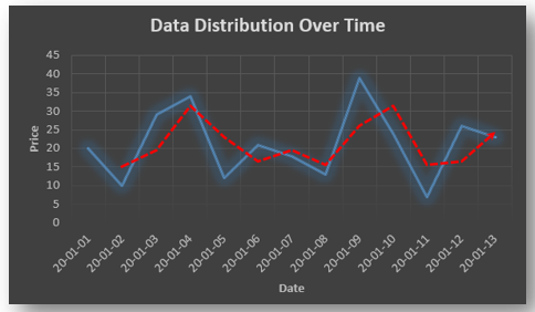
Non-stationary: A non-stationary time series will have a time varying mean or time varying variance or both, which makes it impossible to generalize the time series over other time periods.

Non stationary processes can further be explained with the help of a term called Random walk models. This term or theory usually is used in stock market which assumes that stock prices are independent of each other over time. Now there are two types of random walks:
Random walk with drift : When the observation that is to be predicted at a time ‘t’ is equal to last period’s value plus a constant or a drift (α) and the residual term (ε). It can be written as
Yt= α + Yt-1 + εt
The equation shows that Yt drifts upwards or downwards depending upon α being positive or negative and the mean and the variance also increases over time.
Random walk without drift: The random walk without a drift model observes that the values to be predicted at time ‘t’ is equal to last past period’s value plus a random shock.
Yt= Yt-1 + εt
Consider that the effect in one unit shock then the process started at some time 0 with a value of Y0
When t=1
Y1= Y0 + ε1
When t=2
Y2= Y1+ ε2= Y0 + ε1+ ε2
In general,
Yt= Y0+∑ εt
In this case as t increases the variance increases indefinitely whereas the mean value of Y is equal to its initial or starting value. Therefore the random walk model without drift is a non-stationary process.

So, with that we come to the end of the discussion on the Time Series. Hopefully it helped you understand time Series, for more information you can also watch the video tutorial attached down this blog. DexLab Analytics offers machine learning courses in delhi. To keep on learning more, follow DexLab Analytics blog.


.

Not to Miss: The Startup India tableau at Republic Day 2020 parade

Not to Miss: The Startup India tableau at Republic Day 2020 parade

The commerce and industry ministry recently, in a written press briefing, said that it will showcase a tableau on Startup India, with an aim to promote innovation and entrepreneurship in the nation. The tableau will be displayed at the Republic Day Parade this year, in a first.

The name of the tableau is ‘Startups: Reach for the Sky’. It is themed on the stages of the life-cycle of a startup and the multifarious elements of support provided by the government, the ministry said in a press statement.

“The front of the tableau depicts a creative mind, full of ideas to solve real world problems. The Startup India Tree, in the middle will represent different kinds of support given,” a government official from the Department of Promotion of Industry & Internal Trade (DPIIT), said in the statement.

The staircase will stand for the various stages of growth – those are – coming up with a concept, creating a prototype, preparing a business plan, building a team, launching into markets and eventually scaling up, an Economic Times report said.

The wheel will denote sectors of economy where Indians have driven and given a fillip to economic growth and created employment opportunities on a big scale, the statement read. The wheel and the map of India together depict the width and the depth of the Startup India movement in the country.

Startup India is a flagship initiative of the Narendra Modi government, conceived with the intention of building a strong environment to nurture innovation, drive sustainable economic growth and generate large scale employment opportunities and job openings.

“We have a million problems, but at the same time we have over a billion minds,” Prime Minister Narendra Modi had said about the flagship programme started in January, 2016. In October, 2019 Prime Minister Narendra Modi said that the Indian startup ecosystem will help India achieve the $5 trillion target for the economy set by the government.  

The objective is to inspire and motivate youth to follow their dreams to generate wealth and become job creators and not just job seekers. Under the Startup India Scheme, eligible companies can get recognised as startups by the ministry in order to access a host of tax benefits, easier compliance, IPR fast tracking and other incentives.

More than 26,000 startups from 551 districts of 28 States and 7 Union Territories have been recognized so far. “Working across IT, Industry 4.0, education, healthcare, agriculture, energy, finance, space, defence and all other sectors of economy, Indian startups have attracted substantial global investments and created more than 2,91,000 jobs,” it added.

Besides DPIIT, the Department of Financial Services, Department of Drinking Water and Sanitation, NDRF Ministry of Home Affairs, CPWD Ministry of Housing and Urban Affairs, and Ministry of Shipping will also participate in the Republic Day parade.


Interested in a career in Data Analyst?

To learn more about Data Analyst with Advanced excel course – Enrol Now.
To learn more about Data Analyst with R Course – Enrol Now.
To learn more about Big Data Course – Enrol Now.

To learn more about Machine Learning Using Python and Spark – Enrol Now.
To learn more about Data Analyst with SAS Course – Enrol Now.
To learn more about Data Analyst with Apache Spark Course – Enrol Now.
To learn more about Data Analyst with Market Risk Analytics and Modelling Course – Enrol Now.

Why Tableau Is the Best Data Visualization Tool for Industries Worldwide?

Why Tableau Is the Best Data Visualization Tool for Industries Worldwide?

There are several data visualization tools available in the market but Tableau is the most popular and effective. Most of the key players from the BI industry depend on this software for transforming raw data into an easy-to-understand format.

What Makes Tableau So Popular?

Tableau is frequently used as a tool that helps to analyze data quickly and creates visualizations for worksheets and dashboards. It lets users design dashboards that generate actionable insights and takes businesses to new heights. Below, we’ve rounded up top 4 reasons why businesses rely on Tableau:

Amazing Visualizations

Tableau allows you to work with more unordered data and develop stunning visualization: courtesy an array of in-built features. You can also achieve superb context, different ways of drilling meaningful data and understand data in minutes.

Data Science Machine Learning Certification

Detailed Insights

The best thing about this visualization tool is that it lets you analyze future data; you can do that while observing data from several angles and approaches. Plus, you can frame hypothetical queries and work on that data correspondingly – possible only because of the feature of adding elements for comparison and analysis and ‘what-if’ visualizations!

Simple Approach

Being user-friendly is one of the major strengths of Tableau. Thanks to this feature, users with no coding or technical knowledge can use Tableau easily. Since most of the features are in a drag-and-drop format, any newbie can work on Tableau without possessing a prior set of skills.

DexLab Analytics is one of the most popular Tableau training institutes in Delhi. Take a look at their offerings.

Works With Various Data Sources

This is what makes Tableau an absolute essential for business houses! In Tableau, data can be taken from anywhere irrespective of its sources. This feature makes it powerful as compared to other BI and Analytics tools. It lets you connect diverse data sources, cloud files, spreadsheet data, big data, data warehouses and various other types of data, including non-relational ones. The software can blend any kind of data to create amazing visualizations that are bound to garner admiration.

Are You Ready?

As of endnotes, a large number of Fortune Global 500 companies prefer Tableau over other data visualization tools. And why not! It is user-friendly and can solve complex business problems and prepare phenomenal visualizations within minutes.  

If you are interested in pursuing a business intelligence career, check out Tableau Certification Delhi. Such certification course will push your career to new heights. It will be a good start for your analytics career and you will get better opportunities to succeed.

Enroll now: <www.dexlabanalytics.com/courses/tableau-bi-visualization-certification>
 
The blog has been sourced from: www.knowledgehut.com/blog/business-intelligence-and-visualization/why-tableau-is-so-popular
 

Interested in a career in Data Analyst?

To learn more about Data Analyst with Advanced excel course – Enrol Now.
To learn more about Data Analyst with R Course – Enrol Now.
To learn more about Big Data Course – Enrol Now.

To learn more about Machine Learning Using Python and Spark – Enrol Now.
To learn more about Data Analyst with SAS Course – Enrol Now.
To learn more about Data Analyst with Apache Spark Course – Enrol Now.
To learn more about Data Analyst with Market Risk Analytics and Modelling Course – Enrol Now.

Know the Difference between Alteryx and Tableau

Know the Difference between Alteryx and Tableau

Alteryx and Tableau are two leading software products in the realm of data science with broad application. Both are pivotal in the analysis of data and obtaining important insights. But what is the specific role of each product in an enterprise? Are the products complementary or incompatible? Will using them jointly enhance performance? Read on to find out.

Function of Alteryx:

In general, data preparation takes up a major portion of an analyst’s time. Before the data can be analyzed, it needs to be prepped, which involves many humdrum tasks such as combining data sources together and changing the format of data. This process of readying the data in a format appropriate for analysis is called ETL, short for Extract, Transform and Load.

Alteryx is a top software product for simplifying the ETL process. It offers a large array of tools for handling data. From importing data from various sources to getting it ready for analysis work, Alteryx provides a tool for every task. After modifying the data, you can use Alteryx tools with advanced statistical capabilities to perform sophisticated analyses, like predictive analytics and time series forecasting.

For top rated Alteryx certification training in Delhi, get in touch with DexLab Analytics.

Function of Tableau:

Tableau is renowned as a useful data visualization tool, performing a distinct role in the world of data analytics.  Tableau helps transform data into charts and dashboards, revealing useful insights contained in the data. High-quality charts can be created with Tableau, which in turn leave an impactful impression on the audience.

Combination of the Two Tools:

Tableau and Alteryx complement each other really well. Alteryx comes in very handy in converting data into operable format, but it has limited capacity to display data before an audience. Tableau effectively fills this void. On the other hand, Tableau is unparalleled at data visualization, but is lacking in the field of data preparation, especially areas requiring advanced analytics. Hence, the combination of the two tools adds value to the overall task.

In a nutshell, Alteryx simplifies the tedious preparation process of data analysis and Tableau makes the explanatory part of analysis more enjoyable.

Who works with these products?

A good thing about Alteryx and Tableau is that they are user-friendly and hence, don’t demand advanced technical expertise. They contain easy-to-use drag and drop interfaces. So, data analysts with different levels of skill and experience are comfortable working with these tools.

However, these two software products are market leaders and that reflects in their cost. They are quite pricey and can be afforded only by companies greater than the average ones. It makes sense; because these companies generally work huge volumes of data and have the financial power to afford high-level analytics tools like these.

For companies with smaller budgets, Power BI can be an alternative to Tableau, but its functionality will not be at par with Tableau. In case of Alteryx, there isn’t a clear alternative. R and Python are typically used by businesses, but these are coding languages demanding high levels of skill.

2

Concluding Note:

Alteryx and Tableau are both leading products in the analytics industry, the former deals with data preparation whereas the latter deals with visualization. Together they boost up business operations. Affordability might be an issue for many organizations, but if you’re looking for the best products in the market, you cannot go wrong with Alteryx and Tableau.

Looking for ways to upskill and get a hefty pay hike in your analytics career? Check out the courses offered by DexLab Analytics. The faculty, comprising industry experts, provides professional certification courses in a number of key areas, like Tableau, credit risk modeling and more!

Reference: blog.kubicle.com/what-is-the-difference-between-alteryx-and-tableau


Interested in a career in Data Analyst?

To learn more about Data Analyst with Advanced excel course – Enrol Now.
To learn more about Data Analyst with R Course – Enrol Now.
To learn more about Big Data Course – Enrol Now.

To learn more about Machine Learning Using Python and Spark – Enrol Now.
To learn more about Data Analyst with SAS Course – Enrol Now.
To learn more about Data Analyst with Apache Spark Course – Enrol Now.
To learn more about Data Analyst with Market Risk Analytics and Modelling Course – Enrol Now.

Importance of MIS in Business

Importance of MIS in Business

Today’s corporate world is dynamic. Ever-evolving technologies and daily upgrades drive business organizations to fulfill goals and objectives. They also involve substantial risks and uncertainties. These challenges urge businesses to take crucial decisions that end up determining their future success. Since the primary objective of any organization is to improve their profit ratio and flourish in the long run.

This is why businesses can’t ignore the significance of MIS – Management Information System

Define MIS

MIS is a comprehensive set of processes that offers critical data and information to the management so as to enhance informed decision-making. It involves:

  • Gathering apt data from numerous reliable sources
  • Processing of those data to derive meaningful, relevant information
  • Furnishing this essential information to the respective department

What Makes MIS Reports so Important to Boost Business Decision-making?

MIS Reports are prepared after careful analysis of existing data and observing on-going trends prevalent in the industry. They play a key role in improving productivity, performance and profitability of any enterprise. No wonder, it’s extremely important for the administration to lay hands on reliable data in sync with the latest trends to make quick, informed decisions.

As a result, MIS Reporting System is regarded as the bedrock of company operations, and it aids the company to stand out against its tailing rivals.

2

Advantages of MIS

Efficient Data Management

MIS is widely favored for managing essential business data to aid in complex decision-making. The high on significance kind of information is stored in an efficient way and can be easily accessed by the administration anytime anywhere.

Trend Analysis

Management in any organization needs to prepare a presentation for strategic planning and tabulate future goals. In order to create such advanced strategies, they need to possess accurate reports clearing in accordance with prevailing market situations. MIS uses numerous mathematical tools that would analyze current market trends and precisely predict future trends based on such details.

MIS Sets Future Goals

Be it a finance firm, an MNC, a healthcare institute – setting up a goal matters a lot. It requires ample research and development. The information derived from MIS Reports is held veritable and is mostly used to determine company goal. Also, MIS requires current market trend analysis and future industry forecasts. Thus, it won’t be prudent enough to ignore MIS and reporting.

Improved Efficiency

The appropriate information collected by MIS helps in formulating improved goals and top notch strategies for the company. Also, the performance can be easily gauged with the help MIS Reports. Undeniably, MS plays a crucial role in enhancing the efficiency of the organization.

Compare and Contrast

MIS database is encompassing and can be accessed anytime. Management professionals can anytime go through the MIS reports and compare and contrast its present business performance with that of previous years’. Often this helps in measuring company’s growth prospects and if it’s on the right track towards success.

In a concluding note, we would recommend Best MIS Training in Gurgaon; DexLab Analytics is a sure bet when it comes to the best MIS training institute in Delhi. With skilled experts in the team, the institute is one stop shop for all things data analytics.

 
The blog has been sourced from  ― aristotleconsultancy.com/blog/mis-important-businesses
 

Interested in a career in Data Analyst?

To learn more about Data Analyst with Advanced excel course – Enrol Now.
To learn more about Data Analyst with R Course – Enrol Now.
To learn more about Big Data Course – Enrol Now.

To learn more about Machine Learning Using Python and Spark – Enrol Now.
To learn more about Data Analyst with SAS Course – Enrol Now.
To learn more about Data Analyst with Apache Spark Course – Enrol Now.
To learn more about Data Analyst with Market Risk Analytics and Modelling Course – Enrol Now.

Comprehensive Tableau Reference Guide: Calculated Fields-Logical Functions

Comprehensive Tableau Reference Guide: Calculated Fields-Logical Functions
Comprehensive Tableau Reference Guide is a blog series for explaining the basics of Tableau Software. So, if you are a newbie planning to get started with Tableau or if you simply want to explore the popular features in Tableau, then these step-by-step guides are perfect for you. In this blog, we will discuss about Logical Functions in Tableau.

  • Go to the Calculated Field window:

1

  • Go to Functions table. From the drop-down menu, select the option ‘’Logical’’:

2

  • This selection filters the list of functions to display a listing of only logical functions, which consists of seven different functions:

3

We will explain these functions one by one.

  • CASE Function:

CASE expression WHEN value1 THEN return1 WHEN value2 THEN return2… ELSE default return END

The CASE function is applied when we need to perform a logical test. This function returns values based on the result of the logical test. A CASE function can also be written as an IF function. Generally, CASE function statements are simpler and shorter.

Example of a formula using CASE function:

004

Going through the country field, when the function comes across the value ‘’United States’’, it uses ‘’USA’’. On the other hand, when it comes across “United Kingdom’’, the function uses ‘’UK”. For all other values in the country field, ‘’World’’ is used.

  • IF Function:

IF test THEN value END/IF test THEN value ELSE else END

A logical test can be created using the IF function. The function works like this- IF the test is true THEN carry out the given condition. The test portion of the function must be Boolean. This can be achieved either by selecting a Boolean field from data source or by constructing the expression using operators and logical comparisons (AND, OR, NOT).

Example:

Logical205

IF test1 THEN value1 ELSEIF test2 THEN value2 ELSE else END

This statement is used when the functionality of IF function needs to be expanded. Additional IF-THEN statements can be incorporated through ELSEIF. Here’s an example to rewrite the CASE formula above with IF-THEN-ELSEIF statement:

Logical3-03

The result is the same as before.

  • IFNULL Function:

IFNULL(expression1, expression2)

The IFNULL function is used to perform a true/false test and check if the value in the tested field is NULL or not. If the value isn’t null then the first value of the function is used, and if the value is null then the second one is used.

Logical4_05

If Total Population of a country has no value, then it will be reset as zero and the null shall be eliminated from the newly created field.

  • IIF Function:

IIF(test, then, else, [unknown])

IIF function is very much alike the IF function described above, just a shorthand version for the IF-THEN-ELSE statement. The final argument of IIF function can define a value in case the test produces an unknown result. Like the IF function, the test must be Boolean, either by data type or the result of the test must give a Boolean value.

Here’s an example:

Logical5-06

If the % of change field is lower than 5% then the value Poor will be returned, or else the value Good will be returned.

  • ISDATE Function:

ISDATE(string)

The ISDATE function is used to determine if a string argument can be converted to a valid date (TRUE) or not (FALSE).

Example:

Logical6_1

This formula is supported by Tableau since the field used is a string data type, however each result will be FALSE. This function comes handy in case dates are formatted in a manner that is unrecognizable by a user, like ISO 8601.

Example:

Logical7_2

The above value stands for September 1, 2014 and is obviously a valid date.

  • ISNULL Function:

ISNULL(expression)

This is a simple function that checks if an expression is null (TRUE) or not (FALSE).

Example:

Logical8-03

The Filter card enables users to filter null values from their visualization.

  • ZN Function:

Statement: ZN(expression)

The ZN function is a variant of the ISNULL and IFNULL functions. It tests whether a function is null or not. In case the function is null, it returns a zero value.

Example:

Logical9_04

It is natural to feel overwhelmed when you see a list of logical functions for the first time. Since we have discussed each one of them, hopefully these functions will come handy in your visualization and data leveraging pursuits.

To learn more about Tableau functions, follow Dexlab Analytics– it is one of the best Tableau training institutes in Delhi. Do take a look at their Tableau BI training courses.


This article has been sourced from:  https://interworks.com/blog/ccapitula/2015/04/01/tableau-essentials-calculated-fields-logical-functions


Interested in a career in Data Analyst?

To learn more about Machine Learning Using Python and Spark – click here.

To learn more about Data Analyst with Advanced excel course – click here.
To learn more about Data Analyst with SAS Course – click here.
To learn more about Data Analyst with R Course – click here.
To learn more about Big Data Course – click here.

DIY Website Analytics Dashboards for Marketers at TC 17 – A Quick Overview [Video]

Are you bushed of creating reports in Excel? Do you feel annoyed every time you extract data from multiple platforms to develop website traffic reports?

 
DIY-Website-Analytics-Dashboards -for-Marketers-at-TC 17– A-Quick-Overview
 

Here we have some good news for y’all!


Two of Tableau’s own marketers have invented a next-level website analytics dashboard loaded with custom traffic metrics to turn reporting as easy as cake, and they are going to showcase it at TC17 in their breakout session Disparate measures: Tableau marketing’s DIY ethos and custom reporting.

Continue reading “DIY Website Analytics Dashboards for Marketers at TC 17 – A Quick Overview [Video]”

5 Sure-fire Ways to Develop a Powerful Customized Web Analytics Dashboard in Tableau [VIDEO]

Let’s kickstart creating a custom web analytics dashboard!

 
5 Sure-fire Ways to Develop a Powerful Customized Web Analytics Dashboard in Tableau [VIDEO]
 

This blogpost consists of all the resources you will need to build your own web analytics dashboard – some of the resources we have used ourselves and some we have culled down from the web.

Continue reading “5 Sure-fire Ways to Develop a Powerful Customized Web Analytics Dashboard in Tableau [VIDEO]”

5 Quick-Fire Tips and Tricks from Dashboard Specialists

No two dashboards are similar. They cater to different audiences, serves distinct purposes, and address individual problems as unique as you.


5 Quick-Fire Tips and Tricks from Dashboard Specialists


In this blog post, we will talk about the 5 best practices to apply right now to create attractive dashboards, and engage users effectively.

Continue reading “5 Quick-Fire Tips and Tricks from Dashboard Specialists”

Call us to know more