SAS Archives - Page 2 of 2 - DexLab Analytics | Big Data Hadoop SAS R Analytics Predictive Modeling & Excel VBA

How to Append Data to Add Markers to SAS Graphs

How to Append Data to Add Markers to SAS Graphs

Would you like to create customized SAS graphs with the use of PROC SGPLOT and other ODS graphic procedures? Then an essential skill that you must learn is to know how to join, merge, concentrate and append SAS data sets, which arise from a variety of sources. The SG procedures, which stand for SAS statistical graphic procedures, enable users to overlay different kinds of customized curves, bars and markers. But the SG procedures do expect all the data for a graph to be in one single set of data. Thus, it often becomes necessary to append two or more sets of data before one can create a complex graph.

In this blog post, we will discuss two ways in which we can combine data sets in order to create ODS graphics. An alternative option is to use the SG annotation facility, which will add extra curves and markers to the graph. We mostly recommend the use of the techniques that are given in this article for simple features and reserve annotations when adding highly complex yet non-standard features.

Using overlay curves:

Here is a brief idea on how to structure a SAS data set, so that one can overlay curves on a scatter plot.

The original data is contained in the X and Y variables, as can be seen from the picture below. These will be the coordinates for the scatter plot. The secondary information will be appended at the end of the data. The variables X1 and Y1 contain the coordinates of a custom scatter plot smoother. The X2 and Y2 variables contain the coordinates of another scatter plot smoother.

sgplotoverlay
Source: blogs.sas.com

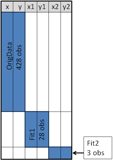
This structure will enable you to use the SGPLOT procedure for overlaying, two curves on the scatter plot. One may make use of a SCATTER statement along with two SERIES statements to build the graphs.

With the right Retail Analytics Courses, you can learn to do the same, and much more with SAS.

Using Overlay Markers: Wide form

Sometimes in addition to the overlaying curves, we like to add special markers to the scatter plot. In this blog we plan to show people how to add a marker that shows the location of the sample mean. It will discuss how to use PROC MEANS to build an output data set, which contains the coordinates of the sample mean, then we will append the data set to the original data.

With the below mentioned statements we can use PROC MEANS for computing the sample mean of the four variables in the data set of SasHelp.Iris. This data contains the measurements for 150 iris flowers. To further emphasize on the general syntax of this computation, we will make use of macro variables but note that it is not necessary:

%let DSName = Sashelp.Iris;
%let VarNames = PetalLength PetalWidth SepalLength SepalWidth;
  
proc means data=&DSName noprint;
var &VarNames;
output out=Means(drop=_TYPE_ _FREQ_) mean= / autoname;
run;

With the AUTONAME option on the output statement, we can tell PROC MEANS to append the name of the statistics to names of the variables. As a result, the output datasets will contain the variables, with names like PetalLength_Mean or SepalWidth_Mean.

As depicted in the previous picture, this will enable you to append the new data into the end of the old data in the “wide form”, as shown here:

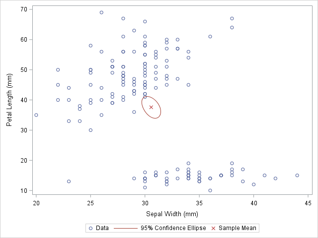
data Wide;
   set &DSName Means; /* add four new variables; pad with missing values */
run;
 
ods graphics / attrpriority=color subpixel;
proc sgplot data=Wide;
scatter x=SepalWidth y=PetalLength / legendlabel="Data";
ellipse x=SepalWidth y=PetalLength / type=mean;
scatter x=SepalWidth_Mean y=PetalLength_Mean / 
         legendlabel="Sample Mean" markerattrs=(symbol=X color=firebrick);
run;

And as here:

Scatter plot with markers for sample means

Source: blogs.sas.com


The original data is used in the first SCATTER statement and the ELLIPSE statement. You must remember that the ELLIPSE statement draws an approximate confidence ellipse for the population mean. The second SCATTER statement also makes use of sample means, which must be appended to the end of the original data. The second SCATTER statement will draw a red marker at the location of the sample mean.

This method can be used to plot other sample statistics (like the median) or to highlight special values such as the origin of a coordinate system.

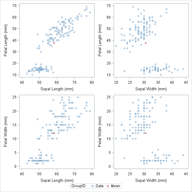
Using overlay markers: of the long form

In certain circumstances, it is better to append the secondary data in the “long form”. In the long form the secondary data sets contains variables similar to the names in the original data set. One can choose to use the SAS data step to build a variable that will pinpoint the original and supplementary observations. With this technique it will be useful when people would want to show multiple markers (like, sample, mean, median, mode etc.) by making use of the GROUP = option on one of the SCATTER statement.

For detailed explanation of these steps and more on such techniques, join our SAS training courses in Delhi.

The following call to the PROC MEANS does not make use of an AUTONAME option. That is why the output data sets contain variables which have the same name as the input data. One can make use of the IN= data set option, for creating the ID variables that identifies with the data from the computed statistics:

/* Long form. New data has same name but different group ID */
proc means data=&DSName noprint;
var &VarNames;
output out=Means(drop=_TYPE_ _FREQ_) mean=;
run;
 
data Long;
set &DSName Means(in=newdata);
if newdata then 
   GroupID = "Mean";
else GroupID = "Data";
run;

The DATA step is used to create the GroupID variable, which has several values “Data” for the original observations and the value “Mean” for the appended observations. This data structure will be useful for calling the PROC SGSCATTER and this will support the GROUP = option, however it does not support multiple PLOT statements as the following:

ods graphics / attrpriority=none;
proc sgscatter data=Long 
   datacontrastcolors=(steelblue firebrick)
   datasymbols=(Circle X);
plot (PetalLength PetalWidth)*(SepalLength SepalWidth) / group=groupID;
run;

Scatter plot matrix with markers for sample means

Source: blogs.sas.com


In closing thoughts, this blog is to demonstrate some useful techniques, to add markers to a graph. The technique requires people to use concatenate the original data with supplementary data. Often for creating ODS statistical graphics it is better to use appending and merging data technique in SAS. This is a great technique to include in your programming capabilities.

SAS courses in Noida can give you further details on some more techniques that are worth adding to your analytics toolbox!

 
This post originally appeared onblogs.sas.com/content/iml/2016/11/30/append-data-add-markers-sas-graphs.html
 

Interested in a career in Data Analyst?

To learn more about Data Analyst with Advanced excel course – Enrol Now.
To learn more about Data Analyst with R Course – Enrol Now.
To learn more about Big Data Course – Enrol Now.

To learn more about Machine Learning Using Python and Spark – Enrol Now.
To learn more about Data Analyst with SAS Course – Enrol Now.
To learn more about Data Analyst with Apache Spark Course – Enrol Now.
To learn more about Data Analyst with Market Risk Analytics and Modelling Course – Enrol Now.

Understanding the Difference Between ‘Sub-Setting IF’ and ‘IF-Then-Else-IF Statement’ in SAS Programming:

Winter is knocking at our doorstep and we are hoping to get our brains worked out with some rigorous learning.


Understanding the Difference Between ‘Sub-Setting IF’ and ‘IF-Then-Else-IF Statement’ in SAS Programming:

However the weather remains, as data analysts using SAS programming, we can definitely use the weather forecasts to provide the data for explaining the concepts of IF and IF-THEN-ELSE statements to our readers interested in learning SAS predictive modeling. Continue reading “Understanding the Difference Between ‘Sub-Setting IF’ and ‘IF-Then-Else-IF Statement’ in SAS Programming:”

Join Us at a Free Live Demo Session Today, On Credit Risk Modelling With SAS

Learning is almost close to being free with the ascent of the internet era. People keen on learning new things need not go across the world or even migrate to different cities. They can simply open their browser and gather as much knowledge as they want online while watching tutorials, reading articles and guides and watching free demo sessions. This convenience is now available for the challenging field of data analytics as well, as DexLab Analytics the premiere data analytics training institute in the country is offering a free live demo session on Credit Risk Modelling using SAS this Saturday at 5 PM.


Join us at a free live demo session today, on Credit Risk Modelling with SAS


To join our demo session all you have to do is register for the same with an email directly to us at hello@dexlabanalytics.com or even drop in a line showing interested at our contact us form. Then all that is left to do is to make yourself comfortable with keen ears and eyes at 5 PM sharp in front of the computer screen. The demo session is to be held today (at 15/10/2016) live, online and will be completely free. Continue reading “Join Us at a Free Live Demo Session Today, On Credit Risk Modelling With SAS”

The Right Tool For Statistical Analysis SAS Vs. Stata

Both SPSS and SAS have been around in the world of statistical analysis for several years now, so, the conundrum of which is better software for statistical analysis is an age-old question among data people.


The Right Tool For Statistical Analysis SAS Vs. Stata


To begin with SAS is in its version 9+ and has also enhanced its visual appeal greatly. But SPSS still comes with its popular “click and get results” interface. SPSS has also moved beyond its version 15.0+ and has also began adding different modules like its competitor SAS. Continue reading “The Right Tool For Statistical Analysis SAS Vs. Stata”

Why the Job Market is Going Gaga over Big Data

We will start off this post with a little bit of trivia.

  • The advertised median salary on offer for technically inclined professionals with expertise in Big Data, which today is a highly sought-after skill is no less than $124,000 inclusive of compensation and bonuses.
  • Cisco, IBM and Oracle together had 26,488 positions that were open during the previous year which required expertise in Big Data.
  • EMC or Dell required 25.1% of all positions in Big Data to have analytics tracks.
  • Data Warehousing, VMWare and developing programming expertise in Python are the fastest growing skill sets that are in demand by companies that are on an expansion of their development teams in Big Data.

why the job market is going gaga over big data

Continue reading “Why the Job Market is Going Gaga over Big Data”

Decades On, SAS is Still the Market Leader

In the 2016 February report by Gartner, SAS bagged the top slot in its execution ability and was once again placed in the quadrant of leaders in the Magic Quadrant for Advanced Analytics Platforms.According to the description, as provided by Gartner, advanced analytics involves various sorts of data analysis through the use of quantitative methods of great sophistication like machine learning, statistics, simulation, data mining in its both predictive and descriptive forms as well as optimization.


Decades On , SAS Still The Leader


The goal is come up with insights that are unlikely to be discovered through approaching business intelligence traditionally like query and reporting.

Continue reading “Decades On, SAS is Still the Market Leader”

Elementary Character Functions in SAS

Basically the number of functions present in the SAS program amount to three. They are Character Functions, Numeric Functions and Date and Time Functions. In this post we are going to take a brief look at Character functions of a basic nature.


Elementary Character Function  in SAS


Character Functions

Suppose that there is this program with the following lines of command:

Data Len_func ; input name $ ; cards; Sandeep Baljeet
Neeta
.
;
run;
data Len_func; set Len_func ; Len=length(name);
Len_N=lengthn(name); Len_C=lengthc(name); run;
proc print; run;

Here,

  • The function called LENGTH returns the character value’s length.
  • The function LENGTHN is more or less identical to the LENGTH function. The sole difference between the two lies in the fact that for a value missing character it returns the length that equals to 0 whereas LENGTH returns a value of 1.
  • The function LENGTHC returns to the program the storage length of particular strings.


The ABC of Summary Statistics and T Tests in SAS – @Dexlabanalytics.


Again let us consider the following lines of code:

Data case ; input name $ ;cards;
sandeep baljeet neeta
;
New_U=upcase(name); New_P=propcase(name); 
run;
proc print; run;


Data Preparation using SAS – @Dexlabanalytics.


Here the following functions are introduced:

  • The function UPCASE converts all of the letters to the uppercase.
  • The function PROPCASE serves to capitalize the first letter of all words and converts the remaining to lowercase.
  • As might be guess from the convention conformed to while naming the function, LOWCASE transforms all letters to their lowercase counterparts.


In the following program commands:

Data AMOUNTS; input NAME $20.; cards;
RAD-HIKA SHARMA RAJARAM PAND-IT SURESH
AA-RT-I
;
RUN;
Data AMOUNTS;
Set AMOUNTS; NAME1=COMPRESS(NAME,'-'); NAME2=COMPBL(NAME);
RUN;
PROC PRINT;
RUN;


Here’s why SAS Analytics Is a Must-Have IT Skill to Possess – @Dexlabanalytics.


Here we can see the following syntax:

  1. Compress (Variable, ”want to remove”);
  2. Compbl (Variable)
  • The function COMPRESS removes blanks by default. It can also remove a particular specified character value as indicated by the code. In the example cited the character value ‘-‘is compressed.
  • On the other hand the COMPBL function serves to result in a single blank from multiple ones.


For expert guidance, you will be well advised to enroll yourself in a SAS course from a reputed SAS Training institute. You may consider DexLab Analytics if you are in the vicinity of Delhi or noida.


Interested in a career in Data Analyst?

To learn more about Machine Learning Using Python and Spark – click here.
To learn more about Data Analyst with Advanced excel course – click here.
To learn more about Data Analyst with SAS Course – click here.
To learn more about Data Analyst with R Course – click here.
To learn more about Big Data Course – click here.

10 Things You Might Not Have Known About Your Favorite SAS Authors

10 Things You Might Not Have Known About Your Favorite SAS Authors

If you are into the ecosphere of SAS it is most probable that at some point you have read their SAS books. But now it is time to be illuminated about a previously unknown side of your favorite SAS author.

  • Tricia Aanderud

    Tricia has the distinction of having 100 jokes committed to memory including some that would fall into the category of dubious taste.

  • Bill Benjamin

    Bill contemplated photography, art and even journalism classes during high school. When giving computers too a thought, the golden idea of flipping a coin to decide his destiny came upon him. And the result benefited the world of SAS.

  • Patricia Berglund

    She is game for adventures regarding sled dogs and racing too! Under her adaptation is a sled dog,  now retired from the wild sport.

  • Chuck Boiler

    Chuck has had a brief experience in teaching grade school where he fell in love with learning which he pursues through his popular SAS books.

  • Iain Brown

    Iain digs anything that is remotely associated with football and uses all the SAS tools to pick and maintain his very own fantasy team.

  • Michele Burlew

    Her SAS macro quoting functions comparison to cloaking devices referred to in Star Trek made by her husband found its way in the first edition of the book “SAS Macro Programming Made Easy”.

  • 2

  • Art Carpenter

    A backpacker by heart,  Art once hiked through the John Muir Trail along with his daughter.

  • Charlie Chase

    An avid jazz aficionado he has had the opportunity to watch Winton Marsalis, Dizzy Gillespie, David Benoit and Grover Washington Jr, his personal favorite,  in action.

  • Ron Cody

    One of the ruling passions of John is scuba diving and he is the sort who will work his way through datasets while being on vacation.

  • Lora D. Delwiche

    Lora spent a few months in Israel and Belgium while her husband took a long leave from his university job.

Endwords

Besides getting into the details of SAS authors, get yourself enrolled in state-of-the-art SAS courses. DexLab Analytics boasts of the best SAS certification and it will provide more of such trivia in the days to come. So stay tuned.


Interested in a career in Data Analyst?

To learn more about Machine Learning Using Python and Spark – click here.
To learn more about Data Analyst with Advanced excel course – click here.
To learn more about Data Analyst with SAS Course – click here.
To learn more about Data Analyst with R Course – click here.
To learn more about Big Data Course – click here.

Call us to know more