Of late, in spite of trending insurgence of cutting edge technology tools, SAS remains one of the most popular, in-demand programming languages for advanced analytics. It’s been more than two decades, yet it didn’t lose its importance in ruling the data science market. This shows how flexible this pioneering analytics tool is, and how adaptable it is in its functionality that it stood strong through the test of time and development.
Possess the Right SAS Skills, Be In Demand
Organizations are utilizing the perks of advanced analytics inside out. They are realizing that not only big data analytics has secured a niche area of concentration for itself, but it has strived to be an indispensable part of any organization that is on its walk to success.
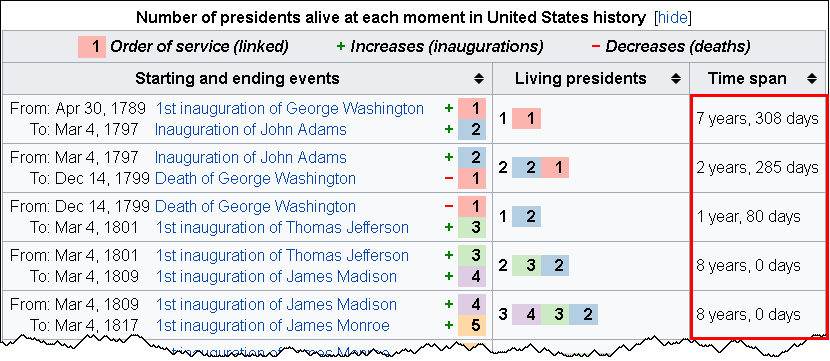
The INTCK and INTNX functions in SAS helps you compute the time between events. This technical blog is based on the timeline of living US presidents, sourced from a Wikipedia table. The table data shows the number of years and days between events.
So, let’s start.
Gaps between dates
To calculate the interval between two dates, you can use these two SAS functions:
The INTCK function returns the number of time units between dates. The time unit can be selected in years, months, weeks, days, or whatever you feel like.
The INTNX function helps you compute the date that is 308 days away in the future from a specific date. This was just an example to help you understand what it means. The INTNX function returns a SAS date that is particular number of time units away from a particular date.
These two functions share a complimentary bond: where one calculates the difference between two dates, the other entitles you to add time units to a specified date value. Also, the INT part in both the functions denotes INTervals, and the terms INTCK and INTNX means Interval Check and Interval Next, respectively.
These two prime functions tend to be useful in counting the number of anniversaries between two dates along with calculating a future anniversary date. Use the ‘CONTINUOUS’ option for the INTCK function and the ‘SAME’ option for the INTNX function in the following manner:
The ‘CONTINUOUS’ option in the INTCK function helps you count the number of anniversaries of one date that occur before a second date. For example, the statement
Years = intck('year', '30APR1789'd, '04MAR1797'd, 'continuous');
returns the value 7 because there are 7 full years (anniversaries of 30APR) between those two dates. Without the ‘CONTINUOUS’ option, the function returns 8 as 01JAN occurs 8 times between those dates.
The statement
Anniv = intnx('year', '30APR1789'd, 7, 'same');
returns the 7th anniversary of the date 30APR1789. In some ways, it returns the date value for 30APR1796.
The most exciting part about these two functions is that they automatically handle leap years! Yes, you read that right. If you ask for the number of days within two dates, the INTCK function will show leap days in the result. If an event takes place on a leap day, and you ask the INTNX function to reveal the anniversary date, it will report 28FEB of the next year to the next anniversary date.
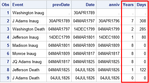
An algorithm calculating years and days between events
Go through the following algorithm to calculate the number of years and days between dates in SAS:
Use the INTCK function with the ‘CONTINUOUS’ option to calculate the number of completed years between two dates
Use the INTNX function to discover a third date, i.e. anniversary date, which is the same month and day like the start date, but takes place less than a year before the end date.
Use the INTCK function to ascertain the number of days occurring between the anniversary date and the end date.
Here are the data steps that enable you to compute the time interval in years and days between the first few US presidential inaugurations and deaths.
data YearDays;
formatDate prevDate anniv Date9.;
input @1 Date anydtdte12.
@13 Event $26.;
prevDate = lag(Date);
if_N_=1thendo; /* when _N_=1, lag(Date)=. */
Years=.; Days=.; return; /* set years & days, go to next obs */end;
Years = intck('year', prevDate, Date, 'continuous'); /* num complete years */
Anniv = intnx('year', prevDate, Years, 'same'); /* most recent anniv */
Days = intck('day', anniv, Date); /* days since anniv */
datalines;
Apr 30, 1789 Washington Inaug
Mar 4, 1797 J Adams Inaug
Dec 14, 1799 Washington Death
Mar 4, 1801 Jefferson Inaug
Mar 4, 1809 Madison Inaug
Mar 4, 1817 Monroe Inaug
Mar 4, 1825 JQ Adams Inaug
Jul 4, 1826 Jefferson Death
Jul 4, 1826 J Adams Death
run;
proc printdata=YearDays;
var Event prevDate Date Anniv Years Days;
run;
In a nutshell, the INTCK and INTNX functions are consequential for calculating intervals between dates. In this blog, I discussed about two-less-popular options inn SAS, for more such SAS training related blogs, follow us at DexLab Analytics.
To learn more about Machine Learning Using Python and Spark – click here. To learn more about Data Analyst with Advanced excel course – click here. To learn more about Data Analyst with SAS Course – click here. To learn more about Data Analyst with R Course – click here. To learn more about Big Data Course – click here.
It seems some good news is waiting for you – honing your data for effective reports are easier now with the 8.1 release of SAS Visual Analytics. In this technical blog, we will understand the structure of data pane, how it exhibits data from an active data source, and a handful number of tasks, which you might want to perform – like viewing measure details, adjusting data item properties and fabricating geographic data items, custom categories and hierarchies.
Colours are amazing, they are the subject of many romantic poems and songs, they are what can alter our moods drastically, they are these magical wavelengths that transform into incredible visions for our eyes.
Some feel warm, while others feel cool, some make us happy while others make us sad… but as colours are so important, how to add these values within the SAS Enterprise Guide?
Recently, a discussion was held, which invited data scientists and analysts all over the world, to take part in the Science of Super Bowl discussion panel, this discussion was held by Newswise.
We found one notable discussion topic, which answered three very important questions related to data science that the sports industry could use:
The PUT statement in SAS for programmers who have completed a SAS certification in the DATA step and the %PUT macro statements are highly useful statements, which will help to enable you to display the values of variables and macro variables, respectively.
And almost by default the output will appear in the SAS logs. In this article we will share a few tips which will allow you to make use of these statements more efficiently.
Christmas is just at the end of this week, so we at team DexLab decided to help our dear readers who love some data-wizardry, with some SAS magic! You can choose to flaunt your extra SAS knowledge to your peer groups with the below described SAS program.
Celebrate Christmas in Data Analyst Style With SAS!
We are taking things a tad backwards by trying to, almost idiosyncratically complicate things that are otherwise simple. After all some say, a job of a data analyst is to do so! However, be it stupid or unnecessary this is definitely by far the coolest way to wish Merry Christmas, in data-analyst style.
Would you like to create customized SAS graphs with the use of PROC SGPLOT and other ODS graphic procedures? Then an essential skill that you must learn is to know how to join, merge, concentrate and append SAS data sets, which arise from a variety of sources. The SG procedures, which stand for SAS statistical graphic procedures, enable users to overlay different kinds of customized curves, bars and markers. But the SG procedures do expect all the data for a graph to be in one single set of data. Thus, it often becomes necessary to append two or more sets of data before one can create a complex graph.
In this blog post, we will discuss two ways in which we can combine data sets in order to create ODS graphics. An alternative option is to use the SG annotation facility, which will add extra curves and markers to the graph. We mostly recommend the use of the techniques that are given in this article for simple features and reserve annotations when adding highly complex yet non-standard features.
Using overlay curves:
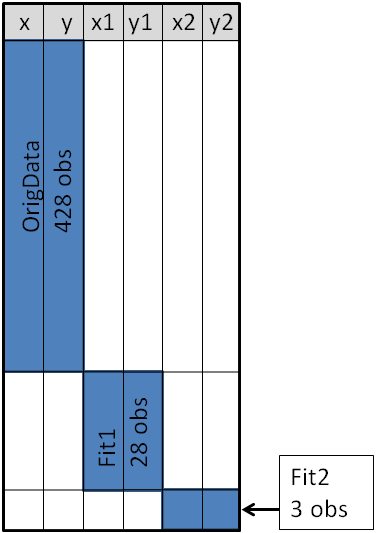
Here is a brief idea on how to structure a SAS data set, so that one can overlay curves on a scatter plot.
The original data is contained in the X and Y variables, as can be seen from the picture below. These will be the coordinates for the scatter plot. The secondary information will be appended at the end of the data. The variables X1 and Y1 contain the coordinates of a custom scatter plot smoother. The X2 and Y2 variables contain the coordinates of another scatter plot smoother.
Source: blogs.sas.com
This structure will enable you to use the SGPLOT procedure for overlaying, two curves on the scatter plot. One may make use of a SCATTER statement along with two SERIES statements to build the graphs.
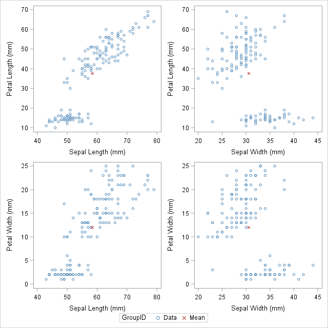
Sometimes in addition to the overlaying curves, we like to add special markers to the scatter plot. In this blog we plan to show people how to add a marker that shows the location of the sample mean. It will discuss how to use PROC MEANS to build an output data set, which contains the coordinates of the sample mean, then we will append the data set to the original data.
With the below mentioned statements we can use PROC MEANS for computing the sample mean of the four variables in the data set of SasHelp.Iris. This data contains the measurements for 150 iris flowers. To further emphasize on the general syntax of this computation, we will make use of macro variables but note that it is not necessary:
With the AUTONAME option on the output statement, we can tell PROC MEANS to append the name of the statistics to names of the variables. As a result, the output datasets will contain the variables, with names like PetalLength_Mean or SepalWidth_Mean.
As depicted in the previous picture, this will enable you to append the new data into the end of the old data in the “wide form”, as shown here:
data Wide;
set &DSName Means; /* add four new variables; pad with missing values */run;
ods graphics / attrpriority=color subpixel;
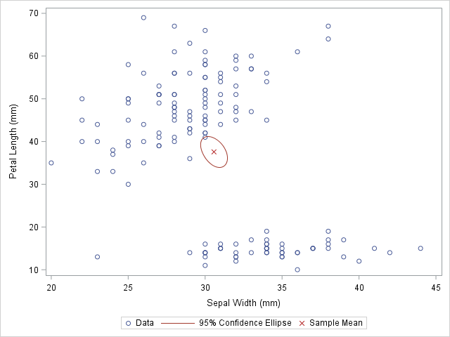
proc sgplotdata=Wide;
scatter x=SepalWidth y=PetalLength / legendlabel="Data";
ellipse x=SepalWidth y=PetalLength / type=mean;
scatter x=SepalWidth_Mean y=PetalLength_Mean /
legendlabel="Sample Mean" markerattrs=(symbol=X color=firebrick);
run;
And as here:
Source: blogs.sas.com
The original data is used in the first SCATTER statement and the ELLIPSE statement. You must remember that the ELLIPSE statement draws an approximate confidence ellipse for the population mean. The second SCATTER statement also makes use of sample means, which must be appended to the end of the original data. The second SCATTER statement will draw a red marker at the location of the sample mean.
This method can be used to plot other sample statistics (like the median) or to highlight special values such as the origin of a coordinate system.
Using overlay markers: of the long form
In certain circumstances, it is better to append the secondary data in the “long form”. In the long form the secondary data sets contains variables similar to the names in the original data set. One can choose to use the SAS data step to build a variable that will pinpoint the original and supplementary observations. With this technique it will be useful when people would want to show multiple markers (like, sample, mean, median, mode etc.) by making use of the GROUP = option on one of the SCATTER statement.
The following call to the PROC MEANS does not make use of an AUTONAME option. That is why the output data sets contain variables which have the same name as the input data. One can make use of the IN= data set option, for creating the ID variables that identifies with the data from the computed statistics:
/* Long form. New data has same name but different group ID */proc meansdata=&DSName noprint;
var&VarNames;
output out=Means(drop=_TYPE_ _FREQ_)mean=;
run;
data Long;
set &DSName Means(in=newdata);
if newdata then
GroupID = "Mean";
else GroupID = "Data";
run;
The DATA step is used to create the GroupID variable, which has several values “Data” for the original observations and the value “Mean” for the appended observations. This data structure will be useful for calling the PROC SGSCATTER and this will support the GROUP = option, however it does not support multiple PLOT statements as the following:
In closing thoughts, this blog is to demonstrate some useful techniques, to add markers to a graph. The technique requires people to use concatenate the original data with supplementary data. Often for creating ODS statistical graphics it is better to use appending and merging data technique in SAS. This is a great technique to include in your programming capabilities.
SAS courses in Noidacan give you further details on some more techniques that are worth adding to your analytics toolbox!
To learn more about Data Analyst with Advanced excel course – Enrol Now. To learn more about Data Analyst with R Course – Enrol Now. To learn more about Big Data Course – Enrol Now.
To learn more about Machine Learning Using Python and Spark – Enrol Now. To learn more about Data Analyst with SAS Course – Enrol Now. To learn more about Data Analyst with Apache Spark Course – Enrol Now. To learn more about Data Analyst with Market Risk Analytics and Modelling Course – Enrol Now.