R predictive modelling Archives - DexLab Analytics | Big Data Hadoop SAS R Analytics Predictive Modeling & Excel VBA

Predictive Analytics: The Key to Enhance the Process of Debt Collection

Predictive Analytics: The Key to Enhance the Process of Debt Collection

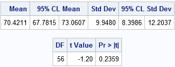
A wide array of industries has already engaged in some kind of predictive analytics – numerical analysis of debt collection is relatively a recent addition. Financial analysts are now found harnessing the power of predictive analytics to cull better results out for their clients, and measure the effectiveness of their strategies and collections.

Let’s see how predictive analytics is used in debt collection process:

2

Understanding Client Scoring (Risk Assessment)

Since the late 1980’s, FICO score is regarded as the golden standard for determining creditworthiness and loan application. But, however, machine learning, particularly predictive analytics can replace it, and develop an encompassing portrait of a client, taking into effect more than his mere credit history and present debts. It can also include his social media feeds and spending trajectory.

Evaluating Payment Patterns

The survival models evaluate each client’s probability of becoming a potential loss. If the account shows a continuous downward trend, then it should be regarded soon as a potential risk. Predictive analytics can help identify spending patterns, indicating the struggles of each client. A system can be developed which self-triggers whenever any unwanted pattern transpires. It could ask the client if they need any help or if they are going through a financial distress, so that it can help before the situation turns beyond repairs.

For R predictive modeling training courses, visit DexLab Analytics.

Cash Flow Predictions

Businesses are keen to know about future cash flows – what they can expect! Financial institutions are no different. Predictive analytics helps in making more appropriate predictions, especially when it comes to receivables.

Debt collector’s business models are subject to the ability to forecast the success of collection operations, and ascertaining results at the end of each month, before the billing cycle initiates. As a result, the workforce of the company is able to shift their focus from the potential payers to those who would not be able to meet their obligations. This shift in focus helps!

Better Client Relationship

Predictive analytics weave wonders; not only it has the ability to point which clients are the highest risks for your company, but also predict the best time to contact them to reap maximum results. What you need to do is just visit the logs of past conversations.

Challenges

Last, but not the least, all big data models face a common challenge – data cleaning. As it’s a process of wastage in and out, before starting with prediction, company should deal with this problem at first to construct a pipeline, for feeding in the data, clean it and use it for neural network training.

In a concluding statement, predictive analytics is the best bet for debt and revenue collection – it boosts conversion rates at the right time with the right people. If you want to study more about predictive analytics, and its varying uses in different segments of industry, enroll in R Predictive Modelling Certification training at DexLab Analytics. They provide superior knowledge-intensive training to interested individuals with added benefit of placement assistance. For more, visit their website.


The blog has been sourced fromdataconomy.com/2018/09/improving-debt-collection-with-predictive-models


Interested in a career in Data Analyst?

To learn more about Data Analyst with Advanced excel course – Enrol Now.
To learn more about Data Analyst with R Course – Enrol Now.
To learn more about Big Data Course – Enrol Now.

To learn more about Machine Learning Using Python and Spark – Enrol Now.
To learn more about Data Analyst with SAS Course – Enrol Now.
To learn more about Data Analyst with Apache Spark Course – Enrol Now.
To learn more about Data Analyst with Market Risk Analytics and Modelling Course – Enrol Now.

R is Gaining Huge Prominence in Data Analytics: Explained Why

Why should you learn R?

Just because it is largely popular..

Is this reason enough for you?

Budding data analytics professionals look forward to learn R because they think by grasping R skills, they would be able to nab the core principles of data science: data visualization, machine learning and data manipulation.

Be careful, while selecting a language to learn. The language should be capacious enough to trigger all the above-mentioned areas and more. Being a data scientist, you would need tools to carry out all these tasks, along with having the resources to learn them in the desired language.

In short, fix your attention on process and technique and just not on the syntax – after all, you need to find out ways to discover insight in data, and for that you need to excel over these 3 core skills in data science and FYI – in R, it is easier to master these skills as compared to any other language.

Data Manipulation

As rightly put, more than 80% of work in data science is related to data manipulation. Data wrangling is very common; a regular data scientist spends a significant portion of his time working on data – he arranges data and puts them into a proper shape to boost future operational activities. 

In R, you will find some of the best data management tools – dplyr package in R makes data manipulation easier. Just ‘chain’ the standard dplyr together and see how drastically data manipulation turns out to be simple.

For R programming certification in Delhi, drop by DexLab Analytics.

2

Data Visualization

One of the best data visualization tools, ggplot2 helps you get a better grip on syntax, while easing out the way you think about data visualization. Statistical visualizations are rooted in deep structure – they consist of a highly structured framework on which several data visualizations are created. Ggplot2 is also based on this system – learn ggplot2 and discover data visualization in a new way.

However, the moment you combine dplyr and ggplot2 together, through the chaining technology, deciphering new insights about your data becomes a piece of cake.

Machine Learning

For many, machine learning is the most important skill to develop but if you ask me, it takes time to ace it. Professionals, who are in this line of work takes years to fully understand the real workings of machine learning and implement it in the best way possible.

Stronger tools are needed time and often, especially when normal data exploration stops producing good results. R boasts of some of the most innovative tools and resources.

R is gaining popularity. It is becoming the lingua franca for data science, though there are several other high-end language programs, R is the one that is used most widely and extremely reliable. A large number of companies are putting their best bets on R – Digital natives like Google and Facebook both houses a large number of data scientists proficient in R. Revolution Analytics once stated, “R is also the tool of choice for data scientists at Microsoft, who apply machine learning to data from Bing, Azure, Office, and the Sales, Marketing and Finance departments.” Besides the tech giants, a wide array of medium-scale companies like Uber, Ford, HSBC and Trulia have also started recognizing the growing importance of R.

Now, if you want to learn more programming languages, you are good to go. To be clear, there is no single programming language that would solve all your data related problems, hence it’s better to set your hands in other languages to solve respective problems.

Consider Machine Learning Using Python; next to R, Python is the encompassing multi-purpose programming language all the data scientists should learn. Loaded with incredible visualization tools, machine learning techniques, Python is the second most useful language to learn. Grab a Python certification Gurgaon today from DexLab Analytics. It will surely help your career move!


Interested in a career in Data Analyst?

To learn more about Data Analyst with Advanced excel course – Enrol Now.
To learn more about Data Analyst with R Course – Enrol Now.
To learn more about Big Data Course – Enrol Now.

To learn more about Machine Learning Using Python and Spark – Enrol Now.
To learn more about Data Analyst with SAS Course – Enrol Now.
To learn more about Data Analyst with Apache Spark Course – Enrol Now.
To learn more about Data Analyst with Market Risk Analytics and Modelling Course – Enrol Now.

How R Programming is Transforming Business for Good

Today, every business is putting efforts to understand their customers and themselves, better. But, how? What methods are they applying? Do mere Excel pivot tables help analyze vast pool of data? The answer to the latter question is in the negative – Excel pivot tables are not that great at analyzing data – so a wide number of companies look forward to SAS and R Programming to cull Business Intelligence.

 
How R Programming is Transforming Business for Good
 

Besides SAS, R-Programming is another open-source language that is used by most of the budding data scientists in the world of analytics. The R Programming language is more oriented towards the correct implication of data science, while ensuring business the cutting edge data analysis tools. Continue reading “How R Programming is Transforming Business for Good”

How to create Chart Templates with R Functions

R functions are used to produce chart templates to keep the look and feel of the reports intact.

 
How to create Chart Templates with R Functions
 

In this post you will come across how to create chart templates with R functions – all the R users should be accustomed to the calling functions so as to perform calculations and outline plots accurately. Remember what colors and fonts to use each time: R functions are used as a short-cut for producing customary-looking charts.

Continue reading “How to create Chart Templates with R Functions”

The ABC of Summary Statistics and T Tests in SAS

The ABC of Summary Statistics and T Tests in SAS

Getting introduced to statistics for SAS training? Then, you must know how to create summary statistics (such as sample size, mean, and standard deviation) to test hypotheses and to figure confidence intervals. In this blog, we will show you how to furnish summary statistics (instead of raw data) to PROC TTEST in SAS, how to develop a data set that includes summary statistics and how to run PROC TTEST to calculate a two-sample or one-sample t test for the mean.

So, let’s start!

2

Running a two-sample t test for difference of means from summarized statistics

Instead of going the clichéd way, we will start with establishing a comparison between the mean heights of 19 students, based on gender – the data is held in the Sashelp class data set.

Observe the below SAS statements that sorts the data by the grouping variable, calling PROC MEANS and printing a subset of the statistics:

proc sort data=sashelp.class out=class; 
   by sex;                                /* sort by group variable */
run;
proc means data=class noprint;           /* compute summary statistics by group */
   by sex;                               /* group variable */
   var height;                           /* analysis variable */
   output out=SummaryStats;              /* write statistics to data set */
run;
proc print data=SummaryStats label noobs; 
   where _STAT_ in ("N", "MEAN", "STD");
   var Sex _STAT_ Height;
run;

summarystats1

The table reflects the structure of the Summary Stats set for two sample tests. The two samples used here are differentiated on the levels of the Sex Variable (‘F’ for females and ‘M’ for males). The _STAT_ column shows the name of the statistic implemented here. The Height column depicts the value of the statistics for individual group.

Get SAS certification Delhi from DexLab Analytics today!

The problem: The heights of sixth-grade students are normally distributed. Random samples of n1=9 females and n2=10 males are selected. The mean height of the female sample is m1=60.5889 with a standard deviation of s1=5.0183. The mean height of the male sample is m2=63.9100 with a standard deviation of s2=4.9379. Is there evidence that the mean height of sixth-grade students depends on gender?

Here, you have to do nothing special to get the PROC TTEST – whenever the procedure gets the sight of the respective variable _STAT_ and any unique values, the procedure understands that the data set comprises summarized statistics. The following representation compares the mean heights of males and females:

proc ttest data=SummaryStats order=data
           alpha=0.05 test=diff sides=2; /* two-sided test of diff between group means */
   class sex;
   var height;
run;

summarystats1

Check the confidence intervals for the standard deviations and also that the output includes 95% confidence intervals for group means.

In the second table, the ‘Pooled’ row radiates out the impression that both the variances of two groups are more or less equal, which is somewhat true even. The value of the t statistic is t = -1.45 with a two-sided p-value of 0.1645.

The syntax for the PROC TTEST statement allows you to change the type of hypothesis test and the significance level. To support this, you can now run a one-sided test for the alternative hypothesis μ1 < μ2 at the 0.10 significance level just by using:

proc ttest ... alpha=0.10 test=diff sides=L;  /* Left-tailed test */

Running a one-sample t test of the mean from summarized statistics

In the above section, you have learnt to create the summary statistics from PROC MEANS. Nevertheless, you can also generate the summary statistic manually, if you lack original data.

The problem: A research study measured the pulse rates of 57 college men and found a mean pulse rate of 70.4211 beats per minute with a standard deviation of 9.9480 beats per minute. Researchers want to know if the mean pulse rate for all college men is different from the current standard of 72 beats per minute.

The following statements jots down the summary statistics for a data set, asks PROC TTEST to perform a one-sample test of the null hypothesis μ = 72 against a two-sided alternative hypothesis:

data SummaryStats;
  infile datalines dsd truncover;
  input _STAT_:$8. X;
datalines;
N, 57
MEAN, 70.4211
STD, 9.9480
;
 
proc ttest data=SummaryStats alpha=0.05 H0=72 sides=2; /* H0: mu=72 vs two-sided alternative */
   var X;
run;

summarystats3 (2)

The outcome is a 95% confidence interval for the mean containing a value 72. The value of the t statistic is t = -1.20, which corresponds to a p-value of 0.2359. Therefore, the data fails in rejecting the null hypothesis at the 0.05 significance level.

For more informative blogs and news about SAS course, drop by our prime SAS predictive modeling training institute DexLab Analytics.

 
This post originally appeared onblogs.sas.com/content/iml/2017/07/03/summary-statistics-t-tests-sas.html
 

Interested in a career in Data Analyst?

To learn more about Data Analyst with Advanced excel course – Enrol Now.
To learn more about Data Analyst with R Course – Enrol Now.
To learn more about Big Data Course – Enrol Now.

To learn more about Machine Learning Using Python and Spark – Enrol Now.
To learn more about Data Analyst with SAS Course – Enrol Now.
To learn more about Data Analyst with Apache Spark Course – Enrol Now.
To learn more about Data Analyst with Market Risk Analytics and Modelling Course – Enrol Now.

Data Science: Is It the Right Answer?

‘Big Data’, and then there is ‘Data Science’. These terms are found everywhere, but there is a constant issue lingering with their effectiveness. How effective is data science? Is Big Data an overhyped concept stealing the thunder?

Summing this up, Tim Harford stated in a leading financial magazine –“Big Data has arrived, but big insights have not.” Well, to be precise, Data Science nor Big Data are to be blamed for this, whereas the truth is there exists a lot of data around, but in different places. The aggregation of data is difficult and time-consuming.

Look for Data analyst course in Gurgaon at DexLab Analytics.

Statistically, Data science may be the next-big-thing, but it is yet to become mainstream. Though prognosticators predict 50% of organizations are going to use Data Science in 2017, more practical visionaries put the numbers closer to 15%. Big Data is hard, but it is Data Science that is even harder. Gartner reports, “Only 15% organizations are able to channelize Data Science to production.” – The reason being the gap existing between Data Science expectations and reality.

Big Data is relied upon so extensively that companies have started to expect more than it can actually deliver. Additionally, analytics-generated insights are easier to be replicated – of late, we studied a financial services company where we found a model based on Big Data technology only to learn later that the developers had already developed similar models for several other banks. It means, duplication is to be expected largely.

However, Big Data is the key to Data Science success. For years, the market remained exhilarated about Big Data. Yet, years after big data infused into Hadoop, Spark, etc., Data Science is nowhere near a 50% adoption rate. To get the best out of this revered technology, organizations need vast pools of data and not the latest algorithms. But the biggest reason for Big Data failure is that most of the companies cannot muster in the information they have, properly. They don’t know how to manage it, evaluate it in the exact ways that amplify their understanding, and bring in changes according to newer insights developed. Companies never automatically develop these competencies; they first need to know how to use the data in the correct manner in their mainframe systems, much the way he statisticians’ master arithmetic before they start on with algebra. So, unless and until a company learns to derive out the best from its data and analysis, Data Science has no role to play.

Even if companies manage to get past the above mentioned hurdles, they fail miserably in finding skillful data scientists, who are the right guys for the job in question. Veritable data scientists are rare to find these days. Several universities are found offering Data Science programs for the learners, but instead of focusing on the theoretical approach, Data Science is a more practical discipline. Classroom training is not what you should be looking for. Seek for a premier Data analyst training institute and grab the fundamentals of Data Science. DexLab Analytics is here with its amazing analyst courses in Delhi. Get enrolled today to outshine your peers and leave an imprint in the bigger Big Data community for long.


Interested in a career in Data Analyst?

To learn more about Data Analyst with Advanced excel course – Enrol Now.
To learn more about Data Analyst with R Course – Enrol Now.
To learn more about Big Data Course – Enrol Now.

To learn more about Machine Learning Using Python and Spark – Enrol Now.
To learn more about Data Analyst with SAS Course – Enrol Now.
To learn more about Data Analyst with Apache Spark Course – Enrol Now.
To learn more about Data Analyst with Market Risk Analytics and Modelling Course – Enrol Now.

Analyze Smartphone Sensor Data with R and the BreakoutDetection Package

Analyze-Smartphone-Sensor-Data-with-R-and-the-BreakoutDetection-Package

Quite interetsing. Juggling with sensor data is starkly different from economics data, document processing or social networking, but very worthwhile. In this blog, we will take a practical approach to analyze smartphone sensor data with R. We are going to use the accelerometer smartphone data that Datarella presented in its Data Fiction competition. The dataset signifies the stimulation along the three axes of the smartphone:


x – for sideways stimulation

y – for forward and backward stimulation

z – for upward and downward stimulation


The trickier part lies in its interpretation – on one hand where there are device, manufacturer and sensor specific mutations and artifacts, the other reflects all acceleration is calculated relative to the sensor orientation of the device. For example, taking out the cell phone out of your pocket and reading a tweet can be presented in the following way:


y acceleration – the phone was in the pocket top down but now has been taken out

z and y acceleration – tossing the phone so that it becomes horizontal

x acceleration – moving the smartphone from the left to the middle of your body

z acceleration – bringing  up the phone so that you can read the tweet clearly

And thirdly, the gravity influences all the movements.


Seeking R programming courses in Gurgaon? Feel free to reach us at DexLab Analytics..

Knowing exactly what to do with your smartphone can be quite intimidating – let us introduce an application of the Twitter BreakoutDetection Open Source library (see Github), which is used extensively for Behavioral Change Point analysis.

First, I have loaded the dataset and this is how it looks like:

setwd("~/Documents/Datarella")
accel <- read.csv("SensorAccelerometer.csv", stringsAsFactors=F)
head(accel)

  user_id           x          y        z                 updated_at                 type
1      88 -0.06703765 0.05746084 9.615114 2014-05-09 17:56:21.552521 Probe::Accelerometer
2      88 -0.05746084 0.10534488 9.576807 2014-05-09 17:56:22.139066 Probe::Accelerometer
3      88 -0.04788403 0.03830723 9.605537 2014-05-09 17:56:22.754616 Probe::Accelerometer
4      88 -0.01915361 0.04788403 9.567230 2014-05-09 17:56:23.372244 Probe::Accelerometer
5      88 -0.06703765 0.08619126 9.615114 2014-05-09 17:56:23.977817 Probe::Accelerometer
6      88 -0.04788403 0.07661445 9.595961  2014-05-09 17:56:24.53004 Probe::Accelerometer

This data includes the sensor data per user per day:

accel$day <- substr(accel$updated_at, 1, 10)
df <- accel[accel$day == '2014-05-12' & accel$user_id == 88,]
df$timestamp <- as.POSIXlt(df$updated_at) # Transform to POSIX datetime
library(ggplot2)
ggplot(df) + geom_line(aes(timestamp, x, color="x")) + 
             geom_line(aes(timestamp, y, color="y")) + 
             geom_line(aes(timestamp, z, color="z")) + 
             scale_x_datetime() + xlab("Time") + ylab("acceleration")

sensor_all

Let’s focus on the period between 12:32 and 13:00:

ggplot(df[df$timestamp >= '2014-05-12 12:32:00' & df$timestamp < '2014-05-12 13:00:00',]) +
  geom_line(aes(timestamp, x, color="x")) + 
  geom_line(aes(timestamp, y, color="y")) + 
  geom_line(aes(timestamp, z, color="z")) + 
  scale_x_datetime() + xlab("Time") + ylab("acceleration")

sensor_zoom

Following all this, I load the Breakoutdetection library:

install.packages("devtools")
devtools::install_github("twitter/BreakoutDetection")
library(BreakoutDetection)
bo <- breakout(df$x[df$timestamp >= '2014-05-12 12:32:00' & df$timestamp < '2014-05-12 12:35:00'], 
               min.size=10, method='multi', beta=.001, degree=1, plot=TRUE)
bo$plotsensor_breakout

The rapid analysis of the acceleration in the x direction presents us with 4 change points, in which the stimulation suddenly starts to change. At the start, the smartphone normally lies flat on a horizontal surface – the sensor reading revolves around value of 9.8 in a positive direction – which means the gravitational force only triggers this axis and not the x or y axes. Therefore, the phone is lying flat. However, things change and after a couple of movements or changing directions, the last observation reveals the phone has been on a position where the x axis has 9.6 acceleration, meaning the phone is being positioned in a landscape orientation facing the right.

Get the best R Analytics Certification in Gurgaon from our seasoned experts at DexLab Analytics.

 
This post originally appeared onwww.r-bloggers.com/how-to-analyze-smartphone-sensor-data-with-r-and-the-breakoutdetection-package
 

Interested in a career in Data Analyst?

To learn more about Data Analyst with Advanced excel course – Enrol Now.
To learn more about Data Analyst with R Course – Enrol Now.
To learn more about Big Data Course – Enrol Now.

To learn more about Machine Learning Using Python and Spark – Enrol Now.
To learn more about Data Analyst with SAS Course – Enrol Now.
To learn more about Data Analyst with Apache Spark Course – Enrol Now.
To learn more about Data Analyst with Market Risk Analytics and Modelling Course – Enrol Now.

New R Packages- 5 Reasons for Data Scientists to Rejoice

5-Reasons-for-Data-Scientists-to-Rejoice

One of the fundamental advantages of the ecosystem related to R and the primary reason that lie behind the phenomenal growth of R is the practice and facility to contribute new packages to R. When this is added to the highly stable CRAN which happens to be the primary repository of packages of R,gives it a great advantage. The effectiveness of CRAN is further enhanced by the ability of people with sufficient technical expertise and to contribute packages through a proper system of submission.

It is only with sufficient effort and time that one realizes the system of packages submitted through proper procedures can yield integrated software of high quality.Even those who are relatively new to R Programming the process of discovering the packages that serves as the bedrock of R language growth. Such packages add value to the language in a reliable way.

2

The following 5 new packages listed in the paragraphs that follow may trigger the curiosity of data scientists.

  •  AzureML V0.1.1

Cloud computing is and will continue to be of great interest to all data scientists. The AzureML provides Python and R Programmers a rich environment for machine learning. If you are yet to be initiated to Azure as a user this package will go long ways in helping you get started. It provides functions that let you push R code from your local system to the Azure cloud in addition to publishing models and functions as web services.

  •  Distcomp V0.25.1

Using distributed computing when dealing with large sets of data is invariable an irksome problem. This is truer in cases where sharing data amongst collaborators is difficult or simply not possible. The distcomp package implements a crafty partial likelihood algorithm which lets users build statistical models of complexity and sophistication on data sets that are not aggregated.

  • RotationForest V0.1

If there is any primary ensemble method that performs well on diverse sets of data on a constant basis is the forests algorithm. This particular variety performs principal analysis of components on subsets taken at random in the feature space and holds great promise.

  • Rpca V0.2.3

In case there is a matrix that forms a superposition of a component that is lowly ranked along with a sparse component, rcpa calls in a robust PCA method that recovers all of these components. The algorithm was publicized by the data scientists at Netflix.

  •  SwarmSVM V0.1

One of the primary machine learning algorithm happens to be the support vector machine. SwarmSVM has for its basis an approach that may be said to be as a clustering approach and makes provisions for 3 different ensemble methods that train support vector machines. A practical introduction to this particular method is also attached with the vignette that comes with the package.

For more such interesting technical blogs and insights, follow us at DexLab Analytics. We are a pioneering R programming training institute. Our industry experts impart the best possible R programming courses, so when are you contacting us!!


Interested in a career in Data Analyst?

To learn more about Data Analyst with Advanced excel course – Enrol Now.
To learn more about Data Analyst with R Course – Enrol Now.
To learn more about Big Data Course – Enrol Now.

To learn more about Machine Learning Using Python and Spark – Enrol Now.
To learn more about Data Analyst with SAS Course – Enrol Now.
To learn more about Data Analyst with Apache Spark Course – Enrol Now.
To learn more about Data Analyst with Market Risk Analytics and Modelling Course – Enrol Now.

Twelve Great Free R Programming E-books

To Big Data enthusiasts R is word or rather a letter that needs no introduction. R programming is a programming language that brings the complex world of statistics and datasets at your fingertips. It is mainly used for computing statistics and relevant graphics. The following twelve e-books are not only useful to bring you up to the task for R programming but best of all they are free.


Twelve Great Free R Programming E-books


  • Learning Statistics with R
    Author: Daniel Navarro

If you are looking for a guide that will take you through the intricacies of developing software with R be it the basic types and structures of data to more complex topics like recursion, closures as well as anonymous functions. Knowledge of statistics, although helpful, is not an essential pre-requisite .

Continue reading “Twelve Great Free R Programming E-books”

Call us to know more