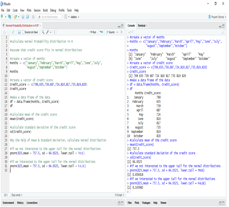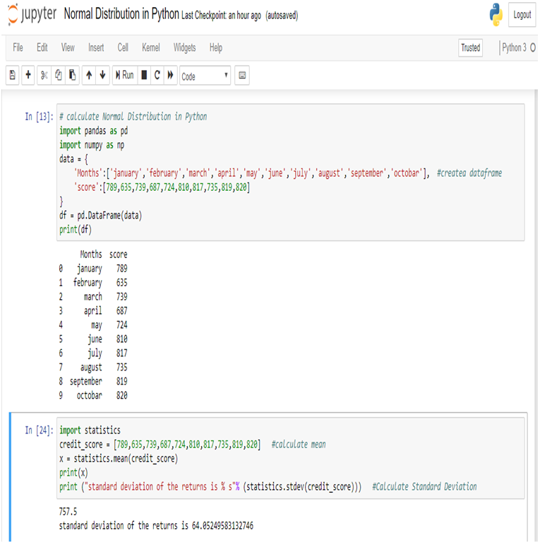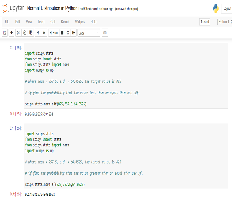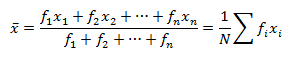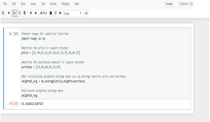
Data Smoothing is done to better understand the hidden patterns in the data. In the non- stationary processes, it is very hard to forecast the data as the variance over a period of time changes, therefore data smoothing techniques are used to smooth out the irregular roughness to see a clearer signal.
In this segment we will be discussing two of the most important data smoothing techniques :-
- Moving average smoothing
- Exponential smoothing
Moving average smoothing
Moving average is a technique where subsets of original data are created and then average of each subset is taken to smooth out the data and find the value in between each subset which better helps to see the trend over a period of time.
![]()
Lets take an example to better understand the problem.
Suppose that we have a data of price observed over a period of time and it is a non-stationary data so that the tend is hard to recognize.
| QTR (quarter) | Price |
| 1 | 10 |
| 2 | 11 |
| 3 | 18 |
| 4 | 14 |
| 5 | 15 |
| 6 | ? |
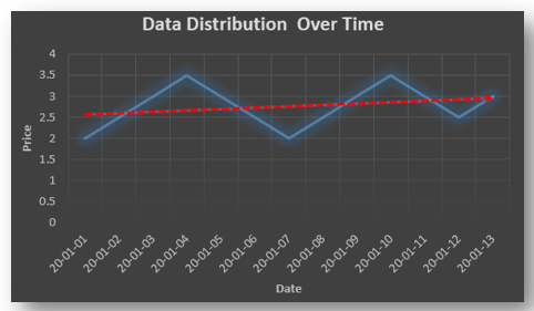
In the above data we don’t know the value of the 6th quarter.
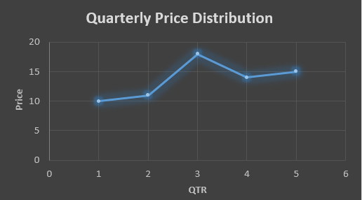
….fig (1)
The plot above shows that there is no trend the data is following so to better understand the pattern we calculate the moving average over three quarter at a time so that we get in between values as well as we get the missing value of the 6th quarter.
To find the missing value of 6th quarter we will use previous three quarter’s data i.e.
MAS = = 15.7
| QTR (quarter) | Price |
| 1 | 10 |
| 2 | 11 |
| 3 | 18 |
| 4 | 14 |
| 5 | 15 |
| 6 | 15.7 |
MAS = = 13
MAS = = 14.33
| QTR (quarter) | Price | MAS (Price) |
| 1 | 10 | 10 |
| 2 | 11 | 11 |
| 3 | 18 | 18 |
| 4 | 14 | 13 |
| 5 | 15 | 14.33 |
| 6 | 15.7 | 15.7 |
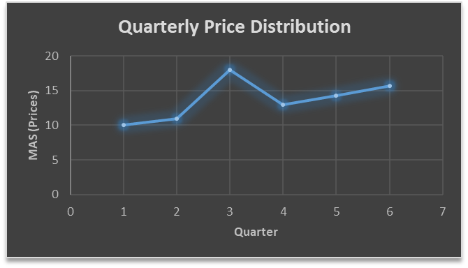
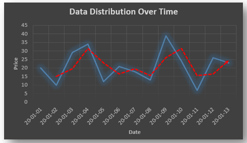
….. fig (2)
In the above graph we can see that after 3rd quarter there is an upward sloping trend in the data.
Exponential Data Smoothing
In this method a larger weight ( ) which lies between 0 & 1 is given to the most recent observations and as the observation grows more distant the weight decreases exponentially.
The weights are decided on the basis how the data is, in case the data has low movement then we will choose the value of closer to 0 and in case the data has a lot more randomness then in that case we would like to choose the value of closer to 1.
EMA= Ft= Ft-1 + (At-1 – Ft-1)
Now lets see a practical example.
For this example we will be taking = 0.5
Taking the same data……
| QTR (quarter) | Price (At) | EMS Price(Ft) |
| 1 | 10 | 10 |
| 2 | 11 | ? |
| 3 | 18 | ? |
| 4 | 14 | ? |
| 5 | 15 | ? |
| 6 | ? | ? |
To find the value of yellow cell we need to find out the value of all the blue cells and since we do not have the initial value of F1 we will use the value of A1. Now lets do the calculation:-
F2=10+0.5(10 – 10) = 10
F3=10+0.5(11 – 10) = 10.5
F4=10.5+0.5(18 – 10.5) = 14.25
F5=14.25+0.5(14 – 14.25) = 14.13
F6=14.13+0.5(15 – 14.13)= 14.56
| QTR (quarter) | Price (At) | EMS Price(Ft) |
| 1 | 10 | 10 |
| 2 | 11 | 10 |
| 3 | 18 | 10.5 |
| 4 | 14 | 14.25 |
| 5 | 15 | 14.13 |
| 6 | 14.56 | 14.56 |
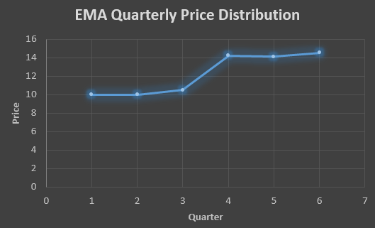
In the above graph we see that there is a trend now where the data is moving in the upward direction.
So, with that we come to the end of the discussion on the Data smoothing method. Hopefully it helped you understand the topic, for more information you can also watch the video tutorial attached down this blog. The blog is designed and prepared by Niharika Rai, Analytics Consultant, DexLab Analytics DexLab Analytics offers machine learning courses in Gurgaon. To keep on learning more, follow DexLab Analytics blog.
.