Python Archives - Page 2 of 7 - DexLab Analytics | Big Data Hadoop SAS R Analytics Predictive Modeling & Excel VBA

Visualization with Python Part-V: Introducing the Pandas_bokeh library

Visualization with Python Part-V: Introducing the Pandas_bokeh library

In our fifth installment of the visualization series using Python programming language, we introduce you to another powerful library in Python that is the Pandas_bokeh library. So, let’s find out what you can achieve with Pandas_bokeh library.

Pandas_bokeh is a library which can help you create interactive graphs in python. One can zoom in, zoom out, select a certain portion of the graph to see, move the plot left, right and center, create tabs in case they want to see a single plot at a time, create multiple plots at a time, create widgets like dropdown list, check boxes, radio buttons, slider etc. It is similar to the shiny app which is used in the r programming language  but simpler and faster.

How to install pandas_bokeh?

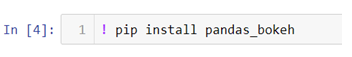
In the above code we are changing our jupyter notebook code cell into a command line by using ! and then we can use pip (python installation package) to install the library.

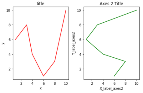
How to create a simple line plot using pandas_bokeh ?

The first thing to do is import the libraries which we will be using to create a line plot.

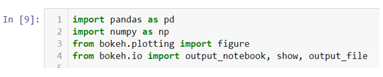
  • We will be creating our own dataset here and for that we need to import Numpy and Pandas libraries. Also we will be importing .figure() method from plotting module to create our canvas on which we will be building our graph from the scratch and we will also be importing .output_notebook() method to visualize our graph on jupyter notebook and to visualize our graph on a new tab and save at the same time we can use .output_file() method.
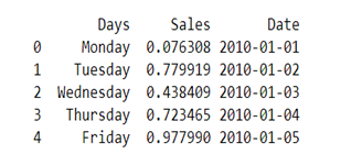
  • The Dataset we are creating here will have three columns ‘Days’, ‘Sales’ and ‘Date’.
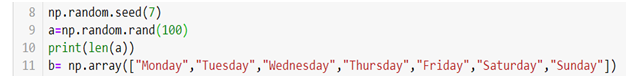
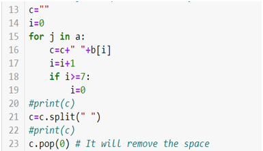
  • We will be creating a dataset with hundred observations in each column so for that we are using .rand() method to generate hundred random numbers and that will be our ‘Sales’ column data. Now for our ‘Days’ column we will be creating a loop which will run hundred times and each time an array index value will be saved in a variable c which has an empty string and .split() method is then used to create a list of that string.
  • For creating a ‘Date’ column we will be using the following code

  • At last create a data frame we will be using .DataFrame() method.

  • Now to create two line graphs on a single canvas we will be using object-oriented programming.

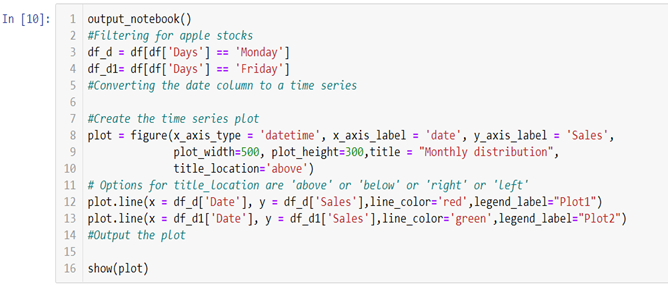
  • To build the graph on the jupyter notebook we are using .output_notebook() method and in case you want to plot the graph on a new tab you can use .output_file(“filename.html”) method.

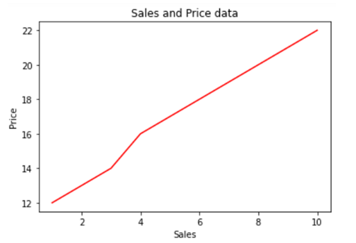
In the above line of codes we are creating two separate data frames df_d and df_d1 each containing Monday and Friday’s sales and dates separately now all we need to do is build a canvas using .figure() method and use few other arguments like x_axis_type to define the data type of the x axis and x_axis_label and y_axis_label to set graph labels, to adjust width and height of the canvas we have used plot_width and plot_height argument and to set title and title location we have used title and title_location. Once we have our canvas ready we can use .line() method and add x axis and y axis data to plot our graphs.

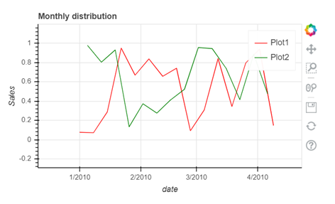
  • To interact with your graph you can use the icons on the right hand side corner which will help you zoom in and out, look at a certain part of the graph, scroll to zoom in and out, save your plot and reset the changes made by you using the side icons.

The video tutorial attached below will help you gain better understanding. 

At the end of this segment you must have become familiar with the nuances of the Pandas_bokeh library. As you continue on with the series, you will realize that you are becoming an expert in visualization. On Dexlab Analytics blog, you will find interesting blogs on various topics related to Python certification training.


.

Visualization with Python Part IV: Learn To Create A Box Plot Using Seaborn Library

Visualization with Python Part-IV: Learn To Create A Box Plot Using Seaborn Library

This is the 4th part of the series on visualization using Python programming language, where we will continue our discussion on the Seaborn library. Now that you have become familiar with the basics of the Seaborn library, you will be learning specific skills such as learning to create a box plot using Seaborn. So, let’s begin.

Seaborn library offers a list of pre-defined methods to create semi-flexible plots in Python and one of them is. boxplot() method. But what is a box plot?

Answer:- A box plot often known as box and whisker plot is a graph created to visualize the distribution of numerical data and skewness through displaying the data quartiles (or percentiles) and median.

Creating a box plot

Let’s begin by importing the Seaborn and Matplotlib library.

We will again be using the tips dataset which is a pre-defined dataset in Seaborn

Data description:- This is a dataset of a restaurant which keeps a record of the amount of bill paid by a customer, tip amount over the total bill paid, gender of the customer, whether he or she was a smoker or not, the day on which they ate at the restaurant, what was the time when they ate at the restaurant and the size of the table they booked.

To create a box plot we will be using .boxplot() method.

On the x axis we have day column having categorical data type and on the y axis we have total_bill column having numerical data type. Thus for each day with the help of a box plot we will  be able to visualize how the total_bill changes around its median value.

To add title to the graph we can use. title() method from the Matplotlib library

To add color to your graph you can use palette argument

We are adding a list of palette colors in this blog down below:-

You can replace the color mentioned in the above code to see which color variations you would prefer in your graph. For example

Here we are using color palette ‘CMRmap’ to change my graph color from different shades of blues to a completely different color range i.e. from blues to orange, violet, pale yellow etc.

This tutorial hopefully, has clarified the concept and you can now create boxplots with Seaborn. Since this is a series you need to keep track of all the parts to be a visualization expert as we take you through the process step by step. Follow the Dexlab Analytics blog to access more informative posts on different topics including python for data analysis.

Go through the video tutorial attached below to get more in-depth knowledge.


.

Visualization with Python Part III: Introducing The Seaborn Library

Visualization with Python Part III: Introducing The Seaborn Library

In this 3rd part of the visualization series using Python programming language, we are going to introduce you to the Seaborn Library. Seaborn is a visualization library which is built on top of Matplotlib library in Python. This library helps us build method based plots which when combined with Matplotlib library methods lets us build flexible graphs.

In this tutorial we will be using tips data, which is a pre-defined dataset in the Seaborn library.

So let’s begin by importing the Seaborn library and giving it a sudo name sns. We will also be importing Matplotlib library to add more attributes to our graphs.

To load the tips data set we will be using .load_dataset() method.

Data description:- This is a dataset of a restaurant which keeps a record of the amount of bill paid by a customer, tip amount over the total bill paid, gender of the customer, whether he or she was a smoker or not, the day on which they ate at the restaurant, what was the time when they ate at the restaurant and the size of the table they booked.

In case while loading the dataset you see a warning box appear on the screen you don’t need to worry , you haven’t done anything wrong. These FutureWarning boxes appear to make you aware that in the future there might be some changes in the library or methods you are using.

You can simply use the .simplefilter() method from the warning library to make them disappear.

Here the category argument helps you decide which type of warning you want to ignore.

Creating a bar plot in Seaborn

Now let’s quickly go ahead and create a bar plot with the help of .barplot() method.

In the above line of code we are using column named sex on the x axis and total_bill on the y axis. But this bar plot is very different from the bar plot which we usually make. The basic concept of a bar plot is to check the frequency but here we are also mentioning the y axis data which in general is not the case with a normal bar plot, that is, we get the frequency on the y axis when we are plotting a bar graph. So what does the above code do?

The above code compares the average of the category. In our case the above graph shows that the average bill of male is higher than the average bill of female. In case you want to plot a graph showing the average variation of bill around the mean (Standard deviation) you can use estimator argument within the .barplot() to do so.

Also if you want to change the background of your graph you can easily do so by using .set_style() method.

The vertical bars between the graph are called the error bars and they tell you how far from your mean or standard deviation by max data varies.

How to add Matplotlib attributes to your Seaborn graphs

Matplotlib methods can be imported and added to the Seaborn graphs to make them more presentable and flexible. Here we will be adding a title in our graph by using .title() method from the Matplotlib library.

You can use other Matplotlib methods like .legend(),xlabel(),.ylabel() etc,. to add more value to your graphs.

The video tutorial attached below will further help you clarify your ideas regarding the Seaborn library. Follow the series to gain expertise in visualization with Python programming language. Keep on following the Dexlab Analytics blog for reading more informative posts on Python for data science training.


.

An Introduction to Matplotlib Object Oriented Method: Visualization with Python (Part II)

An Introduction to Matplotlib Object Oriented Method: Visualization with Python (Part II)

In the last blog that covered Part 1 of the visualization series using Python programming language, we have learned the basics of the Matplotlib Library. Now that our grasp on the basics is strong we would move further. Let’s break it all down with a more formal introduction of Matplotlib’s Object Oriented API. This means we will instantiate figure objects and then call methods or attributes from that object.

Introduction to the Object Oriented Method

The main idea in using the more formal Object Oriented method is to create figure objects and then just call methods or attributes off of that object. This approach is nicer when dealing with a canvas that has multiple plots on it.

How to make multiple plots using .add_axes()

To begin, we create a figure instance. Then we can add axes to that figure where .figure()is a method which helps us create an empty canvas and then we use .add_axes() method to give the position where the plot is to be made. The positional arguments [left, bottom, width, height] help us decide from where the graph should begin within the canvas and what should be the width and the height of the graph. Since the area of the graph is 100% (1.0), the range of the positional argument should be between 0 and 1 and in case you want to plot the graph half within and half outside the canvas, you can go beyond the specified range depending upon your needs.

Let’s  quickly get to the coding part now.

  • In the above line of codes we are simply importing the Matplotlib library and creating a data which we want to plot.

  • plt.figure()method is helping us create an empty canvas and then we are giving the positional values to the .add_axes() method. As you can see we are using a variable named fig to save our canvas and then using the same variable as an object to add an axes to the canvas. Now all we need to do is use that axes to build are graph by adding x and y data.
  • Now you must be wondering why we aren’t able to see a plot in the corner of the canvas? It is because this procedure works only if we were to build multiple plots. So now let’s see how we can use the .add_axes() method to build multiple plots on top of each other.

  • In the above line of codes we are creating three axes and each axes is smaller than the other so that we are able to plot multiple graphs on top of each other.

  • Here we are making three different graphs and each graph has its own title and x axis and y axis labels. But to add title and axis labels we are now using .set_title(), .set_xlabel(), and .set_ylabel() instead of .title(), .xlabel() and .ylabel(). In axes2.plot() we are also using RGB color instead of using the predefined color in .plot() method. You can use your favorite color too by simply typing RGB color picker in your Google search and copy pasting the color code in the .plot() method. After running the above code we get the following graph:-

How to make multiple plots using .subplots()

.subplots() method is similar to the previous .subplot() method, the only difference is that now we use it on a canvas.

  • In the .subplots() we do not mention the plot number instead we use plot indexing method to build graph.

  • As you can see we are accessing the index number to build our plot and then using .tight_layout() method to keep the graphs from overlapping. After running the above code we get the following graphs:-

Do not forget to check out the video tutorial attached below to learn how this method works. Keep following the series to upgrade your skills and to explore more informative posts on topics like Python Programming training you need to follow the Dexlab Analytics blog.


.

A Quick Guide To Using Matplotlib Library (Part I)

A Quick Guide To Using Matplotlib Library

Matplotlib is the “grandfather” library of data visualization with Python. It was created by John Hunter. He created it to try replicating MatLab’s (another programming language) plotting capabilities in Python. So, if you are already familiar with matlab, matplotlib will feel natural to you.

This library gives you the flexibility to plot the graphs the way you want. You can start with a blank canvas and plot the graph on that canvas wherever you want. You can make multiple plots on top of each other, change the line type, change the line color using predefined colors or hex codes, line width etc.

Data Science Machine Learning Certification

Installation

Before you begin you’ll need to install matplotlib first by using the following code:-

There are two ways in which you can built matplotlib graphs:-

  • Method based graphs
  • Object-oriented graphs

Method Based Graphs in Matplotlib:-

There are pre-defined methods in matplotlib library which you can use to  create graphs directly using python language for example:-

Where, import matplotlib.pyplot as plt this code is used to import the library, %matplotlib inline is used to keep the plot within the parameters of the jupyter notebook, import numpy as np and x = np.array([1,3,4,6,8,10]) is used to import the numpy (numerical python) library and create an array x and plt.plot(x) is used to plot the distribution of the x variable.

We can also use .xlabel(), .ylabel() and .title() methods print x axis and y axis labels and title on the graph.

If you want to add text within your graph you can either use .annotate() method or .text() method.

Creating Multiplots

You can also create multiple plots by using .subplot() method by mentioning the number of rows and columns in which you want your graphs to be plotted. It works similar to the way you mention the number of rows and columns in a matrix.

You can add title, axis labels, texts etc., on each plot separately. In the end you can add .tight_layout() to solve the problem of overlapping of the graphs and to make the labels and scales visible.

Check out the video attached below to get an in-depth understanding of how Matplotlib works. This is a part of a visualization series using Python programming language. So, stay tuned for more updates. You can discover more such informative posts on the Dexlab Analytics blog.


.

Data Warehouse: Concept and Benefits

Data Warehouse: Concept and Benefits

A business organization has to deal with a massive amount of data streaming from myriad sources, and data warehousing refers to the process of collection and storage of that data that needs to be analyzed to glean valuable business insight.  Data warehousing plays a crucial role in business intelligence. The concept originated in the 1980s, it basically involves data extraction from disparate sources which later gets processed and post formatting the data stays in the system ready to be utilized for taking important decisions.

Data warehouse basically performs the task of running an analysis on the stored data which could be both structured and unstructured even semi-structured, however, the data that is in the warehouse cannot be modified. Data warehousing basically helps companies gain insight regarding factors influencing business, and they could use the data insight to formulate new strategies, developing products and so on. This highly skilled task demands professionals who have a background in Data science using python training.

What are the different steps in data warehousing?

Data warehousing involves the following steps

Transactional data extraction: In this step, the data is extracted from multiple sources available and loaded into the system.

Data transformation: The transactional data extracted from different sources need to be transformed and it would need relating as well.

Building a dimensional model: A dimensional model comprising fact and dimension tables are built and the data gets loaded.

Getting a front-end reporting tool: The tool could be built or, purchased, a crucial decision that needs much deliberation.

Benefits of data warehousing

An edge over the competition

This is undeniably one benefit every business would be eager to reap from data warehousing.  The data that is untapped could be the source of valuable information regarding risk factors, trends, customers and so many other factors that could impact the business. Data warehousing collates the data and arranges them in a contextual manner that is easy for a company to access and utilize to make informed decisions.

Enhanced data quality

Since data pooled from different sources could be structured or, unstructured and in different formats, working with such data inconsistency could be problematic and data warehousing takes care of the issue by transforming the data into a consistent format. The standardized data that easily conforms to the analytics platform can be of immense value.

Historical data analysis

A data warehouse basically stores a big amount of data and that includes historical data as well. Such data are basically old records of the company regarding sales, employee data, or, product-related information. Now the historical data belonging to different time periods need to be analyzed to predict upcoming trends.

Smarter business intelligence

Since businesses now rely on data-driven insight to devise strategies, they need access to data that is consistent, error-free, and high quality. However, data coming from numerous sources could be erroneous and irrelevant. But, data warehousing takes care of this issue by formatting the data to make it consistent and free from any error and could be analyzed to offer valuable insight that could help the management take decisions regarding sales, marketing, finance.

High ROI

Building a data warehouse requires significant investment but in the long term, the revenue that it generates can be significant. In fact, keen business intelligence now plays a crucial role in determining the success of an organization and with data warehousing the organizations can have access to data that is consistent and high quality thus enabling the company to derive actionable intel.  When a company implements such insight in making smarter strategies, they do gain in the long run.

Data Science Machine Learning Certification

Data warehousing plays a significant role in collating and storing valuable data that fuels a company’s business decisions. However,  given the specialized nature of the task, one must undergo Data Science training, to learn the nuances. The field of big data has plenty of opportunities for the right candidates.


.

DexLab Analytics Presents Mega Artificial Intelligence Course In Python: An Online Demo

DexLab Analytics Presents Mega Artificial Intelligence Course In Python: An Online Demo

Dexlab Analytics is undoubtedly a leading name in the field of the Big Data Analytics industry. The latest offering from this institute is a course that is remarkable in so many ways. The course is Mega Artificial Intelligence Course In Python, which aims to cover everything you ever need to learn regarding artificial intelligence. To help you get a better grasp of the course we have also prepared an online demo and the demo video is attached at the end of the blog do check that out to clear away any confusion you might have.

Before getting into the course details, there are certain features of the course that we think you should know about. To begin with, you do not need any special educational background, you can hail from any stream and can still pursue the course because here we will teach you from scratch. Just having some mathematical knowledge is fine. We have kept things flexible here, so you can repeat the course if and when necessary. The notes that you will be needing for the course including the code sheets, will be provided to you in the beginning so that you do not have to waste precious time in class taking notes.

However, the nature of the course will be online, because due to COVID 19 situation offline classes are temporarily not possible. You will be given all the classroom videos, furthermore, there will be guidelines regarding Kaggle.com where we will teach you how to participate in this pioneering data science website, how to compete over there and offer you tips to increase your ranking. All in all the course aims to transform you into a super data scientist.

You can find the detailed course information, the online demo and brochure in the PPT format at


The course will be divide into three sections starting with PYTHON  PROGRAMMING for Data Science. Throughout the sessions, you will get familiar with the language, its libraries. You will be taught to use Plotly and handle projects before moving onto the second section which is AI( Artificial Intelligence) comprising three components namely Statistics, Machine Learning, and Deep Learning. Along with picking up the nuances, you would handle mega projects including one on self driving cars. Moving on to the next segment of Big Data get introduced to PySpark. Handling a growing amount of data could be tough, so, an introduction to Quantum Computing seems necessary before wrapping things up.

Do check out the course details in the video attached below that gives you a thorough tour of the entire course and also check out the course brochure. Our contact number is provided there along with our website address, feel free to contact us regarding any query.


.

A Quick Guide to Data Mining

A Quick Guide to Data Mining

Data mining refers to processing mountainous amount of data that pile up, to detect patterns and offer useful insight to businesses to strategize better. The data in question could be both structured and unstructured datasets containing valuable information and which if and when processed using the right technique could lead towards solutions.

Enrolling in a Data analyst training institute, can help the professionals involved in this field hone their skills. Now that we have learned what data mining is, let’s have a look at the data mining techniques employed for refining data.  

Data cleaning

Since the data we are talking about is mostly unstructured data it could be erroneous, corrupt data. So, before the data processing can even begin it is essential to rectify or, eliminate such data from the data sets and thus preparing the ground for the next phases of operations. Data cleaning enhances data quality and ensures faster processing of data to generate insight. Data Science training is essential to be familiar with the process of data mining.

Classification analysis

Classification analysis is a complicated data mining technique which basically is about data segmentation. To be more precise it is decided which category an observation might belong to. While working with various data different attributes of the data are analyzed and the class or, segments they belong to are identified, then using algorithms further information is extracted.   

Regression analysis

Regression analysis basically refers to the method of deciding the correlation between variables. Using this method how one variable influences the other could be decided. It basically allows the data analyst to decide which variable is of importance and which could be left out. Regression analysis basically helps to predict.  

Anomaly detection

Anomaly detection is the technique that detects data points, observations in a dataset, that deviate from an expected or, normal pattern or behavior. This anomaly could point to some fault or, could lead towards the discovery of an exception that might offer new potential. In fields like health monitoring, or security this could be invaluable.

Clustering

This data mining technique is somewhat similar to classification analysis, but, different in the way that here data objects are grouped together in a cluster. Now objects belonging to one particular cluster will share some common thread while they would be completely different from objects in other clusters. In this technique visual presentation of data is important, for profiling customers this technique comes in handy.  

Association

This data mining technique is employed to find some hidden relationhip patterns among variables, mostly dependent variables belonging to a dataset. The recurring relationships of variables are taken into account in this process. This comes in handy in predicting customer behavior, such as when they shop what items are they likely to purchase together could be predicted.

Data Science Machine Learning Certification

Tracking patterns

This technique is especially useful while sorting out data for the businesses. In this process while working with big datasets, certain trends or, patterns are recognized and these patterns are then monitored to draw a conclusion. This pattern tracking technique could also aid in identifying some sort of anomaly in the dataset that might otherwise go undetected.

Big data is accumulating every day and the more efficiently the datasets get processed and sorted, the better would be the chances of businesses and other sectors be accurate in predicting trends and be prepared for it. The field of data science is full of opportunities now, learning Data science using python training could help the younger generation make it big in this field.


.

Top Python Libraries to Know About in 2020

Top Python Libraries To Know About In 2020

Python today is one of the most sought after programming languages in the world. As per Python’s Executive Summary, “Python is an interpreted, object-oriented, high-level programming language with dynamic semantics. Its high-level built in data structures, combined with dynamic typing and dynamic binding, make it very attractive for Rapid Application Development, as well as for use as a scripting or glue language to connect existing components together. Python’s simple, easy to learn syntax emphasizes readability and therefore reduces the cost of program maintenance.”

The most advantageous facet of Python is the richness of its library sources and the myriad uses and applications of these libraries in programming. This essay is dedicated to studying some of the best Python libraries available.

Tensor Flow

Tensor Flow is a highly popular open source library built by Google and Brain Team. It is used in almost all Google projects for machine learning. Tensor Flow 

works as a computational library for writing fresh algorithms that require vast amounts of tensor operations.

Scikit-learn

Unarguably one of the most competent libraries for working with complex data, Scikit-learn is a python library associated with Numpy and SciPy. This library facilitates cross validation or the ability to use more than one metric.

Keras

Keras is one of the most revolutionary libraries in Python in that it makes it easy to express neural networks. Keras provides some of the most competent utilities for compiling models, processing datasets and more.

PyTorch

It is the largest machine learning library that permits developers to perform tensor computation, create dynamic graphs and calculate gradients automatically. Also, it offers a rich repository of APIs for solving applications related to neural networks.

Light GBM

Gradient Boosting is one of the best machine learning libraries that helps developers build new algorithms using elementary models like decision trees. This library is highly scalable and optimal for fast implementation of gradient boosting.

Eli5

This library helps overcome the problem of inaccuracy in machine learning model predictions. It is used in mathematical operations that consume less computational time and it is important when it comes to depending on other Python libraries.

SciPy

This library is built using Numpy and it is used in high-level computations in data science. It is used extensively for scientific and computations, solving differential equations, linear algebra and optimization algorithms.

Data Science Machine Learning Certification

Pandas

Python Data Analysis or Pandas is another highly popular library that is crucial to a data science life cycle in a data science project. Pandas provides super fast and flexible data structures such as data frame CDs that are specifically designed to work with structured data intuitively.

There are many more libraries like Theano and Librosa that are lesser known but very very important for machine learning, the most revolutionary scientific development of our century. To know more on the subject, do peruse the DexLab Analytics website today. DexLab Analytics is a premier Machine Learning institute in Gurgaon.


.

Call us to know more