MongoDB is a document based database program which was developed by MongoDB Inc. and is licensed under server side public license (SSPL). It can be used across platforms and is a non-relational database also known as NoSQL, where NoSQL means that the data is not stored in the conventional tabular format and is used for unstructured data as compared to SQL and that is the major difference between NoSQL and SQL. MongoDB stores document in JSON or BSON format. JSON also known as JavaScript Object notation is a format where data is stored in a key value pair or array format which is readable for a normal human being whereas BSON is nothing but the JSON file encoded in the binary format which is quite hard for a human being to understand. Structure of MongoDB which uses a query language MQL(Mongodb query language):- Databases:- Databases is a group of collections. Collections:- Collection is a group fields. Fields:- Fields are nothing but key value pairs Just for an example look at the image given below:-
Here I am using MongoDB Compass a tool to connect to Atlas which is a cloud based platform which can help us write our queries and start performing all sort of data extraction and deployment techniques. You can download MongoDB Compass via the given link https://www.mongodb.com/try/download/compass
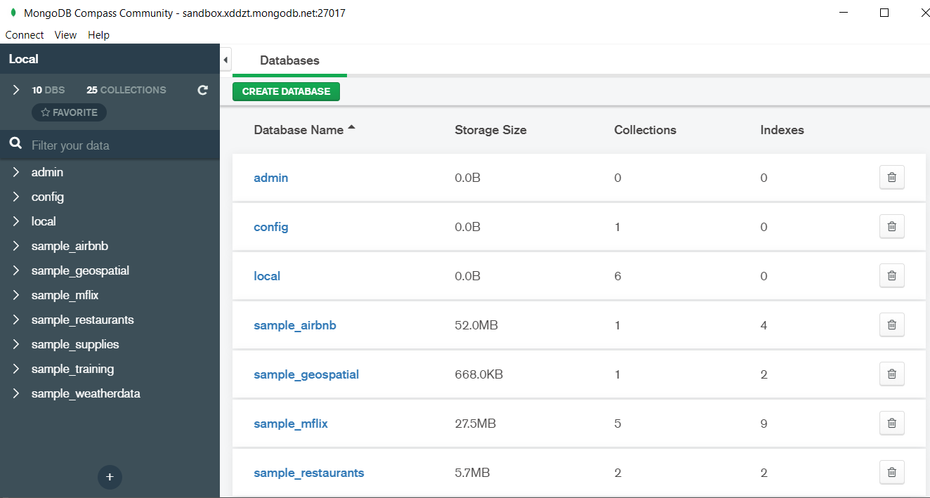
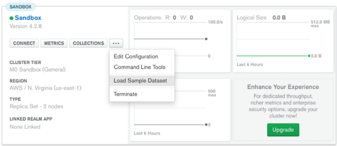
In the above image in the red box we have our databases and if we click on the “sample_training” database we will see a list of collections similar to the tables in sql.
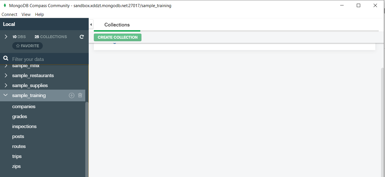
Now lets write our first query and see what data in “companies” collection looks like but before that select the “companies” collection.
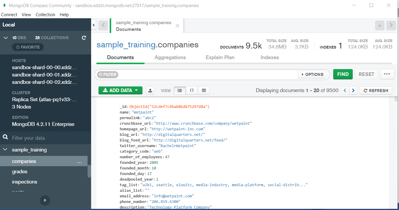
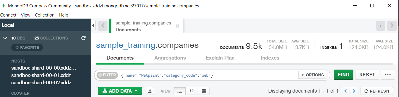
Now in our filter cell we can write the following query:-
In the above query “name” and “category_code” are the key values also known as fields and “Wetpaint” and “web” are the pair values on the basis of which we want to filter the data. What is cluster and how to create it on Atlas? MongoDB cluster also know as sharded cluster is created where each collection is divided into shards (small portions of the original data) which is a replica set of the original collection. In case you want to use Atlas there is an unpaid version available with approximately 512 mb space which is free to use. There is a pre-existing cluster in MongoDB named Sandbox , which currently I am using and you can use it too by following the given steps:- 1. Create a free account or sign in using your Google account on https://www.mongodb.com/cloud/atlas/lp/try2-in?utm_source=google&utm_campaign=gs_apac_india_search_brand_atlas_desktop&utm_term=mongodb%20atlas&utm_medium=cpc_paid_search&utm_ad=e&utm_ad_campaign_id=6501677905&gclid=CjwKCAiAr6-ABhAfEiwADO4sfaMDS6YRyBKaciG97RoCgBimOEq9jU2E5N4Jc4ErkuJXYcVpPd47-xoCkL8QAvD_BwE 2. Click on “Create an Organization”. 3. Write the organization name “MDBU”. 4. Click on “Create Organization”. 5. Click on “New Project”. 6. Name your project M001 and click “Next”. 7. Click on “Build a Cluster”. 8. Click on “Create a Cluster” an option under which free is written. 9. Click on the region closest to you and at the bottom change the name of the cluster to “Sandbox”. 10. Now click on connect and click on “Allow access from anywhere”. 11. Create a Database User and then click on “Create Database User”. username: m001-student password: m001-mongodb-basics 12. Click on “Close” and now load your sample as given below :
Loading may take a while…. 13. Click on collections once the sample is loaded and now you can start using the filter option in a similar way as in MongoDB Compass In my next blog I’ll be sharing with you how to connect Atlas with MongoDB Compass and we will also learn few ways in which we can write query using MQL.
So, with that we come to the end of the discussion on the MongoDB. Hopefully it helped you understand the topic, for more information you can also watch the video tutorial attached down this blog. The blog is designed and prepared by Niharika Rai, Analytics Consultant, DexLab AnalyticsDexLab Analytics offers machine learning courses in Gurgaon. To keep on learning more, follow DexLab Analytics blog.
A time series is a sequence of numerical data in which each item is associated with a particular instant in time. Many sets of data appear as time series: a monthly sequence of the quantity of goods shipped from a factory, a weekly series of the number of road accidents, daily rainfall amounts, hourly observations made on the yield of a chemical process, and so on. Examples of time series abound in such fields as economics, business, engineering, the natural sciences (especially geophysics and meteorology), and the social sciences.
Univariate time series analysis- When we have a single sequence of data observed over time then it is called univariate time series analysis.
Multivariate time series analysis – When we have several sets of data for the same sequence of time periods to observe then it is called multivariate time series analysis.
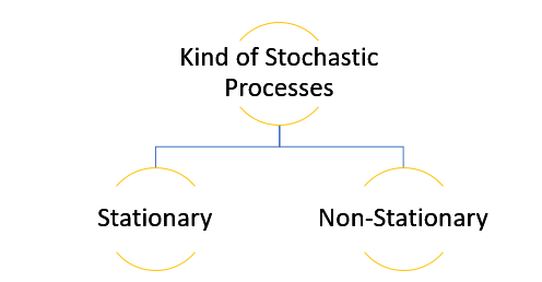
The data used in time series analysis is a random variable (Yt) where t is denoted as time and such a collection of random variables ordered in time is called random or stochastic process.
Stationary: A time series is said to be stationary when all the moments of its probability distribution i.e. mean, variance , covariance etc. are invariant over time. It becomes quite easy forecast data in this kind of situation as the hidden patterns are recognizable which make predictions easy.
Non-stationary: A non-stationary time series will have a time varying mean or time varying variance or both, which makes it impossible to generalize the time series over other time periods.
Non stationary processes can further be explained with the help of a term called Random walk models. This term or theory usually is used in stock market which assumes that stock prices are independent of each other over time. Now there are two types of random walks: Random walk with drift : When the observation that is to be predicted at a time ‘t’ is equal to last period’s value plus a constant or a drift (α) and the residual term (ε). It can be written as Yt= α + Yt-1 + εt The equation shows that Yt drifts upwards or downwards depending upon α being positive or negative and the mean and the variance also increases over time. Random walk without drift: The random walk without a drift model observes that the values to be predicted at time ‘t’ is equal to last past period’s value plus a random shock. Yt= Yt-1 + εt Consider that the effect in one unit shock then the process started at some time 0 with a value of Y0 When t=1 Y1= Y0 + ε1 When t=2 Y2= Y1+ ε2= Y0 + ε1+ ε2 In general, Yt= Y0+∑ εt In this case as t increases the variance increases indefinitely whereas the mean value of Y is equal to its initial or starting value. Therefore the random walk model without drift is a non-stationary process.
So, with that we come to the end of the discussion on the Time Series. Hopefully it helped you understand time Series, for more information you can also watch the video tutorial attached down this blog. DexLab Analytics offers machine learning courses in delhi. To keep on learning more, follow DexLab Analytics blog.
Predictive analytics is an effective in-hand tool crafted for data scientists. Thanks to its quick computing and on-point forecasting abilities! Not only data scientists, but also insurance claim analysts, retail managers and healthcare professionals enjoy the perks of predictive analytics modeling – want to know how?
Below, we’ve enumerated a few real-life use cases, existing across industries, threaded with the power of data science and predictive analytics. Ask us, if you have any queries for your next data science project! Our data science courses in Delhi might be of some help.
Customer Retention
Losing customers is awful. For businesses. They have to gain new customers to make up for the loss in revenue. But, it can cost more, winning new customers is usually hailed more costly than retaining older ones.
Predictive analytics is the answer. It can prevent reduction in the customer base. How? By foretelling you the signs of customer dissatisfaction and identifying the customers that are most likely to leave. In this way, you would know how to keep your customers satisfied and content, and control revenue slip offs.
Customer Lifetime Value
Marketing a product is the crux of the matter. Identifying customers willing to spend a large part of their money, consistently for a long period of time is difficult to find. But once cracked, it helps companies optimize their marketing efforts and enhance their customer lifetime value.
Quality Control
Quality Control is significant. Over time, shoddy quality control measures will affect customer satisfaction ratio, purchasing behavior, thus impacting revenue generation and market share.
Further, low quality control results in more customer support expenses, repairs and warranty challenges and less systematic manufacturing. Predictive analytics help provide insights on potential quality issues, before they turn into crucial company growth hindrances.
Risk Modeling
Risk can originate from a plethora of source, and it can be any form. Predictive analytics can address critical aspects of risk – it collects a huge number of data points from many organizations and sort through them to determine the potential areas of concern.
What’s more, the trends in the data hint towards unfavorable circumstances that might impact businesses and bottom line in an adverse way. A concoction of these analytics and a sound risk management approach is what companies truly need to quantify the risk challenges and devise a perfect course of action that’s indeed the need of the hour.
Sentiment Analysis
It’s impossible to be everywhere, especially when being online. Similarly, it’s very difficult to oversee everything that’s said about your company.
Nevertheless, if you amalgamate web search and a few crawling tools with customer feedback and posts, you’d be able to develop analytics that’d present you an overview of the organization’s reputation along with its key market demographics and more. Recommendation system helps!
All hail Predictive Analytics! Now, maneuver beyond fuss-free reactive operations and let predictive analytics help you plan for a successful future, evaluating newer areas of business scopes and capabilities.
To learn more about Data Analyst with Advanced excel course – Enrol Now. To learn more about Data Analyst with R Course – Enrol Now. To learn more about Big Data Course – Enrol Now.
To learn more about Machine Learning Using Python and Spark – Enrol Now. To learn more about Data Analyst with SAS Course – Enrol Now. To learn more about Data Analyst with Apache Spark Course – Enrol Now. To learn more about Data Analyst with Market Risk Analytics and Modelling Course – Enrol Now.
A wide array of industries has already engaged in some kind of predictive analytics – numerical analysis of debt collection is relatively a recent addition. Financial analysts are now found harnessing the power of predictive analytics to cull better results out for their clients, and measure the effectiveness of their strategies and collections.
Let’s see how predictive analytics is used in debt collection process:
Understanding Client Scoring (Risk Assessment)
Since the late 1980’s, FICO score is regarded as the golden standard for determining creditworthiness and loan application. But, however, machine learning, particularly predictive analytics can replace it, and develop an encompassing portrait of a client, taking into effect more than his mere credit history and present debts. It can also include his social media feeds and spending trajectory.
Evaluating Payment Patterns
The survival models evaluate each client’s probability of becoming a potential loss. If the account shows a continuous downward trend, then it should be regarded soon as a potential risk. Predictive analytics can help identify spending patterns, indicating the struggles of each client. A system can be developed which self-triggers whenever any unwanted pattern transpires. It could ask the client if they need any help or if they are going through a financial distress, so that it can help before the situation turns beyond repairs.
Businesses are keen to know about future cash flows – what they can expect! Financial institutions are no different. Predictive analytics helps in making more appropriate predictions, especially when it comes to receivables.
Debt collector’s business models are subject to the ability to forecast the success of collection operations, and ascertaining results at the end of each month, before the billing cycle initiates. As a result, the workforce of the company is able to shift their focus from the potential payers to those who would not be able to meet their obligations. This shift in focus helps!
Better Client Relationship
Predictive analytics weave wonders; not only it has the ability to point which clients are the highest risks for your company, but also predict the best time to contact them to reap maximum results. What you need to do is just visit the logs of past conversations.
Challenges
Last, but not the least, all big data models face a common challenge – data cleaning. As it’s a process of wastage in and out, before starting with prediction, company should deal with this problem at first to construct a pipeline, for feeding in the data, clean it and use it for neural network training.
In a concluding statement, predictive analytics is the best bet for debt and revenue collection – it boosts conversion rates at the right time with the right people. If you want to study more about predictive analytics, and its varying uses in different segments of industry, enroll in R Predictive Modelling Certificationtraining at DexLab Analytics. They provide superior knowledge-intensive training to interested individuals with added benefit of placement assistance. For more, visit their website.
To learn more about Data Analyst with Advanced excel course – Enrol Now. To learn more about Data Analyst with R Course – Enrol Now. To learn more about Big Data Course – Enrol Now.
To learn more about Machine Learning Using Python and Spark – Enrol Now. To learn more about Data Analyst with SAS Course – Enrol Now. To learn more about Data Analyst with Apache Spark Course – Enrol Now. To learn more about Data Analyst with Market Risk Analytics and Modelling Course – Enrol Now.
Far from the conventional science disciplines, like physics or mathematics, Data Science is a budding discipline: which means there are no proper definition to explain what data science is and what role it does play.
Nevertheless, the internet is full of working definitions of data science. As per Wikipedia, Data Science is
(an) interdisciplinary field about processes and systems to extract knowledge or insights from data in various forms, either structured or unstructured, which is a continuation of some of the data analysis fields such as statistics, data mining, and predictive analytics.
To that note, a very important aspect is left behind in this explanation: Data Science is a science first, which means a proper scientific method should be devised to tackle different data science practices. By scientific method, we mean a healthy process of asking questions, collecting information, framing hypothesis and analyzing the results to draw conclusions thereafter.
Go below, the process breakup is as follows..
Ask questions
Start by asking what is the business problem? How to leverage maximum gains? What ways to implement to increase return on investment? The finance industry takes help from data science for myriad reasons. One of the most striking reasons is to enhance the return on investment out of marketing campaigns.
A predictive modeling analyst has access to vast data resources, which eventually makes the entire research and gathering data process much less complex. However, it is only in theory, because rarely data is stored in the desired format an analyst wants, making his job easier.
After getting to the heart and soul of the problem, we start to develop hypotheses. For example, you believe your firm’s profit is leveraged by an optimistic customer reaction towards your product quality and positive advertising capabilities of your firm. Through this example, we explained a nomological network, where you are in a position to infer casualties and correlations. While dealing in Data Science, assessing customer perception is very crucial, and so is the analysis of financial datasets.
Formulating a hypothesis is not enough; a predictive modeler relies on statistical modeling techniques to forecast the future in a probabilistic manner. Keep a note, this doesn’t result in indicating “X will occur”, instead it refers “Given Y, the probability of X occurring is 75%.”
Any proper experiment includes control groups and test, meaning a modeler when preparing a predictive model should divide the dataset so as to ensure availability of few data for testing predictive equation.
Now, if we talk about marketing – consider logistic regression. It offers a probability whether a binary event of interest will take place or not.
Now is the time to make a decision: do you prefer the quantitative approach? As social media is totally unstructured, the qualitative approach needs to be implemented using Natural Language Processing, which can be a tad difficult. Now, how about making a longitudinal analysis, while transforming data into time series? Do all these questions rake your mind? Yes? Then you are on the right track.
This is the final battle scene for all predictive modelers. It calls for all the documents, based on which a modeler made his decision during the development process. All the assumptions taken have to be identified and highlighted beside the results.
And with it comes the end of our Science in Data Science process!
To learn more about Data Analyst with Advanced excel course – Enrol Now. To learn more about Data Analyst with R Course – Enrol Now. To learn more about Big Data Course – Enrol Now.
To learn more about Machine Learning Using Python and Spark – Enrol Now. To learn more about Data Analyst with SAS Course – Enrol Now. To learn more about Data Analyst with Apache Spark Course – Enrol Now. To learn more about Data Analyst with Market Risk Analytics and Modelling Course – Enrol Now.
We know that you have probably heard many times that predictive analysis will further optimize and accentuate your marketing campaigns. But it is hard to envision that in more concrete terms what it will achieve. This makes it harder to choose and direct analytics technology.
Wondering how you can get a functional value for marketing, sales and product directions without being an expert? The solution to all your problems lies in how predictive analytics may offer with benefits for the current marketing operations. But to use it you must learn a few specifics about how it works.
DexLab Analytics over the course of next few weeks will cover the basics of various data analysis techniques like creating your own histogram in R programming. We will explore three options for this: R commands, ggplot2 and ggvis. These posts are for users of R programming who are in the beginner or intermediate level and who require accessible and easy to understand resources.
A histogram is a category of visual representation of a dataset distribution. As such the shape of a histogram is its most common feature for identification. With a histogram one will be able to see which factor has the relatively higher amount of data and which factors or segments have the least.
Or put in simpler terms, one can see where the middle or median is in a data distribution, and how close or farther away the data would lie around the middle and where would the possible outliers be found. And precisely because of all this histograms will be the best way to understand your data.
But what can a specific shape of a histogram tell us? In short a typical histogram consists of an x-axis and a y-axis and a few bars of varying heights. The y-axis will exhibit how frequently the values on the x-axis are occurring in the data. The y-axis showcases the frequency of the values on the x-axis where the data occurs, the bar group ranges of either values or continuous categories on the x-axis. And the latter explains why the histograms do not have any gaps between the bars.
How can one make a histogram with basic R?
Step 1: Get your eyes on the data:
As histograms require some amount of data to be plotted initially, you can carry that out by importing a dataset or simply using one which is built into the system of R. In this tutorial we will make use of 2 datasets the built-in R dataset AirPassengers and another dataset called as chol, which is stored into a .txt file and is available for download.
Step 2: Acquaint yourself with The Hist () function:
One can make a histogram in R by opting the easy way where they use The Hist () function, which automatically computes a histogram of the given data values. One would put the name of their dataset in between parentheses to use this function.
Here is how to use the function:
hist(AirPassengers)
But if in case, you want to select a certain column of a data frame like for instance in chol, for making a histogram. The hist function should be used with the dataset name in combination with a $ symbol, which should be followed by the column name:
Here is a specimen showing the same:
hist(chol$AGE) #computes a histogram of the data values in the column AGE of the dataframe named “chol”
Step 3: Up the level of the hist () function:
You may find that the histograms created with the previous features seem a little dull. That is because the default visualizations do not contribute much to the understanding of the histograms. One may need to take one more step to reach a better and easier understanding of their histograms. Fortunately, this is not too difficult to accomplish, R has several allowances for easy and fast ways to optimize the visualizations of the diagrams while still making use of the hist () function.
To adapt your histogram you will only need to add more arguments to the hist () function, in this way:
hist(AirPassengers,
     main="Histogram for Air Passengers",
     xlab="Passengers",
     border="blue",
     col="green",
     xlim=c(100,700),
     las=1,
     breaks=5)
This code will help to compute a histogram of data values from the dataset AirPassengers, with the name “Histogram for Air Passengers” as the title. The x-axis would be labelled as ‘Passengers’ and will have a blue border with a green colour to the bins, while limiting the x-axis with a range of 100 to 700 and rotating the printed values on the y-axis by 1 while changing the bin width by 5.
We know what you are thinking – this is a humungous string of code. But do not worry, let us break it down into smaller pieces to see what each component holds.
Name/colours:
You can alter the title of the histogram by adding main as an argument to the hist () function.
This is how:
hist(AirPassengers, main=”Histogram for Air Passengers”) #Histogram of the AirPassengers dataset with title “Histogram for Air Passengers”
For adjusting the label of the x-axis you can add xlab as the feature. Similarly one can also use ylab to label the y-axis.
This code would work:
hist(AirPassengers, xlab=”Passengers”, ylab=”Frequency of Passengers”) #Histogram of the AirPassengers dataset with changed labels on the x-and y-axes hist(AirPassengers, xlab=”Passengers”, ylab=”Frequency of Passengers”) #Histogram of the AirPassengers dataset with changed labels on the x-and y-axes
If in case you would want to change the colours of the default histogram you can simply choose to add the arguments border or col. Adjusting would be easy, as the name itself kind of gives away the borders and the colours of the histogram.
hist(AirPassengers, border=”blue”, col=”green”) #Histogram of the AirPassengers dataset with blue-border bins with green filling
Note: you must not forget to put the names and the colours within “ ”.
For x and y axes:
To change the range of the x and y axes one can use the xlim and the ylim as arguments to the hist function ():
The code to be used is:
hist(AirPassengers, xlim=c(100,700), ylim=c(0,30)) #Histogram of the AirPassengers dataset with the x-axis limited to values 100 to 700 and the y-axis limited to values 0 to 30
Point to be noted in this case, is the c() function is used for delimiting the values on the axes when one is suing the xlim and ylim functions. It takes 2 values the first being the begin value and the second being the end value.
Make sure to rotate the labels on the y-axis by adding 1as=1 as the argument, the argument 1as can be 0, 1, 2 or 3.
The code to be used:
hist(AirPassengers, las=1) #Histogram of the AirPassengers dataset with the y-values projected horizontally
Depending on the option one chooses the placement of the label will vary: like for instance, if you choose 0 the label will always be parallel to the axis (the one that is the default). And if one chooses 1, The label will be horizontally put. If you want the label to be perpendicular to the axis then pick 2 and for placing it vertically select 3.
For bins:
One can alter the bin width by including breaks as an argument, in combination with the number of breakpoints which one wants to have.
This is the code to be used:
hist(AirPassengers, breaks=5) #Histogram of the AirPassengers dataset with 5 breakpoints
If one wants to have increased control over the breakpoints in between the bins, then they can enrich the breaks arguments by adding in it vector of breakpoints, one can also do this by making use of the c() function.
hist(AirPassengers, breaks=c(100, 300, 500, 700)) #Compute a histogram for the data values in AirPassengers, and set the bins such that they run from 100 to 300, 300 to 500 and 500 to 700.
But the c () function can help to make your code very messy at times, which is why we recommend using add = seq(x,y,z) instead. The values of x, y and z are determined by the user and represented in a specific order of appearance, the starting number of x-axis and the last number of the same as well as the intervals in which these numbers are to appear.
A noteworthy point to be mentioned here is that one can combine both the functions:
hist(AirPassengers, breaks=c(100, seq(200,700, 150))) #Make a histogram for the AirPassengers dataset, start at 100 on the x-axis, and from values 200 to 700, make the bins 150 wide
Here is the histogram of AirPassengers:
How to Make a Histogram with Basic R – (Image Courtesy r-bloggers)
Please note that this is the first blog tranche in a list of 3 posts on creating histograms using R programming.
For more information regarding R language training and other interesting news and articles follow our regular uploads at all our channels.
To learn more about Machine Learning Using Python and Spark – click here.
To learn more about Data Analyst with Advanced excel course – click here. To learn more about Data Analyst with SAS Course – click here. To learn more about Data Analyst with R Course – click here. To learn more about Big Data Course – click here.
With the Big Data boom within the IT industry worldwide, more and more online retailers are using it to create better shopping experience for their customers through a boost in customer satisfaction to generate better revenue for themselves.
Dexlab Analytics is Conducting Training for Snapdeal in Data Science and R Programming
The funny news about Target knowing about a young lady’s pregnancy even before the father could was a viral content that sent the internet crazy. But how did they know this?
The answer lies in the wizardry of data analysis, as when a lady starts searching to buy products like nutritional supplements, unscented beauty products and cotton balls then there is a good chance that she is pregnant.
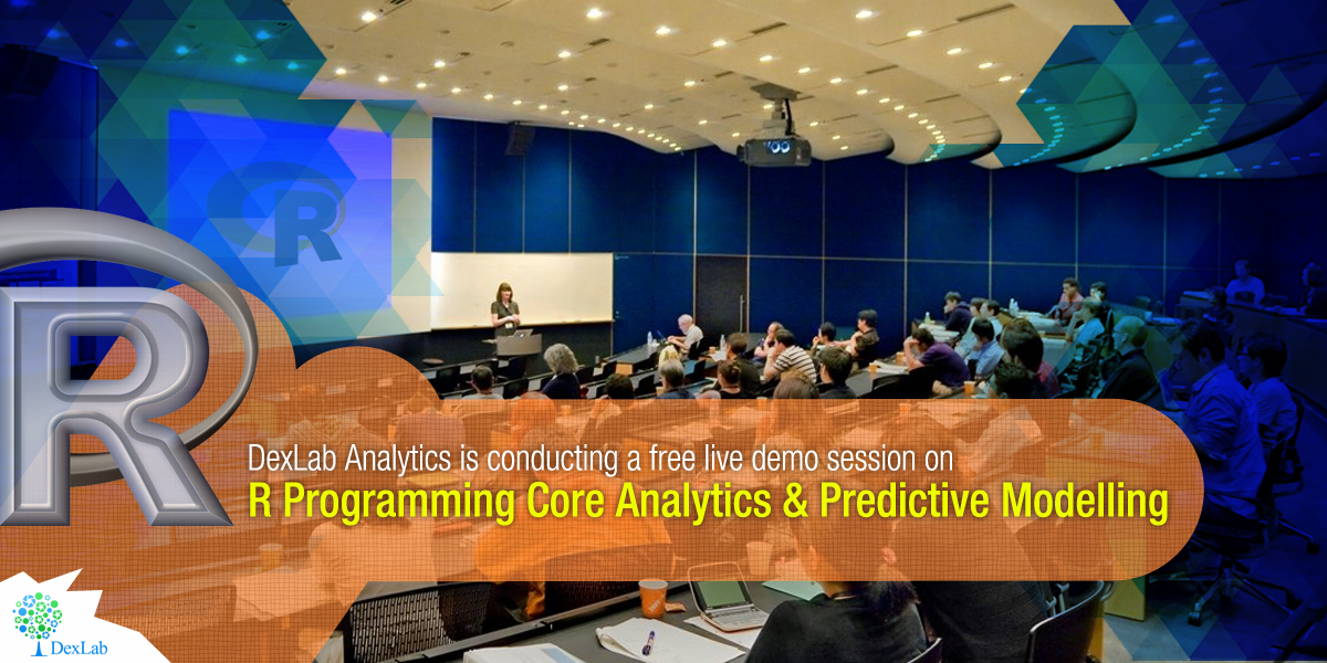
DexLab Analytics is proud to announce a complimentary online demo session which will be held on Saturday 15th October, 2016 at 10:00 PM on the topic of R Programming, Core Analytics & Predictive Modelling. It will be a 30 to 45 minute session which will give the aspiring candidates a glimpse into the content quality, delivery style and intractability with the faculty at the institute.
Those who want to join this demo session must email stating their interest directly to DexLab Analytics for registering for the same. Although as is the common notion about free things that they are usually of poor quality, but for this complimentary session we can promise the case will not stand true. This session will offer ample insight about what to expect in the upcoming batches. This is a one-of-a-kind endeavour by DexLab Analytics as no other analytics training institute offers such complimentary sessions.Continue reading “We are offering a free demo session on: R Programming Core Analytics & Predictive Modelling”