Learn the basics of effective graphic designing and create pretty-looking plots, using matplotlib. In fact, not only matplotlib, I will try to give meaningful insights about R/ggplot2, Matlab, Excel, and any other graphing tool you use, that will help you grasp the concepts of graphic designing better.
Simplicity is the ultimate sophistication
To begin with, make sure you remember– less is more, when it is about plotting. Neophyte graphic designers sometimes think that by adding a visually appealing semi-related picture on the background of data visualization, they will make the presentation look better but eventually they are wrong. If not this, then they may also fall prey to less-influential graphic designing flaws, like using a little more of chartjunk.
Data always look better naked. Try to strip it down, instead of adorning it.
Have a look at the following GIF:

“Perfection is achieved not when there is nothing more to add, but when there is nothing left to take away.” – Antoine de Saint-Exupery explained it the best.
Color rules the world
The default color configuration of Matlab is quite awful. Matlab/matplotlib stalwarts may find the colors not that ugly, but it’s undeniable that Tableau’s default color configuration is way better than Matplotlib’s.
Get Tableau certification Pune today! DexLab Analytics offers Tableau BI training courses to the aspiring candidates.
Make use of established default color schemes from leading software that is famous for offering gorgeous plots. Tableau is here with its incredible set of color schemes, right from grayscale and colored to colorblind friendly.
A plenty of graphic designers forget paying heed to the issue of color blindness, which encompasses over 5% of the graphic viewers. For example, if a person suffers from red-green color blindness, it will be completely indecipherable for him to understand the difference between the two categories depicted by red and green plots. So, how will he work then?
For them, it is better to rely upon colorblind friendly color configurations, like Tableau’s “Color Blind 10”.
To run the codes, you need to install the following Python libraries:
- Matplotlib
- Pandas
Now that we are done with the fundamentals, let’s get started with the coding.
import matplotlib.pyplot as plt
import pandas as pd

# Read the data into a pandas DataFrame.
gender_degree_data = pd.read_csv("http://www.randalolson.com/wp-content/uploads/percent-bachelors-degrees-women-usa.csv")

# These are the "Tableau 20" colors as RGB.
tableau20 = [(31, 119, 180), (174, 199, 232), (255, 127, 14), (255, 187, 120),
             (44, 160, 44), (152, 223, 138), (214, 39, 40), (255, 152, 150),
             (148, 103, 189), (197, 176, 213), (140, 86, 75), (196, 156, 148),
             (227, 119, 194), (247, 182, 210), (127, 127, 127), (199, 199, 199),
             (188, 189, 34), (219, 219, 141), (23, 190, 207), (158, 218, 229)]

# Scale the RGB values to the [0, 1] range, which is the format matplotlib accepts.
for i in range(len(tableau20)):
    r, g, b = tableau20[i]
    tableau20[i] = (r / 255., g / 255., b / 255.)

# You typically want your plot to be ~1.33x wider than tall. This plot is a rare
# exception because of the number of lines being plotted on it.
# Common sizes: (10, 7.5) and (12, 9)
plt.figure(figsize=(12, 14))

# Remove the plot frame lines. They are unnecessary chartjunk.
ax = plt.subplot(111)
ax.spines["top"].set_visible(False)
ax.spines["bottom"].set_visible(False)
ax.spines["right"].set_visible(False)
ax.spines["left"].set_visible(False)

# Ensure that the axis ticks only show up on the bottom and left of the plot.
# Ticks on the right and top of the plot are generally unnecessary chartjunk.
ax.get_xaxis().tick_bottom()
ax.get_yaxis().tick_left()

# Limit the range of the plot to only where the data is.
# Avoid unnecessary whitespace.
plt.ylim(0, 90)
plt.xlim(1968, 2014)

# Make sure your axis ticks are large enough to be easily read.
# You don't want your viewers squinting to read your plot.
plt.yticks(range(0, 91, 10), [str(x) + "%" for x in range(0, 91, 10)], fontsize=14)
plt.xticks(fontsize=14)

# Provide tick lines across the plot to help your viewers trace along
# the axis ticks. Make sure that the lines are light and small so they
# don't obscure the primary data lines.
for y in range(10, 91, 10):
    plt.plot(range(1968, 2012), [y] * len(range(1968, 2012)), "--", lw=0.5, color="black", alpha=0.3)

# Remove the tick marks; they are unnecessary with the tick lines we just plotted.
plt.tick_params(axis="both", which="both", bottom="off", top="off",
                labelbottom="on", left="off", right="off", labelleft="on")

# Now that the plot is prepared, it's time to actually plot the data!
# Note that I plotted the majors in order of the highest % in the final year.
majors = ['Health Professions', 'Public Administration', 'Education', 'Psychology',
          'Foreign Languages', 'English', 'Communications\nand Journalism',
          'Art and Performance', 'Biology', 'Agriculture',
          'Social Sciences and History', 'Business', 'Math and Statistics',
          'Architecture', 'Physical Sciences', 'Computer Science',
          'Engineering']

for rank, column in enumerate(majors):
    # Plot each line separately with its own color, using the Tableau 20
    # color set in order.
    plt.plot(gender_degree_data.Year.values,
            gender_degree_data[column.replace("\n", " ")].values,
            lw=2.5, color=tableau20[rank])

    # Add a text label to the right end of every line. Most of the code below
    # is adding specific offsets y position because some labels overlapped.
    y_pos = gender_degree_data[column.replace("\n", " ")].values[-1] - 0.5
    if column == "Foreign Languages":
        y_pos += 0.5
    elif column == "English":
        y_pos -= 0.5
    elif column == "Communications\nand Journalism":
        y_pos += 0.75
    elif column == "Art and Performance":
        y_pos -= 0.25
    elif column == "Agriculture":
        y_pos += 1.25
    elif column == "Social Sciences and History":
        y_pos += 0.25
    elif column == "Business":
        y_pos -= 0.75
    elif column == "Math and Statistics":
        y_pos += 0.75
    elif column == "Architecture":
        y_pos -= 0.75
    elif column == "Computer Science":
        y_pos += 0.75
    elif column == "Engineering":
        y_pos -= 0.25

    # Again, make sure that all labels are large enough to be easily read
    # by the viewer.
    plt.text(2011.5, y_pos, column, fontsize=14, color=tableau20[rank])

# matplotlib's title() call centers the title on the plot, but not the graph,
# so I used the text() call to customize where the title goes.

# Make the title big enough so it spans the entire plot, but don't make it
# so big that it requires two lines to show.

# Note that if the title is descriptive enough, it is unnecessary to include
# axis labels; they are self-evident, in this plot's case.
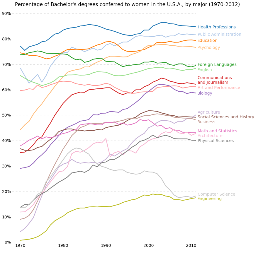
plt.text(1995, 93, "Percentage of Bachelor's degrees conferred to women in the U.S.A."
       ", by major (1970-2012)", fontsize=17, ha="center")

# Always include your data source(s) and copyright notice! And for your
# data sources, tell your viewers exactly where the data came from,
# preferably with a direct link to the data. Just telling your viewers
# that you used data from the "U.S. Census Bureau" is completely useless:
# the U.S. Census Bureau provides all kinds of data, so how are your
# viewers supposed to know which data set you used?
plt.text(1966, -8, "Data source: nces.ed.gov/programs/digest/2013menu_tables.asp"
       "\nAuthor: Randy Olson (randalolson.com / @randal_olson)"
       "\nNote: Some majors are missing because the historical data "
       "is not available for them", fontsize=10)

# Finally, save the figure as a PNG.
# You can also save it as a PDF, JPEG, etc.
# Just change the file extension in this call.
# bbox_inches="tight" removes all the extra whitespace on the edges of your plot.
plt.savefig("percent-bachelors-degrees-women-usa.png", bbox_inches="tight")
import pandas as pd
import matplotlib.pyplot as plt
from scipy.stats import sem

# This function takes an array of numbers and smoothes them out.
# Smoothing is useful for making plots a little easier to read.
def sliding_mean(data_array, window=5):
    data_array = array(data_array)
    new_list = []
    for i in range(len(data_array)):
        indices = range(max(i - window + 1, 0),
                        min(i + window + 1, len(data_array)))
        avg = 0
        for j in indices:
            avg += data_array[j]
        avg /= float(len(indices))
        new_list.append(avg)

    return array(new_list)

# Due to an agreement with the ChessGames.com admin, I cannot make the data
# for this plot publicly available. This function reads in and parses the
# chess data set into a tabulated pandas DataFrame.
chess_data = read_chess_data()

# These variables are where we put the years (x-axis), means (y-axis), and error bar values.
# We could just as easily replace the means with medians,
# and standard errors (SEMs) with standard deviations (STDs).
years = chess_data.groupby("Year").PlyCount.mean().keys()
mean_PlyCount = sliding_mean(chess_data.groupby("Year").PlyCount.mean().values,
                             window=10)
sem_PlyCount = sliding_mean(chess_data.groupby("Year").PlyCount.apply(sem).mul(1.96).values,
                            window=10)

# You typically want your plot to be ~1.33x wider than tall.
# Common sizes: (10, 7.5) and (12, 9)
plt.figure(figsize=(12, 9))

# Remove the plot frame lines. They are unnecessary chartjunk.
ax = plt.subplot(111)
ax.spines["top"].set_visible(False)
ax.spines["right"].set_visible(False)

# Ensure that the axis ticks only show up on the bottom and left of the plot.
# Ticks on the right and top of the plot are generally unnecessary chartjunk.
ax.get_xaxis().tick_bottom()
ax.get_yaxis().tick_left()

# Limit the range of the plot to only where the data is.
# Avoid unnecessary whitespace.
plt.ylim(63, 85)

# Make sure your axis ticks are large enough to be easily read.
# You don't want your viewers squinting to read your plot.
plt.xticks(range(1850, 2011, 20), fontsize=14)
plt.yticks(range(65, 86, 5), fontsize=14)

# Along the same vein, make sure your axis labels are large
# enough to be easily read as well. Make them slightly larger
# than your axis tick labels so they stand out.
plt.ylabel("Ply per Game", fontsize=16)

# Use matplotlib's fill_between() call to create error bars.
# Use the dark blue "#3F5D7D" as a nice fill color.
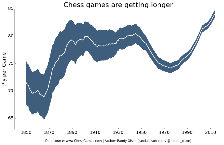
plt.fill_between(years, mean_PlyCount - sem_PlyCount,
                 mean_PlyCount + sem_PlyCount, color="#3F5D7D")

# Plot the means as a white line in between the error bars.
# White stands out best against the dark blue.
plt.plot(years, mean_PlyCount, color="white", lw=2)

# Make the title big enough so it spans the entire plot, but don't make it
# so big that it requires two lines to show.
plt.title("Chess games are getting longer", fontsize=22)

# Always include your data source(s) and copyright notice! And for your
# data sources, tell your viewers exactly where the data came from,
# preferably with a direct link to the data. Just telling your viewers
# that you used data from the "U.S. Census Bureau" is completely useless:
# the U.S. Census Bureau provides all kinds of data, so how are your
# viewers supposed to know which data set you used?
plt.xlabel("\nData source: www.ChessGames.com | "
           "Author: Randy Olson (randalolson.com / @randal_olson)", fontsize=10)

# Finally, save the figure as a PNG.
# You can also save it as a PDF, JPEG, etc.
# Just change the file extension in this call.
# bbox_inches="tight" removes all the extra whitespace on the edges of your plot.
plt.savefig("chess-number-ply-over-time.png", bbox_inches="tight");
Histograms
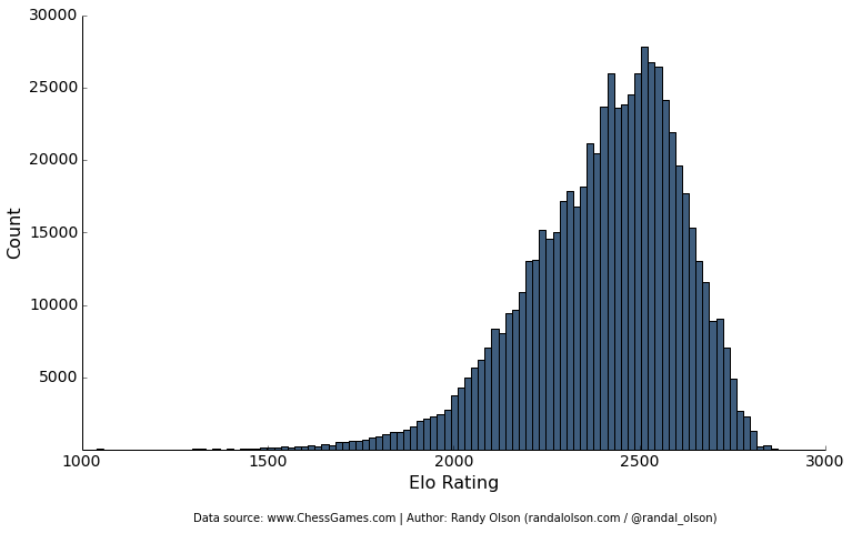
import pandas as pd
import matplotlib.pyplot as plt

# Due to an agreement with the ChessGames.com admin, I cannot make the data
# for this plot publicly available. This function reads in and parses the
# chess data set into a tabulated pandas DataFrame.
chess_data = read_chess_data()

# You typically want your plot to be ~1.33x wider than tall.
# Common sizes: (10, 7.5) and (12, 9)
plt.figure(figsize=(12, 9))

# Remove the plot frame lines. They are unnecessary chartjunk.
ax = plt.subplot(111)
ax.spines["top"].set_visible(False)
ax.spines["right"].set_visible(False)

# Ensure that the axis ticks only show up on the bottom and left of the plot.
# Ticks on the right and top of the plot are generally unnecessary chartjunk.
ax.get_xaxis().tick_bottom()
ax.get_yaxis().tick_left()

# Make sure your axis ticks are large enough to be easily read.
# You don't want your viewers squinting to read your plot.
plt.xticks(fontsize=14)
plt.yticks(range(5000, 30001, 5000), fontsize=14)

# Along the same vein, make sure your axis labels are large
# enough to be easily read as well. Make them slightly larger
# than your axis tick labels so they stand out.
plt.xlabel("Elo Rating", fontsize=16)
plt.ylabel("Count", fontsize=16)

# Plot the histogram. Note that all I'm passing here is a list of numbers.
# matplotlib automatically counts and bins the frequencies for us.
# "#3F5D7D" is the nice dark blue color.
# Make sure the data is sorted into enough bins so you can see the distribution.
plt.hist(list(chess_data.WhiteElo.values) + list(chess_data.BlackElo.values),
         color="#3F5D7D", bins=100)

# Always include your data source(s) and copyright notice! And for your
# data sources, tell your viewers exactly where the data came from,
# preferably with a direct link to the data. Just telling your viewers
# that you used data from the "U.S. Census Bureau" is completely useless:
# the U.S. Census Bureau provides all kinds of data, so how are your
# viewers supposed to know which data set you used?
plt.text(1300, -5000, "Data source: www.ChessGames.com | "
         "Author: Randy Olson (randalolson.com / @randal_olson)", fontsize=10)

# Finally, save the figure as a PNG.
# You can also save it as a PDF, JPEG, etc.
# Just change the file extension in this call.
# bbox_inches="tight" removes all the extra whitespace on the edges of your plot.
plt.savefig("chess-elo-rating-distribution.png", bbox_inches="tight");
Here Goes the Bonus
It takes one more line of code to transform your matplotlib into a phenomenal interactive.
Learn more such tutorials only at DexLab Analytics. We make data visualizations easier by providing excellent Python courses in India. In just few months, you will cover advanced topics and more, which will help you make a career in data analytics.
Interested in a career in Data Analyst?
To learn more about Machine Learning Using Python and Spark – click here.
To learn more about Data Analyst with Advanced excel course – click here.
To learn more about Data Analyst with SAS Course – click here.
To learn more about Data Analyst with R Course – click here.
To learn more about Big Data Course – click here.