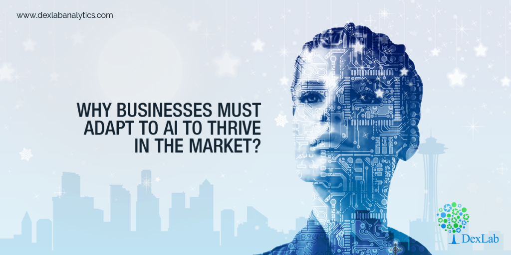
It is a fact that Artificial Intelligence is no longer just a sci-fi hype anymore, but is in fact a major reality. The approached based on Artificial Intelligence like Natural Language Processing (NLP), Machine Learning (ML) and Deep Learning are slowly emerging to be highly realistic technologies within the industry.
Today we have a very efficient NLP engine system, which is as powerful as ML and deep learning algorithms available. In a recent article, published on WIRED we read about the perpetual death of code (i.e. programs and programming) and how we will soon be training in systems, just as the way we train our pets!

Machine Learning is the same as learning from examples and experiences just like in real life. It is all about digesting huge volumes of data. We see great new developments within the industry such as IBM and Memorial Sloan Kettering are training Watson in things like Oncology by making use of massive amounts of patient medical records throughout the world. Watson learns from knowing how doctors are treating patients with cancer around the globe, just as how a medical student learns but only on a much larger scale.
Another great example of machine learning is from Japan. The farmers here are cultivating crispy fresh cucumbers with several prickles on them. The straight and thick cucumbers with a vibrant colour and lots of prickles are known to be of premium grade quality. Each cucumber has a different colour, quality, shape and freshness. They are sorted into nine different classes based on their size, shape, texture, colour, the amount of small scratches and whether or not they are crooked, along with the most important part of the amount of prickles on them. However, there is not well-defined instruction set for the classification of cucumbers in Japan.
Image Source: magisteradvisors.com
A farmer and agricultural scientist Makoto Koike has been studying this problem for several years now, and has been helping his farmer parents sort out cucumbers. But now with the use of Google’s TesorFlow based machine learning algorithm, he has been able to develop a system that learns from the precise way his parents have been sorting cucumbers in their farm. For achieving this, he had trained his system by using 7000 images of cucumbers that have been sorted by his mother, and at present the system classifies cucumbers with a much better rate of success and that too at a rapid speed.
Companies like Capgemeni have been making use of the technology of IBM’s Watson to improve efficiency and effectiveness in the resource supply chain.
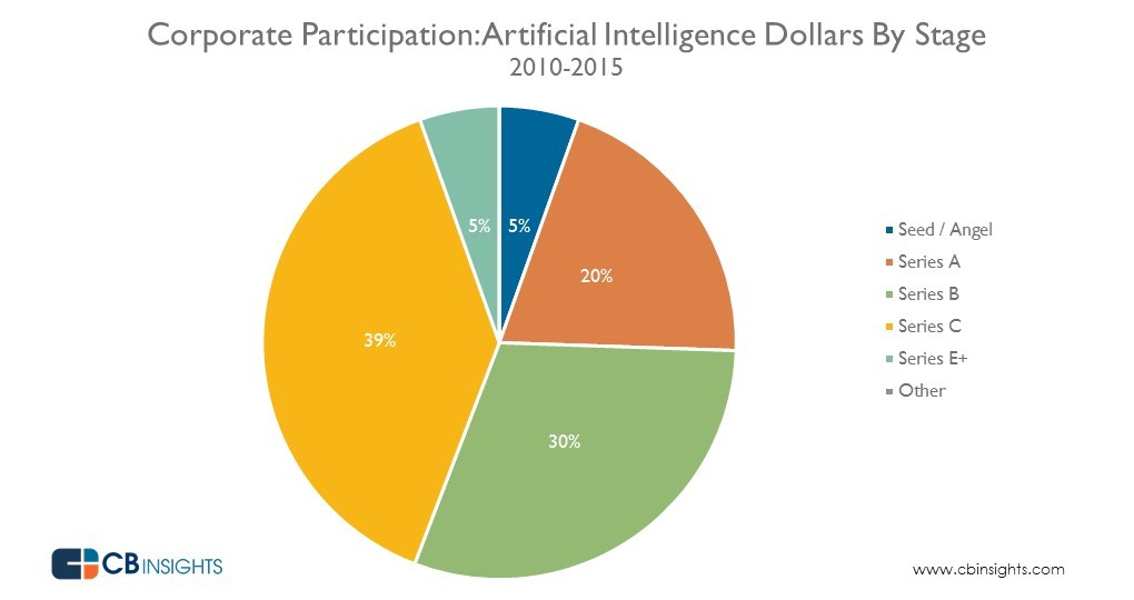
Image Source: vceestartups.com
It is predicted that the AI wave will definitely take the industry by storm and have a profound impact on almost all business and transform the present technology climate.
Moreover, we need to quickly turn our businesses into an AI-based approach along with implementation of Machine Learning, which will be supported by NLP and OCR (optical character recognition), speech recognition, and image recognition.
There are three trends in favour of the present technology service providers and their team of workers:
- The global expense on technology is increasing. So, technology enterprises will increase their size and market share by adapting to these new ways of working.
- The present availability of AI technology across the world is less than the amount that the world needs. So, the companies and individuals must pick up the pace to quickly expand their AI capabilities, and only then they will shine in the market. As for those interested in AI this is the best time to advance in their skills to become market leaders.
- The industry transformation has resulted in the marginalization of the CIO role in business and the expense into technology services by business buyers. This gives an edge to the business-oriented teams in play.
Image Source: cbi-blog.s3.amazonaws.com
But reacting to this new demand for technology also needs AI and will bring newer challenges on board. The first being, change can only happen when the stakeholders of the company believe in the same. But sadly, many employees and managers do not believe in the capabilities of AI until they experience it on their own. It is for those who believe and develop their required skills and embrace the impending digital evolution that is destined to flourish.
However, secondly companies must address the problem of how to deal with the possible cannibalization of the existing revenues in order to adopt these new technologies. And finally, the lack of skill in the world of technology will make it even harder to build and expand AI capabilities.
Nevertheless, due to an industry boom, over the past 20 years a large percentage of the existing staff has skills that are almost obsolete and will not have new ones. Thus, this will bring an interesting future journey for the tech industry.
Interested in a career in Data Analyst?
To learn more about Data Analyst with Advanced excel course – Enrol Now.
To learn more about Data Analyst with R Course – Enrol Now.
To learn more about Big Data Course – Enrol Now.To learn more about Machine Learning Using Python and Spark – Enrol Now.
To learn more about Data Analyst with SAS Course – Enrol Now.
To learn more about Data Analyst with Apache Spark Course – Enrol Now.
To learn more about Data Analyst with Market Risk Analytics and Modelling Course – Enrol Now.