MSEXcel Archives - DexLab Analytics | Big Data Hadoop SAS R Analytics Predictive Modeling & Excel VBA

Master the Art and Science of MS Excel with These Cool Tips and Tricks

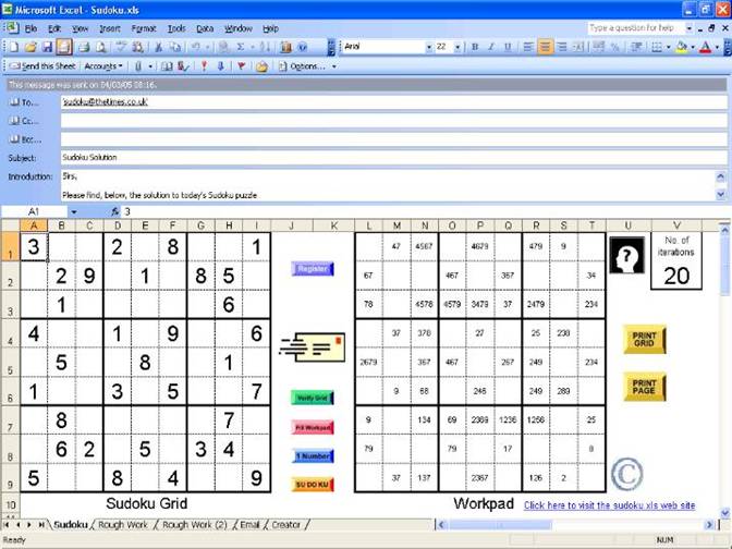
Spreadsheets are savior. In majority of industries, they have become a necessity. With ample filling rows and columns inundated with data points, Excel is the need of the hour. It is a top notch application for creating and managing spreadsheets.

Master the Art and Science of MS Excel with These Cool Tips and Tricks

But, remember the bigger the Excel gets, the uglier it starts to get, and that’s the time when you need to use a set of tricks and features to keep a tab on the data compilation. Here we’ve compiled a set of tips on Excel to help enhance your productivity.

Read on.

Select All

For selecting a specific grid of cell, no worries; simply click and drag. But what happens, when you want to select the entire lot? In cases like such, you can either use a keyboard shortcut Ctrl + “A” in Windows 10 and Command + “A” in MacOS or directly go up to the smaller cell in the upper-left corner and hit it.

Hiding or Unhiding Rows

Want to hide rows or columns of data? It mostly happens when you want to print copies of any event, where the audience needs to see only the important parts. Fortunately, it’s quite easy to hide rows and columns in Excel. Right click it, and Hide. That’s all.

Note: When you’re unhiding rows and columns, both, you have to unhide one axis at a time.


Drop Down List

Drop down menu is the best option when you want to restrict the stream of options a user puts into a cell. You can easily create one that provides users a comprehensive list of options to choose from. Just, choose a cell, go to the data tab and click on Validate.

Use of VLOOKUP

Want to retrieve information from a specified cell? For an instance, suppose you possess an inventory of a store, and want to check the price of any single item. You can use Excel’s VLOOKUP function. It lets you select a range of columns consisting relevant data, a particular column to pick out the output and a cell to deliver output at.

Shading Every Other Row

Spreadsheets can be really boring, and if you’ve got lots of data, the chances of reader’s eyes drifting here and there get high. Hence, adding a dash of color on the spreadsheet will try to fix the gaze of the viewers. So try shading rows of importance. It will make them more visible and prompt to the eyes.

To color the entire spreadsheet, select all. And if you want to color any particular area, apply effects only on that region.

Concatenate

If you want to reorganize data and integrate information from different cells all into a single field, use concatenate function.

Wrap Text

What happens when a lot of text gets accumulated in a single cell? Obviously, the text spills over into adjacent cells, which doesn’t look nice visually.

Luckily, it’s easy to wrap a text within a cell. Just select the cell with more text, right-click and select Format Cells.

Now, get ready to master Excel!

Let’s Take Your Data Dreams to the Next Level

DexLab Analytics is a top notch Excel institute in Delhi that caters to the needs of MS Excel aspirants. Their Advanced Excel course in Gurgaon is assembled by the experts and curated to perfection!

The blog has been sourced from – https://www.digitaltrends.com/computing/microsoft-excel-tips-and-tricks


Interested in a career in Data Analyst?

To learn more about Machine Learning Using Python and Spark – click here.

To learn more about Data Analyst with Advanced excel course – click here.
To learn more about Data Analyst with SAS Course – click here.
To learn more about Data Analyst with R Course – click here.
To learn more about Big Data Course – click here.

Interesting Things to Do With Microsoft Excel

MS Excel Online training in Delhi

Microsoft Excel, whenever you hear this term, you visualise calculations, graphs, tables, formulas and what not – stuffs normally used to arrange and analyse data making pie charts, and countless related gimmicks.

Gaining proficiency in this specific software appears to be a common matter of concern for aspiring professionals from whatever field, they belongs to – and not just the ones who hail from a finance, accounts or IT background.

But do you know that MS Excel can be used for other interesting stuffs, apart from regular work-related things, like gaming and art? I guess not.

Leaf through a set of amazing projects completed with Microsoft Excel, which will surely knock you off your feet. So, are you ready?

Digital Art

Digital Art with MS Excel? Are you kidding me? No, I’m not. A 73-year old Japanese Tatsuo Horiuchi will change your entire perception. He practised digital art using MS Excel spreadsheet, why, because he found other graphics software to be quite expensive. He used the ‘autoshape’ feature of Excel to create stunning works of art. Fascinating, right?

excel-art

Sudoku

Did you finish solving the Sudoku puzzle in the newspaper? You want more? Fortunately, Microsoft is here to help you out! Download an Excel file and use it to create a never-ending stream of Sudoku puzzles and go on teasing your brain cells by solving the puzzle, till you get worn out.

MS-Excel-online-training

Re-inventing legendary games

Work hard, party harder! Excel totally buys the thought. By using Microsoft Excel, you can recreate the stellar games, like Monopoly, Pacman, Tetris and lot more. Of late, latest games like Candy Crush and 2048 have their own versions in Excel format, and that definitely calls for celebration!

pacell

Stop-motion animation

Animations and music video are two sides of the same coin. For years, it has been a popular medium. While A-ha’s “Take on Me” revolutionised the digital world 30 years back, Joe Penna, also known as Mystery Guitar Man on YouTube has taken the world by storm today, thanks to its stop-motion animation music video created using Excel spreadsheets.

He filmed himself performing the song “Cuban Pete”, broke down the video into 730 separate frames and then used each frame to develop a spreadsheet mosaic. The rest simply fell into place!

Advanced excel training

A working flight simulator

Scroll your thoughts to 1997, flight simulators came in from there. With the simulators, you can manoeuvre your environment as your mouse converts into the airplane control – move it back and forth or sideways and keep rolling.

No doubt, it became a favourite pastime for thousands of employees across the globe, including yours truly.

Excel dashboards training

Transport columns into rows

Mistakenly did you put data in columns, instead of rows or vice versa? Relax Microsoft has got you covered. There is a shortcut to fix the mistake. Just copy the row or column you need to interchange, right click on the cell you want to put it on and select Paste Special. A popup window named Transpose will appear. Check the box and click OK. That’s all you have to do. Easy, isn’t it?

Seeking Microsoft excel certification training online, DexLab Analytics is here! Check out our comprehensive MS Excel Online training in Delhi courses and hone your excel skills.


Interested in a career in Data Analyst?

To learn more about Machine Learning Using Python and Spark – click here.
To learn more about Data Analyst with Advanced excel course – click here.
To learn more about Data Analyst with SAS Course – click here.
To learn more about Data Analyst with R Course – click here.
To learn more about Big Data Course – click here.

How to Create a Macro With MS Excel

Did you know that with Excel you can now automate tasks by writing so called programs macros. In this tutorial, we will learn how do so, by learning to create a simple macro, which will executable after clicking a command button. To begin you must first turn on the developer tab:

How to Create a Macro With MS Excel

Developer tab:

Do the following steps to turn the developer tab on:


  1. First right click anywhere on the ribbon, and then click on Customize the Ribbon.


Continue reading “How to Create a Macro With MS Excel”

Tutorial for creating a Speedometer dial in MS Excel

 Tutorial for creating a Speedometer dial in MS Excel

Here in this video tutorial we have discussed in detailed steps, how to create a Speedometer chart in MS Excel. A Speedometer chart is often called as a gauge chart and combines two different type of charts, a pie chart and a doughnut chart.

The Speedometer dial is made with the help of using a Doughnut chart and needle is actually a combination of two types of charts, another doughnut chart and a pie chart.

A speedometer chart or a gauge chart can be created in other data visualization software as well, like for instance in Tableau and is usually easier to create due to availability of better controls and features.  It is due to the simplistic nature of these charts which is well adjusted to context of data and is a great use of space in a spreadsheet that charts like these are popular with non-data executives. Usually such non-data personnel do not want to dig deep into the contextual details like an analyst which is why these charts are great for using in a presentation where diverse departmental executives will be participating.

Gauge charts pack in a lot of horsepower and form a sort of ubiquitous symbol when it comes to understanding business metrics from an analytical point of view. So, learn to create these charts with our simple tutorial and for more such interesting lessons on data analysis software, join us every day as we share technical posts based on data on a regular basis.


Interested in a career in Data Analyst?

To learn more about Data Analyst with Advanced excel course – Enrol Now.
To learn more about Data Analyst with R Course – Enrol Now.
To learn more about Big Data Course – Enrol Now.

To learn more about Machine Learning Using Python and Spark – Enrol Now.
To learn more about Data Analyst with SAS Course – Enrol Now.
To learn more about Data Analyst with Apache Spark Course – Enrol Now.
To learn more about Data Analyst with Market Risk Analytics and Modelling Course – Enrol Now.

Let us Revise Regression Analysis

Let us revise regression analysis

By now every business owner and manager is aware of the latest megatrend related to data analysis and knows that they should make data-driven decisions only at work. Gut feeling and winging it are now practices outdates as they have proved time and again that they fail. But the problem still remains in the know-how of parsing through all the layers of data streaming into your systems. Do you have the requisite know how?

Luckily for you, you may not be the one to crunch all the numbers (phew!). You pay other robotic data analytics personnel to do that for you. But you must correctly understand the analysis report that is handed over to you for interpretation after your colleagues are done with all the heavy lifting. A common practice is the realm of data analysis is regression analysis. Continue reading “Let us Revise Regression Analysis”

Gain Expertise in MS Excel with DexLab Analytics

Gain-Expertise-in-MS-Excel-with-DexLab-Analytics

MS Excel needs no introduction as spreadsheet program. As part of the MS Office suite it has been a regular software skill expected from employees across the globe regardless their roles or levels. But the utility of MS Excel in the world of Big Data is not so widely acknowledged due to the lack of awareness. But that does not rob it of any of its sting as a Big Data tool to advanced Excel users.

So if you are keen to know more about the emerging technology that elite techies cannot stop raving about, a solid grounding in MS Excel will serve you well. Accordingly DexLab Analytics has scheduled a symposium on the topic of Designing MS Excel Dashboards as an introduction to the Big Data capabilities of Big Data to aspiring data analystand data scientists. The symposium is going to be MS Excel Experts who also instruct students of DexLab Analytics most of whom have been advanced users of MS Excel for more than a decade.

How to Create a Macro With MS Excel – @Dexlabanalytics.

The main speaker of the symposium is an industry expert who is currently attached with a leading Multi-National Company for over 5 years. He will bring with himself invaluable information regarding the latest developments in data science. We will cover the following topics in the meet scheduled to be held on the 26th of January:

  •  MS Excel functions overview like V Look Up, Match, H Look Up, Address, Match, Countlfs, Indirect, Sumlfs amongst many others.
  •  Introducing the world of recording macros and building VBA.
  • Introducing Advanced Excel with abilities in Dynamic Referencing and pivot.
  • Hot to make use of Excel and VBA in order to generate KPI dashboards.

The interactive session with industry professionals with many years of experience and help you acquire invaluable exposure to the basics of MS Excel so that you get a foretaste of what lies in store for you in this new and exciting world called Big Data.

Note: It is assumed that the participants of this event have a basic understanding of the rudiments of statistics.

Looking for an Advanced excel training in Gurgaon? Drop by DexLab Analytics – their Excel dashboards training is unparalleled!


Interested in a career in Data Analyst?

To learn more about Data Analyst with Advanced excel course – Enrol Now.
To learn more about Data Analyst with R Course – Enrol Now.
To learn more about Big Data Course – Enrol Now.

To learn more about Machine Learning Using Python and Spark – Enrol Now.
To learn more about Data Analyst with SAS Course – Enrol Now.
To learn more about Data Analyst with Apache Spark Course – Enrol Now.
To learn more about Data Analyst with Market Risk Analytics and Modelling Course – Enrol Now.

Using Hadoop Analyse Retail Wifi Log File

Since a long time we are providing Big Data Hadoop training in Gurgaon to aspirant seeking a career in this domain.So, here our Hadoop experts are going to share a big data Hadoop case study.Think of the wider perspective, as various sensors produce data. Considering a real store we listed out these sensors- free WiFi access points, customer frequency counters located at the doors, smells, the cashier system, temperature, background music and video capturing etc.


big data hadoop


While many of the sensors required hardware and software, a few sensor options are around for the same. Our experts found out that WiFi points provide the most amazing sensor data that do not need any additional software or hardware. Many visitors have Wi- Fi-enabled smart phones. With these Wifi log files, we can easily find out the following-

Continue reading “Using Hadoop Analyse Retail Wifi Log File”

Ms Excel VBA May Be Used To Predict Sales

banner 11

MS Excel VBA has uses in various facets of day to day activities of businesses. But it is a little known factthat this tool may also be used to carry out advanced functions like predicting future sales. This blogpost will try to represent in as an illustrative way as possible how it manages to do the same with thelimitations imposed by the format of this text based post.Suppose we have sales data of two sets for 24 periods within the time range of January 2013 to the December of 2014.

What we are trying to do is to utilize the function LINEST in order to predict sales for the year 2015 by making use of method of least squares as well as regression analysis. The elementary knowledge of this function suggests that it is worth sharing. In the lines that follow we will try to examine the rudiments of this function and the formula that we will put into use in the calculations we make.

The use of the LINEST function lies in regression analysis in order to make calculations about a line that uses the least squares method and return a straight line that is best fitted to the data that you input and outputs an array that serves as a description of the particular line.


The equation that represents the line is: y = mx + b


Here m stands for the slope, x represents the period of time dealt with the data and b is the y intercept.It is to be noted that there is necessity of having a column that indicates the period number of the existing as well as future sales. It should also be noted that while you use the LINEST function so that you may calculate the values of the Y- Intercept along with that of the slope those cells need to reside side by side.

So, what one has to do is to highlight the two cells that you want to use in order to make calculations of the Y-Intercept and the Slope before typing in the LINEST function. In such cases all that is needed is to include the “y”s that are already known. It is up to you whether you want to provide other arguments as they are optional. Then all you need to do is press Ctrl+Shift+Enter and you get the Y-Intercept and the Slope.

The magic that takes place in the background is basically this, by making use of the Slope and the Y-Intercept Excel does its crystal ball gazing and takes the last sales data of the precious 24 months and creates a straight-line that forecasts the trend that is likely to persist in the coming 12 months.

2

What Excel actually does is that it takes the actual values and manipulates them slightly to that is able to come up with a straight-line that serves as the trend line that extends out to the periods of forecast and thus the actual values and the values of the forecast have trends that are similar.This is the basics of crystal ball gazing through the use of MS Excel.


Want to shine bright in MS Excel? Visit DexLab Analytics – their Advanced Excel course is truly remarkable. Enrol for Advanced Excel training today.


Interested in a career in Data Analyst?

To learn more about Machine Learning Using Python and Spark – click here.
To learn more about Data Analyst with Advanced excel course – click here.
To learn more about Data Analyst with SAS Course – click here.
To learn more about Data Analyst with R Course – click here.
To learn more about Big Data Course – click here.

Call us to know more