Matplotlib is the “grandfather” library of data visualization with Python. It was created by John Hunter. He created it to try replicating MatLab’s (another programming language) plotting capabilities in Python. So, if you are already familiar with matlab, matplotlib will feel natural to you.
This library gives you the flexibility to plot the graphs the way you want. You can start with a blank canvas and plot the graph on that canvas wherever you want. You can make multiple plots on top of each other, change the line type, change the line color using predefined colors or hex codes, line width etc.
Installation
Before you begin you’ll need to install matplotlib first by using the following code:-
There are two ways in which you can built matplotlib graphs:-
Method based graphs
Object-oriented graphs
Method Based Graphs in Matplotlib:-
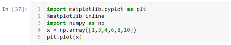
There are pre-defined methods in matplotlib library which you can use to create graphs directly using python language for example:-
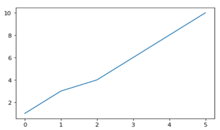
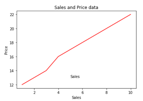
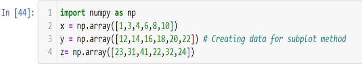
Where, import matplotlib.pyplot as plt this code is used to import the library, %matplotlib inline is used to keep the plot within the parameters of the jupyter notebook, import numpy as np and x = np.array([1,3,4,6,8,10]) is used to import the numpy (numerical python) library and create an array x and plt.plot(x) is used to plot the distribution of the x variable.
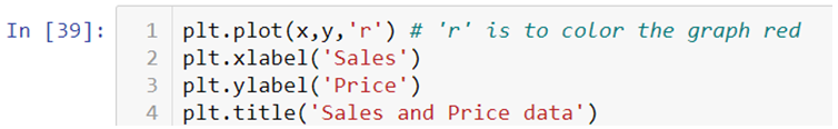
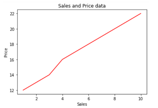
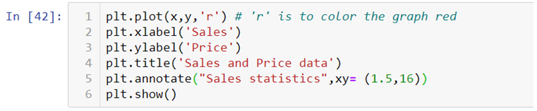
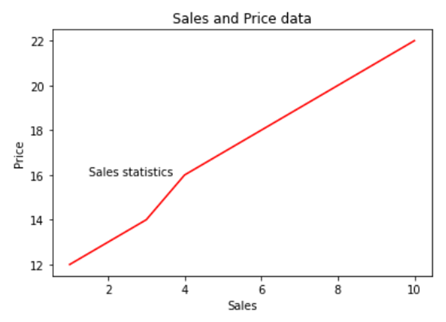
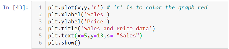
We can also use .xlabel(), .ylabel() and .title() methods print x axis and y axis labels and title on the graph.
If you want to add text within your graph you can either use .annotate() method or .text() method.
Creating Multiplots
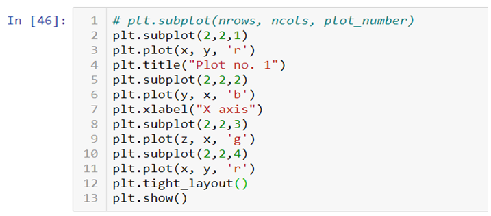
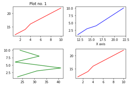
You can also create multiple plots by using .subplot() method by mentioning the number of rows and columns in which you want your graphs to be plotted. It works similar to the way you mention the number of rows and columns in a matrix.
You can add title, axis labels, texts etc., on each plot separately. In the end you can add .tight_layout() to solve the problem of overlapping of the graphs and to make the labels and scales visible.
Check out the video attached below to get an in-depth understanding of how Matplotlib works. This is a part of a visualization series using Python programming language. So, stay tuned for more updates. You can discover more such informative posts on the Dexlab Analytics blog.
The growing significance of big data and the insight it imparts is of utmost significance. Data scientists are working round the clock to process the massive amount of data generated every day. However, unless you have been through Data Science training, it would be impossible for you to grasp even an iota of what is being communicated through data.
The patterns, outliers every single important factor that emerged through decoding must be presented in a coherent format for the untrained eyes. Data visualization enables the researchers to present data findings visually via different techniques and tools to enable people to grasp that information easily.
Why data visualization is so vital?
The complicated nuances of data analysis is not easier for anybody to understand. As we humans are programmed to gravitate towards a visual representation of any information, it makes sense to convey the findings through charts, graphs, or, some other way. This way it takes only a couple of moments for the marketing heads to process what is the trend to watch out for.
We are used to seeing and processing the information presented through bars and pie charts in company board meetings, people use these conventional models to represent company sales data.
It only makes sense to narrate what the scientists have gathered from analyzing complex raw data sets, via visual techniques to an audience who needs that information to form data-driven decisions for the future.
So what are the different formats and tools of data visualization?
Data visualization can take myriad forms which may vary in the format but, these all have one purpose to serve representing data in an easy to grasp manner. The data scientist must be able to choose the right technique to relate his data discovery which should not only enlighten the audience but, also entertain them.
The popular data visualization formats are as follows
Area Chart Bubble Cloud/Chart Scatter Plot Funnel Chart Heat Map The formats should be adopted in accordance with the information to be communicated
Data scientists also have access to smart visualization tools which are
Qlikview
Datawrapper
Sisense
FusionCharts
Plotly
Looker
Tableau
A data scientist must be familiar with the tools available and be able to decide on which suits his line of work better.
What are the advantages of data visualization?
Data visualization is a tricky process while ensuring that the audience does not fall asleep during a presentation, data scientists also need to identify the best visualization techniques, which they can learn during big data training in gurgaon to represent the relationship, comparison or, some other data dynamic. If and when done right data visualization has several benefits to offer
Enables efficient analysis of data
In business, efficient data interpretation can help companies understand trends. Data visualization allows them quickly identify and grasp the information regarding company performance hidden in the data and enables them to make necessary changes to the strategy.
Identify connections faster
While representing information regarding the operational issues of an organization, data visualization technique can be of immense help as it allows to show connections among different data sets with more clarity. Thereby enabling the management to quickly identify the connecting factors.
Better performance analysis
Using certain visualizing techniques it is easier to present a product or, customer-related data in a multi-dimensional manner. This could provide the marketing team with the insight to understand the obstacles they are facing. Such as the reaction of a certain demographic to a particular product, or, it could also be the demand for certain products in different areas. They are able to act faster to solve the niggling issues this way.
Adopt the latest trends
Data processing can quickly identify the emerging trends, and with the help of data visualization techniques, the findings could be quickly represented in an appealing manner to the team. The visual element can immediately communicate which trends are to watch out for and which might no longer work.
Encourages interaction
Visual representation of data allows the strategists to not just look at numbers but, actually understand the story being told through the patterns. It encourages interaction and allows them to delve deeper into the patterns, instead of just merely looking at some numbers and making assumptions.
Data visualization is certainly aiding the businesses to gain an insight that was lost to them earlier. A data scientist needs to be familiar with the sophisticated data visualization tools and must strike a balance between the data and its representation. Identifying what is unimportant and which needs to be communicated as well as finding an engaging visual technique to quickly narrate the story is what makes him an asset for the company. A premier Data analyst training institute can help hone the skills of an aspiring data scientist through carefully designed courses.
The wave of digital transformation is ravaging all industry verticals. Big Data coupled with AI and ML is driving the force, with data being at the bull’s eye.
But, what if we say most of the data in the world is hardly used? What if it becomes a hefty liability? Yes, data can become a liability if we fail to understand it properly. For that, we’ve data visualization – it’s the best way to present your data to the world in order to gain meaningful insights.
Fortunately, data visualization is evolving rapidly. Charts, graphs, infographics, videos and AR/VR presentations have taken the channels of communication to an entirely different level. In this blog, we’ve compiled tip 3 most popular and effective data visualization tools – they are easy to use, do their job well and highly compatible with major software and programming languages. However, they are all paid, although they offer free-trials.
Tableau
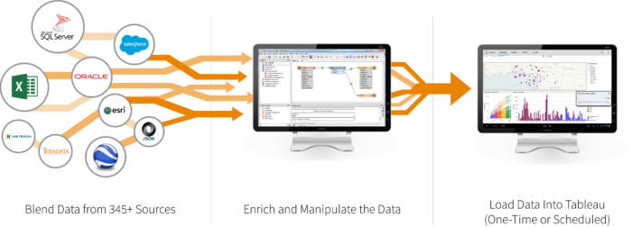
With a huge customer base of 57000+accounts spread across diverse industry verticals, Tableau is the father of data visualization software and for the right reasons! Along with having the ability to generate interactive visualizations, Tableau is relatively easy to use and offers more than generic BI solutions.
Tableau is ideal for handling vast and fast-changing datasets that are used mainly for Big Data operations, such as ML applications and AI implementations. Developers and data scientists look up to Tableau as it integrates seamlessly with high-end database solutions, including My SQL, Hadoop, SAP, Amazon AWS and Teradata. Also, a wide number of third-party resources online are on offer plus a powerful community to aid and assist new users about how to integrate the tool seamlessly with their projects.
Interested in arming yourself with the skills of Tableau? Worry not; DexLab Analytics is a top-notch Tableau training institute in the heart of Delhi excelling in many other in-demand skill training courses.
Plotly
For highly advanced and complex data visualizations, Plotly is the key. All thanks to how well it homogenizes with cutting-edge programming languages, such as Matlab, Python and R! All of them being extremely analytics oriented.
Developed above the open source d3.js visualization libraries for JavaScript, this high-valued commercial package is extremely user-friendly, along with providing inbuilt support for APIs, like Salesforce.
QlikView
Touted as the biggest rival of Tableau, QlikView boasts of 40000 clients’ accounts across 100 countries. It is one of the most terrific players in the space of data visualization, and why not?! The customers who have used it have lauded QlikView because of its customized setup and versatile range of functionalities. However, this could also mean it takes some time to be familiar with entirely and then only it can be leveraged to its full potential.
Along with providing superior data viz capabilities, the tool excels in some of the best BI and analytics reporting capabilities. It’s simple, effective and non-clumsy user interface scores extra brownie points. Interestingly, customers use it in collaboration with its sister package, QlikSense – it manages data discovery and exploration to derive maximum benefits.
The need of the hour in business world is continuous innovation in the field of cyber security. Security vendors constantly brainstorm ideas and methods that’ll keep them ahead of cybercriminals. The gravity of the problem can be understood from a report by Sophos which mentions that almost 50% of Australian businesses were affected by ransomware attacks in 2017.
To keep functioning amidst such threats, businesses require innovative technologies, and artificial intelligence is one such tool that has become vital for cyber security.
Artificial Intelligence
AI is a trendy term now, thanks to blockbuster Bollywood movies made on AI!
AI is an all-embracing principle that includes a number of technologies─ machine learning and deep learning being important ones among them. Basically, artificial intelligence enables machines to learn on their own from experience, modify techniques when fed with new data sets and carry out tasks that are human-like. When the principles of AI are applied to cyber security, we call it predictive security. AI helps to identify and check if files contain malware, which is carried out with the help of machine learning as well as deep learning. Although these two branches use similar AI principles, the two fields are fundamentally very different.
Moving on, let’s explore their basic differences.
Machine Learning
Machine learning is an artificial system that learns from examples and generates knowledge from past experiences. ML technology doesn’t simply memorize examples; rather it picks up laws and patterns and applies it later where relevant.
Considering today’s advanced threat landscape, conventional approaches fail to offer strong protection to a system. Malware programs are sometimes designed to make slight changes and breach traditional systems. In such situations, machine learning can be a better security option as it can detect these unknown and modified malwares too.
An important advantage of machine learning is that it keeps evolving and improving as it is used more and fed with more data. Machine learning algorithms scrutinize file elements in order to comprehend the nature of attacks, which includes simple things like file size as well as complex things like part of codes.
Deep Learning
The benefits of employing machine learning techniques in cyber security are numerous. However, it has some drawbacks too, which can be overcome with deep learning. The main limitations of ML are its inability to handle many variables at once, requirement of huge computing powers and using up a lot of space. In deep learning, unstructured data is stored in neural networks and decisions are made using predictive reasoning, which is modeled on the workings of human brain. This structure has potential to manage numerous points of information without hampering speed of the system.
Deep learning can form better idea of the big picture because it doesn’t include programs designed to solve a particular problem, rather it includes mathematical models that learn over time. A model is developed such that it can explain well what it ‘’sees’’. For this, large amount of data is used, such as trends, malicious URLs and other modes of attacks.
Cyber attackers need to be correct in their methods only once in order to breach an enterprise. On top of that, security threats are becoming more innovative each day. Hence, technologies like deep learning and machine learning need to be the founding stones of modern security systems. Understandably, these skills are also very high in demand. Artificial Intelligence certification courses are hugely popular. If this subject interests you, then don’t delay in enrolling for deep learning courses in Delhi or machine learning courses in Gurgaon from leading institute DexLab Analytics.
To learn more about Data Analyst with Advanced excel course – Enrol Now. To learn more about Data Analyst with R Course – Enrol Now. To learn more about Big Data Course – Enrol Now.
To learn more about Machine Learning Using Python and Spark – Enrol Now. To learn more about Data Analyst with SAS Course – Enrol Now. To learn more about Data Analyst with Apache Spark Course – Enrol Now. To learn more about Data Analyst with Market Risk Analytics and Modelling Course – Enrol Now.
Every customer demand needs to be fulfilled, and CEO’s expect marketing analysts to deliver them. Being a key marketing initiative, optimizing every customer experience is a significant deal to seal for marketers all around the globe.
Data, of course, plays a crucial role in marketing endeavors – but only the data that is interpretable makes sense, rendering other data useless. To turn data into actionable, organizations need to understand the accuracy of data and in the process should be successful in turning insights into action.