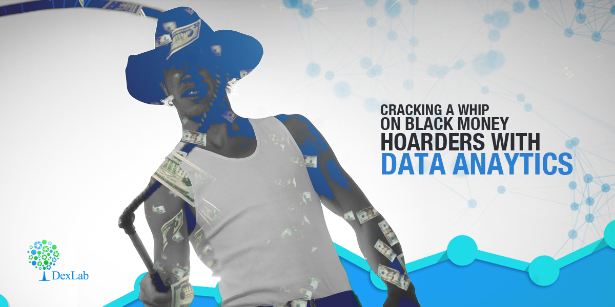
Tax officials are tightening up their ropes with improved Big Data analytics to crack a whip on hoarders of black money.
Under the bill for amending Section 115BBE of the Income Tax Act, transactions with unexplained deposits in banks will be taxed.
As per this amendment, tax officials can now tax people on such deposits at a rate of 60 percent (cess additional) as opposed to the previously determined 30 percent.
This new tax law is applicable from the 1st of April, starting this year!
Cracking a Whip on Black Money Hoarders With Data Anaytics
How are the Income Tax officials leveraging Big Data Analytics to curb black money?
Here are the simple signals that showcase a rise of Big data analytics use and a more planned crack down on Black Money hoarding:
The IT department is now increasingly becoming tech savvy, it is now making use of analytics tools to assess the personal bank deposits for an improved black money crack down action plan.
The income tax officials are making use of Big Data analytics tools for the first time ever done in the history of the Indian economy, to further maintain a hawk’s eye affixed on the target of bringing down black money.
This is a new venture and earlier such advanced tools were only employed on corporate tax assessments.
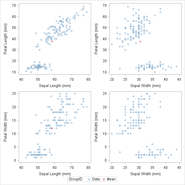
Would you like to create customized SAS graphs with the use of PROC SGPLOT and other ODS graphic procedures? Then an essential skill that you must learn is to know how to join, merge, concentrate and append SAS data sets, which arise from a variety of sources. The SG procedures, which stand for SAS statistical graphic procedures, enable users to overlay different kinds of customized curves, bars and markers. But the SG procedures do expect all the data for a graph to be in one single set of data. Thus, it often becomes necessary to append two or more sets of data before one can create a complex graph.
In this blog post, we will discuss two ways in which we can combine data sets in order to create ODS graphics. An alternative option is to use the SG annotation facility, which will add extra curves and markers to the graph. We mostly recommend the use of the techniques that are given in this article for simple features and reserve annotations when adding highly complex yet non-standard features.
Using overlay curves:
Here is a brief idea on how to structure a SAS data set, so that one can overlay curves on a scatter plot.
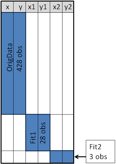
The original data is contained in the X and Y variables, as can be seen from the picture below. These will be the coordinates for the scatter plot. The secondary information will be appended at the end of the data. The variables X1 and Y1 contain the coordinates of a custom scatter plot smoother. The X2 and Y2 variables contain the coordinates of another scatter plot smoother.
Source: blogs.sas.com
This structure will enable you to use the SGPLOT procedure for overlaying, two curves on the scatter plot. One may make use of a SCATTER statement along with two SERIES statements to build the graphs.
Sometimes in addition to the overlaying curves, we like to add special markers to the scatter plot. In this blog we plan to show people how to add a marker that shows the location of the sample mean. It will discuss how to use PROC MEANS to build an output data set, which contains the coordinates of the sample mean, then we will append the data set to the original data.
With the below mentioned statements we can use PROC MEANS for computing the sample mean of the four variables in the data set of SasHelp.Iris. This data contains the measurements for 150 iris flowers. To further emphasize on the general syntax of this computation, we will make use of macro variables but note that it is not necessary:
With the AUTONAME option on the output statement, we can tell PROC MEANS to append the name of the statistics to names of the variables. As a result, the output datasets will contain the variables, with names like PetalLength_Mean or SepalWidth_Mean.
As depicted in the previous picture, this will enable you to append the new data into the end of the old data in the “wide form”, as shown here:
data Wide;
set &DSName Means; /* add four new variables; pad with missing values */run;
ods graphics / attrpriority=color subpixel;
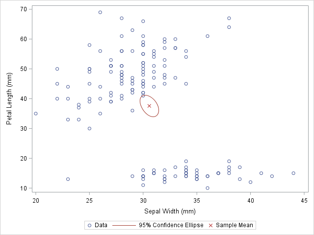
proc sgplotdata=Wide;
scatter x=SepalWidth y=PetalLength / legendlabel="Data";
ellipse x=SepalWidth y=PetalLength / type=mean;
scatter x=SepalWidth_Mean y=PetalLength_Mean /
legendlabel="Sample Mean" markerattrs=(symbol=X color=firebrick);
run;
And as here:
Source: blogs.sas.com
The original data is used in the first SCATTER statement and the ELLIPSE statement. You must remember that the ELLIPSE statement draws an approximate confidence ellipse for the population mean. The second SCATTER statement also makes use of sample means, which must be appended to the end of the original data. The second SCATTER statement will draw a red marker at the location of the sample mean.
This method can be used to plot other sample statistics (like the median) or to highlight special values such as the origin of a coordinate system.
Using overlay markers: of the long form
In certain circumstances, it is better to append the secondary data in the “long form”. In the long form the secondary data sets contains variables similar to the names in the original data set. One can choose to use the SAS data step to build a variable that will pinpoint the original and supplementary observations. With this technique it will be useful when people would want to show multiple markers (like, sample, mean, median, mode etc.) by making use of the GROUP = option on one of the SCATTER statement.
The following call to the PROC MEANS does not make use of an AUTONAME option. That is why the output data sets contain variables which have the same name as the input data. One can make use of the IN= data set option, for creating the ID variables that identifies with the data from the computed statistics:
/* Long form. New data has same name but different group ID */proc meansdata=&DSName noprint;
var&VarNames;
output out=Means(drop=_TYPE_ _FREQ_)mean=;
run;
data Long;
set &DSName Means(in=newdata);
if newdata then
GroupID = "Mean";
else GroupID = "Data";
run;
The DATA step is used to create the GroupID variable, which has several values “Data” for the original observations and the value “Mean” for the appended observations. This data structure will be useful for calling the PROC SGSCATTER and this will support the GROUP = option, however it does not support multiple PLOT statements as the following:
In closing thoughts, this blog is to demonstrate some useful techniques, to add markers to a graph. The technique requires people to use concatenate the original data with supplementary data. Often for creating ODS statistical graphics it is better to use appending and merging data technique in SAS. This is a great technique to include in your programming capabilities.
SAS courses in Noidacan give you further details on some more techniques that are worth adding to your analytics toolbox!
To learn more about Data Analyst with Advanced excel course – Enrol Now. To learn more about Data Analyst with R Course – Enrol Now. To learn more about Big Data Course – Enrol Now.
To learn more about Machine Learning Using Python and Spark – Enrol Now. To learn more about Data Analyst with SAS Course – Enrol Now. To learn more about Data Analyst with Apache Spark Course – Enrol Now. To learn more about Data Analyst with Market Risk Analytics and Modelling Course – Enrol Now.
Today is a time when omnipresent has a whole new definition. We no longer think about the almighty, omnipotent and omnipresent God when we speak about being everywhere. Nowadays we mostly mean data when we hear the term “present everywhere”. The amount of digital data that populates the earth today is growing at a tremendous rate, doubling over every two years and transforming the way we live.
As per IBM, an astounding amount of 2.5 Billion gigabytes of data is generated every day since the year 2012. Another revelation made by an article published in the Forbes magazine stated that data is growing faster than ever before today, and by the year 2020 almost 1.7 megabytes of new information will be created every second by every human being on this earth. And that is why it is imperative to know the fundamental basics of this field as clearly this is where our future lies.
In this article, we will know the main differentiating factors between data science, Big Data analysis and data analytics. We will discuss in detail about the points such as what they are, where they are used, and the skills one needs to be a professional in these fields, and finally the prospect of salary in each case.
First off we start with the understanding of what these subjects are:
What is data science?
Data science involves dealing with unstructured and structured data. It is a field that consists of everything that relates to cleansing of data, preparation and analysis. It can be defined as the combination of mathematics, analytics, statistics, programming, capture of data and problem solving. And all of that in the most ingenious ways with an amazing ability to look at things from a unique perspective. They professionals involved with this field should be proficient in data preparation, cleansing, and alignment of data.
To put it simply, this is the umbrella of techniques which is used to extract insights and information from the data.
What do we mean by Big Data?
As the name suggests, Big Data is nothing but a mammoth amount of data. This is so huge that it cannot be processed effectively with the existing traditional applications. The processing of Big Data starts with working with raw data that is not very well aggregated and is almost impossible to store in the memory of only one single computer.
It is now a popular buzzword filling up the job portals with vacancies. And is used to denote basically a large number of data, both structured and unstructured. It inundates a business on a daily basis. It is a prime source of information that can be used to take better decisions and proper strategic business moves.
As per Gartner, Big Data can be defined as high velocity, high volume and high variety information assets which demand cost efficient, innovative forms of information processing that enable improved insight, better decision making, and a procedural automation.
Data Analytics is the science of assessing raw data with the purpose of drawing actionable insights from the same.
It basically involves application of algorithms in a mechanical and systematic process to gather information. For instance, it may involve a task like running through a large number of data sets to look for comprehensible correlations between one another.
The main focus for data analytics is concentrated on interference, which is the procedure for deriving conclusions which are mainly based on what the researchers already are aware of.
Where can I apply my data science skills?
On internet searching: search engines use data science algorithms
For digital ads: data science algorithms is an important aspect for the whole digital marketing spectrum.
Recommender systems: finding relevant products from a list of billions available can be found easily. Several companies and ecommerce retailers use data to implement this system.
Big Data applicability:
The following sectors use Big Data application:
Customer analysis
Fraud analytics
Compliance analytics
Financial services, credit risk modelling
Operational analytics
Communication systems
Retailers
Data analysis scope and application:
Healthcare sector for efficient service and reduction of cost pressure
Travel sector for optimizing buying experience
Gaming industry for deriving insights about likes and dislikes of gamers
For management of energy, with smart grid management, energy optimization distribution and also used by utility companies.
Here is an infographic that further describes all there is to know about these trending, job-hungry sectors that are growing at a tremendous rate:
Now that you know what the path to career success, looks like stop waiting and get a R Analytics Certification today.
Interested in a career in Data Analyst?
To learn more about Data Analyst with Advanced excel course – Enrol Now. To learn more about Data Analyst with R Course – Enrol Now. To learn more about Big Data Course – Enrol Now.
To learn more about Machine Learning Using Python and Spark – Enrol Now. To learn more about Data Analyst with SAS Course – Enrol Now. To learn more about Data Analyst with Apache Spark Course – Enrol Now. To learn more about Data Analyst with Market Risk Analytics and Modelling Course – Enrol Now.
Hackers when combined with data breaches make a lethal combination for small banks. The recent attack on major Indian banks is a good example of why that should be necessary for banks.
When a major hack or data breach occurs small banks have a lot more to lose than the larger banks. They face a battle for climbing uphill to win back the lost trust of customers. And the component of customer trust is a core value proposition for small and medium sized banks. Moreover, they have a bigger shortcoming at their disposal rather than large financial institutions.Continue reading “Here Are 6 Ways Banks Can Avoid Data Breaches”
A massive stir in the global political scenario piqued the interests of several data analysts, politicians and global onlookers alike with a revelation made by David Robinson, a data scientist. He recently revealed into the media an analysis of Trump’s tweets, wherein he figured that those that happened from an android device were done by the presidential candidate himself, but those that were done from an iPhone device were done by a campaign staff.
While many may not think too deeply about this minor information, the main distinguishing point about this revelation has something to do with sentiments behind the tweets. The android device based tweets from the candidate himself (Trump) use angrier, more negative words but the iPhone-based tweets tended to be more straightforward ones with campaign announcements and hash tag promotions; something that a simple campaigner with digital marketing and clickbaits in mind would do with their docile mannerisms. The news was initially reported by the Scientific American, PC Magazine, and the LA Times. In fact, David Robinson even gave an interview with Time Magazine about his deductions.Continue reading “How are The Tweets of Donald Trump Faring For Him?”
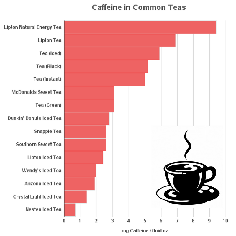
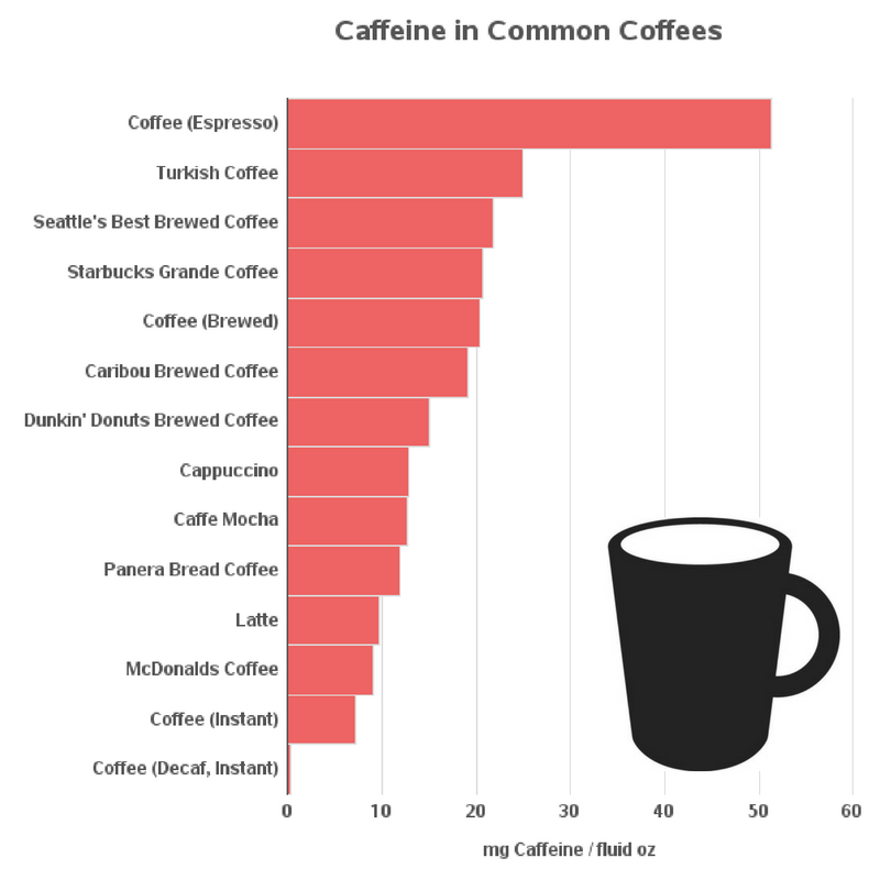
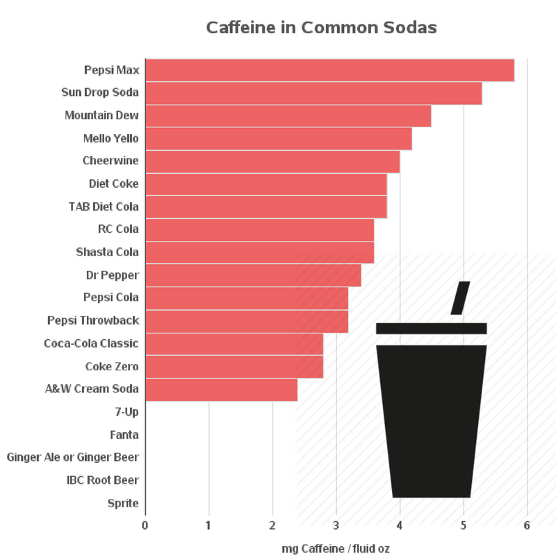
In the health conscious world today, people are often engaging in hot debates as to which drinks have the most and least amounts of caffeine in them. But as data analysts we do not like to engage in any critical discussion without having a few graphs to show for our arguments! So, the moment someone put the kettle on, we turned on our computers to sip a cuppa and make a few caffeinated graphs.
The moment we head on to a cafe or a breakfast joint these days, we are bombarded with a long list of beverages which include an assortment of coffees, tea and other sugary drinks that promise to refresh our Monday-blues thirst with a shot of energizing elixir! It is not only spoiling to have so many options, but in fact confusing to say the least when the waiter/waitress keenly asks us how we would like our coffee.
But coffee, that is dubbed as the Devil’s juice (which I believe, further adds to its charm) is known to be bad for our health when drunk too much. So, we analysed and researched and downloaded some of the data of caffeine in various drinks like tea, soda and different blends of coffee pasted them on an Excel sheet and then used Proc Import to feed and read the data into SAS datasets.
The problem we faced next was that each category still had a few too many drinks to get a quick mental grasp on the matter (i.e. typically 100+). So, we took a two stage approach. The first thing we did was to plot just a handful of drinks in each of the categories which we then recognized as we have or want to drink, and then we plotted the entire list. The images of the small subset graphs are attached below:
Here’s a graph of caffeine content in the most popular coffees:
Here is the complete list of data for all coffees:
Drink
Fluid ounces
Caffeine
mg Caffeine
(mg)
per fluid oz
Nescafe Ice Java
0.9
100
117.6
Stok Black Coffee Shots
0.4
40
90.9
Coffee Crave Fearless Black
12
844
70.3
Chameleon Cold Brew Coffee
32
2160
67.5
Black Insomnia Coffee
12
702
58.5
Death Wish Coffee
12
660
55
Coffee (Espresso)
1.5
77
51.3
Killer Coffee
8.5
430
50.8
Biggby Espresso
2
100
50
Gourmesso Coffee Pods
1.4
65
48.1
Bizzy Cold Brew
16
750
46.9
Peet’s Coffee Espresso
1.5
70
46.7
Nespresso Coffee Capsules
1.4
60
44.4
Robusta Coffee
8
265
33.1
Gloria Jean’s Coffee
2
67
33
Shock Coffee Triple Latte
8
231
28.9
Chameleon Cold Brew RTD Coffee
10
270
27
Stumptown Cold Brew Coffee
10.5
279
26.6
Long Black
6
154
25.7
Greek Coffee (Metrios)
2
50
25
Turkish Coffee
2
50
25
Illy Issimo Cafe
6.8
155
22.8
Seattle’s Best Brewed Coffee
12
260
21.7
Stumptown Cold Brew Chocolate + Milk
16
340
21.2
Coffee Bean & Tea leaf Coffee
16
333
20.8
Starbucks Grande Coffee
16
330
20.6
Coffee (Brewed)
8
163
20.4
High Brew Coffee
8
163
20.4
Stumptown Cold Brew + Milk
16
319
19.9
Starbucks Doubleshot
6.5
125
19.2
Caribou Brewed Coffee
16
305
19.1
Black Medicine Iced Coffee
11
206
18.7
TrueStart Performance Coffee
5.1
95
18.6
Costa Coffee
15.2
277
18.2
Bulletproof Coffee
8
145
18.1
Don Tomas Estate Coffee
8
145
18.1
Starbucks Via Ready Brew
8
135
16.9
Peet’s Brewed Coffee
16
267
16.7
Gold Peak Coffee
8
126
15.8
Cafe Viva Probiotic Coffee
8
125
15.6
Dunkin’ Donuts Brewed Coffee
14
210
15
K-Cup Coffee
8
120
15
Keurig Vue Pack
12
180
15
Starbucks Grande Caffe Americano
16
225
14.1
Starbucks Iced Espresso
16
225
14.1
Starbucks Latte Macchiato
16
225
14.1
Barista Bros Iced Coffee
16.9
219
13
Einstein Bros Coffee
16
206
12.9
Americano Coffee
12
154
12.8
Cappuccino
12
154
12.8
Dutch Bros. Coffee
20
256
12.8
Caffe Mocha
12
152
12.7
Starbucks Protein and Coffee
11
140
12.7
Biggby Brewed Coffee
16
200
12.5
Starbucks Cold Brew Coffee
16
200
12.5
Dunkin’ Donuts Iced Coffee
24
297
12.4
Biggby Iced Coffee
16
192
12
Panera Bread Coffee
16
189
11.8
Pronto Coffee
6
67
11.2
Muscle Milk Coffee House
11
120
10.9
Starbucks Grande Caffe Mocha
16
175
10.9
Dunkin’ Donuts Latte
14
151
10.8
Dunkin’ Donuts Mocha
14
151
10.8
Vita Coco Cafe
11.1
120
10.8
Starbucks Discoveries Caffe Mocha
50.7
539
10.6
Starbucks Bottled Iced Coffee
11
115
10.5
McDonalds (McCafe) Mocha
16
167
10.4
Peet’s Caffe Mocha
16
165
10.3
Peet’s Iced Mocha
16
165
10.3
Tim Hortons Large Brewed Coffee
20
200
10
Baskin Robbins Cappuccino Blast
24
234
9.8
Starbucks Doubleshot Energy + Coffee
15
145
9.7
Latte
16
154
9.6
Dare Iced Coffee
16.9
160
9.5
Starbucks Bottled Frappuccino
9.5
90
9.5
Peet’s Iced Coffee
16
150
9.4
Starbucks Grande Caffe Latte
16
150
9.4
Starbucks Grande Cappuccino
16
150
9.4
Flat White
8.5
77
9.1
McDonalds Coffee
16
145
9.1
McDonalds Iced Coffee
22
200
9.1
V Double Espresso Iced Coffee
16.1
147
9.1
Bean and Body Coffee
8
72
9
McDonalds (McCafe) Latte
16
142
8.9
Peet’s Caffe Americano
16
140
8.8
Peet’s Caffe Latte
16
140
8.8
Peet’s Cappuccino
16
140
8.8
Peet’s Iced Latte
16
140
8.8
Skinny Cow Iced Coffee
8
70
8.8
International Delight Iced Coffee
8
65
8.1
Starbucks Verismo Coffee Pods
8
60
7.5
Coffee (Instant)
8
57
7.1
Zola Coconut Water Espresso
17.5
125
7.1
Real Beanz Iced Coffee
9.5
66
6.9
Caffe Nero Coffee
12
80
6.7
Chick-fil-A Iced Coffee
14
94
6.7
Peet’s Decaf Espresso
1.5
10
6.7
Dunkin’ Donuts Iced Latte
24
151
6.3
Biggby Creamy Lattes
16
100
6.2
Biggby Frozen Lattes
16
100
6.2
Big Train Java Chip Ice Coffee
8
49
6.1
CoolBrew Coffee
10
60
6
Tim Hortons Small English Toffee Coffee
10
60
6
Tim Hortons Small French Vanilla Coffee
10
60
6
Dunkin’ Donuts Dunkaccino
14
83
5.9
Svelte Cappuccino Protein Shake
11
65
5.9
SlimFast Cappuccino Delight Shake
10
40
4
Choffy (roasted cacao)
6
23
3.8
Starbucks Refreshers
16
50
3.1
Indulgio Cappuccino
8
20
2.5
Starbucks Decaf Coffee
16
25
1.6
Coffee Leaf Tea
8
12
1.5
Dunkin’ Donuts Coolatta
24
18
0.8
Nescafe’ Ricoffy
8
6
0.8
Arby’s Jamocha Shake
16
12
0.7
Coffee (Decaf, Brewed)
8
6
0.7
Coffee (Decaf, Instant)
8
3
0.3
Detailed data on all kinds of popular sodas:
Drink
Fluid ounces
Caffeine
mg Caffeine
(mg)
per fluid oz
Bawls Exxtra
16
150
9.4
Blink Energy Water
16.9
150
8.9
Flatt Cola
8
65
8.1
Afri Cola
12
89
7.4
Fritz Kola
11.2
83
7.4
Premium Cola
11.2
83
7.4
Hansen’s Diet Red
8.3
57
6.9
Bawls
10
64
6.4
Bawls Orange
10
64
6.4
Bawls Cherry
16
100
6.2
Bawls Root Beer
16
100
6.2
Mountain Dew Game Fuel
20
121
6
Monster Mutant
20
115
5.8
Pepsi Max
12
69
5.8
Ski Soda
12
69
5.8
Sun Drop Soda
12
64
5.3
Mountain Dew Black Label
16
83
5.2
DOC 360
20
100
5
Mountain Dew Voltage
12
55
4.6
Diet Mountain Dew
12
54
4.5
Mountain Dew
12
54
4.5
Mountain Dew Baja Blast
16
72
4.5
Mountain Dew Live Wire
12
54
4.5
Pepsi One
12
54
4.5
Cult Cola
16.9
75
4.4
Surge Citrus Soda
16
69
4.3
Dr Pepper 10
12
51
4.2
Mello Yello
12
51
4.2
Mello Yello Zero
12
51
4.2
Starbucks Refreshers Canned
12
50
4.2
Cheerwine
12
48
4
Diet Cheerwine
12
48
4
Diet RC Cola
12
47
3.9
Diet Coke
12
46
3.8
Diet Coke Plus
12
45
3.8
Diet Coke with Lemon
12
45
3.8
Diet Coke with Lime
12
46
3.8
Diet Vanilla Coke
12
45
3.8
Hint Caffeine Kick Water
16
60
3.8
Soda Stream
16
60
3.8
TAB Diet Cola
12
45
3.8
Zevia Cola
12
45
3.8
RC Cola
12
43
3.6
RC Cola, Cherry
12
43
3.6
Shasta Cola
12
43
3.6
Diet Pepsi UK, AU, NZ
12
43
3.5
Diet Sunkist Orange Soda
12
42
3.5
Faygo Cola
12
42
3.5
Pepsi Max UK, NZ, AU
12
43
3.5
Diet Dr Pepper
12
41
3.4
Dr Pepper
12
41
3.4
Sunkist Orange Soda
12
41
3.4
Sunkist Sparkling Lemonade
12
41
3.4
Sunkist Ten
20
68
3.4
Diet Mr. Pibb
12
40
3.3
Honest Professor Fizz
12
40
3.3
Kickapoo Soda: Joy Juice & Fruit Shine
12
40
3.3
Pibb Xtra
12
40
3.3
Pibb Zero
12
40
3.3
Diet Dr Pepper Cherry
12
39
3.2
Diet Dr Pepper Cherry Vanilla
12
39
3.2
Diet Ruby Red Squirt
12
39
3.2
Diet Wild Cherry Pepsi
12
38
3.2
Dr Pepper Cherry
12
39
3.2
Dr Pepper Cherry Vanilla
12
39
3.2
Jazz Caramel Cream
12
38
3.2
Pepsi Cola
12
38
3.2
Pepsi Diet Lemon
12
38
3.2
Pepsi Diet Lime
12
38
3.2
Pepsi Diet Vanilla
12
38
3.2
Pepsi Throwback
12
38
3.2
Pepsi True
7.5
24
3.2
Ruby Red Squirt
12
39
3.2
TK Diet Cola
12
38
3.2
Wild Cherry Pepsi
12
38
3.2
Ale 8 1
12
37
3.1
Crystal Pepsi
20
63
3.1
Inca Kola
16
50
3.1
Red Flash
12
37
3.1
Co-Operative Diet Cola
16.9
50
3
Double Cola
12
36
3
1893 Cola
12
34
2.8
Big Red Soda
12
34
2.8
Caffeinated Club Soda
12
34
2.8
Cherry Coke
12
34
2.8
Cherry Coke Zero
12
34
2.8
Coca-Cola Classic
12
34
2.8
Coke Zero
12
34
2.8
Diet Cherry Coca-Cola
12
34
2.8
Diet Coke with Splenda
12
34
2.8
Diet Pepsi
12
34
2.8
Vanilla Coke
12
34
2.8
Pepsi Next
12
32
2.7
Slurpee
16
40
2.5
A&W Cream Soda
12
29
2.4
Coca-Cola Life
12
28
2.3
Red Rock Cola
12
26
2.2
Barq’s Root Beer
12
22
1.8
Diet A&W Cream Soda
12
22
1.8
Pepsi Slurpee
8
14
1.8
Faygo Moon Mist
12
20
1.6
PC Cola Diet
12
13
1.1
PC Cola
12
12
1
Ritz Cola
12
10
0.9
Canada Dry Green Tea Ginger Ale
12
9
0.8
Boost Nutritional Drink
8
5
0.6
7-Up
12
0
0
A&W Root Beer
12
0
0
Barq’s Red Creme Soda
12
0
0
Coca-Cola caffeine free
12
0
0
Diet Barq’s Root Beer
12
0
0
Fanta
12
0
0
Fresca
12
0
0
Ginger Ale or Ginger Beer
12
0
0
IBC Root Beer
12
0
0
Kinley Soda
12
0
0
Mug Root Beer
12
0
0
Orange Crush
20
0
0
Pepsi Caffeine Free
12
0
0
Sprite
12
0
0
Squirt Soda
12
0
0
Tonic Water
11.9
0
0
Tropicana Twister Soda
20
0
0
Vernors Ginger Ale
12
0
0
While we are not too big a fan of the dancing bologna to be added into serious graphs, but in this we figured we would add a few minimalistic pictures of the drinks to make it easier to be distinguished.
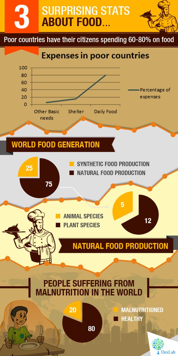
Did you know that insects are the most efficient forms of food available for us? 80 percent of a cricket is edible whereas, only 55 percent of a pig and 40 percent of a cow are edible. So, up for a meal at the bush at the backyard anyone? If that fact did not sound too appetizing to most of you with an acquired taste, then may these few interesting stats on food consumption and production churn your stomachs and stop you from wasting food.
Do you also feel that Artificial Intelligence (AI) is getting eerily powerful day-by-day? That is because the structures of Artificial Intelligence exploit the very fundamental laws of physics and of the universe as per latest research.
These new findings help to answer a long-awaited mystery about a category of AI that employs an interesting strategy called deep learning. These are programs based on deep neural networks hence, the name deep learning. The way this works is that they have multi-layered algorithms in which the lower-level calculations feed into the higher level ones within the hierarchy. These deep neural networks often perform surprisingly well when it comes to solving problems which are highly complex, like beating the world’s best player of a strategic board game called Go or categorising cat photos, however no one truly knows why…Continue reading “What Makes Artificial Intelligence So Incredibly Powerful?”
Whether you like the idea or not, we all have a digital self, a facade that we put on to engage and participate in the technological world! As per psychoanalysts and physicians, a theory proposed by them says that there is a ‘true self’ that is the instinctive core of our personality, it must be realized and nurtured. And there is also a ‘false self’ that is built to protect this true self. From what you ask? From the dangers of insults and vulnerabilities!
Our true selves are usually complex and fragile but it ultimately remains to be our essence. In trying to share that self with the world, we send out our decoy selves to take on the day-to-day vulnerabilities, challenges, and anxieties that come forth.