analytics course in delhi Archives - DexLab Analytics | Big Data Hadoop SAS R Analytics Predictive Modeling & Excel VBA

ARIMA (Auto-Regressive Integrated Moving Average)

arima-time series-dexlab analytics

This is another blog added to the series of time series forecasting. In this particular blog  I will be discussing about the basic concepts of ARIMA model.

So what is ARIMA?

ARIMA also known as Autoregressive Integrated Moving Average is a time series forecasting model that helps us predict the future values on the basis of the past values. This model predicts the future values on the basis of the data’s own lags and its lagged errors.

When a  data does not reflect any seasonal changes and plus it does not have a pattern of random white noise or residual then  an ARIMA model can be used for forecasting.

There are three parameters attributed to an ARIMA model p, q and d :-

p :- corresponds to the autoregressive part

q:- corresponds to the moving average part.

d:- corresponds to number of differencing required to make the data stationary.

In our previous blog we have already discussed in detail what is p and q but what we haven’t discussed is what is d and what is the meaning of differencing (a term missing in ARMA model).

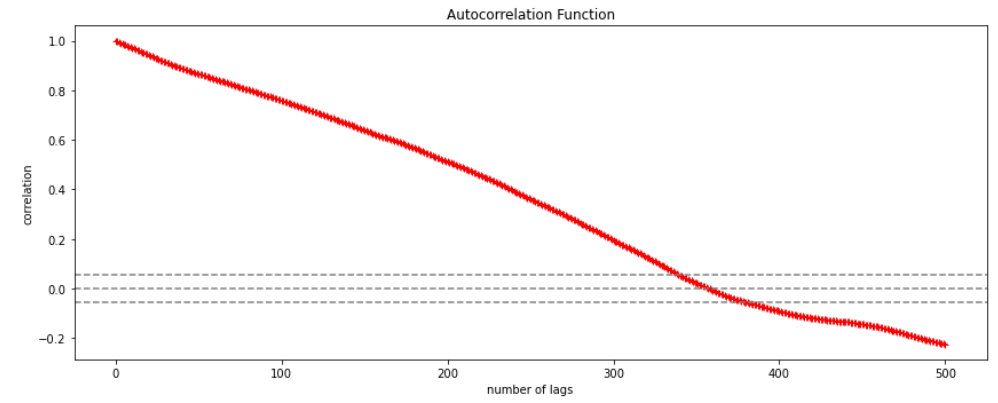
Since AR is a linear regression model and works best when the independent variables are not correlated, differencing can be used to make the model stationary which is subtracting the previous value from the current value so that the prediction of any further values can be stabilized .  In case the model is already stationary the value of d=0. Therefore “differencing is the minimum number of deductions required to make the model stationary”. The order of d depends on exactly when your model becomes stationary i.e. in case  the autocorrelation is positive over 10 lags then we can do further differencing otherwise in case autocorrelation is very negative at the first lag then we have an over-differenced series.

The formula for the ARIMA model would be:-

To check if ARIMA model is suited for our dataset i.e. to check the stationary of the data we will apply Dickey Fuller test and depending on the results we will  using differencing.

In my next blog I will be discussing about how to perform time series forecasting using ARIMA model manually and what is Dickey Fuller test and how to apply that, so just keep on following us for more.

So, with that we come to the end of the discussion on the ARIMA Model. Hopefully it helped you understand the topic, for more information you can also watch the video tutorial attached down this blog. The blog is designed and prepared by Niharika Rai, Analytics Consultant, DexLab Analytics DexLab Analytics offers machine learning courses in Gurgaon. To keep on learning more, follow DexLab Analytics blog.


.

Autocorrelation- Time Series – Part 3

Autocorrelation is a special case of correlation. It refers to the relationship between successive values of the same variables .For example if an individual with a consumption pattern:-

spends too much in period 1 then he will try to compensate that in period 2 by spending less than usual. This would mean that Ut is correlated with Ut+1 . If it is plotted the graph will appear as follows :

Positive Autocorrelation : When the previous year’s error effects the current year’s error in such a way that when a graph is plotted the line moves in the upward direction or when the error of the time t-1 carries over into a positive error in the following period it is called a positive autocorrelation.
Negative Autocorrelation : When the previous year’s error effects the current year’s error in such a way that when a graph is plotted the line moves in the downward direction or when the error of the time t-1 carries over into a negative error in the following period it is called a negative autocorrelation.

Now there are two ways of detecting the presence of autocorrelation
By plotting a scatter plot of the estimated residual (ei) against one another i.e. present value of residuals are plotted against its own past value.

If most of the points fall in the 1st and the 3rd quadrants , autocorrelation will be positive since the products are positive.

If most of the points fall in the 2nd and 4th quadrant , the autocorrelation will be negative, because the products are negative.
By plotting ei against time : The successive values of ei are plotted against time would indicate the possible presence of autocorrelation .If e’s in successive time show a regular time pattern, then there is autocorrelation in the function. The autocorrelation is said to be negative if successive values of ei changes sign frequently.
First Order of Autocorrelation (AR-1)
When t-1 time period’s error affects the error of time period t (current time period), then it is called first order of autocorrelation.
AR-1 coefficient p takes values between +1 and -1
The size of this coefficient p determines the strength of autocorrelation.
A positive value of p indicates a positive autocorrelation.
A negative value of p indicates a negative autocorrelation
In case if p = 0, then this indicates there is no autocorrelation.
To explain the error term in any particular period t, we use the following formula:-

Where Vt= a random term which fulfills all the usual assumptions of OLS
How to find the value of p?

One can estimate the value of ρ by applying the following formula :-

Time Series Analysis & Modelling with Python (Part II) – Data Smoothing

dexlab_time_series

Data Smoothing is done to better understand the hidden patterns in the data. In the non- stationary processes, it is very hard to forecast the data as the variance over a period of time changes, therefore data smoothing techniques are used to smooth out the irregular roughness to see a clearer signal.

In this segment we will be discussing two of the most important data smoothing techniques :-

  • Moving average smoothing
  • Exponential smoothing

Moving average smoothing

Moving average is a technique where subsets of original data are created and then average of each subset is taken to smooth out the data and find the value in between each subset which better helps to see the trend over a period of time.

Lets take an example to better understand the problem.

Suppose that we have a data of price observed over a period of time and it is a non-stationary data so that the tend is hard to recognize.

QTR (quarter)Price
110
211
318
414
515
6?


In the above data we don’t know the value of the 6th quarter.

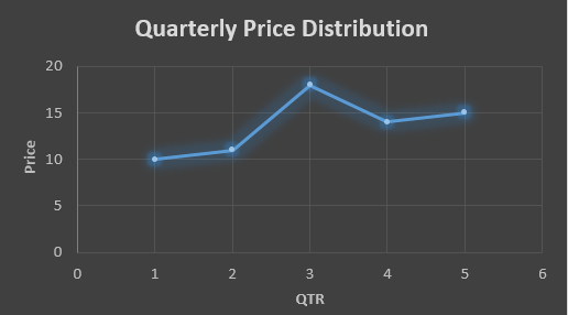
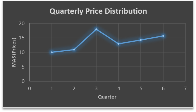
….fig (1)

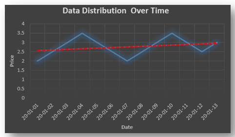
The plot above shows that there is no trend the data is following so to better understand the pattern we calculate the moving average over three quarter at a time so that we get in between values as well as we get the missing value of the 6th quarter.

To find the missing value of 6th quarter we will use previous three quarter’s data i.e.

MAS =  = 15.7

QTR (quarter)Price
110
211
318
414
515
615.7

MAS =  = 13

MAS =  = 14.33

QTR (quarter)PriceMAS (Price)
11010
21111
31818
41413
51514.33
615.715.7


….. fig (2)

In the above graph we can see that after 3rd quarter there is an upward sloping trend in the data.

Exponential Data Smoothing

In this method a larger weight ( ) which lies between 0 & 1 is given to the most recent observations and as the observation grows more distant the weight decreases exponentially.

The weights are decided on the basis how the data is, in case the data has low movement then we will choose the value of  closer to 0 and in case the data has a lot more randomness then in that case we would like to choose the value of  closer to 1.

EMA= Ft= Ft-1 + (At-1 – Ft-1)

Now lets see a practical example.

For this example we will be taking  = 0.5

Taking the same data……

QTR (quarter)Price

(At)

EMS Price(Ft)
11010
211?
318?
414?
515?
6??


To find the value of yellow cell we need to find out the value of all the blue cells and since we do not have the initial value of F1 we will use the value of A1. Now lets do the calculation:-

F2=10+0.5(10 – 10) = 10

F3=10+0.5(11 – 10) = 10.5

F4=10.5+0.5(18 – 10.5) = 14.25

F5=14.25+0.5(14 – 14.25) = 14.13

F6=14.13+0.5(15 – 14.13)= 14.56

QTR (quarter)Price

(At)

EMS Price(Ft)
11010
21110
31810.5
41414.25
51514.13
614.5614.56

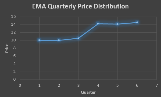
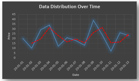
In the above graph we see that there is a trend now where the data is moving in the upward direction.

So, with that we come to the end of the discussion on the Data smoothing method. Hopefully it helped you understand the topic, for more information you can also watch the video tutorial attached down this blog. The blog is designed and prepared by Niharika Rai, Analytics Consultant, DexLab Analytics DexLab Analytics offers machine learning courses in Gurgaon. To keep on learning more, follow DexLab Analytics blog.


.
Time Series Analysis Part I


A time series is a sequence of numerical data in which each item is associated with a particular instant in time. Many sets of data appear as time series: a monthly sequence of the quantity of goods shipped from a factory, a weekly series of the number of road accidents, daily rainfall amounts, hourly observations made on the yield of a chemical process, and so on. Examples of time series abound in such fields as economics, business, engineering, the natural sciences (especially geophysics and meteorology), and the social sciences.

  • Univariate time series analysis- When we have a single sequence of data observed over time then it is called univariate time series analysis.
  • Multivariate time series analysis – When we have several sets of data for the same sequence of time periods to observe then it is called multivariate time series analysis.

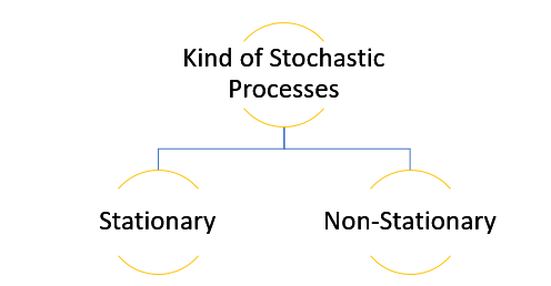
The data used in time series analysis is a random variable (Yt) where t is denoted as time and such a collection of random variables ordered in time is called random or stochastic process.

Stationary: A time series is said to be stationary when all the moments of its probability distribution i.e. mean, variance , covariance etc. are invariant over time. It becomes quite easy forecast data in this kind of situation as the hidden patterns are recognizable which make predictions easy.

Non-stationary: A non-stationary time series will have a time varying mean or time varying variance or both, which makes it impossible to generalize the time series over other time periods.

Non stationary processes can further be explained with the help of a term called Random walk models. This term or theory usually is used in stock market which assumes that stock prices are independent of each other over time. Now there are two types of random walks:
Random walk with drift : When the observation that is to be predicted at a time ‘t’ is equal to last period’s value plus a constant or a drift (α) and the residual term (ε). It can be written as
Yt= α + Yt-1 + εt
The equation shows that Yt drifts upwards or downwards depending upon α being positive or negative and the mean and the variance also increases over time.
Random walk without drift: The random walk without a drift model observes that the values to be predicted at time ‘t’ is equal to last past period’s value plus a random shock.
Yt= Yt-1 + εt
Consider that the effect in one unit shock then the process started at some time 0 with a value of Y0
When t=1
Y1= Y0 + ε1
When t=2
Y2= Y1+ ε2= Y0 + ε1+ ε2
In general,
Yt= Y0+∑ εt
In this case as t increases the variance increases indefinitely whereas the mean value of Y is equal to its initial or starting value. Therefore the random walk model without drift is a non-stationary process.

So, with that we come to the end of the discussion on the Time Series. Hopefully it helped you understand time Series, for more information you can also watch the video tutorial attached down this blog. DexLab Analytics offers machine learning courses in delhi. To keep on learning more, follow DexLab Analytics blog.


.
How Legal Analytics Can Benefit Law Firms?

How Legal Analytics Can Benefit Law Firms?

As different sectors are waking up to realize the significance of big data, the law firms are also catching up. After all it is one of the sectors that have to deal with literally massive amounts of data.

The popularity of legal analytics software like Premonition is a pointer to the fact that even though the industry was initially slow on the uptake, it is now ready to harness the power of big data to derive profit.

 So what exactly is legal analytics?

Legal analytics involves application of data analysis to mine legal documents and dockets to derive valuable insight. Now there is no need to confuse it with legal research or, to think that it is an alternative to the popular practice. Legal analytics is all about detecting patterns in past case records to enable firms strategize better in future. It basically aims to offer aid in legal research. Training received in an analytics lab could help a professional achieve proficiency.

Legal analytics platform combines sophisticated technologies of machine learning, NLP. It goes through past unstructured data and via cleaning and organizing that data into a coherent structure it analyzes the data to detect patterns.

How law firms can benefit from legal analytics?

Law firms having to deal with exhaustive data holding key information can truly gain advantage with the application of legal analytics. Primarily because of the fact it would enable them to anticipate what the possible outcome might be in order to strategize better and increase their chances of turning a case in their favor. Data Science training could be of immense value for firms willing to adopt this technology.

Not just that but implementation of legal analytics could also help the law firms whether big or, small run their operations and market their service in a more efficient manner and thereby increasing the percentage of ROI.

The key advantages of legal analytics could be as followed

  • The chances of winning a case could be better as by analyzing the data of past litigations, useful insight could be derived regarding the key issues like duration, judge’s decision and also certain trends that might help the firm develop a smarter strategy to win a particular case.
  • Cases often continue for a long period before resulting in a loss. To save money and time spent on a particular case, legal analytics could help lawyers decide whether to continue on or, to settle.
  • Often legal firms need to hire outside expertise to help with their case, the decision being costly in nature must be backed by data. With legal analytics it would be easier to go through data regarding a particular candidate and his performance in similar cases in the past.
  • There could be a significant improvement in the field of operational efficiency. In most of the situations lawyers spend huge amount of time in sorting through case documents and other data. This way they are wasting their time in finding background information when they could be spending time in offering consultation to a potential client and securing another case thereby adding financial benefit to the firm. The task of data analysis should better be handled by the legal analytics software.  
  • At the end of the day a law firm is just another business, so, to ensure that the business operations of the firm are being managed with efficiency, legal analytics software could come in handy. Whether it’s budgeting or, recruiting or retaining old staff valuable insight could be gained, which could be channeled to rake in more profit.

Data Science Machine Learning Certification

There has been an increase in the percentage of law firms which have adopted legal analytics, but, overall this industry is still showing reluctance in fully embracing the power. The professionals who have apprehension they need to set aside the bias they have and recognize the potential of this technology. May be they should consider enrolling in a Data analyst training institute to gain sharper business insight.


.

A Deep Dive Into The US Healthcare System in New York

A Deep Dive Into The US Healthcare System in New York

Unlike India’s healthcare system wherein both public and private entities deliver healthcare facilities to citizens, in the US, the healthcare sector is completely privatised.

The aim of this notebook is to study some of the numerical data we have for the US and especially data for New York. Most of us know about New York’s situation that is one of the worst in the world.

Therefore, analysing data may clarify a few things. We will be using three sets of data – urgent care facilities, US county healthcare rankings 2020 and Covid sources for counties.

For the data and codesheet click below.


Now pick key column names for your study with ‘.keys’ as the function name. We are interested in a few variables from health rankings so we take only the ones we think will be useful in a new data frame.

We will study each data set one by one so that we can get an understanding of the data before combining them. For this we call the plotly library that has very interactive graphs. We use the choropleth to generate a heat map over the country in question.

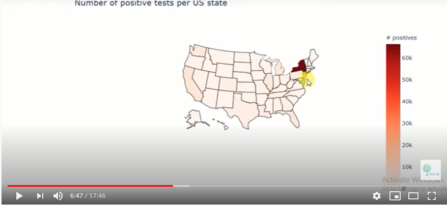
Fig. 1.

It is clear form the heat map that New York has a very high incidence of infections vis a vis other states. We then begin working with data on the number of ICU beds in each state. Since each state will have different populations, we cannot compare the absolute number of ICU beds. We need the ratio of ICU beds per a given number of inhabitants.

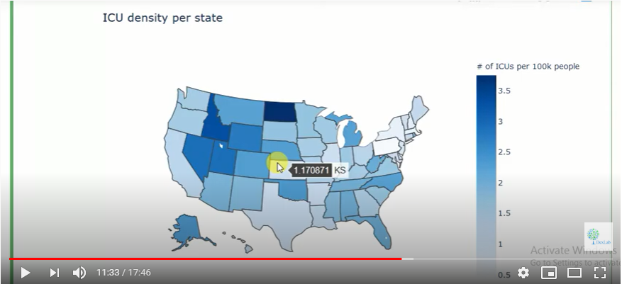
Fig. 2.

The generated heat map (Fig. 2.) shows the ICU density per state in the US. For more on this do watch the complete video tutorial attached herewith.

This tutorial was brought to you by DexLab Analytics. DexLab Analytics is a premiere data analyst training institute in Gurgaon.


.

Covid-19 – Key Insights through Exploration of Data (Part – II)

Covid-19 - Key Insights through Exploration of Data (Part - II)

This video tutorial is on exploratory data analysis. The data is on COVID-19 cases and it has been taken from Kaggle. This tutorial is based on simple visualization of COVID-19 cases.

For code sheet and data click below.


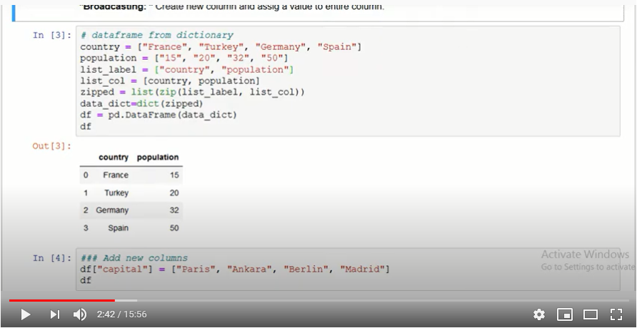
Firstly, we must call whatever libraries we need in Python. Then we must import the data we will be working on onto our platform.

Now, we must explore PANDAS. For this it is important to know that there are three types of data structures – Series, Data Frame and Panel Data. In our tutorial we will be using data frames. 

Fig. 1.

Fig. 1

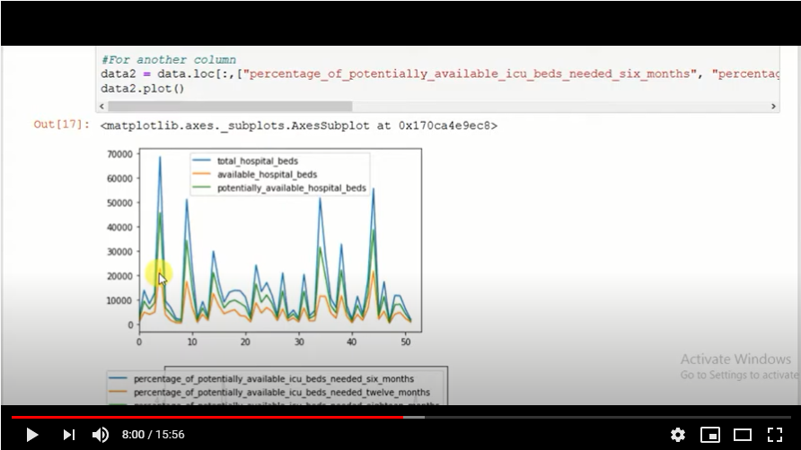
Now we will plot the data we have onto a graph. When we run the program, we get a graph that shows total hospital beds, potentially available hospital beds and available hospital beds.

Fig. 2.

Fig. 2

While visualizing data we must remember to keep the data as simple as possible and not make it complex. If there are too many data columns the interpretation will be a very complex one, something we do not want.

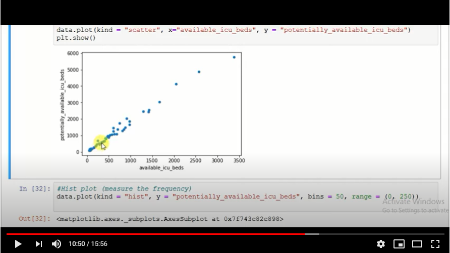
Fig. 3.

Fig. 3

A scatter plot (Fig. 3.) is also generated to show the reading of the data available.  We study the behaviour of the data on the plot.

For more on this, view the video attached herewith. And practise more and more with data from Kaggle. This tutorial was brought to you by DexLab Analytics. DexLab Analytics is a premiere data analyst training institute in Gurgaon.


.

Statistical Application in R & Python: EXPONENTIAL DISTRIBUTION

Statistical Application in R & Python: EXPONENTIAL DISTRIBUTIONStatistical Application in R & Python: EXPONENTIAL DISTRIBUTION

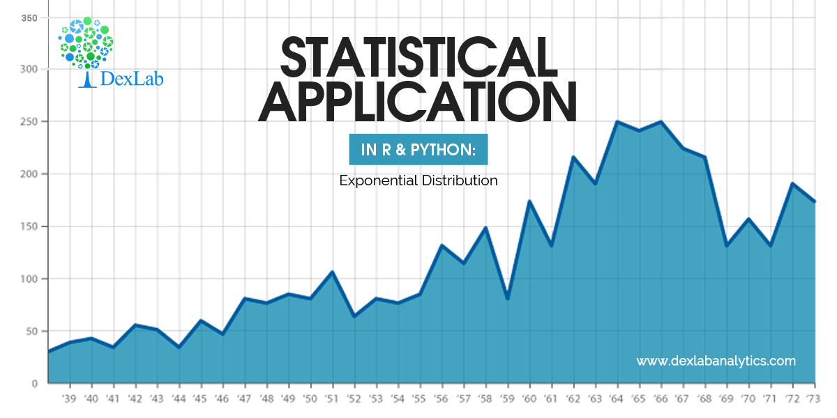
In this blog, we will explore the Exponential distribution. We will begin by questioning the “why” behind the exponential distribution instead of just looking at its PDF formula to calculate probabilities. If we can understand the “why” behind every distribution, we will have a head start in figuring out its practical uses in our everyday business situations.

Much could be said about the Exponential distribution. It is an important distribution used quite frequently in data science and analytics. Besides, it is also a continuous distribution with one parameter “λ” (Lambda). Lambda as a parameter in the case of the exponential distribution represents the “rate of something”. Essentially, the exponential distribution is used to model the decay rate of something or “waiting times”.

Data Science Machine Learning Certification

For instance, you might be interested in predicting answers to the below-mentioned situations:

  • The amount of time until the customer finishes browsing and actually purchases something in your store (success).
  • The amount of time until the hardware on AWS EC2 fails (failure).
  • The amount of time you need to wait until the bus arrives (arrival).

In all of the above cases if we can estimate a robust value for the parameter lambda, then we can make the predictions using the probability density function for the distribution given below:

Application:-

Assume that a telemarketer spends on “average” roughly 5 minutes on a call. Imagine they are on a call right now. You are asked to find out the probability that this particular call will last for 3 minutes or less.


Below we have illustrated how to calculate this probability using Python and R.

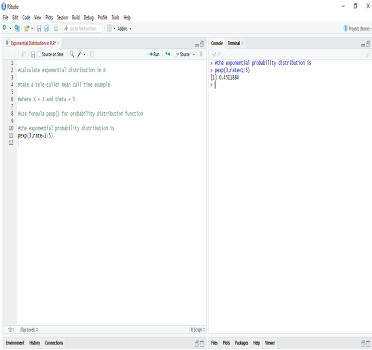
Calculate Exponential Distribution in R:

In R we calculate exponential distribution and get the probability of mean call time of the tele-caller will be less than 3 minutes instead of 5 minutes for one call is 45.11%.This is to say that there is a fairly good chance for the call to end before it hits the 3 minute mark.

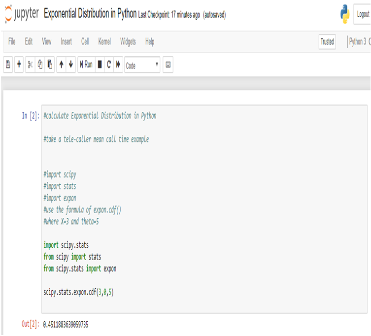
Calculate Exponential Distribution in Python:

We get the same result using Python.

Conclusion:

We use exponential distribution to predict the amount of waiting time until the next event (i.e., success, failure, arrival, etc).

Here we try to predict that the probability of the mean call time of the telemarketer will be less than 3 minutes instead of 5 minutes for one call, with the help of Exponential Distribution. Similarly, the exponential distribution is of particular relevance when faced with business problems that involve the continuous rate of decay of something. For instance, when attempting to model the rate with which the batteries will run out. 

Data Science & Machine Learning Certification

Hopefully, this blog has enabled you to gather a better understanding of the exponential distribution. For more such interesting blogs and useful insights into the technologies of the age, check out the best Analytics Training institute Gurgaon, with extensive Data Science Courses in Gurgaon and Data analyst course in Delhi NCR.

Lastly, let us know your opinions about this blog through your comments below and we will meet you with another blog in our series on data science blogs soon.


Interested in a career in Data Analyst?

To learn more about Data Analyst with Advanced excel course – Enrol Now.
To learn more about Data Analyst with R Course – Enrol Now.
To learn more about Big Data Course – Enrol Now.

To learn more about Machine Learning Using Python and Spark – Enrol Now.
To learn more about Data Analyst with SAS Course – Enrol Now.
To learn more about Data Analyst with Apache Spark Course – Enrol Now.
To learn more about Data Analyst with Market Risk Analytics and Modelling Course – Enrol Now.

Alteryx is Inclined to Make Things Easy

Alteryx is Inclined to Make Things Easy

Alteryx Analytics is primarily looking to ease the usability of the platform in all of the updates that are yet to come. The esteemed data analytics platform is concentrating on reducing the complexities to attract more users and thus, widen their age-old user base beyond that of the data scientists and data analytics professionals.

Alteryx is headquartered in Irvine, California. It was founded as SRC LLC in 1997 and comes with a suite of four tools to help the world of data scientists and data analysts to manage and interpret data easily. Alteryx Connect, Alteryx Designer, Alteryx Promote and Alteryx Server are the main components of the analytics platform of Alteryx. Thus, it is worth mentioning that the Alteryx Certification Course is a must if you are looking to make a career out of data science/data analytics.

Deep Learning and AI using Python

A Quick Glance at the Recent Updates 

The reputed firm launched a recent version of Alteryx 2019.3, in October, and is likely to release the Alteryx 2019.4 as a successor to it. The latter is scheduled for a December release.

What’s in the Update?

Talking about the all-new version Alteryx 2019.3, Ashley Kramer, senior vice president of product management at Alteryx, said that the latest version promises 25 new and upgraded features, all of them focussing on the user-friendliness of the platform at large.

One of the prominent features of the new version is a significant decrease in the total number of clicks that a user will take to arrive at the option of visualizing data to make analytic decisions.

Data profiling helps the users to visualize the data while they are working with it. Here, Alteryx discovered a painless way to work with data by modeling the bottom of the screen in a format similar to that of MS Excel.

All of these changes and additions are done keeping in mind the features that the “customers had been asking for,” according to Kramer.

Now, with the December update, which will come with an enhanced mapping tool, the Alteryx analytics will strive to further lower the difficulties surrounding the platform.

2

If you are interested in knowing all the latest features, it is better to join one of the finest AlterYX Training institutes in Delhi NCR, with exhaustive Analytics Courses in Delhi NCRalong with other demanding courses like Python for Data Analysis, R programming courses in Gurgaonmatchless course of Big Data, Data Analytics and more.

 
The blog has been sourced fromsearchbusinessanalytics.techtarget.com/news/252474294/Alteryx-analytics-platform-focuses-on-ease-of-use
 

Interested in a career in Data Analyst?

To learn more about Data Analyst with Advanced excel course – Enrol Now.
To learn more about Data Analyst with R Course – Enrol Now.
To learn more about Big Data Course – Enrol Now.

To learn more about Machine Learning Using Python and Spark – Enrol Now.
To learn more about Data Analyst with SAS Course – Enrol Now.
To learn more about Data Analyst with Apache Spark Course – Enrol Now.
To learn more about Data Analyst with Market Risk Analytics and Modelling Course – Enrol Now.

Call us to know more