Advanced MS Excel Archives - Page 2 of 3 - DexLab Analytics | Big Data Hadoop SAS R Analytics Predictive Modeling & Excel VBA

Microsoft Excel or Google Sheets: Which is better for Business?

Getting all work done from inside a browser through an internet-enable computer is no mean feat. Just after Google cracked the idea, Microsoft and Apple soon followed the bandwagon and developed online office suites of their own.


Microsoft Excel or Google Sheets: Which is better for Business?


So, do you think Google deserves the tag of top dog or should you give accolades to Microsoft for developing a feature-rich office suite?

Continue reading “Microsoft Excel or Google Sheets: Which is better for Business?”

5 Popular Uses of MS Excel for Better Business Growth

Microsoft Excel is one of the most significant computer software program making rounds in today’s workplace environment. More and more employees are being asked to hone their Excel skills in order to survive in the highly competitive market.


5 Popular Uses of MS Excel for Better Business Growth


From the employer’s viewpoint, especially those who are associated with IT, the use of Excel is gaining prominence and for all the right reasons. Not only it is being used by business professionals to carry out daily functional tasks but also a large chunk of experts rely on it for decision support.

Continue reading “5 Popular Uses of MS Excel for Better Business Growth”

Analyze Data Using These Easy but Effective MS Excel Tricks

Analyze-Data-Using-These-Easy-but-Effective-MS-Excel-Tricks


Everyone adores MS Excel. The powerful Excel software not only excels in doing basic computations but is also used for various formidable purposes, like financial modeling and business strategies. For novices, employing the skills of MS Excel can open new vistas in the world of data analytics. It is even being said – prior to R or Python, better grab the knowledge about Excel. Excel, with its wide array of functions, visualizations and skills empowers the users to quickly generate insights about data from the data, which would take a great toll otherwise.

Top 5 commonly used functions are highlighted below:

  1. Vlookup(): It works great in search of a value in a table and returns the corresponding value. For better understanding, take a look at the Policy Table.

For mapping the city name from the customer tables, based on a regular “customer id”, use function vlookup()

Vlookup_11-850x263

Syntax: =VLOOKUP(Key to lookup, Source_table, column of source table, are you ok with relative match?)


For this problem, we can type formula in cell “F4” as =VLOOKUP(B4, $H$4:$L$15, 5, 0) and this will return the city name for all the Customer id 1 and after that, copy this formula for all Customer ids.

Tip: Do not forget to lock the range of the second table using “$” sign – a common error when copying this formula down. This is known as relative referencing.

  1. CONCATINATE() – When it comes to combine text from two or more cells into a single cell, use CONCATINATE().

Check out the following table:

Concatenate1Here, we want to create a URL structured on input of host name and request path.

Use formula =concatenate(B3,C3) to solve the issue, and copy it.

Tip: Try to use “&” symbol, as it is shorter than typing a full “concatenate” formula, and does the exactly same thing. The formula can be written as “= B3&C3”.

  1. LEN() – It indicates the length of a cell, consisting the number of characters, including special characters and spaces.


Syntax: =Len(Text)


Example: =Len(B3) = 23


  1. TRIM() – This is a very useful function to wipe off text that has leading and trailing white space. When you get a large chunk of data from any database, the text found is usually padded with blanks. To deal with such problems, use this handy function.


Syntax: =Trim(Text)


  1. If() – It allows you to use conditional formulas to calculate when a certain thing holds true and when not. Move your eyes below on the below table to mark each sales as High and Low.Conditional

Undoubtedly MS Excel is one of the most robust programs ever created, and it still remains to be the golden standard for all business outcomes worldwide. Irrespective of whether you are a fresh blood or a veteran user, there is always some scope to learn new things in Excel, which makes it an all-time-favorite software program.  


To follow such interesting blogs on Excel, SAS, Big Data and other branches of Big Data, reach us at DexLab Analytics. We are the prime advanced Excel institute in Gurgaon and expect nothing but the best from us!

 
This post originally appeared onwww.analyticsvidhya.com/blog/2015/11/excel-tips-tricks-data-analysis
 

Interested in a career in Data Analyst?

To learn more about Data Analyst with Advanced excel course – Enrol Now.
To learn more about Data Analyst with R Course – Enrol Now.
To learn more about Big Data Course – Enrol Now.

To learn more about Machine Learning Using Python and Spark – Enrol Now.
To learn more about Data Analyst with SAS Course – Enrol Now.
To learn more about Data Analyst with Apache Spark Course – Enrol Now.
To learn more about Data Analyst with Market Risk Analytics and Modelling Course – Enrol Now.

Interesting Things to Do With Microsoft Excel

MS Excel Online training in Delhi

Microsoft Excel, whenever you hear this term, you visualise calculations, graphs, tables, formulas and what not – stuffs normally used to arrange and analyse data making pie charts, and countless related gimmicks.

Gaining proficiency in this specific software appears to be a common matter of concern for aspiring professionals from whatever field, they belongs to – and not just the ones who hail from a finance, accounts or IT background.

But do you know that MS Excel can be used for other interesting stuffs, apart from regular work-related things, like gaming and art? I guess not.

Leaf through a set of amazing projects completed with Microsoft Excel, which will surely knock you off your feet. So, are you ready?

Digital Art

Digital Art with MS Excel? Are you kidding me? No, I’m not. A 73-year old Japanese Tatsuo Horiuchi will change your entire perception. He practised digital art using MS Excel spreadsheet, why, because he found other graphics software to be quite expensive. He used the ‘autoshape’ feature of Excel to create stunning works of art. Fascinating, right?
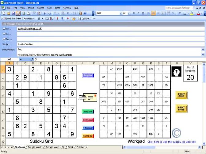
excel-art

Sudoku

Did you finish solving the Sudoku puzzle in the newspaper? You want more? Fortunately, Microsoft is here to help you out! Download an Excel file and use it to create a never-ending stream of Sudoku puzzles and go on teasing your brain cells by solving the puzzle, till you get worn out.

MS-Excel-online-training

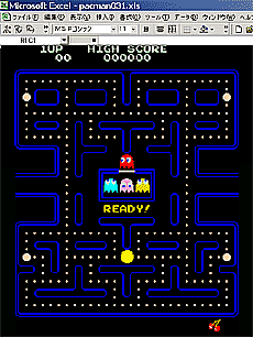
Re-inventing legendary games

Work hard, party harder! Excel totally buys the thought. By using Microsoft Excel, you can recreate the stellar games, like Monopoly, Pacman, Tetris and lot more. Of late, latest games like Candy Crush and 2048 have their own versions in Excel format, and that definitely calls for celebration!

pacell

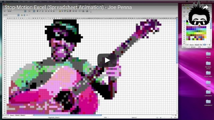
Stop-motion animation

Animations and music video are two sides of the same coin. For years, it has been a popular medium. While A-ha’s “Take on Me” revolutionised the digital world 30 years back, Joe Penna, also known as Mystery Guitar Man on YouTube has taken the world by storm today, thanks to its stop-motion animation music video created using Excel spreadsheets.

He filmed himself performing the song “Cuban Pete”, broke down the video into 730 separate frames and then used each frame to develop a spreadsheet mosaic. The rest simply fell into place!

Advanced excel training

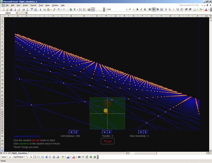
A working flight simulator

Scroll your thoughts to 1997, flight simulators came in from there. With the simulators, you can manoeuvre your environment as your mouse converts into the airplane control – move it back and forth or sideways and keep rolling.

No doubt, it became a favourite pastime for thousands of employees across the globe, including yours truly.

Excel dashboards training

Transport columns into rows

Mistakenly did you put data in columns, instead of rows or vice versa? Relax Microsoft has got you covered. There is a shortcut to fix the mistake. Just copy the row or column you need to interchange, right click on the cell you want to put it on and select Paste Special. A popup window named Transpose will appear. Check the box and click OK. That’s all you have to do. Easy, isn’t it?

Seeking Microsoft excel certification training online, DexLab Analytics is here! Check out our comprehensive MS Excel Online training in Delhi courses and hone your excel skills.


Interested in a career in Data Analyst?

To learn more about Machine Learning Using Python and Spark – click here.
To learn more about Data Analyst with Advanced excel course – click here.
To learn more about Data Analyst with SAS Course – click here.
To learn more about Data Analyst with R Course – click here.
To learn more about Big Data Course – click here.

How to Create a Macro With MS Excel

Did you know that with Excel you can now automate tasks by writing so called programs macros. In this tutorial, we will learn how do so, by learning to create a simple macro, which will executable after clicking a command button. To begin you must first turn on the developer tab:

How to Create a Macro With MS Excel

Developer tab:

Do the following steps to turn the developer tab on:


  1. First right click anywhere on the ribbon, and then click on Customize the Ribbon.


Continue reading “How to Create a Macro With MS Excel”

Learn To Use The AND Function in Excel WS

In this Excel tutorial, we at DexLab Analytics will dig a little deeper with our Excel knowledge and explain how to use the Excel AND function with proper examples, and syntax use.

 
Learn To Use The AND Function in Excel WS

What is the AND function?

The MS Excel AND function works to return TRUE if all the conditions are true. And it returns FALSE if any of the conditions are false. The AND function is an internal function in Excel that is categorized as a Logical Function. It can be utilised as a Work Sheet (WS) function in Excel. Moreover, as a worksheet function, the AND function may as well be included as a part of a formula in a normal excel cell of a worksheet.

Continue reading “Learn To Use The AND Function in Excel WS”

We Have an Announcement: Uncover Your Dormant Excellence With Excel!

Join our free demo session on Advanced MS Excel:

Join our free demo session on Advanced MS Excel:


Team DexLab Analytics remains dedicated at offering data knowledge to keen learners. It is with great pleasure that we announce yet another free demo session to be held this Sunday, on the 27th of November, 2016. This time we will be discussing some concepts of Advanced MS Excel. It is a classroom demo session to be held at our Gurgaon branch.
Continue reading “We Have an Announcement: Uncover Your Dormant Excellence With Excel!”

Tutorial for creating a Speedometer dial in MS Excel

 Tutorial for creating a Speedometer dial in MS Excel

Here in this video tutorial we have discussed in detailed steps, how to create a Speedometer chart in MS Excel. A Speedometer chart is often called as a gauge chart and combines two different type of charts, a pie chart and a doughnut chart.

The Speedometer dial is made with the help of using a Doughnut chart and needle is actually a combination of two types of charts, another doughnut chart and a pie chart.

A speedometer chart or a gauge chart can be created in other data visualization software as well, like for instance in Tableau and is usually easier to create due to availability of better controls and features.  It is due to the simplistic nature of these charts which is well adjusted to context of data and is a great use of space in a spreadsheet that charts like these are popular with non-data executives. Usually such non-data personnel do not want to dig deep into the contextual details like an analyst which is why these charts are great for using in a presentation where diverse departmental executives will be participating.

Gauge charts pack in a lot of horsepower and form a sort of ubiquitous symbol when it comes to understanding business metrics from an analytical point of view. So, learn to create these charts with our simple tutorial and for more such interesting lessons on data analysis software, join us every day as we share technical posts based on data on a regular basis.


Interested in a career in Data Analyst?

To learn more about Data Analyst with Advanced excel course – Enrol Now.
To learn more about Data Analyst with R Course – Enrol Now.
To learn more about Big Data Course – Enrol Now.

To learn more about Machine Learning Using Python and Spark – Enrol Now.
To learn more about Data Analyst with SAS Course – Enrol Now.
To learn more about Data Analyst with Apache Spark Course – Enrol Now.
To learn more about Data Analyst with Market Risk Analytics and Modelling Course – Enrol Now.

Let us Revise Regression Analysis

Let us revise regression analysis

By now every business owner and manager is aware of the latest megatrend related to data analysis and knows that they should make data-driven decisions only at work. Gut feeling and winging it are now practices outdates as they have proved time and again that they fail. But the problem still remains in the know-how of parsing through all the layers of data streaming into your systems. Do you have the requisite know how?

Luckily for you, you may not be the one to crunch all the numbers (phew!). You pay other robotic data analytics personnel to do that for you. But you must correctly understand the analysis report that is handed over to you for interpretation after your colleagues are done with all the heavy lifting. A common practice is the realm of data analysis is regression analysis. Continue reading “Let us Revise Regression Analysis”

Call us to know more