Matplotlib is the “grandfather” library of data visualization with Python. It was created by John Hunter. He created it to try replicating MatLab’s (another programming language) plotting capabilities in Python. So, if you are already familiar with matlab, matplotlib will feel natural to you.
This library gives you the flexibility to plot the graphs the way you want. You can start with a blank canvas and plot the graph on that canvas wherever you want. You can make multiple plots on top of each other, change the line type, change the line color using predefined colors or hex codes, line width etc.

Installation
Before you begin you’ll need to install matplotlib first by using the following code:-
There are two ways in which you can built matplotlib graphs:-
- Method based graphs
- Object-oriented graphs
Method Based Graphs in Matplotlib:-
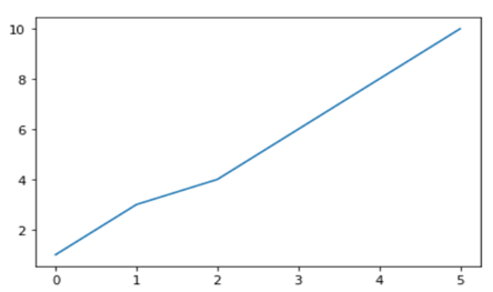
There are pre-defined methods in matplotlib library which you can use to create graphs directly using python language for example:-
Where, import matplotlib.pyplot as plt this code is used to import the library, %matplotlib inline is used to keep the plot within the parameters of the jupyter notebook, import numpy as np and x = np.array([1,3,4,6,8,10]) is used to import the numpy (numerical python) library and create an array x and plt.plot(x) is used to plot the distribution of the x variable.
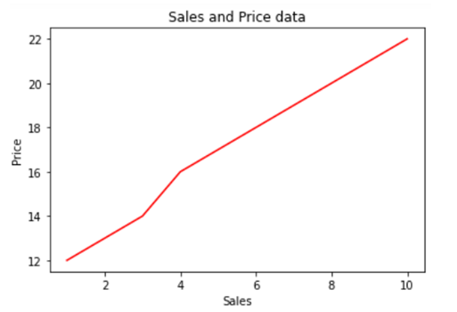
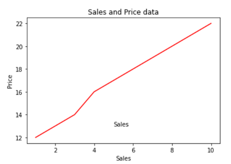
We can also use .xlabel(), .ylabel() and .title() methods print x axis and y axis labels and title on the graph.
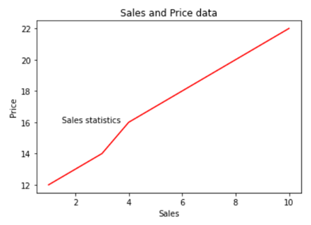
If you want to add text within your graph you can either use .annotate() method or .text() method.
Creating Multiplots
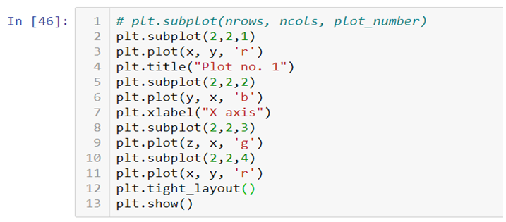
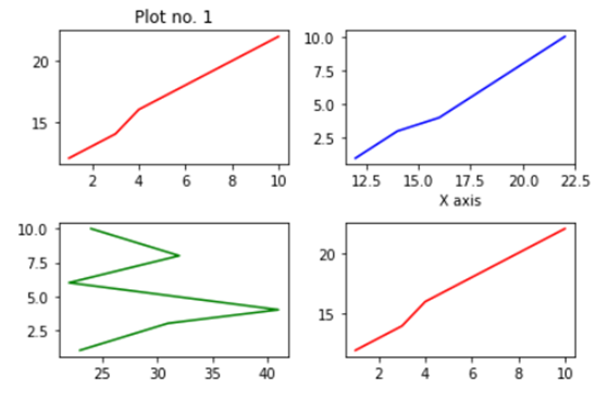
You can also create multiple plots by using .subplot() method by mentioning the number of rows and columns in which you want your graphs to be plotted. It works similar to the way you mention the number of rows and columns in a matrix.
You can add title, axis labels, texts etc., on each plot separately. In the end you can add .tight_layout() to solve the problem of overlapping of the graphs and to make the labels and scales visible.
Check out the video attached below to get an in-depth understanding of how Matplotlib works. This is a part of a visualization series using Python programming language. So, stay tuned for more updates. You can discover more such informative posts on the Dexlab Analytics blog.
.
data visualization, data visualization courses, Python, Python certification, python certification course, Python courses, Python Training Institute
