In our fifth installment of the visualization series using Python programming language, we introduce you to another powerful library in Python that is the Pandas_bokeh library. So, let’s find out what you can achieve with Pandas_bokeh library.
Pandas_bokeh is a library which can help you create interactive graphs in python. One can zoom in, zoom out, select a certain portion of the graph to see, move the plot left, right and center, create tabs in case they want to see a single plot at a time, create multiple plots at a time, create widgets like dropdown list, check boxes, radio buttons, slider etc. It is similar to the shiny app which is used in the r programming language but simpler and faster.
How to install pandas_bokeh?
In the above code we are changing our jupyter notebook code cell into a command line by using ! and then we can use pip (python installation package) to install the library.
How to create a simple line plot using pandas_bokeh ?
The first thing to do is import the libraries which we will be using to create a line plot.
- We will be creating our own dataset here and for that we need to import Numpy and Pandas libraries. Also we will be importing .figure() method from plotting module to create our canvas on which we will be building our graph from the scratch and we will also be importing .output_notebook() method to visualize our graph on jupyter notebook and to visualize our graph on a new tab and save at the same time we can use .output_file() method.
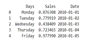
- The Dataset we are creating here will have three columns ‘Days’, ‘Sales’ and ‘Date’.

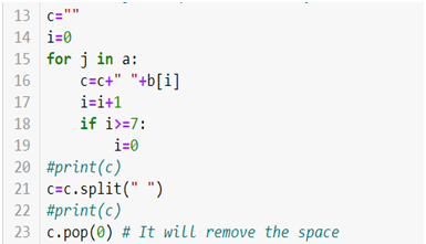
- We will be creating a dataset with hundred observations in each column so for that we are using .rand() method to generate hundred random numbers and that will be our ‘Sales’ column data. Now for our ‘Days’ column we will be creating a loop which will run hundred times and each time an array index value will be saved in a variable c which has an empty string and .split() method is then used to create a list of that string.

- For creating a ‘Date’ column we will be using the following code

- At last create a data frame we will be using .DataFrame() method.


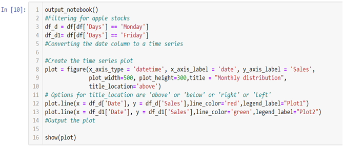
- Now to create two line graphs on a single canvas we will be using object-oriented programming.

- To build the graph on the jupyter notebook we are using .output_notebook() method and in case you want to plot the graph on a new tab you can use .output_file(“filename.html”) method.
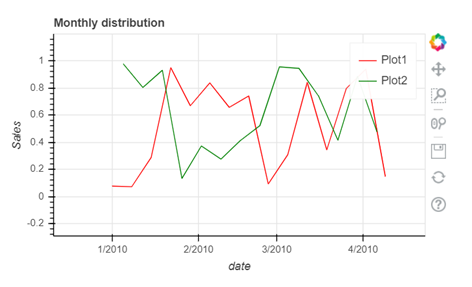
In the above line of codes we are creating two separate data frames df_d and df_d1 each containing Monday and Friday’s sales and dates separately now all we need to do is build a canvas using .figure() method and use few other arguments like x_axis_type to define the data type of the x axis and x_axis_label and y_axis_label to set graph labels, to adjust width and height of the canvas we have used plot_width and plot_height argument and to set title and title location we have used title and title_location. Once we have our canvas ready we can use .line() method and add x axis and y axis data to plot our graphs.

- To interact with your graph you can use the icons on the right hand side corner which will help you zoom in and out, look at a certain part of the graph, scroll to zoom in and out, save your plot and reset the changes made by you using the side icons.
The video tutorial attached below will help you gain better understanding.
At the end of this segment you must have become familiar with the nuances of the Pandas_bokeh library. As you continue on with the series, you will realize that you are becoming an expert in visualization. On Dexlab Analytics blog, you will find interesting blogs on various topics related to Python certification training.
.
Python, Python certification, python certification course, Python courses, python data science course, Python for data analysis, Python Training Institute


